Benvenuto nelle Font Più Popolari — dove popolarità e qualità si incontrano. Qui trovi i font più scaricati e usati dell'anno. Se cerchi scelte sicure per logo, web o social, inizia da qui.
Ogni font top si distingue per equilibrio, leggibilità e versatilità. Troverai sans serif moderne, script eleganti, serif vintage e display minimalisti.
-
( Malindo Creative - www.creativefabrica.com/ref/112799/ )
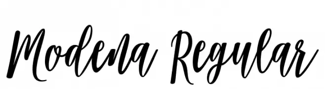
A dynamic and elegant script font with smooth curves and playful swashes.
 Scaricare 1276 Downloads@WebFont
 -
( Fonts by Jayde Garrow - GarrowGlitch - http://jaydegarrow.wix.com/jaydefonts. Personal-use only. For commercial use please contact owner. )
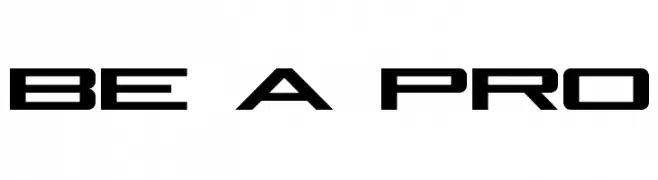
A futuristic, angular font with bold, geometric shapes.
![Be A Pro font caratteri gratis]() Scaricare 1276 Downloads@WebFont
Scaricare 1276 Downloads@WebFont -
( Copyright (c) 2010, 2011 by vernon adams (vern@newtypography.co.uk) )
A bold, rounded font with a futuristic and playful design.
![Monofett font caratteri gratis]() Scaricare 1276 Downloads@WebFont
Scaricare 1276 Downloads@WebFont -
( Fonts by Apostrophic Lab )
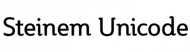
A modern, clean font with balanced proportions and versatile applications.
![Steinem Unicode font caratteri gratis]() Scaricare 1276 Downloads@WebFont
Scaricare 1276 Downloads@WebFont -
( Fonts by Daniel Zadorozny - www.iconian.com - Free for personal use )
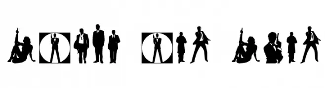
Silhouette dingbat font with spy and action motifs.
![Babes and Bond font caratteri gratis]() Scaricare 1276 Downloads@WebFont
Scaricare 1276 Downloads@WebFont -
-
( Fonts by Andrew Hart - dirt2.com )
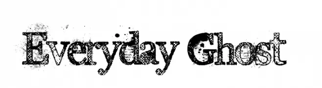
A bold, textured serif font with a vintage, distressed appearance.
![Everyday Ghost font caratteri gratis]() Scaricare 1276 Downloads@WebFont
Scaricare 1276 Downloads@WebFont -
( Frogii`s Fonts )
A pixelated, grid-like font with a digital and futuristic design.
![Abstract font caratteri gratis]() Scaricare 1276 Downloads@WebFont
Scaricare 1276 Downloads@WebFont -
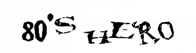
![80's hero font caratteri gratis]() Scaricare 1276 Downloads@WebFont
Scaricare 1276 Downloads@WebFont -
![20 Faces.ttf font caratteri gratis]() Scaricare 1276 Downloads@WebFont
Scaricare 1276 Downloads@WebFont -
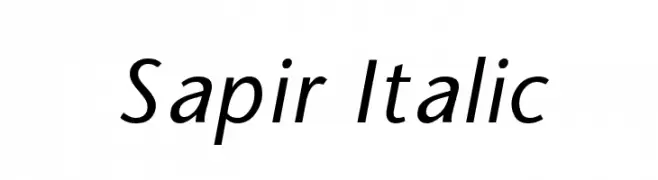
![Sapir Italic font caratteri gratis]() Scaricare 1276 Downloads@WebFont
Scaricare 1276 Downloads@WebFont -
( Personal-use only. For commercial use please contact owner. )
A playful, handwritten font with smooth, rounded edges and an informal style.
![Marius font caratteri gratis]() Scaricare 1275 Downloads@WebFont
Scaricare 1275 Downloads@WebFont -
![Radiant Free For Personal Use font caratteri gratis]() Scaricare 1275 Downloads@WebFont
Scaricare 1275 Downloads@WebFont -
( Fonts by Hanken Design Co. - Personal-use only. For commercial use please contact owner. )
A clean, modern typeface with uniform strokes and balanced spacing.
![Gen-Light font caratteri gratis]() Scaricare 1275 Downloads@WebFont
Scaricare 1275 Downloads@WebFont -
![Airside Sans Regular font caratteri gratis]() Scaricare 1275 Downloads@WebFont
Scaricare 1275 Downloads@WebFont -
![UVN Thu Tu font caratteri gratis]() Scaricare 1275 Downloads@WebFont
Scaricare 1275 Downloads@WebFont -
![POE Sans New Bold font caratteri gratis]() Scaricare 1275 Downloads@WebFont
Scaricare 1275 Downloads@WebFont -
( Fonts by www.blambot.com )
A bold, italicized font with a dynamic and energetic style.
![Back Issues BB Bold Italic font caratteri gratis]() Scaricare 1275 Downloads@WebFont
Scaricare 1275 Downloads@WebFont -
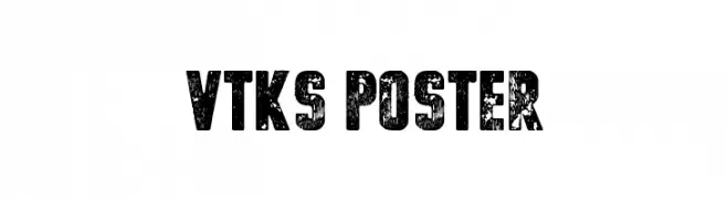
( Fonts by Douglas Vitkauskas - www.vtksdesign.com. Personal-use only. For commercial use please contact owner. )
A bold, distressed font with a rugged, vintage appearance.
![vtks poster font caratteri gratis]() Scaricare 1275 Downloads@WebFont
Scaricare 1275 Downloads@WebFont -
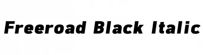
( Font by Jayvee D. Enaguas - grandchaos9000.deviantart.com )
A bold, italicized font with strong, thick strokes and a modern style.
![Freeroad Black Italic font caratteri gratis]() Scaricare 1275 Downloads@WebFont
Scaricare 1275 Downloads@WebFont -
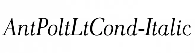
![AntPoltLtCond-Italic font caratteri gratis]() Scaricare 1275 Downloads@WebFont
Scaricare 1275 Downloads@WebFont -
![Beo Bold font caratteri gratis]() Scaricare 1275 Downloads@WebFont
Scaricare 1275 Downloads@WebFont -
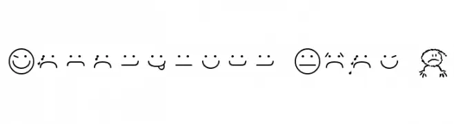
![Smileyface Font 3 font caratteri gratis]() Scaricare 1275 Downloads@WebFont
Scaricare 1275 Downloads@WebFont -
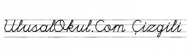
![UlusalOkul.Com Çizgili font caratteri gratis]() Scaricare 1275 Downloads@WebFont
Scaricare 1275 Downloads@WebFont -
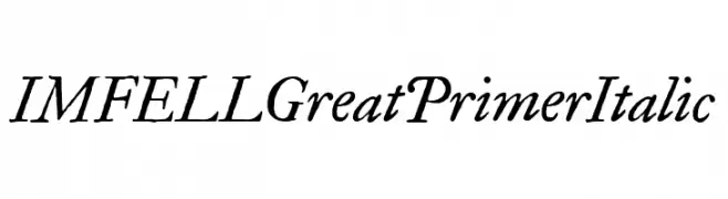
( Copyright (c) 2010, Igino Marini (mail@iginomarini.com) )
An elegant, italic serif font with high contrast and classic style.
![IM FELL Great Primer Italic font caratteri gratis]() Scaricare 1275 Downloads@WebFont
Scaricare 1275 Downloads@WebFont -
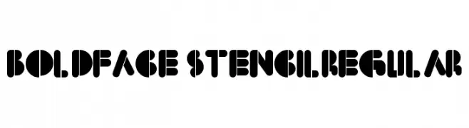
![BoldFace StencilRegular font caratteri gratis]() Scaricare 1275 Downloads@WebFont
Scaricare 1275 Downloads@WebFont -
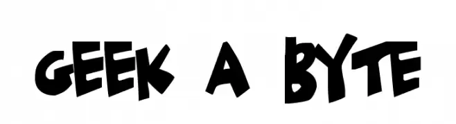
( Fonts by Jacob Fisher - www.pizzadude.dk )
A bold, playful, and cartoonish font with a hand-drawn appearance.
![Geek a byte font caratteri gratis]() Scaricare 1275 Downloads@WebFont
Scaricare 1275 Downloads@WebFont -
( Fonts by Jacob Fisher - www.pizzadude.dk )
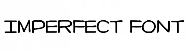
A playful, handwritten-style font with consistent stroke thickness and a casual feel.
![Imperfect font font caratteri gratis]() Scaricare 1275 Downloads@WebFont
Scaricare 1275 Downloads@WebFont -
( Fonts by NubeFonts - nubefonts.blogspot.com - Personal-use only. For commercial use please contact owner. )
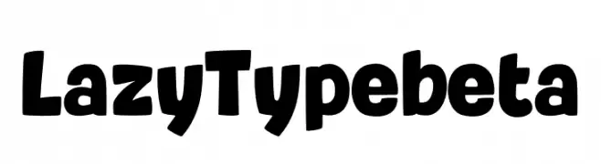
A bold, playful font with rounded characters and a dynamic tilt.
![LazyTypebeta font caratteri gratis]() Scaricare 1274 Downloads@WebFont
Scaricare 1274 Downloads@WebFont -
( André Felipe - www.behance.net/andfelcaslop )
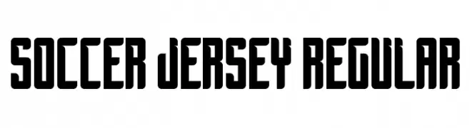
A bold, block-style font perfect for sports and athletic themes.
![Soccer Jersey Regular font caratteri gratis]() Scaricare 1274 Downloads@WebFont
Scaricare 1274 Downloads@WebFont -
( Fonts by Situjuh Nazara - 7ntypes.com - Personal-use only. For commercial use please contact owner. )
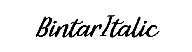
A fluid and elegant script font with a handwritten appearance.
![Bintar Italic font caratteri gratis]() Scaricare 1274 Downloads@WebFont
Scaricare 1274 Downloads@WebFont -
( Copyright 2017 The Sedgwick Ave Project Authors (https://github.com/googlefonts/sedgwickave) )
A bold, handwritten font with fluid, slightly slanted letterforms.
![Sedgwick Ave Regular font caratteri gratis]() Scaricare 1274 Downloads@WebFont
Scaricare 1274 Downloads@WebFont -
![DKColiseu font caratteri gratis]() Scaricare 1274 Downloads@WebFont
Scaricare 1274 Downloads@WebFont -
( Copyright (c) 2011, Vernon Adams (vern@newtypography.co.uk) )
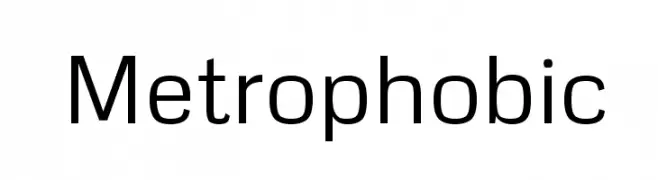
A clean, modern sans-serif font with a geometric influence.
![Metrophobic font caratteri gratis]() Scaricare 1274 Downloads@WebFont
Scaricare 1274 Downloads@WebFont -
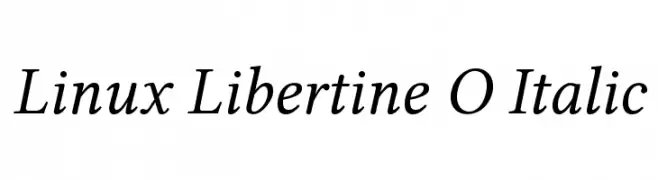
![Linux Libertine O Italic font caratteri gratis]() Scaricare 1274 Downloads@WebFont
Scaricare 1274 Downloads@WebFont -
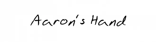
![Aaron's Hand font caratteri gratis]() Scaricare 1274 Downloads@WebFont
Scaricare 1274 Downloads@WebFont


Quali sono i font più popolari adesso?
Poppins, Roboto, Montserrat, Open Sans e Lato sono molto usati per le forme pulite e l'ampia applicabilità — dall'identità di marca alle landing page e ai poster.
Quali font si usano spesso nei loghi?
Le sans serif geometriche (es. Poppins, famiglie in stile Gotham) sono scelte comuni per un branding pulito e scalabile. Per un tocco personale restano valide script e stili manoscritti. Abbina un display deciso per i titoli a un corpo testo neutro per riconoscibilità ed equilibrio.
Ogni quanto si aggiorna la lista?
Con regolarità, in base ai download e all'attività reale. Torna spesso per scoprire in anticipo le nuove preferite.
💡 Consiglio: aggiungi ai preferiti — le tendenze cambiano in fretta e i font top di oggi possono ispirare il rebranding di domani.