Benvenuto nelle Font Più Popolari — dove popolarità e qualità si incontrano. Qui trovi i font più scaricati e usati dell'anno. Se cerchi scelte sicure per logo, web o social, inizia da qui.
Ogni font top si distingue per equilibrio, leggibilità e versatilità. Troverai sans serif moderne, script eleganti, serif vintage e display minimalisti.
-
( Fonts by wep - Wahyu Eka Prasetya - Personal-use only. For commercial use please contact owner. )
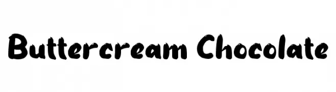
A bold, playful handwritten font with thick, uneven strokes and a lively appearance.
 Scaricare 344 Downloads@WebFont
 -
( Fonts by Graham Meade - GemFonts )
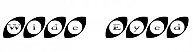
A playful font with characters enclosed in eye-shaped ovals, offering a whimsical and decorative style.
![Wide Eyed font caratteri gratis]() Scaricare 344 Downloads@WebFont
Scaricare 344 Downloads@WebFont -
( Fonts by Fanastudio )
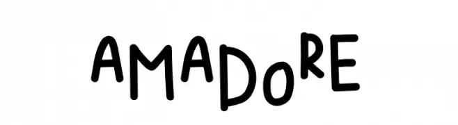
A playful, handwritten font with a quirky and informal style.
![AMADORE font caratteri gratis]() Scaricare 344 Downloads@WebFont
Scaricare 344 Downloads@WebFont -
![KR Star Letters font caratteri gratis]() Scaricare 344 Downloads@WebFont
Scaricare 344 Downloads@WebFont -
( Gage LaGreca - www.gagelagreca.com )
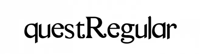
A classic serif font with elegant strokes and refined details.
![questRegular font caratteri gratis]() Scaricare 344 Downloads@WebFont
Scaricare 344 Downloads@WebFont -
-
![LaPierre font caratteri gratis]() Scaricare 344 Downloads@WebFont
Scaricare 344 Downloads@WebFont -
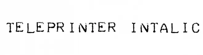
![Teleprinter Intalic font caratteri gratis]() Scaricare 343 Downloads@WebFont
Scaricare 343 Downloads@WebFont -
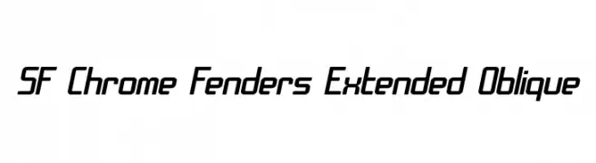
( Fonts by ShyFonts )
A modern, extended oblique font with a sleek, dynamic style.
![SF Chrome Fenders Extended Oblique font caratteri gratis]() Scaricare 343 Downloads@WebFont
Scaricare 343 Downloads@WebFont -
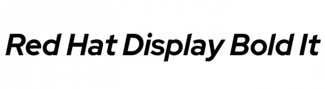
( Copyright 2019 The Red Hat Project Authors (https://github.com/RedHatOfficial/RedHatFont) )
A modern, bold, and italicized font with a clean and professional appearance.
![Red Hat Display Bold It font caratteri gratis]() Scaricare 343 Downloads@WebFont
Scaricare 343 Downloads@WebFont -
Caratteri di TGIFStudio. For commercial use please contact the owner.
( Thank you for downloading this font This font is free for PERSONAL USE ONLY! Commercial license for this font can be purchased at: http://bit.ly/2xYRdEB )
An elegant script font with flowing, interconnected characters and a sophisticated style.
![Camille Script font caratteri gratis]() Scaricare 343 Downloads@WebFont
Scaricare 343 Downloads@WebFont


Quali sono i font più popolari adesso?
Poppins, Roboto, Montserrat, Open Sans e Lato sono molto usati per le forme pulite e l'ampia applicabilità — dall'identità di marca alle landing page e ai poster.
Quali font si usano spesso nei loghi?
Le sans serif geometriche (es. Poppins, famiglie in stile Gotham) sono scelte comuni per un branding pulito e scalabile. Per un tocco personale restano valide script e stili manoscritti. Abbina un display deciso per i titoli a un corpo testo neutro per riconoscibilità ed equilibrio.
Ogni quanto si aggiorna la lista?
Con regolarità, in base ai download e all'attività reale. Torna spesso per scoprire in anticipo le nuove preferite.
💡 Consiglio: aggiungi ai preferiti — le tendenze cambiano in fretta e i font top di oggi possono ispirare il rebranding di domani.