Benvenuto nelle Font Più Popolari — dove popolarità e qualità si incontrano. Qui trovi i font più scaricati e usati dell'anno. Se cerchi scelte sicure per logo, web o social, inizia da qui.
Ogni font top si distingue per equilibrio, leggibilità e versatilità. Troverai sans serif moderne, script eleganti, serif vintage e display minimalisti.
-
 Scaricare 347 Downloads@WebFont
 -
( Fonts by Jacob Fisher - www.pizzadude.dk )
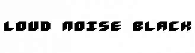
A bold, pixelated font with a retro video game aesthetic.
![Loud noise Black font caratteri gratis]() Scaricare 347 Downloads@WebFont
Scaricare 347 Downloads@WebFont -
( Fonts by Beyond Design - Ola Bjorling )
A futuristic, bold outline font with rounded, continuous lines.
![hybrid Outline font caratteri gratis]() Scaricare 347 Downloads@WebFont
Scaricare 347 Downloads@WebFont -
( Fonts by Yudi Pratama Chandra )
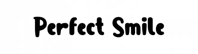
A playful, bold font with rounded, bubbly characters.
![Perfect Smile font caratteri gratis]() Scaricare 347 Downloads@WebFont
Scaricare 347 Downloads@WebFont -
( Fonts by Syaf Rizal - www.creativefabrica.com/ref/53/ - Personal-use only. For commercial use please contact owner. )
A bold, brush-style font with dynamic, energetic strokes.
![Breaking Wild font caratteri gratis]() Scaricare 347 Downloads@WebFont
Scaricare 347 Downloads@WebFont -
-
( Fonts by Shanaya Studio - Personal-use only. For commercial use please contact owner. )
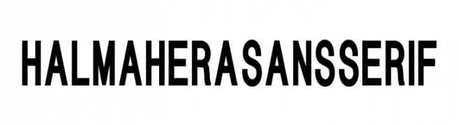
A bold, modern sans-serif font with clean lines and strong presence.
![HALMAHERA SANS SERIF font caratteri gratis]() Scaricare 347 Downloads@WebFont
Scaricare 347 Downloads@WebFont -
( Fonts by Apostrophic Lab )
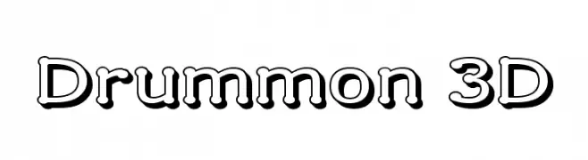
A bold, 3D-effect font with a playful and striking appearance.
![Drummon 3D font caratteri gratis]() Scaricare 347 Downloads@WebFont
Scaricare 347 Downloads@WebFont -
( Fonts by Castcraft Software - opti.netii.net - check the website before use )
A playful, handwritten font with smooth, flowing lines and a light, airy appearance.
![OPTIBalloon-Light font caratteri gratis]() Scaricare 347 Downloads@WebFont
Scaricare 347 Downloads@WebFont -
( Fonts by Jen Jones )
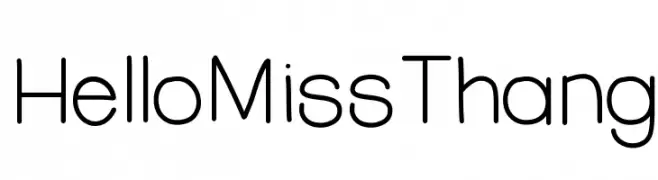
A playful, modern font with rounded edges and a clean aesthetic.
![HelloMissThang font caratteri gratis]() Scaricare 347 Downloads@WebFont
Scaricare 347 Downloads@WebFont -
( Fonts by Dieter Schumacher )
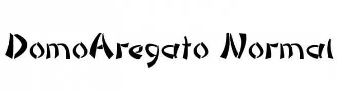
A bold, angular font with a dynamic and geometric style.
![DomoAregato Normal font caratteri gratis]() Scaricare 347 Downloads@WebFont
Scaricare 347 Downloads@WebFont


Quali sono i font più popolari adesso?
Poppins, Roboto, Montserrat, Open Sans e Lato sono molto usati per le forme pulite e l'ampia applicabilità — dall'identità di marca alle landing page e ai poster.
Quali font si usano spesso nei loghi?
Le sans serif geometriche (es. Poppins, famiglie in stile Gotham) sono scelte comuni per un branding pulito e scalabile. Per un tocco personale restano valide script e stili manoscritti. Abbina un display deciso per i titoli a un corpo testo neutro per riconoscibilità ed equilibrio.
Ogni quanto si aggiorna la lista?
Con regolarità, in base ai download e all'attività reale. Torna spesso per scoprire in anticipo le nuove preferite.
💡 Consiglio: aggiungi ai preferiti — le tendenze cambiano in fretta e i font top di oggi possono ispirare il rebranding di domani.