Benvenuto nelle Font Più Popolari — dove popolarità e qualità si incontrano. Qui trovi i font più scaricati e usati dell'anno. Se cerchi scelte sicure per logo, web o social, inizia da qui.
Ogni font top si distingue per equilibrio, leggibilità e versatilità. Troverai sans serif moderne, script eleganti, serif vintage e display minimalisti.
-
( Fonts by Rvandtype - Randi Irvan - Personal-use only. For commercial use please contact owner. )
A lively and elegant script font with flowing, cursive letterforms.
 Scaricare 41 Downloads@WebFont
 -
( Fonts by GGBot - www.ggbot.net - Personal-use only. For commercial use please contact owner. )
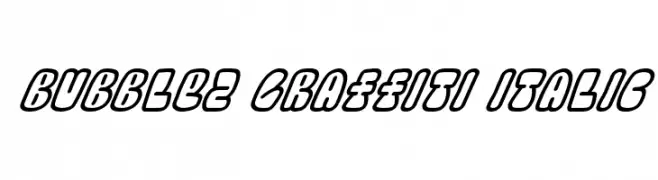
A bold, italicized graffiti-style font with a playful, bubble-like appearance.
![Bubblez Graffiti Italic font caratteri gratis]() Scaricare 41 Downloads@WebFont
Scaricare 41 Downloads@WebFont -
( Fonts by Achmad Yani - Personal-use only. For commercial use please contact owner. )
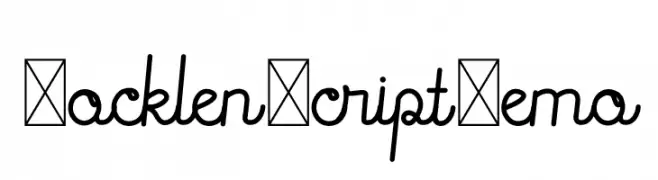
A smooth, flowing script font with connected letters and uniform strokes.
![Rocklen Script Demo font caratteri gratis]() Scaricare 41 Downloads@WebFont
Scaricare 41 Downloads@WebFont -
( Fonts by Iconian Fonts - Daniel Zadorozny - Personal-use only. For commercial use please contact owner. )
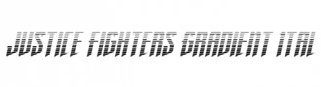
A bold, italicized font with a striped gradient effect for a modern, dynamic look.
![Justice Fighters Gradient Ital font caratteri gratis]() Scaricare 41 Downloads@WebFont
Scaricare 41 Downloads@WebFont -
( Fonts by Letterara - Thomas Aradea - Personal-use only. For commercial use please contact owner. )
An elegant and flowing script font with a sophisticated cursive style.
![Seoulscript-BoldItalic font caratteri gratis]() Scaricare 41 Downloads@WebFont
Scaricare 41 Downloads@WebFont -
( Fonts by Nilson Art Design - Nilson Lima - Personal-use only. For commercial use please contact owner. )
A bold, geometric font with unique cutouts and modern style.
![Rotundum - Demo font caratteri gratis]() Scaricare 41 Downloads@WebFont
Scaricare 41 Downloads@WebFont -
( Fonts by StringLabs - stringlabscreative.com - Personal-use only. For commercial use please contact owner. )
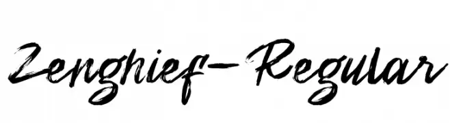
A bold and expressive brush script font with dynamic strokes.
![Zenghief-Regular font caratteri gratis]() Scaricare 41 Downloads@WebFont
Scaricare 41 Downloads@WebFont -
( Fonts by Jef Triforce - Francisco Arellano - Personal-use only. For commercial use please contact owner. )
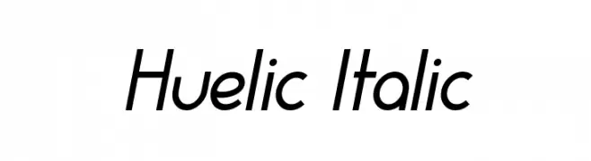
A modern, italicized font with medium contrast and smooth curves.
![Huelic Italic font caratteri gratis]() Scaricare 41 Downloads@WebFont
Scaricare 41 Downloads@WebFont -
( Fonts by Teguh Pranata - Personal-use only. For commercial use please contact owner. )
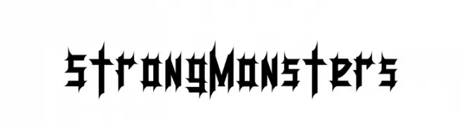
A bold, gothic-inspired font with sharp, angular edges and high contrast.
![StrongMonsters font caratteri gratis]() Scaricare 41 Downloads@WebFont
Scaricare 41 Downloads@WebFont -
( Fonts by Greta Silvi - Personal-use only. For commercial use please contact owner. )
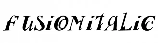
A bold, dynamic italic font with expressive, flowing letterforms.
![Fusion Italic font caratteri gratis]() Scaricare 41 Downloads@WebFont
Scaricare 41 Downloads@WebFont -
( Fonts by Sabrcreative - Personal-use only. For commercial use please contact owner. )
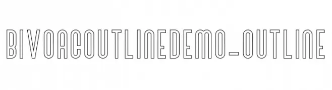
A modern, geometric outline font with clean lines and structured appearance.
![BivoacOutlineDemo-Outline font caratteri gratis]() Scaricare 41 Downloads@WebFont
Scaricare 41 Downloads@WebFont -
( Fonts by weknow - Wino S Kadir - Personal-use only. For commercial use please contact owner. )
A modern, hollow, inverse font with geometric and futuristic design elements.
![Internationalist-Hollow-Inverse font caratteri gratis]() Scaricare 41 Downloads@WebFont
Scaricare 41 Downloads@WebFont -
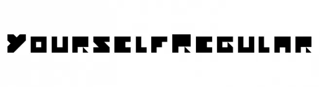
( Fonts by Jeronimo - Jeroen Kant - Personal-use only. For commercial use please contact owner. )
A bold, geometric font with a modern, futuristic style.
![Yourself Regular font caratteri gratis]() Scaricare 41 Downloads@WebFont
Scaricare 41 Downloads@WebFont -
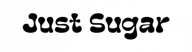
( Personal-use only. For commercial use please contact owner. )
Bold, bubbly display font with playful, organic shapes.
![Just Sugar font caratteri gratis]() Scaricare 41 Downloads@WebFont
Scaricare 41 Downloads@WebFont -
( Fonts by weknow - Wino S Kadir - Personal-use only. For commercial use please contact owner. )
A modern, geometric font with rounded lines and a futuristic style.
![Internationalist-Inverse font caratteri gratis]() Scaricare 41 Downloads@WebFont
Scaricare 41 Downloads@WebFont -
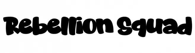
( Personal-use only. For commercial use please contact owner. )
A bold, rounded, and playful display font with a cartoonish style.
![Rebellion Squad font caratteri gratis]() Scaricare 41 Downloads@WebFont
Scaricare 41 Downloads@WebFont -
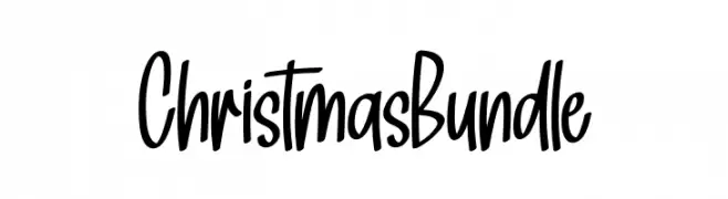
( Personal-use only. For commercial use please contact owner. )
Tall, playful handwritten script with a casual, whimsical feel.
![Christmas Bundle font caratteri gratis]() Scaricare 41 Downloads@WebFont
Scaricare 41 Downloads@WebFont -
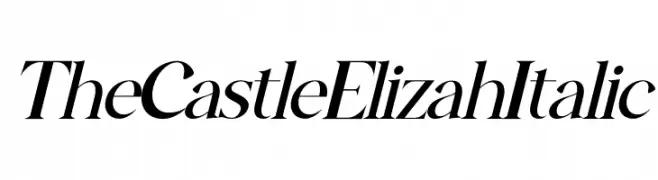
( Fonts by Letterena Studios - letterena.com - Personal-use only. For commercial use please contact owner. )
A refined italic font with smooth strokes and moderate contrast, exuding elegance and sophistication.
![The Castle Elizah Italic font caratteri gratis]() Scaricare 41 Downloads@WebFont
Scaricare 41 Downloads@WebFont -
( Fonts by NanaNissa - Personal-use only. For commercial use please contact owner. )
An elegant script font with flowing, cursive style and decorative flourishes.
![Valeyola font caratteri gratis]() Scaricare 41 Downloads@WebFont
Scaricare 41 Downloads@WebFont -
( Fonts by weknow - Wino S Kadir - Personal-use only. For commercial use please contact owner. )
A modern, hollow, inverse font with bold outlines and geometric shapes.
![MASTER-Hollow-Inverse font caratteri gratis]() Scaricare 41 Downloads@WebFont
Scaricare 41 Downloads@WebFont -
( Fonts by Woodcutter )
A bold, rounded font with a playful, hand-drawn feel.
![Final Match font caratteri gratis]() Scaricare 41 Downloads@WebFont
Scaricare 41 Downloads@WebFont -
( Fonts by Kong Font - Personal-use only. For commercial use please contact owner. )
A bold, angular, and oblique font with a modern, edgy style.
![Miles Hunt Oblique font caratteri gratis]() Scaricare 41 Downloads@WebFont
Scaricare 41 Downloads@WebFont -
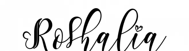
( Fonts by Yoga Letter - Isroni Yoga Prasetya - Personal-use only. For commercial use please contact owner. )
An elegant script font with flowing, decorative flourishes and a romantic style.
![Roshalia font caratteri gratis]() Scaricare 41 Downloads@WebFont
Scaricare 41 Downloads@WebFont -
( Fonts by Vladimir Nikolic - www.creativefabrica.com/designer/vladimirnikolic/ - Personal-use only. For commercial use please contact owner. )
A dynamic and artistic concave font with bold, fluid characters.
![Steam Concave Regular font caratteri gratis]() Scaricare 41 Downloads@WebFont
Scaricare 41 Downloads@WebFont -
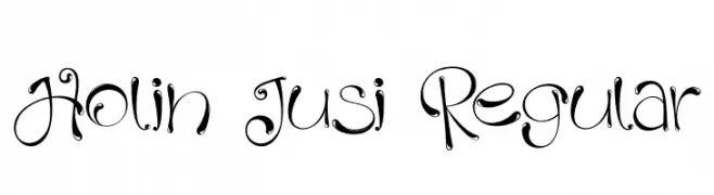
( Fonts by Ibram Syah - Personal-use only. For commercial use please contact owner. )
A whimsical and decorative font with elegant swirls and dynamic contrast.
![Holin Jusi Regular font caratteri gratis]() Scaricare 41 Downloads@WebFont
Scaricare 41 Downloads@WebFont -
( Fonts by Perspectype Studio - Personal-use only. For commercial use please contact owner. )
An elegant, cursive script font with intricate loops and high contrast.
![Barbara Derina Italic font caratteri gratis]() Scaricare 41 Downloads@WebFont
Scaricare 41 Downloads@WebFont -
( Fonts by Vunira Design - Personal-use only. For commercial use please contact owner. )
An elegant and flowing script font with ornate letterforms and high contrast.
![DaytoneFREE font caratteri gratis]() Scaricare 41 Downloads@WebFont
Scaricare 41 Downloads@WebFont -
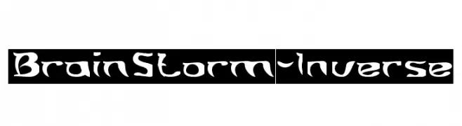
( Fonts by weknow - Wino S Kadir - Personal-use only. For commercial use please contact owner. )
A bold, dynamic font with sharp, angular edges and a graffiti-like aesthetic.
![Brain Storm-Inverse font caratteri gratis]() Scaricare 41 Downloads@WebFont
Scaricare 41 Downloads@WebFont -
( Fonts by Kong Font - fontkong.com - Personal-use only. For commercial use please contact owner. )
An artistic font with bold, sweeping strokes and dynamic movement.
![Koonamie Swash font caratteri gratis]() Scaricare 41 Downloads@WebFont
Scaricare 41 Downloads@WebFont -
( Fonts by Staircase Studio )
Expressive handwritten script with playful, dynamic strokes.
![Sweetchild font caratteri gratis]() Scaricare 41 Downloads@WebFont
Scaricare 41 Downloads@WebFont -
( Fonts by Daniel Zadorozny - www.iconian.com - Personal-use only. For commercial use please contact owner. )
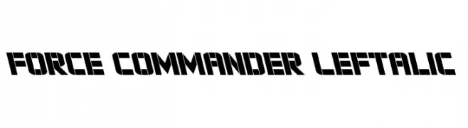
A bold, geometric stencil font with a dynamic, futuristic style.
![Force Commander Leftalic font caratteri gratis]() Scaricare 41 Downloads@WebFont
Scaricare 41 Downloads@WebFont -
( Fonts by Digital Typeface Studio - Eva Barabasne Olasz - Personal-use only. For commercial use please contact owner. )
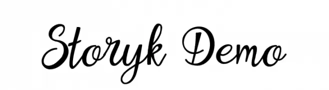
An elegant and flowing script font with smooth, cursive strokes.
![Storyk Demo font caratteri gratis]() Scaricare 41 Downloads@WebFont
Scaricare 41 Downloads@WebFont -
( Fonts by Heumm Design - Personal-use only. For commercial use please contact owner. )
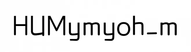
A modern, geometric sans-serif font with a clean and professional look.
![HUMymyoh_m font caratteri gratis]() Scaricare 41 Downloads@WebFont
Scaricare 41 Downloads@WebFont -
( Fonts by NanaNissa - Personal-use only. For commercial use please contact owner. )
An elegant, flowing script font with decorative flourishes and a handwritten style.
![Siluetta font caratteri gratis]() Scaricare 41 Downloads@WebFont
Scaricare 41 Downloads@WebFont -
( Fonts by weknow - Wino S Kadir - Personal-use only. For commercial use please contact owner. )
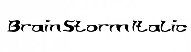
A bold, dynamic font with sharp, angular edges and an italicized style.
![Brain Storm Italic font caratteri gratis]() Scaricare 41 Downloads@WebFont
Scaricare 41 Downloads@WebFont


Quali sono i font più popolari adesso?
Poppins, Roboto, Montserrat, Open Sans e Lato sono molto usati per le forme pulite e l'ampia applicabilità — dall'identità di marca alle landing page e ai poster.
Quali font si usano spesso nei loghi?
Le sans serif geometriche (es. Poppins, famiglie in stile Gotham) sono scelte comuni per un branding pulito e scalabile. Per un tocco personale restano valide script e stili manoscritti. Abbina un display deciso per i titoli a un corpo testo neutro per riconoscibilità ed equilibrio.
Ogni quanto si aggiorna la lista?
Con regolarità, in base ai download e all'attività reale. Torna spesso per scoprire in anticipo le nuove preferite.
💡 Consiglio: aggiungi ai preferiti — le tendenze cambiano in fretta e i font top di oggi possono ispirare il rebranding di domani.