Benvenuto nelle Font Più Popolari — dove popolarità e qualità si incontrano. Qui trovi i font più scaricati e usati dell'anno. Se cerchi scelte sicure per logo, web o social, inizia da qui.
Ogni font top si distingue per equilibrio, leggibilità e versatilità. Troverai sans serif moderne, script eleganti, serif vintage e display minimalisti.
-
( Fonts by Fontfabric - Svetoslav Simov - Personal-use only. For commercial use please contact owner. )
A modern, light, and italic sans-serif font with sleek lines.
 Scaricare 41 Downloads@WebFont
 -
( Typodermic Fonts - Ray Larabie - www.typodermicfonts.com/ )
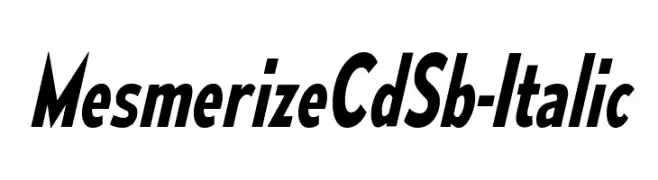
A bold, italicized font with high contrast and a dynamic, condensed style.
![MesmerizeCdSb-Italic font caratteri gratis]() Scaricare 41 Downloads@WebFont
Scaricare 41 Downloads@WebFont -
( Fonts by Daniel Zadorozny - www.iconian.com - Personal-use only. For commercial use please contact owner. )
A bold, geometric font with a futuristic and industrial aesthetic.
![Dark Hornet Laser font caratteri gratis]() Scaricare 41 Downloads@WebFont
Scaricare 41 Downloads@WebFont -
( Fonts by Inermedia Studio - Personal-use only. For commercial use please contact owner. )
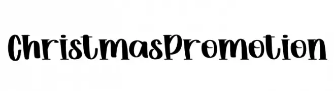
A playful and festive font with bold, curvaceous letters perfect for holiday themes.
![Christmas Promotion font caratteri gratis]() Scaricare 41 Downloads@WebFont
Scaricare 41 Downloads@WebFont -
( Fonts by Get Studio - Hermansyah , - Personal-use only. For commercial use please contact owner. )
A lively, expressive handwritten font with a modern, flowing style.
![Mauritania-Regular font caratteri gratis]() Scaricare 41 Downloads@WebFont
Scaricare 41 Downloads@WebFont -
( Fonts by Scratchones )
Tall, whimsical sans-serif with playful rounded forms.
![Morning House font caratteri gratis]() Scaricare 41 Downloads@WebFont
Scaricare 41 Downloads@WebFont -
( Fonts by Daniel Zadorozny - www.iconian.com - Personal-use only. For commercial use please contact owner. )
A futuristic, geometric, and italicized font with outlined characters.
![Sky Ridge Condensed Out Italic font caratteri gratis]() Scaricare 41 Downloads@WebFont
Scaricare 41 Downloads@WebFont -
( Fonts by Edric Studio - Personal-use only. For commercial use please contact owner. )
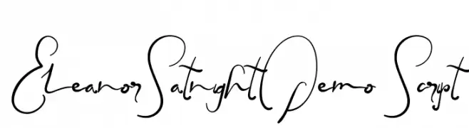
A lively and elegant script font with flowing, interconnected letterforms.
![EleanorSatnightDemo Script font caratteri gratis]() Scaricare 41 Downloads@WebFont
Scaricare 41 Downloads@WebFont -
( Fonts by Dimitris Anasto - Personal-use only. For commercial use please contact owner. )
A bold, playful font with rounded, whimsical characters.
![Hyto font caratteri gratis]() Scaricare 41 Downloads@WebFont
Scaricare 41 Downloads@WebFont -
( Fonts by Iconian Fonts - Daniel Zadorozny - Personal-use only. For commercial use please contact owner. )
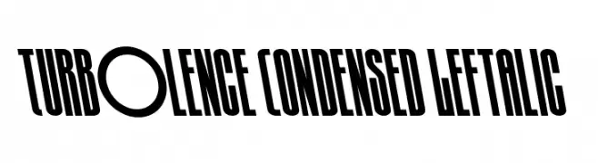
A bold, condensed, and left-italic font with high contrast and tight spacing.
![Turb0lence Condensed Leftalic font caratteri gratis]() Scaricare 41 Downloads@WebFont
Scaricare 41 Downloads@WebFont -
( Fonts by Vunira Design - Personal-use only. For commercial use please contact owner. )
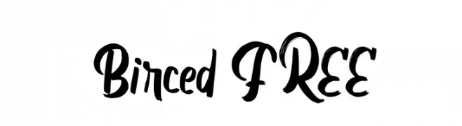
A bold, expressive script font with a handwritten style.
![Birced FREE font caratteri gratis]() Scaricare 41 Downloads@WebFont
Scaricare 41 Downloads@WebFont -
( Fonts by Iconian Fonts - Daniel Zadorozny - Personal-use only. For commercial use please contact owner. )
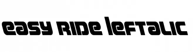
A bold, modern font with geometric, slanted characters for a dynamic look.
![Easy Ride Leftalic font caratteri gratis]() Scaricare 41 Downloads@WebFont
Scaricare 41 Downloads@WebFont -
( Fonts by Letterhend Studio - Hendry Juanda - Personal-use only. For commercial use please contact owner. )
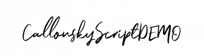
A dynamic, handwritten script font with fluid strokes and expressive style.
![CallonskyScriptDEMO font caratteri gratis]() Scaricare 41 Downloads@WebFont
Scaricare 41 Downloads@WebFont -
( Fonts by Pedro Teixeira Foundry - Pedro Alexandre Teixeira - Personal-use only. For commercial use please contact owner. )
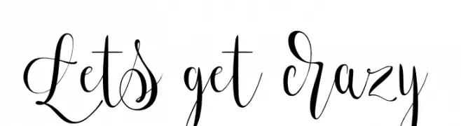
A decorative script font with flowing, interconnected letterforms and intricate swashes.
![Lets get crazy font caratteri gratis]() Scaricare 41 Downloads@WebFont
Scaricare 41 Downloads@WebFont -
( Fonts by bringtypestudio.co - Bringtype Studio - Personal-use only. For commercial use please contact owner. )
A modern geometric font with sharp angles and a futuristic aesthetic.
![Avint Regular font caratteri gratis]() Scaricare 41 Downloads@WebFont
Scaricare 41 Downloads@WebFont -
( Fonts by Asd Studio - Ghazi Humam Fauzan - Personal-use only. For commercial use please contact owner. )
A sophisticated script font with fluid, cursive strokes and an elegant italic slant.
![Anderson Wakler Italic font caratteri gratis]() Scaricare 41 Downloads@WebFont
Scaricare 41 Downloads@WebFont -
( Fonts by Graptail Type Studio - Personal-use only. For commercial use please contact owner. )
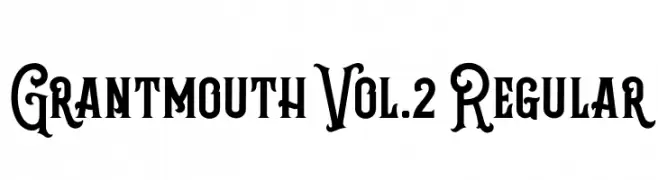
A bold, decorative font with vintage flair and intricate details.
![Grantmouth Vol.2 Regular font caratteri gratis]() Scaricare 41 Downloads@WebFont
Scaricare 41 Downloads@WebFont -
( Fonts by Rangkai Aksara - Personal-use only. For commercial use please contact owner. )
A bold, dynamic font with artistic flair and varying stroke widths.
![Feel Calm font caratteri gratis]() Scaricare 41 Downloads@WebFont
Scaricare 41 Downloads@WebFont -
( Fonts by InksTypia Studio - Andi Winarno - Personal-use only. For commercial use please contact owner. )
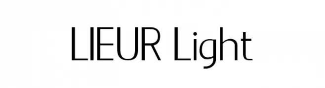
A sleek, modern typeface with clean lines and a minimalist aesthetic.
![LIEUR Light font caratteri gratis]() Scaricare 41 Downloads@WebFont
Scaricare 41 Downloads@WebFont -
( Fonts by Tiny Lily Typography - Personal-use only. For commercial use please contact owner. )
A bold, brushstroke font with a dynamic and artistic style.
![Key Virtue font caratteri gratis]() Scaricare 41 Downloads@WebFont
Scaricare 41 Downloads@WebFont -
( Fonts by Vladimir Nikolic - www.creativefabrica.com/designer/vladimirnikolic/ - Personal-use only. For commercial use please contact owner. )
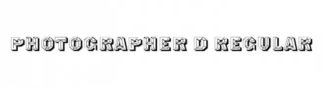
A bold, 3D geometric font with an angular, industrial style.
![Photographer 3D Regular font caratteri gratis]() Scaricare 41 Downloads@WebFont
Scaricare 41 Downloads@WebFont -
( Fonts by Edric Studio - Personal-use only. For commercial use please contact owner. )
A casual, flowing handwritten font with smooth, cursive strokes.
![Telly Humble DEMO font caratteri gratis]() Scaricare 41 Downloads@WebFont
Scaricare 41 Downloads@WebFont -
( Fonts by Brian Attridge - Personal-use only. For commercial use please contact owner. )
The image does not depict a valid font.
![Warded Man Hollow font caratteri gratis]() Scaricare 41 Downloads@WebFont
Scaricare 41 Downloads@WebFont -
( Fonts by Iconian Fonts - Daniel Zadorozny - Personal-use only. For commercial use please contact owner. )
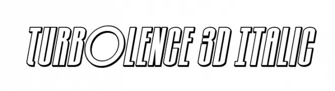
A bold, 3D italic font with outlined characters and a futuristic style.
![Turb0lence 3D Italic font caratteri gratis]() Scaricare 41 Downloads@WebFont
Scaricare 41 Downloads@WebFont -
( Fonts by Letterara - Thomas Aradea - Personal-use only. For commercial use please contact owner. )
A graceful script font with flowing, interconnected letters and high contrast.
![Gamos font caratteri gratis]() Scaricare 41 Downloads@WebFont
Scaricare 41 Downloads@WebFont -
( Fonts by PhontPhreak - Personal-use only. For commercial use please contact owner. )
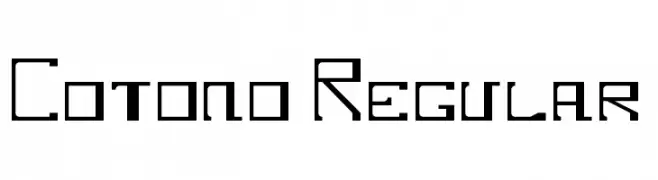
A geometric, angular font with a modern and technical appearance.
![Cotono Regular font caratteri gratis]() Scaricare 41 Downloads@WebFont
Scaricare 41 Downloads@WebFont -
( Fonts by Letterena Studios - letterena.com - Personal-use only. For commercial use please contact owner. )
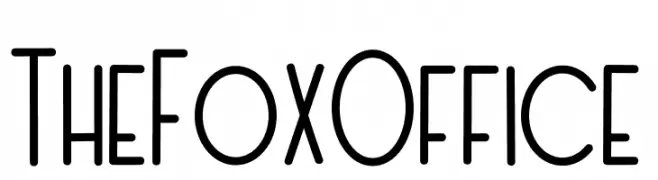
A playful, hand-drawn font with tall, narrow characters and a whimsical style.
![The Fox Office font caratteri gratis]() Scaricare 41 Downloads@WebFont
Scaricare 41 Downloads@WebFont -
( Fonts by Reka Safriani - Personal-use only. For commercial use please contact owner. )
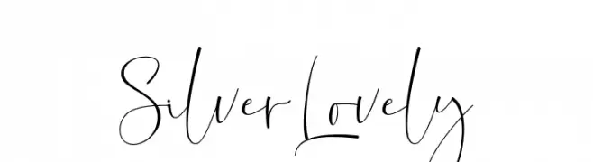
A modern, elegant script font with flowing, handwritten characteristics.
![SilverLovely font caratteri gratis]() Scaricare 41 Downloads@WebFont
Scaricare 41 Downloads@WebFont -
( Fonts by Chairul Art - Personal-use only. For commercial use please contact owner. )
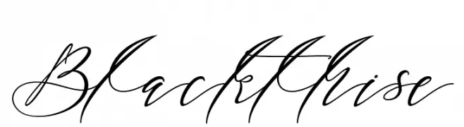
An elegant and flowing script font with graceful curves and intricate loops.
![Blackthise font caratteri gratis]() Scaricare 41 Downloads@WebFont
Scaricare 41 Downloads@WebFont -
( Fonts by Vunira Design - Personal-use only. For commercial use please contact owner. )
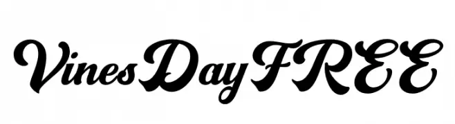
An elegant script font with flowing, decorative strokes and a classic appeal.
![VinesDayFREE font caratteri gratis]() Scaricare 41 Downloads@WebFont
Scaricare 41 Downloads@WebFont -
( Fonts by Pizzadude - Jakob Fischer - Personal-use only. For commercial use please contact owner. )
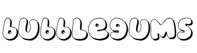
A playful, bubble-like font with bold, rounded characters and outlined edges.
![bubblegums font caratteri gratis]() Scaricare 41 Downloads@WebFont
Scaricare 41 Downloads@WebFont -
( Fonts by Zulfikar Ali - Personal-use only. For commercial use please contact owner. )
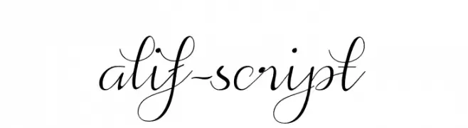
An elegant script font with flowing, cursive strokes and sophisticated flourishes.
![alif-script font caratteri gratis]() Scaricare 41 Downloads@WebFont
Scaricare 41 Downloads@WebFont -
( Fonts by PutraCetol Studio )
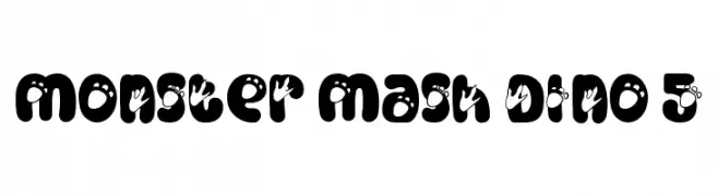
A playful, dinosaur-themed decorative font with bold, rounded characters and integrated footprints.
![Monster Mash Dino 5 font caratteri gratis]() Scaricare 41 Downloads@WebFont
Scaricare 41 Downloads@WebFont -
( Fonts by Jetsmax Studio - Khairil Anwar - Personal-use only. For commercial use please contact owner. )
A bold, playful font with geometric influences and rounded characters.
![Obstacle font caratteri gratis]() Scaricare 41 Downloads@WebFont
Scaricare 41 Downloads@WebFont -
( Fonts by Saxofont - Personal-use only. For commercial use please contact owner. )
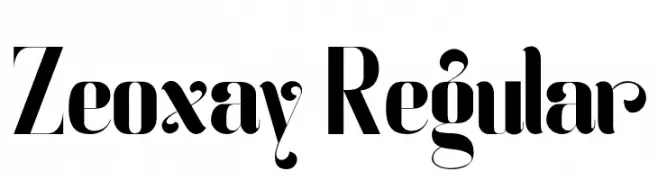
A high-contrast, decorative font with modern and vintage elements.
![Zeoxay-Regular font caratteri gratis]() Scaricare 41 Downloads@WebFont
Scaricare 41 Downloads@WebFont


Quali sono i font più popolari adesso?
Poppins, Roboto, Montserrat, Open Sans e Lato sono molto usati per le forme pulite e l'ampia applicabilità — dall'identità di marca alle landing page e ai poster.
Quali font si usano spesso nei loghi?
Le sans serif geometriche (es. Poppins, famiglie in stile Gotham) sono scelte comuni per un branding pulito e scalabile. Per un tocco personale restano valide script e stili manoscritti. Abbina un display deciso per i titoli a un corpo testo neutro per riconoscibilità ed equilibrio.
Ogni quanto si aggiorna la lista?
Con regolarità, in base ai download e all'attività reale. Torna spesso per scoprire in anticipo le nuove preferite.
💡 Consiglio: aggiungi ai preferiti — le tendenze cambiano in fretta e i font top di oggi possono ispirare il rebranding di domani.