Benvenuto nelle Font Più Popolari — dove popolarità e qualità si incontrano. Qui trovi i font più scaricati e usati dell'anno. Se cerchi scelte sicure per logo, web o social, inizia da qui.
Ogni font top si distingue per equilibrio, leggibilità e versatilità. Troverai sans serif moderne, script eleganti, serif vintage e display minimalisti.
-
 Scaricare 340 Downloads@WebFont
 -
( Free for a personal use. For a commercial use please visit www.kevinandamanda.com )
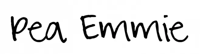
A playful, casual handwritten font with irregular strokes and a dynamic feel.
![Pea Emmie font caratteri gratis]() Scaricare 340 Downloads@WebFont
Scaricare 340 Downloads@WebFont -
( Fonts by Bitstream )
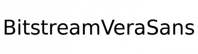
A clean, modern sans-serif font with excellent readability and balanced design.
![Bitstream Vera Sans font caratteri gratis]() Scaricare 340 Downloads@WebFont
Scaricare 340 Downloads@WebFont -
( Fonts by Steve Cloutier - www.cloutierfontes.ca )
A bold, brushstroke-style font with a dynamic and artistic appearance.
![CF Rebelle Regular font caratteri gratis]() Scaricare 340 Downloads@WebFont
Scaricare 340 Downloads@WebFont -
( Fonts by Manfred Klein. Free for private and charity use. Free for commercial with donation to organizations )
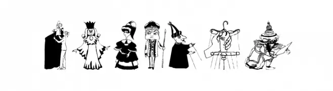
A decorative font with theatrical and whimsical character illustrations.
![OnStage font caratteri gratis]() Scaricare 340 Downloads@WebFont
Scaricare 340 Downloads@WebFont -
-
( Fonts by FreshtypeINK )
A playful, star-studded decorative font with a whimsical and friendly style.
![Happy Careful Semi Display font caratteri gratis]() Scaricare 340 Downloads@WebFont
Scaricare 340 Downloads@WebFont -
( Fonts by Alejandro Fabuel )
A tall, slender font with thin strokes and a modern, elegant style.
![Fab Craft font caratteri gratis]() Scaricare 340 Downloads@WebFont
Scaricare 340 Downloads@WebFont -
( Fonts by Dieter Steffmann )
An ornate, Gothic-inspired decorative font with intricate patterns.
![Ehmcke-Schwabacher Initialen font caratteri gratis]() Scaricare 340 Downloads@WebFont
Scaricare 340 Downloads@WebFont -
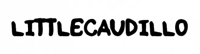
( Fonts by Woodcutter )
A bold, playful handwritten font with rounded characters.
![Little Caudillo font caratteri gratis]() Scaricare 340 Downloads@WebFont
Scaricare 340 Downloads@WebFont -
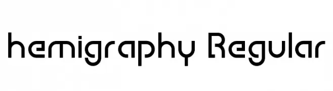
( Fonts by Nestor Delgado )
A modern, geometric font with rounded edges and uniform stroke width.
![hemigraphy Regular font caratteri gratis]() Scaricare 340 Downloads@WebFont
Scaricare 340 Downloads@WebFont


Quali sono i font più popolari adesso?
Poppins, Roboto, Montserrat, Open Sans e Lato sono molto usati per le forme pulite e l'ampia applicabilità — dall'identità di marca alle landing page e ai poster.
Quali font si usano spesso nei loghi?
Le sans serif geometriche (es. Poppins, famiglie in stile Gotham) sono scelte comuni per un branding pulito e scalabile. Per un tocco personale restano valide script e stili manoscritti. Abbina un display deciso per i titoli a un corpo testo neutro per riconoscibilità ed equilibrio.
Ogni quanto si aggiorna la lista?
Con regolarità, in base ai download e all'attività reale. Torna spesso per scoprire in anticipo le nuove preferite.
💡 Consiglio: aggiungi ai preferiti — le tendenze cambiano in fretta e i font top di oggi possono ispirare il rebranding di domani.