Benvenuto nelle Font Più Popolari — dove popolarità e qualità si incontrano. Qui trovi i font più scaricati e usati dell'anno. Se cerchi scelte sicure per logo, web o social, inizia da qui.
Ogni font top si distingue per equilibrio, leggibilità e versatilità. Troverai sans serif moderne, script eleganti, serif vintage e display minimalisti.
-
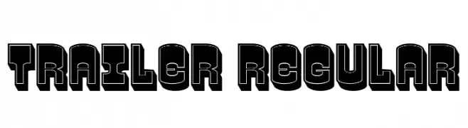
( Fonts by Vladimir Nikolic - www.creativefabrica.com/designer/vladimirnikolic/ - Personal-use only. For commercial use please contact owner. )
A bold, three-dimensional font with a retro, impactful style.
 Scaricare 40 Downloads@WebFont
 -
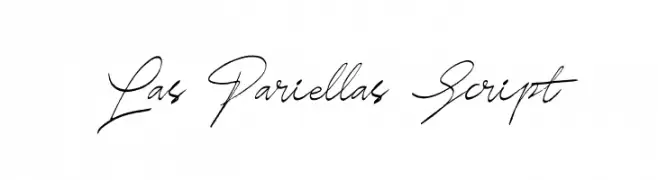
( Fonts by Nur Solikh - Personal-use only. For commercial use please contact owner. )
A flowing, cursive script font with elegant, interconnected strokes.
![Las Pariellas Script font caratteri gratis]() Scaricare 40 Downloads@WebFont
Scaricare 40 Downloads@WebFont -
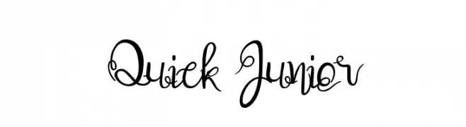
( Fonts by UI Creative - Personal-use only. For commercial use please contact owner. )
A whimsical, decorative script font with elegant loops and swirls.
![Quick Junior font caratteri gratis]() Scaricare 40 Downloads@WebFont
Scaricare 40 Downloads@WebFont -
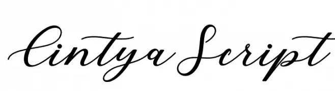
( Fonts by Creative Lab - Creative LAB - Personal-use only. For commercial use please contact owner. )
An elegant script font with fluid, cursive strokes and a sophisticated appearance.
![CintyaScript font caratteri gratis]() Scaricare 40 Downloads@WebFont
Scaricare 40 Downloads@WebFont -
( Fonts by Runsell Studio - Personal-use only. For commercial use please contact owner. )
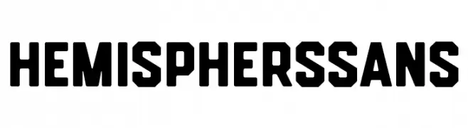
A bold, geometric font with strong, angular lines and a modern aesthetic.
![HemisphersSans font caratteri gratis]() Scaricare 40 Downloads@WebFont
Scaricare 40 Downloads@WebFont -
( Fonts by Perspectype Studio - Personal-use only. For commercial use please contact owner. )
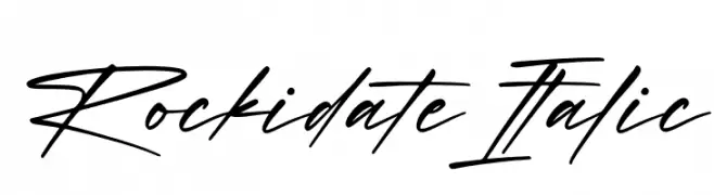
A dynamic, italicized script font with a fluid, handwritten style.
![Rockidate Italic font caratteri gratis]() Scaricare 40 Downloads@WebFont
Scaricare 40 Downloads@WebFont -
( Fonts by Yoga Letter - Isroni Yoga Prasetya - Personal-use only. For commercial use please contact owner. )
A lively, flowing script font with a natural handwriting style.
![Leonisa font caratteri gratis]() Scaricare 40 Downloads@WebFont
Scaricare 40 Downloads@WebFont -
( Fonts by sronstudio - Yusron Billah - Personal-use only. For commercial use please contact owner. )
A flowing, cursive script font with elegant, interconnected letters.
![Hasting font caratteri gratis]() Scaricare 40 Downloads@WebFont
Scaricare 40 Downloads@WebFont -
( Fonts by Mans Greback - www.mansgreback.com - Personal-use only. For commercial use please contact owner. )
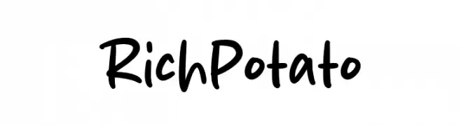
A playful, bold handwritten font with rounded strokes and a casual style.
![Rich Potato font caratteri gratis]() Scaricare 40 Downloads@WebFont
Scaricare 40 Downloads@WebFont -
( Fonts by Kong Font - Personal-use only. For commercial use please contact owner. )
An elegant, flowing script font with a handwritten style.
![Neal Ball font caratteri gratis]() Scaricare 40 Downloads@WebFont
Scaricare 40 Downloads@WebFont -
( Fonts by Skiiller Studio - Personal-use only. For commercial use please contact owner. )
A lively, flowing script font with playful loops and a dynamic slant.
![Hinatta font caratteri gratis]() Scaricare 40 Downloads@WebFont
Scaricare 40 Downloads@WebFont -
( Fonts by Mans Greback - www.mansgreback.com - Personal-use only. For commercial use please contact owner. )
A bold, calligraphic blackletter font with intricate details and a gothic style.
![Wardshus Calligraphy PERSONAL Regular font caratteri gratis]() Scaricare 40 Downloads@WebFont
Scaricare 40 Downloads@WebFont -
( Fonts by Vladimir Nikolic - www.creativefabrica.com/designer/vladimirnikolic/ - Personal-use only. For commercial use please contact owner. )
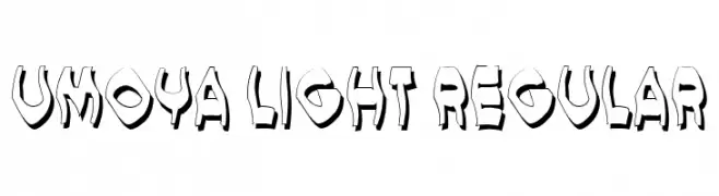
A bold, 3D font with a playful, graffiti-inspired style.
![Umoya Light Regular font caratteri gratis]() Scaricare 40 Downloads@WebFont
Scaricare 40 Downloads@WebFont -
( Fonts by Beautypes - Bhakti Al Akbar Pasaribu - Personal-use only. For commercial use please contact owner. )
A playful and elegant handwritten script font.
![HeyShanay font caratteri gratis]() Scaricare 40 Downloads@WebFont
Scaricare 40 Downloads@WebFont -
( Fonts by Makashi - Maqsum Kamil - Personal-use only. For commercial use please contact owner. )
A bold, dynamic script font with fluid, connected letterforms and expressive strokes.
![Stonehole font caratteri gratis]() Scaricare 40 Downloads@WebFont
Scaricare 40 Downloads@WebFont -
( Fonts by Rayn Media - Rayan - Personal-use only. For commercial use please contact owner. )
A playful, cursive font with flowing strokes and a dynamic, energetic style.
![Booncyfly font caratteri gratis]() Scaricare 40 Downloads@WebFont
Scaricare 40 Downloads@WebFont -
( Fonts by Vultype - Candra Hamdani - Personal-use only. For commercial use please contact owner. )
A dynamic and expressive handwritten font with fluid strokes and a playful aesthetic.
![Roullasse font caratteri gratis]() Scaricare 40 Downloads@WebFont
Scaricare 40 Downloads@WebFont -
( Fonts by Mans Greback - www.mansgreback.com - Personal-use only. For commercial use please contact owner. )
A playful, handwritten font with bold, rounded strokes.
![Milku font caratteri gratis]() Scaricare 40 Downloads@WebFont
Scaricare 40 Downloads@WebFont -
( Fonts by Maulana Creative )
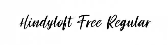
A modern, handwritten script font with a casual, elegant style.
![Hindyloft Free Regular font caratteri gratis]() Scaricare 40 Downloads@WebFont
Scaricare 40 Downloads@WebFont -
( Fonts by Vladimir Nikolic - www.creativefabrica.com/designer/vladimirnikolic/ - Personal-use only. For commercial use please contact owner. )
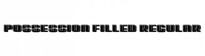
A bold, geometric font with a filled, outlined style, ideal for modern and impactful designs.
![Possession Filled Regular font caratteri gratis]() Scaricare 40 Downloads@WebFont
Scaricare 40 Downloads@WebFont -
( Fonts by Illushvara - Bayu Suwirya - Personal-use only. For commercial use please contact owner. )
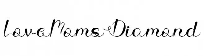
A decorative script font with elegant swashes and flowing connections.
![Love Moms Diamond font caratteri gratis]() Scaricare 40 Downloads@WebFont
Scaricare 40 Downloads@WebFont -
( Fonts by Jonathan S. Harris - Personal-use only. For commercial use please contact owner. )
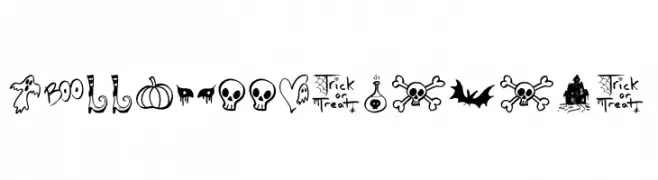
A whimsical and playful Halloween-themed icon font.
![Halloween Spirits font caratteri gratis]() Scaricare 40 Downloads@WebFont
Scaricare 40 Downloads@WebFont -
( Fonts by Md Shohail Bhuian - Personal-use only. For commercial use please contact owner. )
A whimsical and eerie font with elongated, narrow strokes.
![Scary Hours font caratteri gratis]() Scaricare 40 Downloads@WebFont
Scaricare 40 Downloads@WebFont -
( Fonts by Perspectype Studio - Personal-use only. For commercial use please contact owner. )
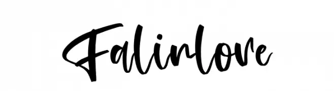
A bold, expressive handwritten font with fluid strokes and dynamic style.
![Falinlove font caratteri gratis]() Scaricare 40 Downloads@WebFont
Scaricare 40 Downloads@WebFont -
( Fonts by Mega Type - M Akmal - Personal-use only. For commercial use please contact owner. )
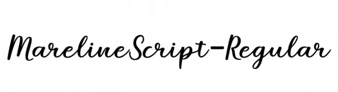
A flowing, cursive script font with elegant, sweeping strokes.
![MarelineScript-Regular font caratteri gratis]() Scaricare 40 Downloads@WebFont
Scaricare 40 Downloads@WebFont -
( Fonts by Iconian Fonts - Daniel Zadorozny - Personal-use only. For commercial use please contact owner. )
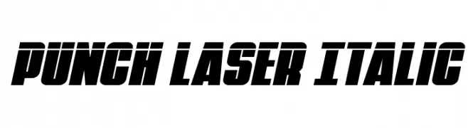
A bold, italic font with a dynamic and aggressive style.
![Punch Laser Italic font caratteri gratis]() Scaricare 40 Downloads@WebFont
Scaricare 40 Downloads@WebFont -
( Fonts by Vultype - Candra Hamdani - Personal-use only. For commercial use please contact owner. )
A cursive, handwritten font with elegant, flowing letters.
![Gustera font caratteri gratis]() Scaricare 40 Downloads@WebFont
Scaricare 40 Downloads@WebFont -
( Fonts by SlipStreamGFX - Personal-use only. For commercial use please contact owner. )
A whimsical and artistic font with playful, irregular strokes and dynamic characters.
![Wave font caratteri gratis]() Scaricare 40 Downloads@WebFont
Scaricare 40 Downloads@WebFont -
( Fonts by Typemacz Studio - Yusuf Sangdes - Personal-use only. For commercial use please contact owner. )
A dynamic and flowing script font with elegant, fluid strokes.
![LaAladdins font caratteri gratis]() Scaricare 40 Downloads@WebFont
Scaricare 40 Downloads@WebFont -
( Fonts by Vladimir Nikolic - www.creativefabrica.com/designer/vladimirnikolic/ - Personal-use only. For commercial use please contact owner. )
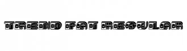
A bold, decorative font with intricate geometric patterns.
![Trend Fat Regular font caratteri gratis]() Scaricare 40 Downloads@WebFont
Scaricare 40 Downloads@WebFont -
( Fonts by Perspectype Studio - Personal-use only. For commercial use please contact owner. )
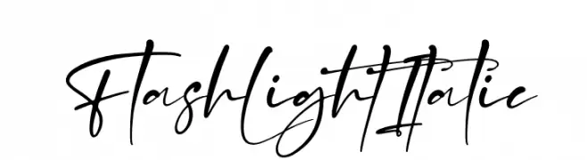
A dynamic and flowing script font with elegant, cursive letterforms.
![Flash Light Italic font caratteri gratis]() Scaricare 40 Downloads@WebFont
Scaricare 40 Downloads@WebFont -
( Fonts by SSI.Scraps - Syukur Setiyadi - Personal-use only. For commercial use please contact owner. )
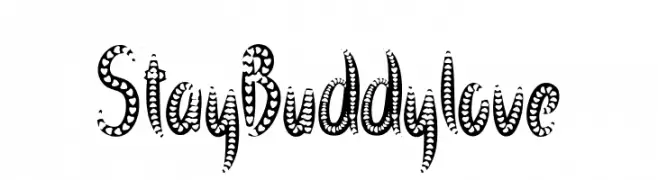
A playful, heart-themed decorative font with bold, rounded characters.
![Stay Buddy love font caratteri gratis]() Scaricare 40 Downloads@WebFont
Scaricare 40 Downloads@WebFont -
( Fonts by Zeenesia Studio - Doni Purwoko - Personal-use only. For commercial use please contact owner. )
A dynamic, cursive handwritten font with textured strokes and a personal touch.
![Gatinlose font caratteri gratis]() Scaricare 40 Downloads@WebFont
Scaricare 40 Downloads@WebFont -
( Fonts by Almarkhatype - Abdul Malik Wisnu - Personal-use only. For commercial use please contact owner. )
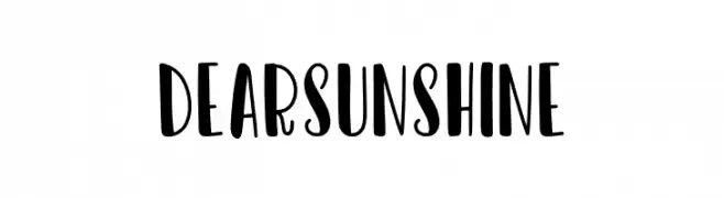
A playful and whimsical font with bold, rounded letterforms.
![Dear Sunshine font caratteri gratis]() Scaricare 40 Downloads@WebFont
Scaricare 40 Downloads@WebFont -
( Fonts by Lauren Harrison - Personal-use only. For commercial use please contact owner. )
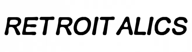
A retro, italicized font with rounded edges and a playful style.
![RETRO ITALICS font caratteri gratis]() Scaricare 40 Downloads@WebFont
Scaricare 40 Downloads@WebFont


Quali sono i font più popolari adesso?
Poppins, Roboto, Montserrat, Open Sans e Lato sono molto usati per le forme pulite e l'ampia applicabilità — dall'identità di marca alle landing page e ai poster.
Quali font si usano spesso nei loghi?
Le sans serif geometriche (es. Poppins, famiglie in stile Gotham) sono scelte comuni per un branding pulito e scalabile. Per un tocco personale restano valide script e stili manoscritti. Abbina un display deciso per i titoli a un corpo testo neutro per riconoscibilità ed equilibrio.
Ogni quanto si aggiorna la lista?
Con regolarità, in base ai download e all'attività reale. Torna spesso per scoprire in anticipo le nuove preferite.
💡 Consiglio: aggiungi ai preferiti — le tendenze cambiano in fretta e i font top di oggi possono ispirare il rebranding di domani.