Benvenuto nelle Font Più Popolari — dove popolarità e qualità si incontrano. Qui trovi i font più scaricati e usati dell'anno. Se cerchi scelte sicure per logo, web o social, inizia da qui.
Ogni font top si distingue per equilibrio, leggibilità e versatilità. Troverai sans serif moderne, script eleganti, serif vintage e display minimalisti.
-
( Fonts by Heitor Berguerand - Personal-use only. For commercial use please contact owner. )
A bold, geometric font with abstract and futuristic character designs.
 Scaricare 40 Downloads@WebFont
 -
( Fonts by Prioritype Co - Prio Nurokhim Aji - Personal-use only. For commercial use please contact owner. )
A playful, bold font with rounded, bubbly characters ideal for fun and whimsical designs.
![The Bonbon font caratteri gratis]() Scaricare 40 Downloads@WebFont
Scaricare 40 Downloads@WebFont -
( Fonts by Saridezra - Personal-use only. For commercial use please contact owner. )
A dynamic, handwritten script font with fluid, elongated characters.
![StrongHeartScript font caratteri gratis]() Scaricare 40 Downloads@WebFont
Scaricare 40 Downloads@WebFont -
( Fonts by Taznix Art - Personal-use only. For commercial use please contact owner. )
A playful, casual handwritten font with dynamic strokes and organic flow.
![Limpung font caratteri gratis]() Scaricare 40 Downloads@WebFont
Scaricare 40 Downloads@WebFont -
( Fonts by Bexxtype - Personal-use only. For commercial use please contact owner. )
A sophisticated script font with elegant, flowing cursive strokes.
![chetlie font caratteri gratis]() Scaricare 40 Downloads@WebFont
Scaricare 40 Downloads@WebFont -
( Fonts by Mans Greback - www.mansgreback.com - Personal-use only. For commercial use please contact owner. )
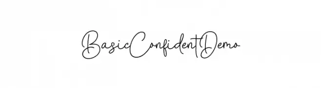
A playful and elegant handwritten font with fluid, continuous strokes.
![Basic Confident Demo font caratteri gratis]() Scaricare 40 Downloads@WebFont
Scaricare 40 Downloads@WebFont -
( Fonts by Alpaprana - Personal-use only. For commercial use please contact owner. )
A bold, cursive script font with flowing, connected letters.
![Northing font caratteri gratis]() Scaricare 40 Downloads@WebFont
Scaricare 40 Downloads@WebFont -
( Fonts by Heitor Berguerand - Personal-use only. For commercial use please contact owner. )
A decorative, geometric font with a futuristic and cryptic design.
![Crypto_Sans font caratteri gratis]() Scaricare 40 Downloads@WebFont
Scaricare 40 Downloads@WebFont -
( Fonts by Pamela Orrico - Personal-use only. For commercial use please contact owner. )
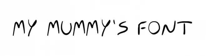
A playful, casual handwritten font with a natural and organic appearance.
![MY MUMMY'S FONT font caratteri gratis]() Scaricare 40 Downloads@WebFont
Scaricare 40 Downloads@WebFont -
( Fonts by junkohanhero - Personal-use only. For commercial use please contact owner. )
A bold, distressed font with a grunge aesthetic and uneven edges.
![Hit me, punk! 09 font caratteri gratis]() Scaricare 40 Downloads@WebFont
Scaricare 40 Downloads@WebFont -
( Fonts by Woodcutter Manero - www.woodcutter.es - Personal-use only. For commercial use please contact owner. )
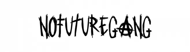
Energetic, punk-inspired hand-drawn font with chaotic strokes.
![No Future Gang font caratteri gratis]() Scaricare 40 Downloads@WebFont
Scaricare 40 Downloads@WebFont -
( Fonts by Beautypes - Bhakti Al Akbar Pasaribu - Personal-use only. For commercial use please contact owner. )
An elegant, cursive font with intricate flourishes and a handwritten style.
![Hilland font caratteri gratis]() Scaricare 40 Downloads@WebFont
Scaricare 40 Downloads@WebFont -
( Fonts by Ellen Luff - Personal-use only. For commercial use please contact owner. )
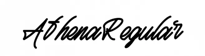
A fluid and elegant script font with a cohesive cursive style.
![Athena Regular font caratteri gratis]() Scaricare 40 Downloads@WebFont
Scaricare 40 Downloads@WebFont -
( Fonts by Wahyu Eka Prasetya - wepfont.com - Personal-use only. For commercial use please contact owner. )
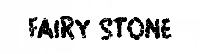
A rugged, textured font with a distressed, organic appearance.
![FAIRY STONE font caratteri gratis]() Scaricare 40 Downloads@WebFont
Scaricare 40 Downloads@WebFont -
( Fonts by zone108.main.jp - Personal-use only. For commercial use please contact owner. )
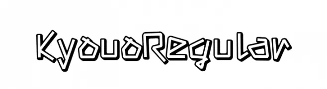
A bold, playful font with outlined characters and a cartoonish style.
![Kyouo Regular font caratteri gratis]() Scaricare 40 Downloads@WebFont
Scaricare 40 Downloads@WebFont -
( Fonts by sronstudio - Yusron Billah - Personal-use only. For commercial use please contact owner. )
A lively and expressive handwritten font with dynamic strokes and playful character.
![Handsel font caratteri gratis]() Scaricare 40 Downloads@WebFont
Scaricare 40 Downloads@WebFont -
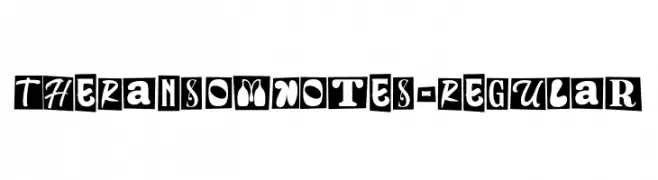
( Fonts by Letterhend Studio )
A playful, eclectic typeface mimicking cut-out letters, ideal for decorative use.
![TheRansomNotes-Regular font caratteri gratis]() Scaricare 40 Downloads@WebFont
Scaricare 40 Downloads@WebFont -
( Fonts by Balev - Balevgraph Studio - Personal-use only. For commercial use please contact owner. )
A playful, casual handwritten font with flowing, irregular letterforms.
![Astevy-Regular font caratteri gratis]() Scaricare 40 Downloads@WebFont
Scaricare 40 Downloads@WebFont -
( Fonts by Nico Muslib - Personal-use only. For commercial use please contact owner. )
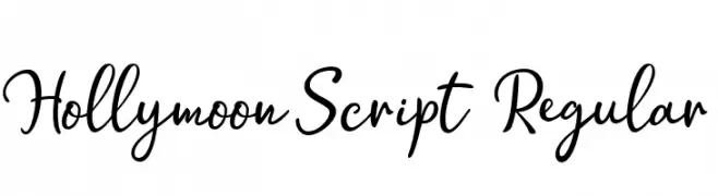
A flowing, elegant script font with a handwritten aesthetic.
![Hollymoon Script Regular font caratteri gratis]() Scaricare 40 Downloads@WebFont
Scaricare 40 Downloads@WebFont -
( Fonts by Luna Daisy - Personal-use only. For commercial use please contact owner. )
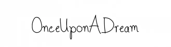
A whimsical handwritten font with tall, narrow letterforms and playful strokes.
![Once Upon A Dream font caratteri gratis]() Scaricare 40 Downloads@WebFont
Scaricare 40 Downloads@WebFont -
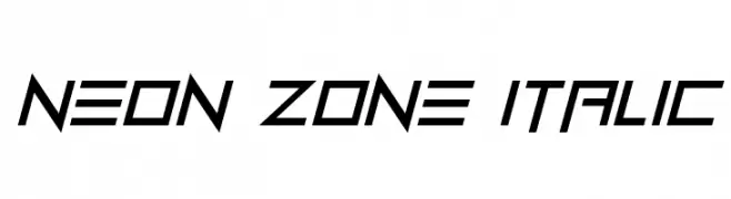
( Fonts by Darrell Flood - Personal-use only. For commercial use please contact owner. )
A futuristic, italicized font with angular and dynamic letterforms.
![Neon Zone Italic font caratteri gratis]() Scaricare 40 Downloads@WebFont
Scaricare 40 Downloads@WebFont -
( Fonts by UI Creative - Personal-use only. For commercial use please contact owner. )
A dynamic and elegant script font with fluid, cursive strokes.
![Wolfstar font caratteri gratis]() Scaricare 40 Downloads@WebFont
Scaricare 40 Downloads@WebFont -
( Fonts by Mans Greback - www.mansgreback.com - Personal-use only. For commercial use please contact owner. )
A casual, handwritten-style font with a playful and informal appearance.
![Black Storage font caratteri gratis]() Scaricare 40 Downloads@WebFont
Scaricare 40 Downloads@WebFont -
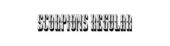
( Fonts by Vladimir Nikolic - www.creativefabrica.com/designer/vladimirnikolic/ - Personal-use only. For commercial use please contact owner. )
A bold, decorative font with a 3D shadow effect, ideal for impactful headlines.
![Scorpions Regular font caratteri gratis]() Scaricare 40 Downloads@WebFont
Scaricare 40 Downloads@WebFont -
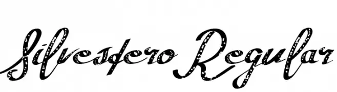
( Fonts by SSI.Scraps - Syukur Setiyadi - Personal-use only. For commercial use please contact owner. )
A decorative script font with a distressed, vintage look.
![SilvesteroRegular font caratteri gratis]() Scaricare 40 Downloads@WebFont
Scaricare 40 Downloads@WebFont -
( Fonts by StringLabs - stringlabscreative.com - Personal-use only. For commercial use please contact owner. )
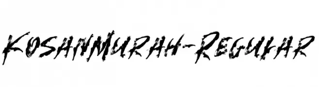
A bold, brush-style font with dynamic, irregular strokes.
![KosanMurah-Regular font caratteri gratis]() Scaricare 40 Downloads@WebFont
Scaricare 40 Downloads@WebFont -
( Fonts by dcoxy - Greg Medina - Personal-use only. For commercial use please contact owner. )
A playful decorative font with Christmas-themed illustrations for each character.
![Pimp My Christmas_PersonalUseOnly font caratteri gratis]() Scaricare 40 Downloads@WebFont
Scaricare 40 Downloads@WebFont -
Caratteri di ZedFonts2334. For commercial use please contact the owner.
![ZF2334 Typography Love Italic font caratteri gratis]() Scaricare 40 Downloads@WebFont
Scaricare 40 Downloads@WebFont -
( Fonts by Woodcutter Manero - www.woodcutter.es - Personal-use only. For commercial use please contact owner. )
A spiky, horror-themed decorative display font with bold, condensed letters.
![Sons of Satan font caratteri gratis]() Scaricare 40 Downloads@WebFont
Scaricare 40 Downloads@WebFont -
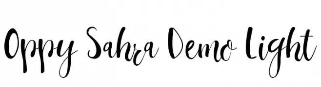
( Fonts by Edric Studio - Personal-use only. For commercial use please contact owner. )
A playful, handwritten script font with bold uppercase and fluid lowercase letters.
![Oppy Sahra Demo Light font caratteri gratis]() Scaricare 40 Downloads@WebFont
Scaricare 40 Downloads@WebFont -
( Fonts by Creative Lab - Creative LAB - Personal-use only. For commercial use please contact owner. )
An elegant script font with flowing, cursive letterforms and sophisticated style.
![LiontineScript font caratteri gratis]() Scaricare 40 Downloads@WebFont
Scaricare 40 Downloads@WebFont -
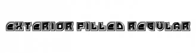
( Fonts by Vladimir Nikolic - www.creativefabrica.com/designer/vladimirnikolic/ - Personal-use only. For commercial use please contact owner. )
A bold, three-dimensional font with a filled exterior and thick outlines.
![Exterior Filled Regular font caratteri gratis]() Scaricare 40 Downloads@WebFont
Scaricare 40 Downloads@WebFont -
( Fonts by Din Studio - Donis Miftahudin - Personal-use only. For commercial use please contact owner. )
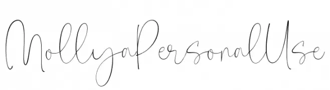
An elegant, flowing script font with delicate strokes and graceful curves.
![Mollya Personal Use font caratteri gratis]() Scaricare 40 Downloads@WebFont
Scaricare 40 Downloads@WebFont -
( Fonts by I M Studio - IM Studio - Personal-use only. For commercial use please contact owner. )
A bold, decorative font with elegant serifs and playful curves.
![HarlerMixgiter font caratteri gratis]() Scaricare 40 Downloads@WebFont
Scaricare 40 Downloads@WebFont -
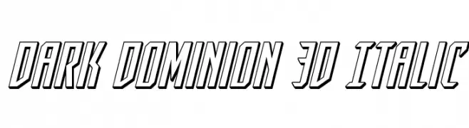
( Fonts by Iconian Fonts - Daniel Zadorozny - Personal-use only. For commercial use please contact owner. )
A bold, 3D italic font with a futuristic and dynamic style.
![Dark Dominion 3D Italic font caratteri gratis]() Scaricare 40 Downloads@WebFont
Scaricare 40 Downloads@WebFont


Quali sono i font più popolari adesso?
Poppins, Roboto, Montserrat, Open Sans e Lato sono molto usati per le forme pulite e l'ampia applicabilità — dall'identità di marca alle landing page e ai poster.
Quali font si usano spesso nei loghi?
Le sans serif geometriche (es. Poppins, famiglie in stile Gotham) sono scelte comuni per un branding pulito e scalabile. Per un tocco personale restano valide script e stili manoscritti. Abbina un display deciso per i titoli a un corpo testo neutro per riconoscibilità ed equilibrio.
Ogni quanto si aggiorna la lista?
Con regolarità, in base ai download e all'attività reale. Torna spesso per scoprire in anticipo le nuove preferite.
💡 Consiglio: aggiungi ai preferiti — le tendenze cambiano in fretta e i font top di oggi possono ispirare il rebranding di domani.