Benvenuto nelle Font Più Popolari — dove popolarità e qualità si incontrano. Qui trovi i font più scaricati e usati dell'anno. Se cerchi scelte sicure per logo, web o social, inizia da qui.
Ogni font top si distingue per equilibrio, leggibilità e versatilità. Troverai sans serif moderne, script eleganti, serif vintage e display minimalisti.
-
( Fonts by Kong Font - Personal-use only. For commercial use please contact owner. )
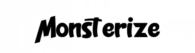
A bold, playful font with exaggerated curves and a whimsical style.
 Scaricare 40 Downloads@WebFont
 -
( Fonts by Achmad Yani )
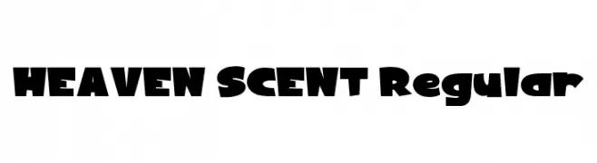
A bold, playful font with chunky, exaggerated letterforms and a whimsical style.
![HEAVEN SCENT Regular font caratteri gratis]() Scaricare 40 Downloads@WebFont
Scaricare 40 Downloads@WebFont -
( Fonts by Woodcutter Manero - www.woodcutter.es - Personal-use only. For commercial use please contact owner. )
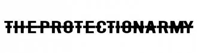
Bold, obstructed sans-serif with horizontal strike-through and military motifs.
![The Protection Army font caratteri gratis]() Scaricare 40 Downloads@WebFont
Scaricare 40 Downloads@WebFont -
( Fonts by Edric Studio - Personal-use only. For commercial use please contact owner. )
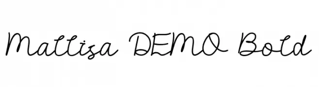
A flowing, cursive font with interconnected characters and a bold presence.
![Mallisa DEMO Bold font caratteri gratis]() Scaricare 40 Downloads@WebFont
Scaricare 40 Downloads@WebFont -
( Fonts by Garisman Studio - Risman Ginarwan - Personal-use only. For commercial use please contact owner. )
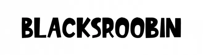
A bold, playful font with a hand-drawn, whimsical style.
![BlacksRoobin font caratteri gratis]() Scaricare 40 Downloads@WebFont
Scaricare 40 Downloads@WebFont -
( Fonts by Royaltype - Darwinoo - Personal-use only. For commercial use please contact owner. )
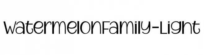
A modern, geometric font with consistent stroke width and clear readability.
![WatermelonFamily-Light font caratteri gratis]() Scaricare 40 Downloads@WebFont
Scaricare 40 Downloads@WebFont -
( Fonts by SolaType Studio - Personal-use only. For commercial use please contact owner. )
A bold, playful, hand-drawn font with a whimsical style.
![Sorcerous font caratteri gratis]() Scaricare 40 Downloads@WebFont
Scaricare 40 Downloads@WebFont -
( Fonts by StringLabs - stringlabscreative.com - Personal-use only. For commercial use please contact owner. )
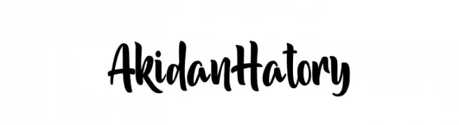
A bold, expressive handwritten font with fluid strokes and artistic flair.
![Akidan Hatory font caratteri gratis]() Scaricare 40 Downloads@WebFont
Scaricare 40 Downloads@WebFont -
( Fonts by Yoga Letter - Isroni Yoga Prasetya - Personal-use only. For commercial use please contact owner. )
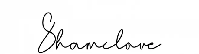
A playful and elegant handwritten script font.
![Shamilove font caratteri gratis]() Scaricare 40 Downloads@WebFont
Scaricare 40 Downloads@WebFont -
( Fonts by Revublikata - Personal-use only. For commercial use please contact owner. )
A delicate, flowing script font with a whimsical and elegant style.
![Whinter Regular font caratteri gratis]() Scaricare 40 Downloads@WebFont
Scaricare 40 Downloads@WebFont -
( Fonts by Wondoo - Personal-use only. For commercial use please contact owner. )
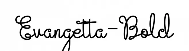
A playful, whimsical script font with flowing, interconnected letterforms.
![Evangetta-Bold font caratteri gratis]() Scaricare 40 Downloads@WebFont
Scaricare 40 Downloads@WebFont -
( Fonts by Zetafonts - Personal-use only. For commercial use please contact owner. )
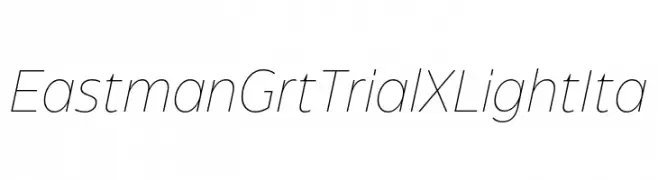
A sleek, modern, and elegant italic font with thin strokes.
![Eastman Grt Trial XLight Ita font caratteri gratis]() Scaricare 40 Downloads@WebFont
Scaricare 40 Downloads@WebFont -
( Fonts by Rangkai Aksara - Personal-use only. For commercial use please contact owner. )
A playful handwritten font with a casual and friendly style.
![Love Today font caratteri gratis]() Scaricare 40 Downloads@WebFont
Scaricare 40 Downloads@WebFont -
( Fonts by Figuree Studio - Icep Fadhil - Personal-use only. For commercial use please contact owner. )
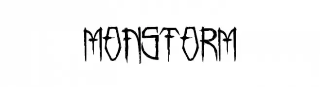
A jagged, edgy font with sharp, irregular strokes and a hand-drawn appearance.
![MONSTORM font caratteri gratis]() Scaricare 40 Downloads@WebFont
Scaricare 40 Downloads@WebFont -
( Fonts by Typegoals Labs - Personal-use only. For commercial use please contact owner. )
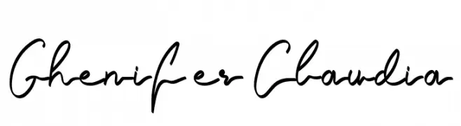
A playful, flowing handwritten font with elegant loops and smooth cursive strokes.
![Ghenifer Claudia font caratteri gratis]() Scaricare 40 Downloads@WebFont
Scaricare 40 Downloads@WebFont -
( Fonts by Alexander Tiunov - Personal-use only. For commercial use please contact owner. )
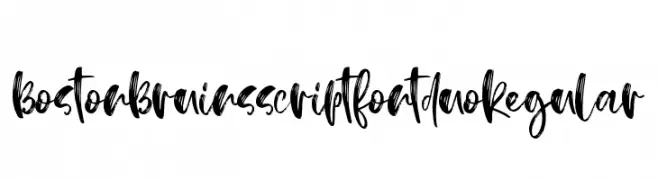
A bold, expressive script font with dynamic brush strokes and a handcrafted feel.
![BostonBruins script font duo Regular font caratteri gratis]() Scaricare 40 Downloads@WebFont
Scaricare 40 Downloads@WebFont -
( Fonts by LetterStock - Guguh Gumantoro - Personal-use only. For commercial use please contact owner. )
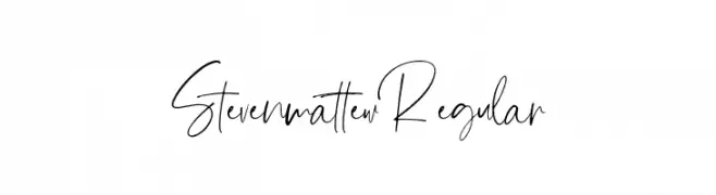
A modern, elegant handwritten font with flowing cursive letterforms.
![Steven mattew Regular font caratteri gratis]() Scaricare 40 Downloads@WebFont
Scaricare 40 Downloads@WebFont -
( Fonts by Edric Studio - Personal-use only. For commercial use please contact owner. )
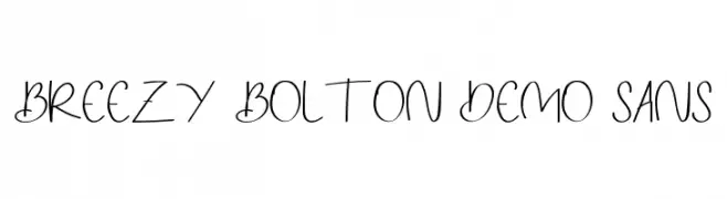
A playful, handwritten font with a whimsical and dynamic style.
![Breezy Bolton DEMO Sans font caratteri gratis]() Scaricare 40 Downloads@WebFont
Scaricare 40 Downloads@WebFont -
( Fonts by Hermawan - Personal-use only. For commercial use please contact owner. )
A playful, handwritten font with smooth curves and a casual style.
![Gislake font caratteri gratis]() Scaricare 40 Downloads@WebFont
Scaricare 40 Downloads@WebFont -
( Fonts by Nirmana Visual - Sigit Dwipa - Personal-use only. For commercial use please contact owner. )
A bold, brush-style font with a dynamic and artistic appearance.
![Rikabrush font caratteri gratis]() Scaricare 40 Downloads@WebFont
Scaricare 40 Downloads@WebFont -
( Fonts by Pixel Sagas - Neale and Shayna Davidson - Personal-use only. For commercial use please contact owner. )
A modern, italic font with sharp angles and a dynamic, forward-leaning style.
![Crichton Italic font caratteri gratis]() Scaricare 40 Downloads@WebFont
Scaricare 40 Downloads@WebFont -
( Fonts by StringLabs - stringlabscreative.com - Personal-use only. For commercial use please contact owner. )
An elegant, flowing script font with a modern, timeless appeal.
![Hunthers Dwayne font caratteri gratis]() Scaricare 40 Downloads@WebFont
Scaricare 40 Downloads@WebFont -
( Fonts by Jessica Wright - Personal-use only. For commercial use please contact owner. )
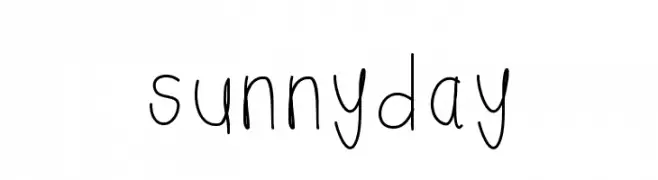
A playful, handwritten font with a casual and whimsical style.
![sunnyday font caratteri gratis]() Scaricare 40 Downloads@WebFont
Scaricare 40 Downloads@WebFont -
( Fonts by olexstudio - Firman Syah - Personal-use only. For commercial use please contact owner. )
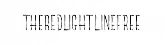
A distressed, textured font with a vintage, hand-drawn style.
![TheRedlightLineFree font caratteri gratis]() Scaricare 40 Downloads@WebFont
Scaricare 40 Downloads@WebFont -
( Fonts by Calligraphy Fonts )
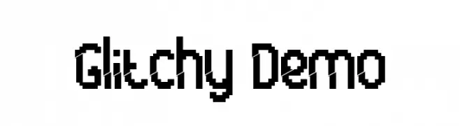
A pixelated, retro-style font with a glitchy, digital aesthetic.
![Glitchy Demo font caratteri gratis]() Scaricare 40 Downloads@WebFont
Scaricare 40 Downloads@WebFont -
( Fonts by Edric Studio - Personal-use only. For commercial use please contact owner. )
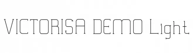
A modern, geometric font with thin lines and a minimalist aesthetic.
![VICTORISA DEMO Light font caratteri gratis]() Scaricare 40 Downloads@WebFont
Scaricare 40 Downloads@WebFont -
( Fonts by VitaminRGB - Personal-use only. For commercial use please contact owner. )
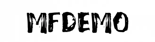
A bold, hand-painted style font with a textured, artistic appearance.
![Mixed_Feeling_DEMO font caratteri gratis]() Scaricare 40 Downloads@WebFont
Scaricare 40 Downloads@WebFont -
( Fonts by Jetsmax Studio - Khairil Anwar - Personal-use only. For commercial use please contact owner. )
A cursive, handwritten-style font with elegant, flowing characters.
![Gellato font caratteri gratis]() Scaricare 40 Downloads@WebFont
Scaricare 40 Downloads@WebFont -
( Fonts by Nirmana Visual - Sigit Dwipa - Personal-use only. For commercial use please contact owner. )
A bold, hand-drawn font with an expressive and dynamic style.
![Sharoe font caratteri gratis]() Scaricare 40 Downloads@WebFont
Scaricare 40 Downloads@WebFont -
( Fonts by StringLabs - stringlabscreative.com - Personal-use only. For commercial use please contact owner. )
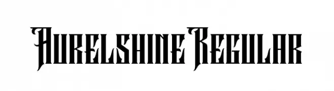
A bold, Gothic-inspired font with sharp, angular lines and ornate detailing.
![Aurel shine Regular font caratteri gratis]() Scaricare 40 Downloads@WebFont
Scaricare 40 Downloads@WebFont -
( Fonts by Calligraphy Fonts )
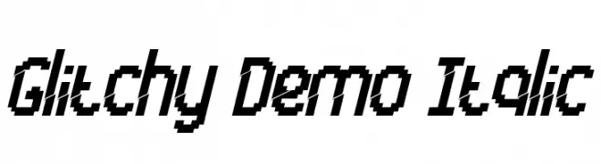
A pixelated, italic font with a digital, glitchy aesthetic.
![Glitchy Demo Italic font caratteri gratis]() Scaricare 40 Downloads@WebFont
Scaricare 40 Downloads@WebFont -
( Fonts by Staircase Studio )
A lively handwritten script with expressive, flowing lines.
![Jhon Hilley font caratteri gratis]() Scaricare 40 Downloads@WebFont
Scaricare 40 Downloads@WebFont -
( Fonts by Woodcutter Manero - www.woodcutter.es - Personal-use only. For commercial use please contact owner. )
Tall, quirky handwritten font with playful irregularity.
![Juanita Banana font caratteri gratis]() Scaricare 40 Downloads@WebFont
Scaricare 40 Downloads@WebFont -
( Fonts by Rahagita Studio - - Personal-use only. For commercial use please contact owner. )
A playful, casual script font with smooth, flowing lines and a handwritten appearance.
![Chesta font caratteri gratis]() Scaricare 40 Downloads@WebFont
Scaricare 40 Downloads@WebFont -
( Fonts by Iconian Fonts - Daniel Zadorozny - Personal-use only. For commercial use please contact owner. )
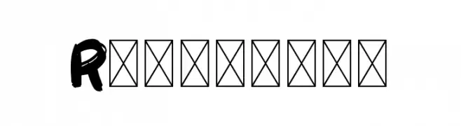
A bold, futuristic font with a geometric, three-dimensional design.
![Robotaur Academy font caratteri gratis]() Scaricare 40 Downloads@WebFont
Scaricare 40 Downloads@WebFont


Quali sono i font più popolari adesso?
Poppins, Roboto, Montserrat, Open Sans e Lato sono molto usati per le forme pulite e l'ampia applicabilità — dall'identità di marca alle landing page e ai poster.
Quali font si usano spesso nei loghi?
Le sans serif geometriche (es. Poppins, famiglie in stile Gotham) sono scelte comuni per un branding pulito e scalabile. Per un tocco personale restano valide script e stili manoscritti. Abbina un display deciso per i titoli a un corpo testo neutro per riconoscibilità ed equilibrio.
Ogni quanto si aggiorna la lista?
Con regolarità, in base ai download e all'attività reale. Torna spesso per scoprire in anticipo le nuove preferite.
💡 Consiglio: aggiungi ai preferiti — le tendenze cambiano in fretta e i font top di oggi possono ispirare il rebranding di domani.