Benvenuto nelle Font Più Popolari — dove popolarità e qualità si incontrano. Qui trovi i font più scaricati e usati dell'anno. Se cerchi scelte sicure per logo, web o social, inizia da qui.
Ogni font top si distingue per equilibrio, leggibilità e versatilità. Troverai sans serif moderne, script eleganti, serif vintage e display minimalisti.
-
( Fonts by Thomas Ledin - tomledin.com )
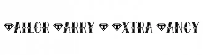
A bold, decorative font with vintage tattoo-inspired embellishments.
 Scaricare 336 Downloads@WebFont
 -
( imagex - www.imagex-fonts.com )
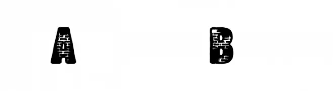
A bold, textured font with a brick wall pattern, ideal for urban-themed designs.
![Another Brick font caratteri gratis]() Scaricare 336 Downloads@WebFont
Scaricare 336 Downloads@WebFont -
( Fonts by Mikko Sumulong )
A sleek, modern font with tall, narrow characters and consistent stroke width.
![MixLean font caratteri gratis]() Scaricare 336 Downloads@WebFont
Scaricare 336 Downloads@WebFont -
( Fonts by Aqeela Studio - Muhammad Nasir - Personal-use only. For commercial use please contact owner. )
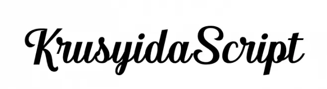
An elegant and fluid script font with graceful, connected letters.
![KrusyidaScript font caratteri gratis]() Scaricare 336 Downloads@WebFont
Scaricare 336 Downloads@WebFont -
( Fonts by Castcraft Software - opti.netii.net - check the website before use )
A light, elegant italic font with classic and sophisticated appeal.
![OPTIwtcGoudy-LightItalic font caratteri gratis]() Scaricare 336 Downloads@WebFont
Scaricare 336 Downloads@WebFont -
-
( Anton Bohlin - antonbohlin.com )
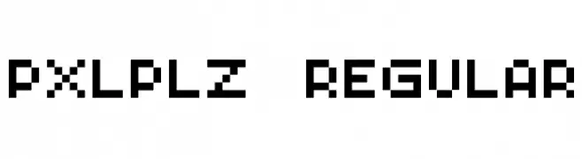
A pixelated, retro-style font with a digital, blocky appearance.
![PXLPLZ Regular font caratteri gratis]() Scaricare 336 Downloads@WebFont
Scaricare 336 Downloads@WebFont -
( Ydhra Studio - creativemarket.com/ydhra )
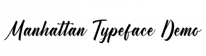
A modern, elegant script typeface with bold, slanted characters.
![Manhattan Typeface Demo font caratteri gratis]() Scaricare 336 Downloads@WebFont
Scaricare 336 Downloads@WebFont -
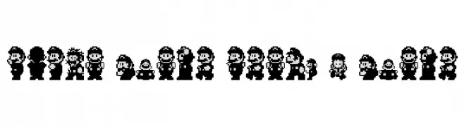
( Fonts by Diego Gonzalez )
![Super Mario World - Mario font caratteri gratis]() Scaricare 336 Downloads@WebFont
Scaricare 336 Downloads@WebFont -
( Free for Personal Use. To use commercially please visit the www.bvfonts.com )
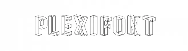
A 3D outline font with geometric precision and modern appeal.
![Plexifont font caratteri gratis]() Scaricare 336 Downloads@WebFont
Scaricare 336 Downloads@WebFont -
( Fonts by David Kerkhoff - www.hanodedphotography.com )
A whimsical, decorative font with charming swirls and curls.
![DKFatherFrost font caratteri gratis]() Scaricare 336 Downloads@WebFont
Scaricare 336 Downloads@WebFont


Quali sono i font più popolari adesso?
Poppins, Roboto, Montserrat, Open Sans e Lato sono molto usati per le forme pulite e l'ampia applicabilità — dall'identità di marca alle landing page e ai poster.
Quali font si usano spesso nei loghi?
Le sans serif geometriche (es. Poppins, famiglie in stile Gotham) sono scelte comuni per un branding pulito e scalabile. Per un tocco personale restano valide script e stili manoscritti. Abbina un display deciso per i titoli a un corpo testo neutro per riconoscibilità ed equilibrio.
Ogni quanto si aggiorna la lista?
Con regolarità, in base ai download e all'attività reale. Torna spesso per scoprire in anticipo le nuove preferite.
💡 Consiglio: aggiungi ai preferiti — le tendenze cambiano in fretta e i font top di oggi possono ispirare il rebranding di domani.