Benvenuto nelle Font Più Popolari — dove popolarità e qualità si incontrano. Qui trovi i font più scaricati e usati dell'anno. Se cerchi scelte sicure per logo, web o social, inizia da qui.
Ogni font top si distingue per equilibrio, leggibilità e versatilità. Troverai sans serif moderne, script eleganti, serif vintage e display minimalisti.
-
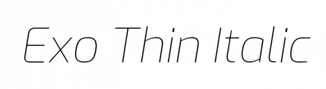
( Copyright 2017 The Exo Project Authors (https://github.com/NDISCOVER/Exo-1.0) )
A sleek, modern italic font with thin, elongated letterforms and a geometric structure.
 Scaricare 335 Downloads@WebFont
 -
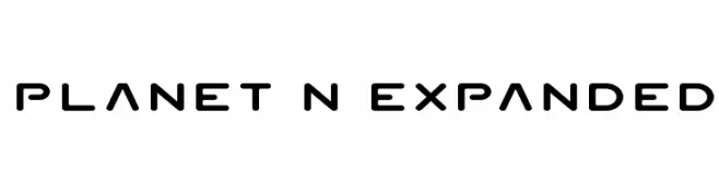
( Fonts by Iconian Fonts )
A futuristic, geometric font with rounded edges and a sleek, modern style.
![Planet N Expanded font caratteri gratis]() Scaricare 335 Downloads@WebFont
Scaricare 335 Downloads@WebFont -
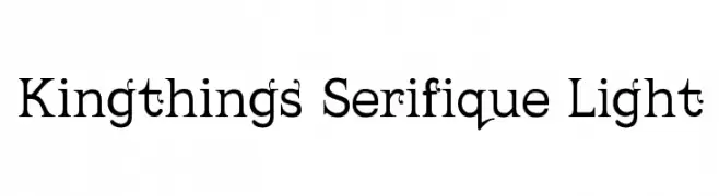
( Font by kingthingsfonts.co.uk )
A light, elegant serif font with classic curves and modern appeal.
![Kingthings Serifique Light font caratteri gratis]() Scaricare 335 Downloads@WebFont
Scaricare 335 Downloads@WebFont -
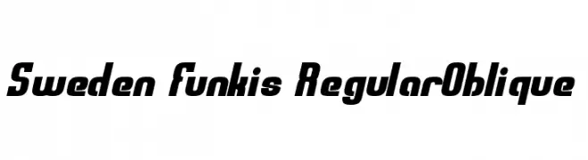
![Sweden Funkis RegularOblique font caratteri gratis]() Scaricare 335 Downloads@WebFont
Scaricare 335 Downloads@WebFont -
![Orbitronio font caratteri gratis]() Scaricare 335 Downloads@WebFont
Scaricare 335 Downloads@WebFont -
-
( «Eremite» font by Perdita Goodenow © 2018 This font is free for PERSONAL USE ONLY. If you would like to use it commercially, contact me at perditagoodenow@gmail.co to get a commercial license. Thank you. )
A classic serif font with elegant and refined letterforms.
![Eremite Regular font caratteri gratis]() Scaricare 335 Downloads@WebFont
Scaricare 335 Downloads@WebFont -
![History Lowercase Regular font caratteri gratis]() Scaricare 335 Downloads@WebFont
Scaricare 335 Downloads@WebFont -
![Jet Set Italic font caratteri gratis]() Scaricare 335 Downloads@WebFont
Scaricare 335 Downloads@WebFont -
( Fonts by Goma Shin - Shintarou Nakayama www.geocities.jp/gomarice_font/ )
A bold, playful font with rounded edges and a bubbly appearance.
![MINI POP__G font caratteri gratis]() Scaricare 335 Downloads@WebFont
Scaricare 335 Downloads@WebFont -
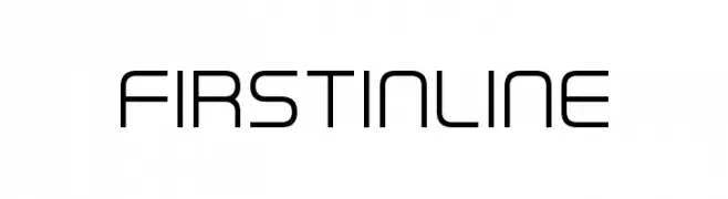
( Chequered Ink - chequered.ink/ )
A modern, geometric font with rounded edges and consistent character width.
![First In Line font caratteri gratis]() Scaricare 335 Downloads@WebFont
Scaricare 335 Downloads@WebFont

Quali sono i font più popolari adesso?
Poppins, Roboto, Montserrat, Open Sans e Lato sono molto usati per le forme pulite e l'ampia applicabilità — dall'identità di marca alle landing page e ai poster.
Quali font si usano spesso nei loghi?
Le sans serif geometriche (es. Poppins, famiglie in stile Gotham) sono scelte comuni per un branding pulito e scalabile. Per un tocco personale restano valide script e stili manoscritti. Abbina un display deciso per i titoli a un corpo testo neutro per riconoscibilità ed equilibrio.
Ogni quanto si aggiorna la lista?
Con regolarità, in base ai download e all'attività reale. Torna spesso per scoprire in anticipo le nuove preferite.
💡 Consiglio: aggiungi ai preferiti — le tendenze cambiano in fretta e i font top di oggi possono ispirare il rebranding di domani.