Benvenuto nelle Font Più Popolari — dove popolarità e qualità si incontrano. Qui trovi i font più scaricati e usati dell'anno. Se cerchi scelte sicure per logo, web o social, inizia da qui.
Ogni font top si distingue per equilibrio, leggibilità e versatilità. Troverai sans serif moderne, script eleganti, serif vintage e display minimalisti.
-
( Fonts by www.fugit-tempus.de )
A tall, narrow font with a modern, industrial feel and consistent stroke width.
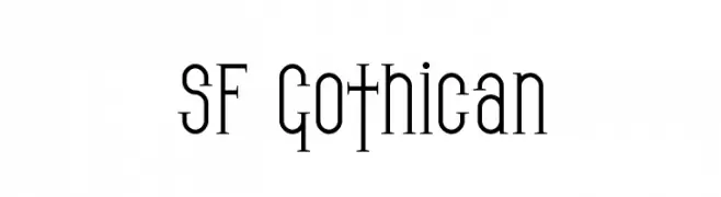 Scaricare 334 Downloads@WebFont
 -
( Fonts by Des Gomez )
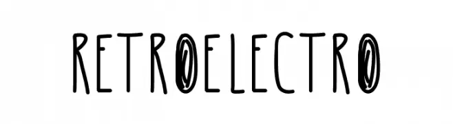
A quirky, handwritten font with tall, narrow letters and playful strokes.
![RetroElectro font caratteri gratis]() Scaricare 334 Downloads@WebFont
Scaricare 334 Downloads@WebFont -
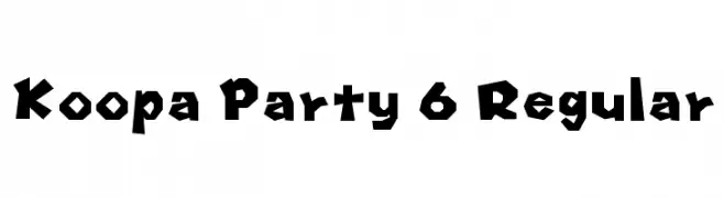
Caratteri di HammerBro101. For commercial use please contact the owner.
![Koopa Party 6 Regular font caratteri gratis]() Scaricare 334 Downloads@WebFont
Scaricare 334 Downloads@WebFont -
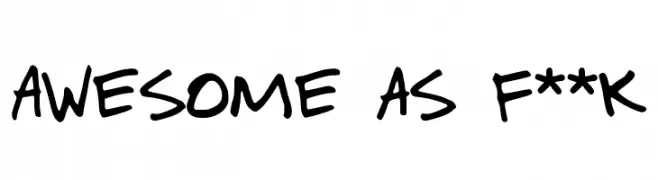
( Fonts by xpeehdroox )
A playful, handwritten font with bold strokes and a casual, dynamic style.
![Awesome as f**k font caratteri gratis]() Scaricare 334 Downloads@WebFont
Scaricare 334 Downloads@WebFont -
( Fonts by David Espinosa [Type Sailor] - www.facebook.com/typesailor - Personal-use only. For commercial use please contact owner. )
A classic serif font with elegant strokes and refined details.
![Urania Serif font caratteri gratis]() Scaricare 334 Downloads@WebFont
Scaricare 334 Downloads@WebFont -
-
( Fonts by Matthew Austin Petty - www.disturbed.com )
A playful, hand-drawn font with quirky, decorative letterforms.
![Janis font caratteri gratis]() Scaricare 334 Downloads@WebFont
Scaricare 334 Downloads@WebFont -
![DINGarbageschrift Bold font caratteri gratis]() Scaricare 334 Downloads@WebFont
Scaricare 334 Downloads@WebFont -
( Fonts by www.junkohanhero.com )
A bold, distressed font with a vintage, grunge aesthetic.
![IKHIOOGLA font caratteri gratis]() Scaricare 334 Downloads@WebFont
Scaricare 334 Downloads@WebFont -
( Fonts by kukika )
A playful, hand-drawn font with rounded, bold characters and a casual vibe.
![Mogugu Regular font caratteri gratis]() Scaricare 334 Downloads@WebFont
Scaricare 334 Downloads@WebFont -
![One more week of school font caratteri gratis]() Scaricare 334 Downloads@WebFont
Scaricare 334 Downloads@WebFont


Quali sono i font più popolari adesso?
Poppins, Roboto, Montserrat, Open Sans e Lato sono molto usati per le forme pulite e l'ampia applicabilità — dall'identità di marca alle landing page e ai poster.
Quali font si usano spesso nei loghi?
Le sans serif geometriche (es. Poppins, famiglie in stile Gotham) sono scelte comuni per un branding pulito e scalabile. Per un tocco personale restano valide script e stili manoscritti. Abbina un display deciso per i titoli a un corpo testo neutro per riconoscibilità ed equilibrio.
Ogni quanto si aggiorna la lista?
Con regolarità, in base ai download e all'attività reale. Torna spesso per scoprire in anticipo le nuove preferite.
💡 Consiglio: aggiungi ai preferiti — le tendenze cambiano in fretta e i font top di oggi possono ispirare il rebranding di domani.