Benvenuto nelle Font Più Popolari — dove popolarità e qualità si incontrano. Qui trovi i font più scaricati e usati dell'anno. Se cerchi scelte sicure per logo, web o social, inizia da qui.
Ogni font top si distingue per equilibrio, leggibilità e versatilità. Troverai sans serif moderne, script eleganti, serif vintage e display minimalisti.
-
( Fonts by Vunira Design - Personal-use only. For commercial use please contact owner. )
An elegant and flowing script font with intricate loops and swirls.
 Scaricare 38 Downloads@WebFont
 -
( Fonts by StringLabs - stringlabscreative.com - Personal-use only. For commercial use please contact owner. )
A bold, cursive handwritten font with dynamic and expressive strokes.
![Bezitta font caratteri gratis]() Scaricare 38 Downloads@WebFont
Scaricare 38 Downloads@WebFont -
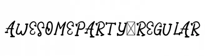
( Fonts by Letter Jos - Personal-use only. For commercial use please contact owner. )
A playful, cursive font with a dynamic and whimsical style.
![AwesomeParty-Regular font caratteri gratis]() Scaricare 38 Downloads@WebFont
Scaricare 38 Downloads@WebFont -
( Fonts by Almarkhatype - Abdul Malik Wisnu - Personal-use only. For commercial use please contact owner. )
A bold, playful font with a modern and approachable style.
![Delninoys font caratteri gratis]() Scaricare 38 Downloads@WebFont
Scaricare 38 Downloads@WebFont -
( Fonts by Rizka Prayuda - Personal-use only. For commercial use please contact owner. )
A geometric, futuristic font with angular, sharp edges and consistent stroke width.
![Musk Night font caratteri gratis]() Scaricare 38 Downloads@WebFont
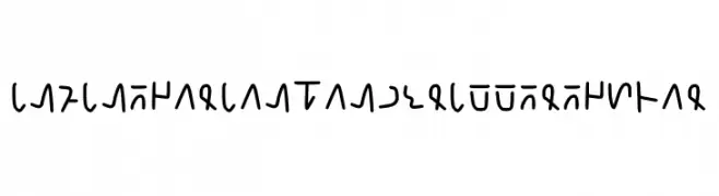
Scaricare 38 Downloads@WebFont -
![Infinegarian Handwritte Regular font caratteri gratis]() Scaricare 38 Downloads@WebFont
Scaricare 38 Downloads@WebFont -
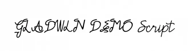
( Fonts by Edric Studio - Personal-use only. For commercial use please contact owner. )
A fluid and elegant script font with interconnected, graceful letters.
![GLADWIN DEMO Script font caratteri gratis]() Scaricare 38 Downloads@WebFont
Scaricare 38 Downloads@WebFont -
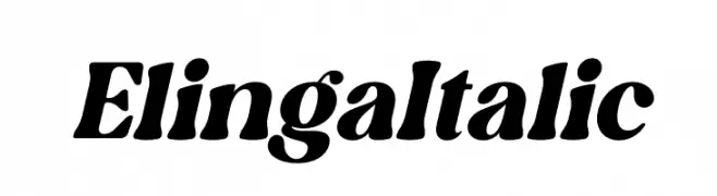
( Fonts by Letterena Studios - letterena.com - Personal-use only. For commercial use please contact owner. )
A bold, italicized font with dynamic strokes and a modern yet classic appeal.
![Elinga Italic font caratteri gratis]() Scaricare 38 Downloads@WebFont
Scaricare 38 Downloads@WebFont -
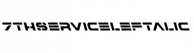
( Fonts by Iconian Fonts - Daniel Zadorozny - Personal-use only. For commercial use please contact owner. )
A bold, futuristic font with geometric shapes and stencil-like gaps.
![7th Service Leftalic font caratteri gratis]() Scaricare 38 Downloads@WebFont
Scaricare 38 Downloads@WebFont -
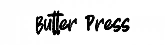
( Fonts by Gassstype )
![Butter Press font caratteri gratis]() Scaricare 38 Downloads@WebFont
Scaricare 38 Downloads@WebFont -
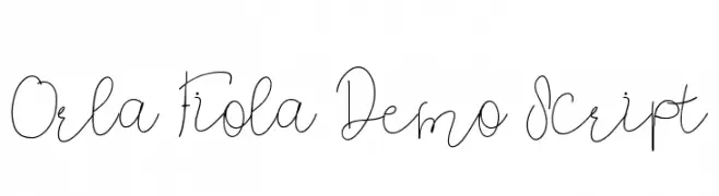
( Fonts by Edric Studio - Personal-use only. For commercial use please contact owner. )
A fluid, modern script font with elegant, connected strokes.
![Orla Fiola Demo Script font caratteri gratis]() Scaricare 38 Downloads@WebFont
Scaricare 38 Downloads@WebFont -
( Fonts by Atjcloth Studio - Hanif Syahputra - Personal-use only. For commercial use please contact owner. )
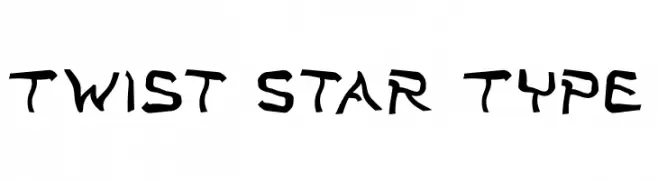
A dynamic, angular font with a modern, edgy style.
![Twist Star Type font caratteri gratis]() Scaricare 38 Downloads@WebFont
Scaricare 38 Downloads@WebFont -
( Fonts by Gassstype - Anang Fibriyanto - www.gassstype.com - Personal-use only. For commercial use please contact owner. )
A bold, brush-style font with dynamic, hand-painted strokes.
![Sleepless font caratteri gratis]() Scaricare 38 Downloads@WebFont
Scaricare 38 Downloads@WebFont -
( Fonts by Vladimir Nikolic - Personal-use only. For commercial use please contact owner. )
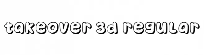
A playful, bold font with a 3D effect and rounded edges, perfect for eye-catching designs.
![Takeover 3D Regular font caratteri gratis]() Scaricare 38 Downloads@WebFont
Scaricare 38 Downloads@WebFont -
( Fonts by Kong Font - fontkong.com - Personal-use only. For commercial use please contact owner. )
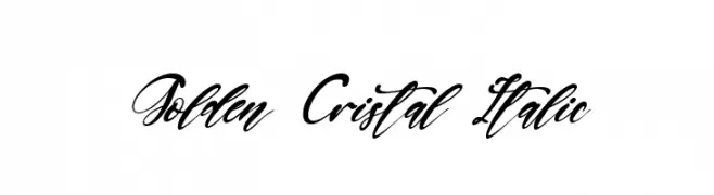
A flowing, elegant script font with a sophisticated italic style.
![Golden Cristal Italic font caratteri gratis]() Scaricare 38 Downloads@WebFont
Scaricare 38 Downloads@WebFont -
( Fonts by Deni Dessastra - Personal-use only. For commercial use please contact owner. )
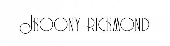
A decorative and geometric font with elongated, slender letterforms.
![Jhoony richmond font caratteri gratis]() Scaricare 38 Downloads@WebFont
Scaricare 38 Downloads@WebFont -
( Fonts by Iconian Fonts - Daniel Zadorozny - Personal-use only. For commercial use please contact owner. )
A futuristic, geometric font with bold, angular letterforms.
![Oberon font caratteri gratis]() Scaricare 38 Downloads@WebFont
Scaricare 38 Downloads@WebFont -
( Fonts by NendesKombet - Husain Assyahid - Personal-use only. For commercial use please contact owner. )
A flowing, cursive font with elegant, interconnected strokes.
![Michelles font caratteri gratis]() Scaricare 38 Downloads@WebFont
Scaricare 38 Downloads@WebFont -
( Fonts by Niskala Huruf - Personal-use only. For commercial use please contact owner. )
A playful, rounded font with bold, smooth curves.
![Gray Light Regular font caratteri gratis]() Scaricare 38 Downloads@WebFont
Scaricare 38 Downloads@WebFont -
( Fonts by Iconian Fonts )
A bold, dynamic font with a halftone effect and sharp, angular characters.
![Capitol City Halftone font caratteri gratis]() Scaricare 38 Downloads@WebFont
Scaricare 38 Downloads@WebFont -
( Fonts by Scratchones )
Casual, hand-drawn sans-serif with tall, narrow, playful letters.
![Thanks Giving font caratteri gratis]() Scaricare 38 Downloads@WebFont
Scaricare 38 Downloads@WebFont -
( Fonts by Typetemp Studio - Personal-use only. For commercial use please contact owner. )
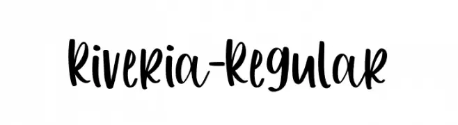
A bold, playful handwritten font with a dynamic and informal style.
![Riveria-Regular font caratteri gratis]() Scaricare 38 Downloads@WebFont
Scaricare 38 Downloads@WebFont -
( Fonts by Marsnev - Muhammad Ariq Syauqi - Personal-use only. For commercial use please contact owner. )
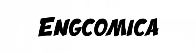
A bold, comic-inspired font with dynamic curves and a playful slant.
![Engcomica font caratteri gratis]() Scaricare 38 Downloads@WebFont
Scaricare 38 Downloads@WebFont -
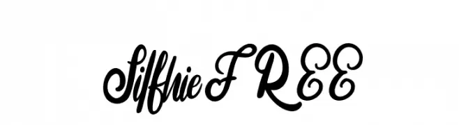
( Fonts by Vunira Design - Personal-use only. For commercial use please contact owner. )
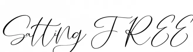
An elegant script font with flowing, interconnected cursive letters.
![Salting FREE font caratteri gratis]() Scaricare 38 Downloads@WebFont
Scaricare 38 Downloads@WebFont -
( Fonts by elharrak - elharrak fonts - Personal-use only. For commercial use please contact owner. )
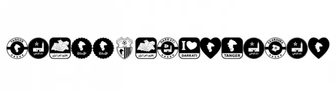
A bold collection of Moroccan-themed icons and Arabic calligraphy.
![font tanger color font caratteri gratis]() Scaricare 38 Downloads@WebFont
Scaricare 38 Downloads@WebFont -
( Fonts by Iconian Fonts - Daniel Zadorozny - Personal-use only. For commercial use please contact owner. )
A bold, expanded serif font with high contrast and strong, angular serifs.
![Gentleman Caller Expanded font caratteri gratis]() Scaricare 38 Downloads@WebFont
Scaricare 38 Downloads@WebFont -
( Fonts by Iconian Fonts - Daniel Zadorozny - Personal-use only. For commercial use please contact owner. )
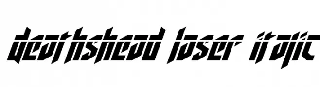
A bold, angular font with a futuristic and aggressive style.
![Deathshead Laser Italic font caratteri gratis]() Scaricare 38 Downloads@WebFont
Scaricare 38 Downloads@WebFont -
( Fonts by Faqih Fawaji - Personal-use only. For commercial use please contact owner. )
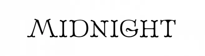
A whimsical, decorative font with a playful, hand-drawn style.
![MIDNIGHT font caratteri gratis]() Scaricare 38 Downloads@WebFont
Scaricare 38 Downloads@WebFont -
( Fonts by Macul Inc - Personal-use only. For commercial use please contact owner. )
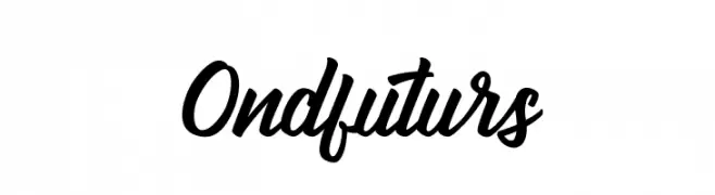
A bold, dynamic script font with fluid, connected letterforms and a playful yet sophisticated style.
![Ondfuturs font caratteri gratis]() Scaricare 38 Downloads@WebFont
Scaricare 38 Downloads@WebFont -
( Fonts by Michelle Kolo - Personal-use only. For commercial use please contact owner. )
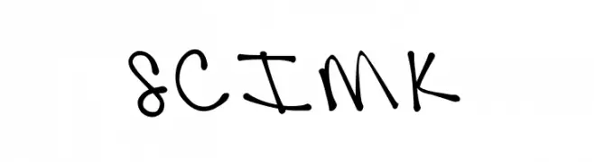
A playful, casual handwritten font with dynamic strokes.
![SCIMKfontfree font caratteri gratis]() Scaricare 38 Downloads@WebFont
Scaricare 38 Downloads@WebFont -
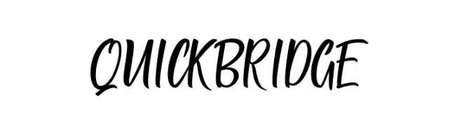
( Fonts by ToniStudio - Fatoni Nurman - Personal-use only. For commercial use please contact owner. )
A lively and fluid script font with a handwritten feel.
![QUICK BRIDGE font caratteri gratis]() Scaricare 38 Downloads@WebFont
Scaricare 38 Downloads@WebFont -
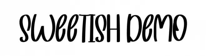
( Fonts by NihStudio )
![Sweetish Demo font caratteri gratis]() Scaricare 38 Downloads@WebFont
Scaricare 38 Downloads@WebFont -
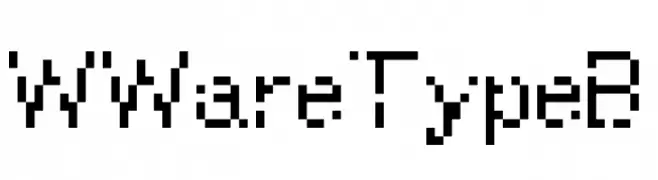
( Fonts by Caveras - Cliff - Personal-use only. For commercial use please contact owner. )
A pixelated, blocky font with a retro digital aesthetic.
![WWareTypeB font caratteri gratis]() Scaricare 38 Downloads@WebFont
Scaricare 38 Downloads@WebFont -
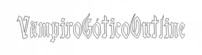
( Fonts by Woodcutter )
Outline blackletter font with sharp, gothic forms.
![Vampiro G font caratteri gratis]() Scaricare 38 Downloads@WebFont
Scaricare 38 Downloads@WebFont -
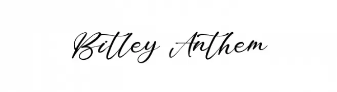
( Fonts by StringLabs - stringlabscreative.com - Personal-use only. For commercial use please contact owner. )
A sophisticated script font with elegant, flowing cursive strokes.
![Bitley Anthem font caratteri gratis]() Scaricare 38 Downloads@WebFont
Scaricare 38 Downloads@WebFont


Quali sono i font più popolari adesso?
Poppins, Roboto, Montserrat, Open Sans e Lato sono molto usati per le forme pulite e l'ampia applicabilità — dall'identità di marca alle landing page e ai poster.
Quali font si usano spesso nei loghi?
Le sans serif geometriche (es. Poppins, famiglie in stile Gotham) sono scelte comuni per un branding pulito e scalabile. Per un tocco personale restano valide script e stili manoscritti. Abbina un display deciso per i titoli a un corpo testo neutro per riconoscibilità ed equilibrio.
Ogni quanto si aggiorna la lista?
Con regolarità, in base ai download e all'attività reale. Torna spesso per scoprire in anticipo le nuove preferite.
💡 Consiglio: aggiungi ai preferiti — le tendenze cambiano in fretta e i font top di oggi possono ispirare il rebranding di domani.