Benvenuto nelle Font Più Popolari — dove popolarità e qualità si incontrano. Qui trovi i font più scaricati e usati dell'anno. Se cerchi scelte sicure per logo, web o social, inizia da qui.
Ogni font top si distingue per equilibrio, leggibilità e versatilità. Troverai sans serif moderne, script eleganti, serif vintage e display minimalisti.
-
( Free for commercial use. Copyright (c) 2015 Ek Type (www.ektype.in) )
A playful, rounded font with a bold and friendly appearance.
 Scaricare 10281 Downloads@WebFont
 -
![Gravicon Display font caratteri gratis]() Scaricare 10276 Downloads@WebFont
Scaricare 10276 Downloads@WebFont -
![FederationBold font caratteri gratis]() Scaricare 10275 Downloads@WebFont
Scaricare 10275 Downloads@WebFont -
( Fonts by Billy Argel - www.billyargel.com - Personal-use only. For commercial use please contact owner. )
A bold, geometric font with a modern and structured design.
![NOVAegular font caratteri gratis]() Scaricare 10274 Downloads@WebFont
Scaricare 10274 Downloads@WebFont -
![VI Hai Duong font caratteri gratis]() Scaricare 10270 Downloads@WebFont
Scaricare 10270 Downloads@WebFont -
( Nils Merkel )
A bold, modern sans-serif font with clean lines and a structured appearance.
![HYPE Bold font caratteri gratis]() Scaricare 10267 Downloads@WebFont
Scaricare 10267 Downloads@WebFont -
![3000 font caratteri gratis]() Scaricare 10264 Downloads@WebFont
Scaricare 10264 Downloads@WebFont -
Caratteri di alphadesigner. For commercial use please contact the owner.
![BulgariaModernaV3 font caratteri gratis]() Scaricare 10241 Downloads@WebFont
Scaricare 10241 Downloads@WebFont -
( Fonts by Castcraft Software - opti.netii.net - check the website before use )
A bold, condensed font with high contrast and a modern style.
![OPTICompit-Light font caratteri gratis]() Scaricare 10235 Downloads@WebFont
Scaricare 10235 Downloads@WebFont -
![Cooper Black BT font caratteri gratis]() Scaricare 10226 Downloads
Scaricare 10226 Downloads -
( Fonts by Castcraft Software - opti.netii.net - check the website before use )
A bold, heavy font with strong, uniform strokes and tight spacing.
![OPTIMorgan-Two font caratteri gratis]() Scaricare 10201 Downloads@WebFont
Scaricare 10201 Downloads@WebFont -
![Gunplay font caratteri gratis]() Scaricare 10201 Downloads@WebFont
Scaricare 10201 Downloads@WebFont -
![Movie Poster font caratteri gratis]() Scaricare 10189 Downloads@WebFont
Scaricare 10189 Downloads@WebFont -
( Copyright 2015 The Amatica Project Authors (hafontia@gmail.com) )
A playful, handwritten-style font with tall, narrow characters and a casual feel.
![Amatica SC Bold font caratteri gratis]() Scaricare 10185 Downloads@WebFont
Scaricare 10185 Downloads@WebFont -
![ClerestorySSK font caratteri gratis]() Scaricare 10183 Downloads@WebFont
Scaricare 10183 Downloads@WebFont -
( Fonts by Diogene - Claude Pelletier )
A bold, modern sans-serif font with a clean and assertive style.
![Essai font caratteri gratis]() Scaricare 10179 Downloads@WebFont
Scaricare 10179 Downloads@WebFont -
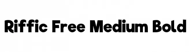
( Fonts by niniprower - Personal-use only. For commercial use please contact owner. )
A bold, geometric font with uniform stroke widths and a modern design.
![Riffic Free Medium Bold font caratteri gratis]() Scaricare 10171 Downloads@WebFont
Scaricare 10171 Downloads@WebFont -
![Bullpen 3D font caratteri gratis]() Scaricare 10167 Downloads@WebFont
Scaricare 10167 Downloads@WebFont -
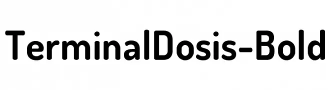
( Fonts by www.impallari.com )
A bold, rounded sans-serif font with a modern and friendly style.
![TerminalDosis-Bold font caratteri gratis]() Scaricare 10141 Downloads@WebFont
Scaricare 10141 Downloads@WebFont -
![Bundy Yellow Solid font caratteri gratis]() Scaricare 10136 Downloads@WebFont
Scaricare 10136 Downloads@WebFont -
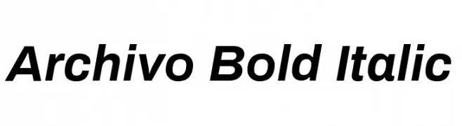
( Copyright 2016 The Archivo Project Authors (omnibus.type@gmail.com) )
A modern, bold, and italicized typeface with a clean and dynamic style.
![Archivo Bold Italic font caratteri gratis]() Scaricare 10132 Downloads@WebFont
Scaricare 10132 Downloads@WebFont -
( Copyright 2010, 2012 Adobe Systems Incorporated (http://www.adobe.com/), with Reserved Font Name 'Source'. All Rights Reserved. Source is a trademark of Adobe Systems Incorporated in the United States and/or other countries. )
A modern, versatile sans-serif font with clean, rounded letterforms and balanced proportions.
![Source Sans Pro font caratteri gratis]() Scaricare 10124 Downloads@WebFont
Scaricare 10124 Downloads@WebFont -
![NCAA Ohio State Buckeyes font caratteri gratis]() Scaricare 10119 Downloads@WebFont
Scaricare 10119 Downloads@WebFont -
![Caterpillar font caratteri gratis]() Scaricare 10117 Downloads@WebFont
Scaricare 10117 Downloads@WebFont -
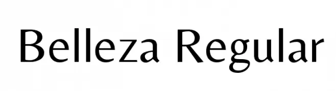
( Copyright (c) 2012, Eduardo Tunni (http://www.tipo.net.ar), with Reserved Font Name "Belleza" )
An elegant and sophisticated serif font with a blend of classic and modern elements.
![Belleza Regular font caratteri gratis]() Scaricare 10108 Downloads@WebFont
Scaricare 10108 Downloads@WebFont -
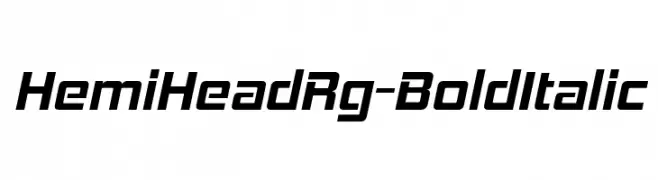
( Fonts by www.typodermicfonts.com - Ray Larabie )
A bold, italicized font with a modern, dynamic style.
![HemiHeadRg-BoldItalic font caratteri gratis]() Scaricare 10107 Downloads@WebFont
Scaricare 10107 Downloads@WebFont -
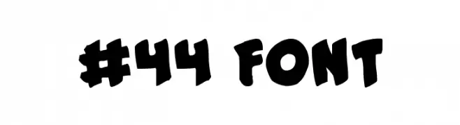
( Fonts by Daniel Zadorozny - www.iconian.com )
A bold, playful font with irregular, hand-drawn letterforms.
![#44 Font font caratteri gratis]() Scaricare 10104 Downloads@WebFont
Scaricare 10104 Downloads@WebFont -
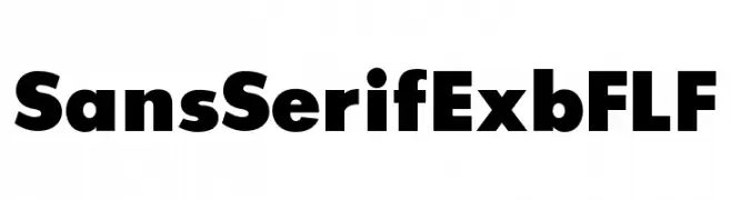
( Fonts by Casady & Greene )
A bold, geometric sans-serif font with clean lines and strong presence.
![SansSerifExbFLF font caratteri gratis]() Scaricare 10099 Downloads@WebFont
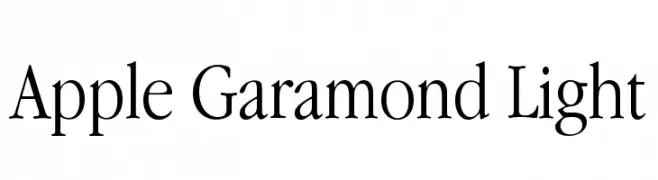
Scaricare 10099 Downloads@WebFont -
![Apple Garamond Light font caratteri gratis]() Scaricare 10099 Downloads@WebFont
Scaricare 10099 Downloads@WebFont -
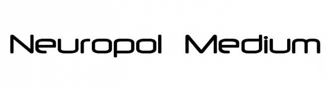
![Neuropol Medium font caratteri gratis]() Scaricare 10097 Downloads@WebFont
Scaricare 10097 Downloads@WebFont -
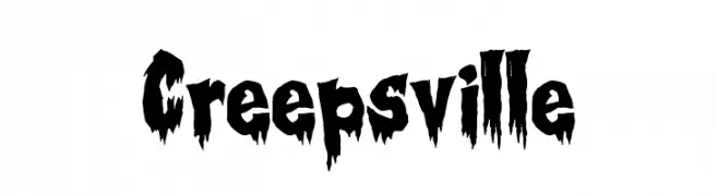
( Fonts by Tony O`Farrell )
A spooky, dripping font ideal for horror themes.
![Creepsville font caratteri gratis]() Scaricare 10096 Downloads@WebFont
Scaricare 10096 Downloads@WebFont -
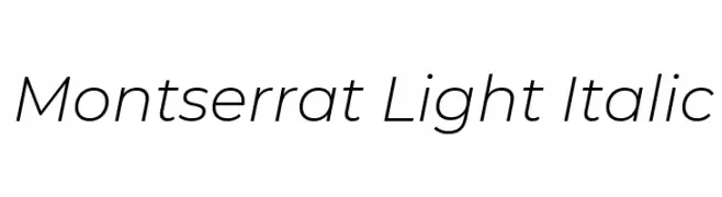
( Copyright 2011 The Montserrat Project Authors (https://github.com/JulietaUla/Montserrat) )
A sleek, modern, and light italic font with smooth curves and clean lines.
![Montserrat Light Italic font caratteri gratis]() Scaricare 10088 Downloads@WebFont
Scaricare 10088 Downloads@WebFont -
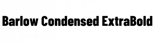
( Copyright 2017 The Barlow Project Authors (https://github.com/jpt/barlow) )
A bold, condensed typeface ideal for impactful headlines.
![Barlow Condensed ExtraBold font caratteri gratis]() Scaricare 10079 Downloads@WebFont
Scaricare 10079 Downloads@WebFont -
( Fonts by Alan Carr )
A playful, bold font with rounded, bubbly characters and a hand-drawn feel.
![Croissant font caratteri gratis]() Scaricare 10076 Downloads@WebFont
Scaricare 10076 Downloads@WebFont -
( Fonts by ShyFonts )
A bold, futuristic font with geometric, block-like characters.
![Alien Encounters Solid Bold font caratteri gratis]() Scaricare 10073 Downloads@WebFont
Scaricare 10073 Downloads@WebFont


Quali sono i font più popolari adesso?
Poppins, Roboto, Montserrat, Open Sans e Lato sono molto usati per le forme pulite e l'ampia applicabilità — dall'identità di marca alle landing page e ai poster.
Quali font si usano spesso nei loghi?
Le sans serif geometriche (es. Poppins, famiglie in stile Gotham) sono scelte comuni per un branding pulito e scalabile. Per un tocco personale restano valide script e stili manoscritti. Abbina un display deciso per i titoli a un corpo testo neutro per riconoscibilità ed equilibrio.
Ogni quanto si aggiorna la lista?
Con regolarità, in base ai download e all'attività reale. Torna spesso per scoprire in anticipo le nuove preferite.
💡 Consiglio: aggiungi ai preferiti — le tendenze cambiano in fretta e i font top di oggi possono ispirare il rebranding di domani.