Benvenuto nelle Font Più Popolari — dove popolarità e qualità si incontrano. Qui trovi i font più scaricati e usati dell'anno. Se cerchi scelte sicure per logo, web o social, inizia da qui.
Ogni font top si distingue per equilibrio, leggibilità e versatilità. Troverai sans serif moderne, script eleganti, serif vintage e display minimalisti.
-
 Scaricare 1264 Downloads@WebFont
 -
![AB Majik font caratteri gratis]() Scaricare 1264 Downloads@WebFont
Scaricare 1264 Downloads@WebFont -
( Fonts by Mario Arturo - marioarturo.com. Personal-use only. For commercial use please contact owner. Contact the owner for a donation. )
A whimsical and elegant script font with flowing, interconnected letterforms.
![DorisDay font caratteri gratis]() Scaricare 1264 Downloads@WebFont
Scaricare 1264 Downloads@WebFont -
( Copyright (c) 2010, Kimberly Geswein (kimberlygeswein.com) )
A casual, handwritten-style font with smooth, fluid strokes.
![Nothing You Could Do font caratteri gratis]() Scaricare 1264 Downloads@WebFont
Scaricare 1264 Downloads@WebFont -
( Fonts by www.peter-wiegel.de. Personal-use only. For commercial use please contact owner. )
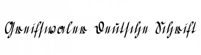
An ornate, historical script with intricate flourishes and a calligraphic style.
![Greifswaler Deutsche Schrift font caratteri gratis]() Scaricare 1264 Downloads@WebFont
Scaricare 1264 Downloads@WebFont -
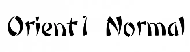
![Orient1 Normal font caratteri gratis]() Scaricare 1264 Downloads@WebFont
Scaricare 1264 Downloads@WebFont -
( Fonts by Yadhie Setiawan - typelinestudio.com - Personal-use only. For commercial use please contact owner. )
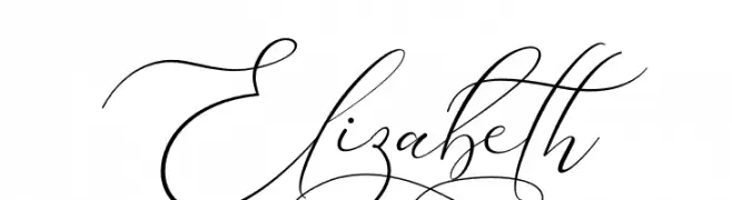
An elegant, cursive font with flowing, ornate letters and high contrast.
![Elizabeth font caratteri gratis]() Scaricare 1263 Downloads@WebFont
Scaricare 1263 Downloads@WebFont -
![Sheppaloe font caratteri gratis]() Scaricare 1263 Downloads@WebFont
Scaricare 1263 Downloads@WebFont -
( Fonts by Clement Nicolle - www.stereo-type.fr - Personal-use only. For commercial use please contact owner. )
A bold, dynamic script font with flowing, cursive letterforms.
![Mustardo font caratteri gratis]() Scaricare 1263 Downloads@WebFont
Scaricare 1263 Downloads@WebFont -
( Fonts by Daniel Zadorozny - www.iconian.com )
A bold, expanded, and italicized font with a modern and dynamic style.
![Grand National Expanded Italic font caratteri gratis]() Scaricare 1263 Downloads@WebFont
Scaricare 1263 Downloads@WebFont -
( Fonts by Noor AlQahtani )
A playful, handwritten font with a casual and friendly style.
![Uno font caratteri gratis]() Scaricare 1263 Downloads@WebFont
Scaricare 1263 Downloads@WebFont -
( Fonts by Daniel Zadorozny - www.iconian.com - Free for personal use )
A bold, condensed, and italicized font with a dynamic and energetic style.
![Buddy Champion Condensed Italic font caratteri gratis]() Scaricare 1263 Downloads@WebFont
Scaricare 1263 Downloads@WebFont -
![Snacker Comic Personal Use Only font caratteri gratis]() Scaricare 1263 Downloads@WebFont
Scaricare 1263 Downloads@WebFont -
( Font by Jayvee D. Enaguas - grandchaos9000.deviantart.com )
A bold, modern sans-serif font with uniform weight and clear readability.
![Hauracherell NC font caratteri gratis]() Scaricare 1263 Downloads@WebFont
Scaricare 1263 Downloads@WebFont -
![AI kelso BI font caratteri gratis]() Scaricare 1263 Downloads@WebFont
Scaricare 1263 Downloads@WebFont -
( Fonts by Gyom Seguin - last-soundtrack.daportfolio.com )
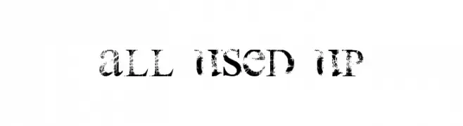
A distressed, vintage-style font with a bold, weathered appearance.
![all used up font caratteri gratis]() Scaricare 1263 Downloads@WebFont
Scaricare 1263 Downloads@WebFont -
( Fonts by Daniel Zadorozny - www.iconian.com )
A bold, futuristic italic font with geometric precision and dynamic style.
![7th Service Italic font caratteri gratis]() Scaricare 1263 Downloads@WebFont
Scaricare 1263 Downloads@WebFont -
![in blossom vintage font caratteri gratis]() Scaricare 1262 Downloads@WebFont
Scaricare 1262 Downloads@WebFont -
![Zinc font caratteri gratis]() Scaricare 1262 Downloads@WebFont
Scaricare 1262 Downloads@WebFont -
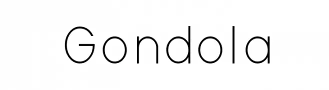
![Gondola font caratteri gratis]() Scaricare 1262 Downloads@WebFont
Scaricare 1262 Downloads@WebFont -
( Fonts by weknow - Wino S Kadir )
A modern, bold font with rounded, geometric characters and a futuristic style.
![carlos font caratteri gratis]() Scaricare 1262 Downloads@WebFont
Scaricare 1262 Downloads@WebFont -
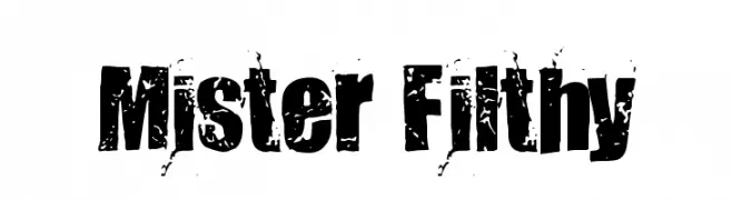
![Mister Filthy font caratteri gratis]() Scaricare 1262 Downloads@WebFont
Scaricare 1262 Downloads@WebFont -
( Fonts by Andrey Chernevich - Mister Chek - www.misterchek.ru )
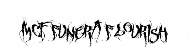
A decorative and gothic font with intricate flourishes and high contrast strokes.
![MCF funera flourish font caratteri gratis]() Scaricare 1262 Downloads@WebFont
Scaricare 1262 Downloads@WebFont -
( Fonts by Manfred Klein. Free for private and charity use. Free for commercial with donation to organizations )
A bold, geometric font with missing segments for a modern, dynamic look.
![MissingLinks font caratteri gratis]() Scaricare 1262 Downloads@WebFont
Scaricare 1262 Downloads@WebFont -
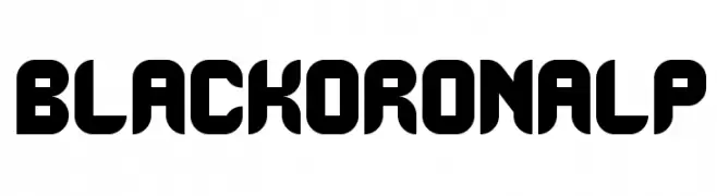
![BlackoronAlp font caratteri gratis]() Scaricare 1262 Downloads@WebFont
Scaricare 1262 Downloads@WebFont -
( Fonts by Apostrophic Lab )
A bold, italic, and modern font with a sleek, dynamic style.
![Labtop Secundo Bold Italic font caratteri gratis]() Scaricare 1262 Downloads@WebFont
Scaricare 1262 Downloads@WebFont -
![Cicle Shadow font caratteri gratis]() Scaricare 1262 Downloads@WebFont
Scaricare 1262 Downloads@WebFont -
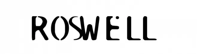
![ROSWELL font caratteri gratis]() Scaricare 1262 Downloads@WebFont
Scaricare 1262 Downloads@WebFont -
( Fonts by Apostrophic Lab )
A bold, italicized font with a playful and dynamic style.
![Komika Text Kaps Bold Italic font caratteri gratis]() Scaricare 1262 Downloads@WebFont
Scaricare 1262 Downloads@WebFont -
( Fonts by Noah Type )
A playful, hand-drawn font with bold, irregular strokes and a dynamic slant.
![Good Kids Demo font caratteri gratis]() Scaricare 1261 Downloads@WebFont
Scaricare 1261 Downloads@WebFont -
( Fonts by Taylor Wade )
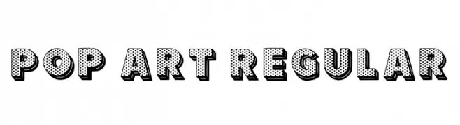
A bold, playful font with a pop art style and dotted pattern.
![Pop Art Regular font caratteri gratis]() Scaricare 1261 Downloads@WebFont
Scaricare 1261 Downloads@WebFont -
( Fonts by Ramandhani Nugraha )
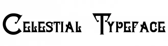
A decorative typeface with celestial motifs and intricate details.
![Celestial Typeface font caratteri gratis]() Scaricare 1261 Downloads@WebFont
Scaricare 1261 Downloads@WebFont -
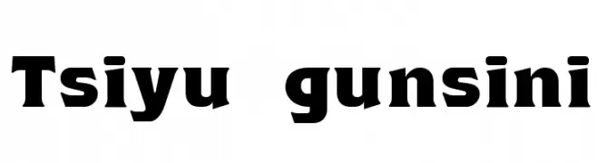
![Tsiyu gunsini font caratteri gratis]() Scaricare 1261 Downloads@WebFont
Scaricare 1261 Downloads@WebFont -
( Fonts by Fernando Haro - defharo.com )
A bold, distressed font with a grunge texture, perfect for urban and edgy designs.
![C.A. Gatintas font caratteri gratis]() Scaricare 1261 Downloads@WebFont
Scaricare 1261 Downloads@WebFont -
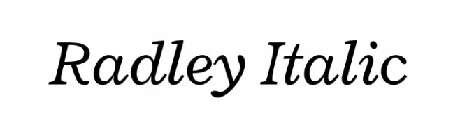
( Copyright 2011 The Radley Project Authors (https://github.com/googlefonts/RadleyFont) )
A classic italic font with smooth curves and moderate contrast, offering elegance and readability.
![Radley Italic font caratteri gratis]() Scaricare 1261 Downloads@WebFont
Scaricare 1261 Downloads@WebFont


Quali sono i font più popolari adesso?
Poppins, Roboto, Montserrat, Open Sans e Lato sono molto usati per le forme pulite e l'ampia applicabilità — dall'identità di marca alle landing page e ai poster.
Quali font si usano spesso nei loghi?
Le sans serif geometriche (es. Poppins, famiglie in stile Gotham) sono scelte comuni per un branding pulito e scalabile. Per un tocco personale restano valide script e stili manoscritti. Abbina un display deciso per i titoli a un corpo testo neutro per riconoscibilità ed equilibrio.
Ogni quanto si aggiorna la lista?
Con regolarità, in base ai download e all'attività reale. Torna spesso per scoprire in anticipo le nuove preferite.
💡 Consiglio: aggiungi ai preferiti — le tendenze cambiano in fretta e i font top di oggi possono ispirare il rebranding di domani.