Benvenuto nelle Font Più Popolari — dove popolarità e qualità si incontrano. Qui trovi i font più scaricati e usati dell'anno. Se cerchi scelte sicure per logo, web o social, inizia da qui.
Ogni font top si distingue per equilibrio, leggibilità e versatilità. Troverai sans serif moderne, script eleganti, serif vintage e display minimalisti.
-
( Fonts by Rangkai Aksara - Personal-use only. For commercial use please contact owner. )
A playful, handwritten font with smooth, flowing lines and rounded edges.
 Scaricare 34 Downloads@WebFont
 -
( Personal-use only. For commercial use please contact owner. )
Bold, rounded handwritten font with a playful and casual style.
![Christmas Planner font caratteri gratis]() Scaricare 34 Downloads@WebFont
Scaricare 34 Downloads@WebFont -
( Fonts by Creatype Studio - Rian Rahardi - Personal-use only. For commercial use please contact owner. )
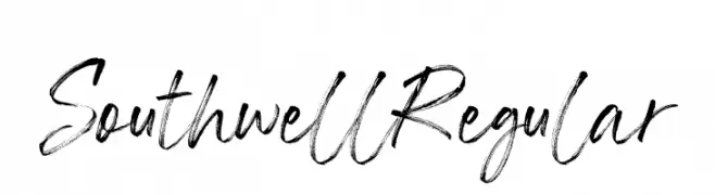
A dynamic, brush-style handwritten font with fluid strokes and artistic flair.
![Southwell Regular font caratteri gratis]() Scaricare 34 Downloads@WebFont
Scaricare 34 Downloads@WebFont -
( Fonts by Nirmana Visual - Sigit Dwipa - Personal-use only. For commercial use please contact owner. )
An elegant, flowing script font with a handwritten appearance.
![Shettricka font caratteri gratis]() Scaricare 34 Downloads@WebFont
Scaricare 34 Downloads@WebFont -
( Fonts by Typodermic Fonts - Raymond Larabie - Personal-use only. For commercial use please contact owner. )
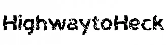
A rugged, distressed font with a fragmented, edgy style.
![Highway to Heck font caratteri gratis]() Scaricare 34 Downloads@WebFont
Scaricare 34 Downloads@WebFont -
( Fonts by Vunira Design - Personal-use only. For commercial use please contact owner. )
A bold, brush-style handwritten font with dynamic strokes.
![ThuneFREE font caratteri gratis]() Scaricare 34 Downloads@WebFont
Scaricare 34 Downloads@WebFont -
( Fonts by Vunira Design - Personal-use only. For commercial use please contact owner. )
An elegant, flowing script font with intricate, decorative letterforms.
![Daytone FREE font caratteri gratis]() Scaricare 34 Downloads@WebFont
Scaricare 34 Downloads@WebFont -
( Fonts by Woodcutter - woodcutter Manero - Personal-use only. For commercial use please contact owner. )
![Man Silhouettes font caratteri gratis]() Scaricare 34 Downloads@WebFont
Scaricare 34 Downloads@WebFont -
( Personal-use only. For commercial use please contact owner. )
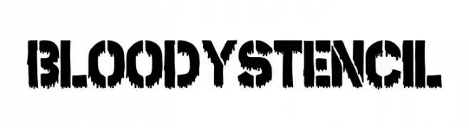
Bold, horror-themed stencil font with dripping, jagged edges.
![Bloody Stencil font caratteri gratis]() Scaricare 34 Downloads@WebFont
Scaricare 34 Downloads@WebFont -
( Fonts by Andrey Font Design - Personal-use only. For commercial use please contact owner. )
A dynamic and elegant script font with flowing letterforms and expressive style.
![Vennesia font caratteri gratis]() Scaricare 34 Downloads@WebFont
Scaricare 34 Downloads@WebFont -
( Fonts by Vunira Design - Personal-use only. For commercial use please contact owner. )
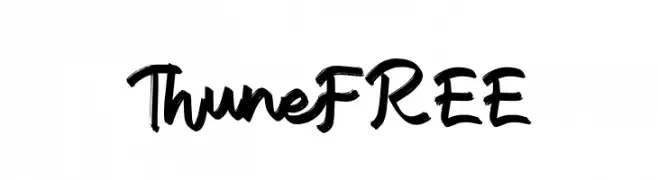
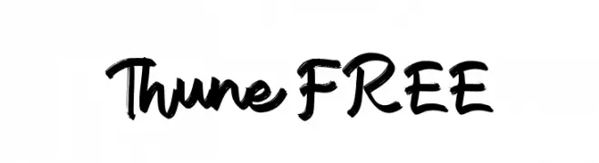
A bold, expressive script font with a hand-drawn, lively appearance.
![Thune FREE font caratteri gratis]() Scaricare 34 Downloads@WebFont
Scaricare 34 Downloads@WebFont -
( Fonts by Studio Morgana.id )
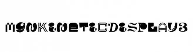
A bold, eclectic display font with dynamic and playful letterforms.
![MGN Kinetic Display 3 font caratteri gratis]() Scaricare 34 Downloads@WebFont
Scaricare 34 Downloads@WebFont -
( Fonts by Colllab Studio - Personal-use only. For commercial use please contact owner. )
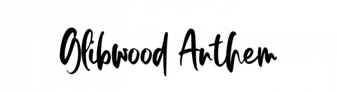
A bold, expressive script font with a hand-drawn, dynamic style.
![Glibwood Anthem font caratteri gratis]() Scaricare 34 Downloads@WebFont
Scaricare 34 Downloads@WebFont -
( Fonts by Vladimir Nikolic - Personal-use only. For commercial use please contact owner. )
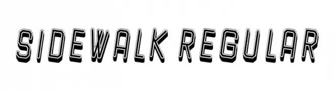
A bold, three-dimensional font with geometric lines and shadow effects.
![Sidewalk Regular font caratteri gratis]() Scaricare 34 Downloads@WebFont
Scaricare 34 Downloads@WebFont -
( Fonts by Adam Jagosz - Personal-use only. For commercial use please contact owner. )
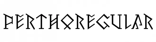
A bold, angular font inspired by ancient runic alphabets.
![Pertho Regular font caratteri gratis]() Scaricare 34 Downloads@WebFont
Scaricare 34 Downloads@WebFont -
( Fonts by StringLabs - stringlabscreative.com - Personal-use only. For commercial use please contact owner. )
A bold, expressive script font with fluid, cursive strokes and dynamic flow.
![AgilScript font caratteri gratis]() Scaricare 34 Downloads@WebFont
Scaricare 34 Downloads@WebFont -
( Fonts by ReyreyBlue - Reyrey Blue - Personal-use only. For commercial use please contact owner. )
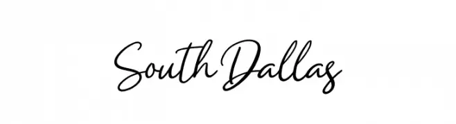
A cursive, handwritten-style font with elegant, flowing characters.
![South Dallas font caratteri gratis]() Scaricare 34 Downloads@WebFont
Scaricare 34 Downloads@WebFont -
( Fonts by weknow - Wino S Kadir - Personal-use only. For commercial use please contact owner. )
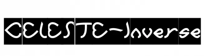
A playful, heart-themed decorative font with curvy, whimsical characters.
![CELESTE-Inverse font caratteri gratis]() Scaricare 34 Downloads@WebFont
Scaricare 34 Downloads@WebFont -
( Fonts by Vladimir Nikolic - www.creativefabrica.com/designer/vladimirnikolic/ - Personal-use only. For commercial use please contact owner. )
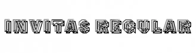
A decorative, geometric font with a three-dimensional, intricate design.
![Invitas Regular font caratteri gratis]() Scaricare 34 Downloads@WebFont
Scaricare 34 Downloads@WebFont -
( Fonts by Nirmana Visual - Sigit Dwipa - Personal-use only. For commercial use please contact owner. )
A playful and elegant handwritten script font with dynamic contrast.
![The Valentine font caratteri gratis]() Scaricare 34 Downloads@WebFont
Scaricare 34 Downloads@WebFont -
( Fonts by Vladimir Nikolic - www.creativefabrica.com/designer/vladimirnikolic/ - Personal-use only. For commercial use please contact owner. )
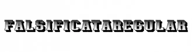
A bold, decorative font with a vintage, three-dimensional style.
![Falsificata Regular font caratteri gratis]() Scaricare 34 Downloads@WebFont
Scaricare 34 Downloads@WebFont -
( Fonts by Iconian Fonts - Daniel Zadorozny - Personal-use only. For commercial use please contact owner. )
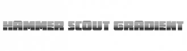
A bold, futuristic font with a gradient effect created by horizontal lines.
![Hammer Scout Gradient font caratteri gratis]() Scaricare 34 Downloads@WebFont
Scaricare 34 Downloads@WebFont -
( Personal-use only. For commercial use please contact owner. )
Ornate, festive script with decorative swashes and high contrast.
![Wonderful Christmas font caratteri gratis]() Scaricare 34 Downloads@WebFont
Scaricare 34 Downloads@WebFont -
( Fonts by AukimVisuel - Audry Kitoko Makelele - Personal-use only. For commercial use please contact owner. )
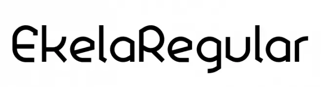
A modern, geometric font with clean lines and angular shapes.
![Ekela Regular font caratteri gratis]() Scaricare 34 Downloads@WebFont
Scaricare 34 Downloads@WebFont -
( Personal-use only. For commercial use please contact owner. )
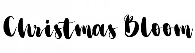
Bold, decorative brush script with playful swashes and high contrast.
![Christmas Bloom font caratteri gratis]() Scaricare 34 Downloads@WebFont
Scaricare 34 Downloads@WebFont -
( Fonts by AukimVisuel - Audry Kitoko Makelele - Personal-use only. For commercial use please contact owner. )
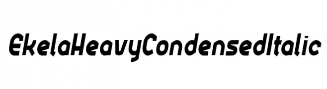
Bold, condensed, and italic with a dynamic and modern style.
![Ekela Heavy Condensed Italic font caratteri gratis]() Scaricare 34 Downloads@WebFont
Scaricare 34 Downloads@WebFont -
( Fonts by Ji Yan Lee - Personal-use only. For commercial use please contact owner. )
A pixelated, blocky font with a retro digital aesthetic.
![Puzzle font caratteri gratis]() Scaricare 34 Downloads@WebFont
Scaricare 34 Downloads@WebFont -
( Fonts by Edric Studio - Personal-use only. For commercial use please contact owner. )
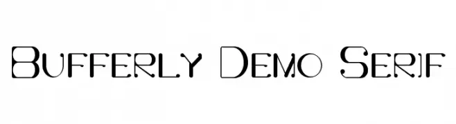
A modern, high-contrast font with geometric and decorative elements.
![Bufferly Demo Serif font caratteri gratis]() Scaricare 34 Downloads@WebFont
Scaricare 34 Downloads@WebFont -
( Fonts by Saridezra - Personal-use only. For commercial use please contact owner. )
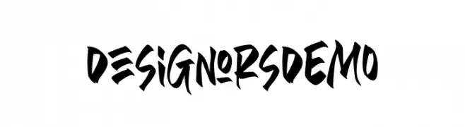
A bold, energetic font with sharp, angular strokes and a graffiti-like style.
![DesignorsDEMO font caratteri gratis]() Scaricare 34 Downloads@WebFont
Scaricare 34 Downloads@WebFont -
( Fonts by SheillaType - Muhammad Taufiq - Personal-use only. For commercial use please contact owner. )
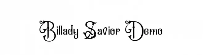
An ornate and decorative font with elaborate swirls and embellishments.
![Billady Savior Demo font caratteri gratis]() Scaricare 34 Downloads@WebFont
Scaricare 34 Downloads@WebFont -
( Fonts by bringtypestudio.co )
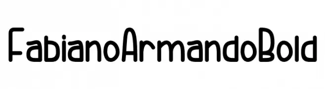
Playful, rounded, bold sans-serif with smooth curves.
![Fabiano Armando Bold font caratteri gratis]() Scaricare 34 Downloads@WebFont
Scaricare 34 Downloads@WebFont -
( Fonts by StringLabs - stringlabscreative.com - Personal-use only. For commercial use please contact owner. )
A dynamic and elegant script font with fluid, cursive strokes.
![Sally Tazem font caratteri gratis]() Scaricare 34 Downloads@WebFont
Scaricare 34 Downloads@WebFont -
( Fonts by TypeType Foundry )
A geometric, octagonal font with a modern and futuristic style.
![TT Octosquares Trl Exp Lt font caratteri gratis]() Scaricare 34 Downloads@WebFont
Scaricare 34 Downloads@WebFont -
( Fonts by Ssid 168 - Personal-use only. For commercial use please contact owner. )
A modern, elegant script font with flowing, cursive characters.
![Shamissa font caratteri gratis]() Scaricare 34 Downloads@WebFont
Scaricare 34 Downloads@WebFont -
( Fonts by StringLabs - stringlabscreative.com - Personal-use only. For commercial use please contact owner. )
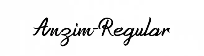
An elegant cursive font with flowing, interconnected characters.
![Anzim-Regular font caratteri gratis]() Scaricare 34 Downloads@WebFont
Scaricare 34 Downloads@WebFont


Quali sono i font più popolari adesso?
Poppins, Roboto, Montserrat, Open Sans e Lato sono molto usati per le forme pulite e l'ampia applicabilità — dall'identità di marca alle landing page e ai poster.
Quali font si usano spesso nei loghi?
Le sans serif geometriche (es. Poppins, famiglie in stile Gotham) sono scelte comuni per un branding pulito e scalabile. Per un tocco personale restano valide script e stili manoscritti. Abbina un display deciso per i titoli a un corpo testo neutro per riconoscibilità ed equilibrio.
Ogni quanto si aggiorna la lista?
Con regolarità, in base ai download e all'attività reale. Torna spesso per scoprire in anticipo le nuove preferite.
💡 Consiglio: aggiungi ai preferiti — le tendenze cambiano in fretta e i font top di oggi possono ispirare il rebranding di domani.