Benvenuto nelle Font Più Popolari — dove popolarità e qualità si incontrano. Qui trovi i font più scaricati e usati dell'anno. Se cerchi scelte sicure per logo, web o social, inizia da qui.
Ogni font top si distingue per equilibrio, leggibilità e versatilità. Troverai sans serif moderne, script eleganti, serif vintage e display minimalisti.
-
 Scaricare 328 Downloads@WebFont
 -
![Charley font caratteri gratis]() Scaricare 328 Downloads@WebFont
Scaricare 328 Downloads@WebFont -
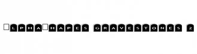
Caratteri di fontsnthings. For commercial use please contact the owner.
![AlphaShapes gravestones 2 font caratteri gratis]() Scaricare 328 Downloads@WebFont
Scaricare 328 Downloads@WebFont -
( imagex - www.imagex-fonts.com )
A decorative font with a stitched, handcrafted appearance.
![Stitch'n School font caratteri gratis]() Scaricare 328 Downloads@WebFont
Scaricare 328 Downloads@WebFont -
( Fonts by Woodcutter )
A bold, decorative font with thick outlines and hollow interiors, perfect for striking headlines.
![Graphic Dictatorship font caratteri gratis]() Scaricare 328 Downloads@WebFont
Scaricare 328 Downloads@WebFont -
-
( Fonts by Greg Medina - www.dcoxy.com - Personal-use only. For commercial use please contact owner. )
A dynamic script font with sharp, angular strokes and a bold presence.
![Mad Rats font caratteri gratis]() Scaricare 328 Downloads@WebFont
Scaricare 328 Downloads@WebFont -
( Fonts by www.aenigmafonts.com )
A bold, playful font with rounded edges and a cohesive design.
![TRAGIC BRK font caratteri gratis]() Scaricare 328 Downloads@WebFont
Scaricare 328 Downloads@WebFont -
( Irina ModBlackmoon - modblackmoon.com/ )
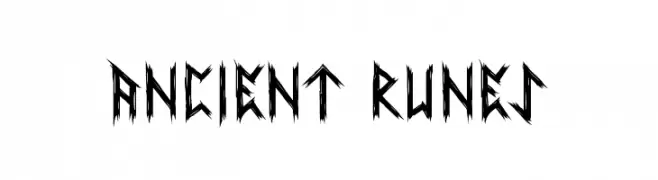
A jagged, rune-like font with a mystical and ancient appearance.
![Ancient Runes font caratteri gratis]() Scaricare 328 Downloads@WebFont
Scaricare 328 Downloads@WebFont -
( Fonts by Chris Vile - fontmonger.com - Personal-use only. For commercial use please contact owner. )
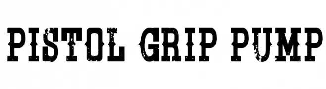
A bold, distressed font with a rugged, vintage appeal.
![Pistol Grip Pump font caratteri gratis]() Scaricare 328 Downloads@WebFont
Scaricare 328 Downloads@WebFont -
( Fonts by Graham Meade - GemFonts )
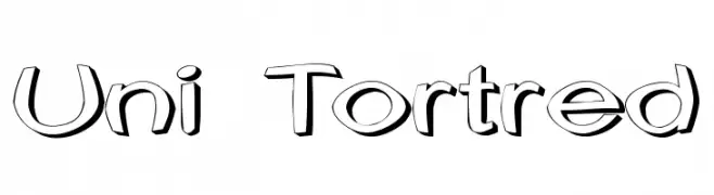
A playful, 3D-effect font with bold, rounded characters and a whimsical style.
![Uni Tortred font caratteri gratis]() Scaricare 328 Downloads@WebFont
Scaricare 328 Downloads@WebFont


Quali sono i font più popolari adesso?
Poppins, Roboto, Montserrat, Open Sans e Lato sono molto usati per le forme pulite e l'ampia applicabilità — dall'identità di marca alle landing page e ai poster.
Quali font si usano spesso nei loghi?
Le sans serif geometriche (es. Poppins, famiglie in stile Gotham) sono scelte comuni per un branding pulito e scalabile. Per un tocco personale restano valide script e stili manoscritti. Abbina un display deciso per i titoli a un corpo testo neutro per riconoscibilità ed equilibrio.
Ogni quanto si aggiorna la lista?
Con regolarità, in base ai download e all'attività reale. Torna spesso per scoprire in anticipo le nuove preferite.
💡 Consiglio: aggiungi ai preferiti — le tendenze cambiano in fretta e i font top di oggi possono ispirare il rebranding di domani.