Benvenuto nelle Font Più Popolari — dove popolarità e qualità si incontrano. Qui trovi i font più scaricati e usati dell'anno. Se cerchi scelte sicure per logo, web o social, inizia da qui.
Ogni font top si distingue per equilibrio, leggibilità e versatilità. Troverai sans serif moderne, script eleganti, serif vintage e display minimalisti.
-
 Scaricare 1255 Downloads@WebFont
 -
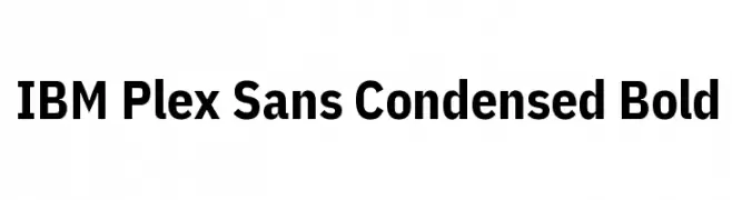
( Copyright © 2017 IBM Corp. with Reserved Font Name "Plex" )
A modern, bold, and condensed sans-serif typeface with a clean and professional look.
![IBM Plex Sans Condensed Bold font caratteri gratis]() Scaricare 1255 Downloads@WebFont
Scaricare 1255 Downloads@WebFont -
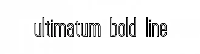
( Fonts by Peter Olexa - www.dealjumbo.com - Personal-use only. For commercial use please contact owner. )
A bold, outlined font with a geometric and modern design.
![ultimatum bold line font caratteri gratis]() Scaricare 1255 Downloads@WebFont
Scaricare 1255 Downloads@WebFont -
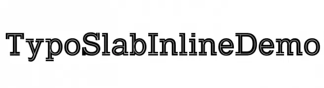
( Fonts by www.studiotypo.com - Personal-use only. For commercial use please contact owner. )
A bold slab serif font with unique inline detailing for a modern twist.
![Typo Slab Inline Demo font caratteri gratis]() Scaricare 1255 Downloads@WebFont
Scaricare 1255 Downloads@WebFont -
( گالری فانت فارسی پژوهش آريانا - only compatible with Farsi and Arabic )
A modern serif font with clean lines and balanced proportions.
![Kabah I font caratteri gratis]() Scaricare 1255 Downloads@WebFont
Scaricare 1255 Downloads@WebFont -
( Fonts by Alex Tomlinson - Skyhaven Fonts - shfonts.com )
A modern, geometric sans-serif font with smooth curves and balanced spacing.
![SuperRad-Regular font caratteri gratis]() Scaricare 1255 Downloads@WebFont
Scaricare 1255 Downloads@WebFont -
( Copyright (c) 2011, Johan Kallas (johankallas@gmail.com), )
A modern, geometric font with a bold, futuristic style.
![Revalia-Regular font caratteri gratis]() Scaricare 1255 Downloads@WebFont
Scaricare 1255 Downloads@WebFont -
( Copyright (c) 2011 by Sorkin Type Co (www.sorkintype.com) )
A classic serif font with elegant, refined letterforms and moderate contrast.
![Habibi font caratteri gratis]() Scaricare 1255 Downloads@WebFont
Scaricare 1255 Downloads@WebFont -
![Macedonian Handwriting font caratteri gratis]() Scaricare 1255 Downloads@WebFont
Scaricare 1255 Downloads@WebFont -
![Grunge Bold font caratteri gratis]() Scaricare 1255 Downloads@WebFont
Scaricare 1255 Downloads@WebFont -
![Bilitis font caratteri gratis]() Scaricare 1255 Downloads@WebFont
Scaricare 1255 Downloads@WebFont -
( Fonts by Iva Florina - Personal-use only. For commercial use please contact owner. )
A bold, playful handwritten font with rounded, consistent strokes.
![Pochirin Regular font caratteri gratis]() Scaricare 1254 Downloads@WebFont
Scaricare 1254 Downloads@WebFont -
( Fonts by Chequered Ink )
A bold, geometric font with sharp angles and a strong presence.
![Altered Quest font caratteri gratis]() Scaricare 1254 Downloads@WebFont
Scaricare 1254 Downloads@WebFont -
( Copyright 2012 The Encode Project Authors (impallari@gmail.com), with Reserved Font Name "Encode Sansâ€. )
A modern, thin, and condensed sans-serif font with a clean and minimalist design.
![Encode Sans Condensed Thin font caratteri gratis]() Scaricare 1254 Downloads@WebFont
Scaricare 1254 Downloads@WebFont -
![PhonepadTwo Regular font caratteri gratis]() Scaricare 1254 Downloads@WebFont
Scaricare 1254 Downloads@WebFont -
( Fonts by Kosal Sen - hwww.philatype.com )
A bold, playful font with dynamic curves and strong visual impact.
![PhillySans font caratteri gratis]() Scaricare 1254 Downloads@WebFont
Scaricare 1254 Downloads@WebFont -
![CaslonLightSSK font caratteri gratis]() Scaricare 1254 Downloads@WebFont
Scaricare 1254 Downloads@WebFont -
( Fonts by Manfred Klein. Free for private and charity use. Free for commercial with donation to organizations )
A modern, light sans-serif font with clean lines and balanced spacing.
![TraditionSansXLight font caratteri gratis]() Scaricare 1254 Downloads@WebFont
Scaricare 1254 Downloads@WebFont -
( Fonts by Apostrophic Lab )
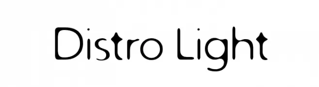
A modern, playful font with rounded characters and a consistent stroke width.
![Distro Light font caratteri gratis]() Scaricare 1254 Downloads@WebFont
Scaricare 1254 Downloads@WebFont -
( Fonts by Rick Mueller )
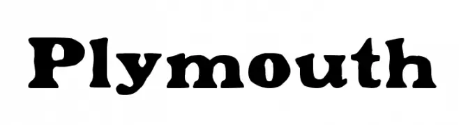
A bold, decorative font with a vintage flair and strong, condensed characters.
![Plymouth font caratteri gratis]() Scaricare 1254 Downloads@WebFont
Scaricare 1254 Downloads@WebFont -
( Fonts by Apostrophic Lab )
A bold, playful font with wide, rounded letters and a dynamic slant.
![Komika Title - Wide font caratteri gratis]() Scaricare 1254 Downloads@WebFont
Scaricare 1254 Downloads@WebFont -
( Fonts by Jonathan Paterson )
A bold, expressive font with dynamic curves and sharp edges.
![French Grotesque font caratteri gratis]() Scaricare 1254 Downloads@WebFont
Scaricare 1254 Downloads@WebFont -
( Fonts by ZF2334 - Salim Zouaghi - www.zedfonts2334.xyz - This font is free for both personal and commercial use. )
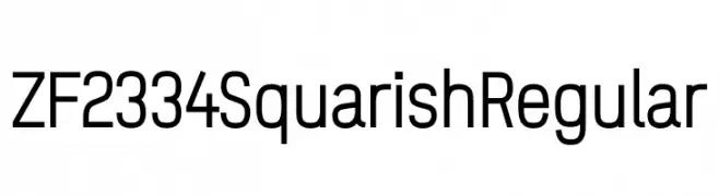
A modern, geometric typeface with a squarish, minimalistic design.
![ZF2334 Squarish Regular font caratteri gratis]() Scaricare 1253 Downloads@WebFont
Scaricare 1253 Downloads@WebFont -
( Fonts by Ospiro Enterprises - Personal-use only. For commercial use please contact owner. )
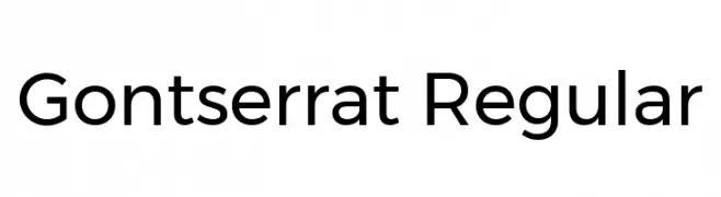
A modern, geometric sans-serif font with balanced proportions and uniform stroke width.
![Gontserrat Regular font caratteri gratis]() Scaricare 1253 Downloads@WebFont
Scaricare 1253 Downloads@WebFont -
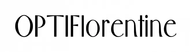
( Fonts by Castcraft Software - opti.netii.net - check the website before use )
An elegant and modern font with tall, slender characters and artistic strokes.
![OPTIFlorentine font caratteri gratis]() Scaricare 1253 Downloads@WebFont
Scaricare 1253 Downloads@WebFont -
( Fonts by Vanessa Bays - bythebutterfly.com )
A playful, handwritten font with smooth, rounded edges and a whimsical style.
![Just Gotta Smile font caratteri gratis]() Scaricare 1253 Downloads@WebFont
Scaricare 1253 Downloads@WebFont -
![WLM èxvwreff]() Scaricare 1253 Downloads@WebFont
Scaricare 1253 Downloads@WebFont -
![Sacred Place ExtraBlack UltraWide Extra Large font caratteri gratis]() Scaricare 1253 Downloads@WebFont
Scaricare 1253 Downloads@WebFont -
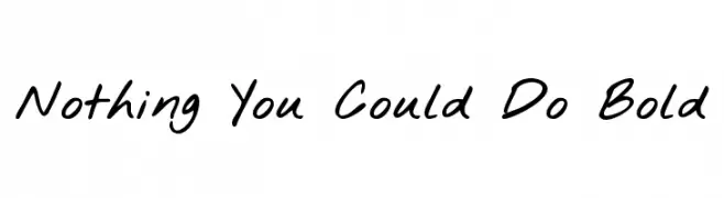
( Fonts by Kimberly Geswein - kimberlygeswein.com )
A bold, handwritten font with a casual and dynamic style.
![Nothing You Could Do Bold font caratteri gratis]() Scaricare 1253 Downloads@WebFont
Scaricare 1253 Downloads@WebFont -
![LongTime font caratteri gratis]() Scaricare 1253 Downloads@WebFont
Scaricare 1253 Downloads@WebFont -
![Stylograph font caratteri gratis]() Scaricare 1253 Downloads@WebFont
Scaricare 1253 Downloads@WebFont -
![SeriesOrbit font caratteri gratis]() Scaricare 1253 Downloads@WebFont
Scaricare 1253 Downloads@WebFont -
( Fonts by Iconian Fonts - Daniel Zadorozny )
A bold, condensed, and italicized font with a futuristic and angular design.
![Gunship Condensed Ital font caratteri gratis]() Scaricare 1253 Downloads@WebFont
Scaricare 1253 Downloads@WebFont -
( Fonts by Apostrophic Lab )
A playful, rounded font with smooth curves and a friendly appearance.
![Lilly font caratteri gratis]() Scaricare 1253 Downloads@WebFont
Scaricare 1253 Downloads@WebFont -
![Beast vs SpreadTall font caratteri gratis]() Scaricare 1253 Downloads@WebFont
Scaricare 1253 Downloads@WebFont


Quali sono i font più popolari adesso?
Poppins, Roboto, Montserrat, Open Sans e Lato sono molto usati per le forme pulite e l'ampia applicabilità — dall'identità di marca alle landing page e ai poster.
Quali font si usano spesso nei loghi?
Le sans serif geometriche (es. Poppins, famiglie in stile Gotham) sono scelte comuni per un branding pulito e scalabile. Per un tocco personale restano valide script e stili manoscritti. Abbina un display deciso per i titoli a un corpo testo neutro per riconoscibilità ed equilibrio.
Ogni quanto si aggiorna la lista?
Con regolarità, in base ai download e all'attività reale. Torna spesso per scoprire in anticipo le nuove preferite.
💡 Consiglio: aggiungi ai preferiti — le tendenze cambiano in fretta e i font top di oggi possono ispirare il rebranding di domani.