Benvenuto nelle Font Più Popolari — dove popolarità e qualità si incontrano. Qui trovi i font più scaricati e usati dell'anno. Se cerchi scelte sicure per logo, web o social, inizia da qui.
Ogni font top si distingue per equilibrio, leggibilità e versatilità. Troverai sans serif moderne, script eleganti, serif vintage e display minimalisti.
-
( Fonts by Md Shohail Bhuian - Personal-use only. For commercial use please contact owner. )
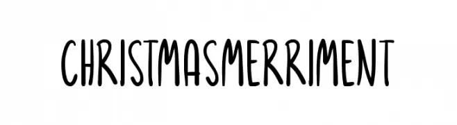
A playful, handwritten-style font with tall, narrow letters and rounded edges.
 Scaricare 38 Downloads@WebFont
 -
( Fonts by WC Fonts - Atypeek - Christophe Féray - Personal-use only. For commercial use please contact owner. )
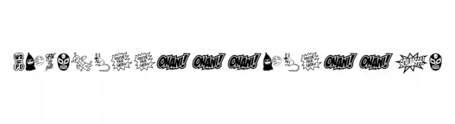
A decorative dingbat font with hand-drawn, comic-style illustrations and expressive symbols.
![WCSchlaasssClassic font caratteri gratis]() Scaricare 38 Downloads@WebFont
Scaricare 38 Downloads@WebFont -
( Fonts by Mans Greback - www.mansgreback.com - Personal-use only. For commercial use please contact owner. )
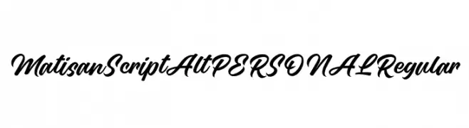
A bold, flowing script font with elegant, cursive letterforms.
![Matisan Script Alt PERSONAL Regular font caratteri gratis]() Scaricare 38 Downloads@WebFont
Scaricare 38 Downloads@WebFont -
( Fonts by Woodcutter Manero - www.woodcutter.es - Personal-use only. For commercial use please contact owner. )
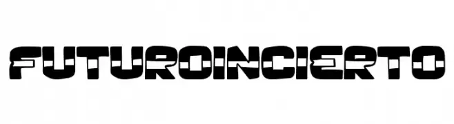
Bold geometric display font with cut-out details and a futuristic vibe.
![Futuro Incierto font caratteri gratis]() Scaricare 38 Downloads@WebFont
Scaricare 38 Downloads@WebFont -
( Fonts by Hadjar Creative - Personal-use only. For commercial use please contact owner. )
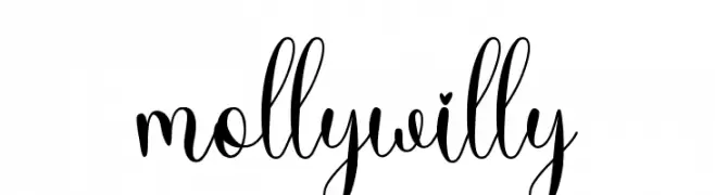
An elegant and whimsical script font with flowing, interconnected letters and playful loops.
![molly willy font caratteri gratis]() Scaricare 38 Downloads@WebFont
Scaricare 38 Downloads@WebFont -
( Fonts by Mozyen Studio - Personal-use only. For commercial use please contact owner. )
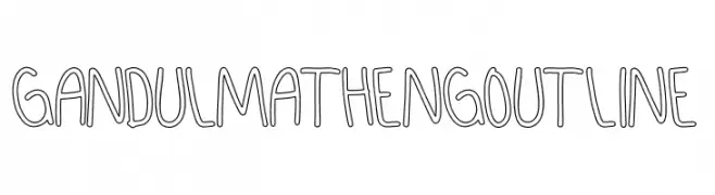
A playful, hand-drawn outline font with a casual and friendly style.
![GANDUL MATHENG Outline font caratteri gratis]() Scaricare 38 Downloads@WebFont
Scaricare 38 Downloads@WebFont -
( Fonts by Darrell Flood - Personal-use only. For commercial use please contact owner. )
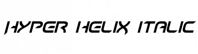
A futuristic, italic font with sharp angles and a dynamic, modern design.
![Hyper heliX Italic font caratteri gratis]() Scaricare 38 Downloads@WebFont
Scaricare 38 Downloads@WebFont -
( Fonts by Forberas Club - Personal-use only. For commercial use please contact owner. )
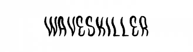
A dynamic, wave-like decorative font with energetic, jagged strokes.
![WavesKiller font caratteri gratis]() Scaricare 38 Downloads@WebFont
Scaricare 38 Downloads@WebFont -
( Fonts by Gilar Studio - Personal-use only. For commercial use please contact owner. )
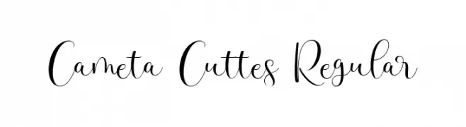
An elegant script font with flowing curves and bold uppercase letters.
![Cameta Cuttes Regular font caratteri gratis]() Scaricare 38 Downloads@WebFont
Scaricare 38 Downloads@WebFont -
( Fonts by Jimtype Studio - Personal-use only. For commercial use please contact owner. )
A playful, handwritten font with a whimsical and casual style.
![Sweet Like Honey font caratteri gratis]() Scaricare 38 Downloads@WebFont
Scaricare 38 Downloads@WebFont -
( Fonts by AukimVisuel - Audry Kitoko Makelele - Personal-use only. For commercial use please contact owner. )
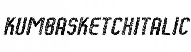
A sketch-style italic font with a hand-drawn, artistic appearance.
![Kumba Sketch Italic font caratteri gratis]() Scaricare 38 Downloads@WebFont
Scaricare 38 Downloads@WebFont -
( Fonts by weknow - Wino S Kadir - Personal-use only. For commercial use please contact owner. )
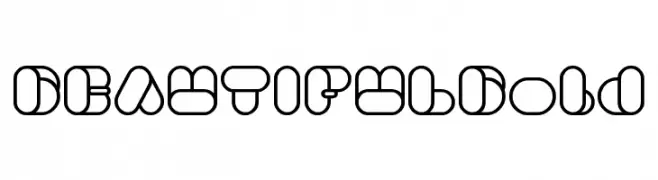
A bold, geometric font with overlapping shapes and a modern, decorative style.
![BEAUTIFUL Bold font caratteri gratis]() Scaricare 38 Downloads@WebFont
Scaricare 38 Downloads@WebFont -
( Fonts by Alpaprana Studio - Personal-use only. For commercial use please contact owner. )
A playful, handwritten font with bold, rounded strokes and a casual, friendly style.
![Another font caratteri gratis]() Scaricare 38 Downloads@WebFont
Scaricare 38 Downloads@WebFont -
( Fonts by Go Letter )
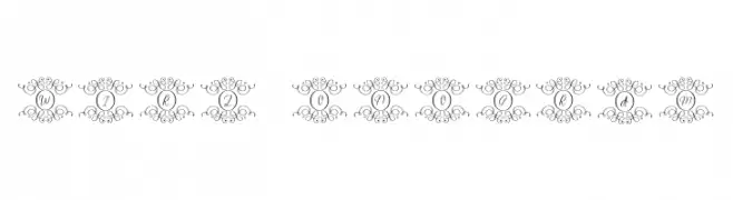
The image contains decorative monogram-style swirls, not a valid font.
![Swirl Monogram font caratteri gratis]() Scaricare 38 Downloads@WebFont
Scaricare 38 Downloads@WebFont -
( Fonts by Nirmana Visual - Sigit Dwipa - Personal-use only. For commercial use please contact owner. )
A playful, handwritten font with bold, dynamic letters and a lively style.
![DIARYKIDIESRegular font caratteri gratis]() Scaricare 38 Downloads@WebFont
Scaricare 38 Downloads@WebFont -
( Fonts by NanaNissa - Personal-use only. For commercial use please contact owner. )
An elegant script font with flowing, interconnected letters and decorative swashes.
![Cerlyneeta font caratteri gratis]() Scaricare 38 Downloads@WebFont
Scaricare 38 Downloads@WebFont -
( Fonts by Iconian Fonts - Daniel Zadorozny - Personal-use only. For commercial use please contact owner. )
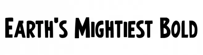
A bold, dynamic font with strong strokes and a playful style.
![Earth's Mightiest Bold font caratteri gratis]() Scaricare 38 Downloads@WebFont
Scaricare 38 Downloads@WebFont -
( Fonts by Mans Greback - www.mansgreback.com - Personal-use only. For commercial use please contact owner. )
A bold, expressive handwritten font with a casual and modern style.
![Samatha font caratteri gratis]() Scaricare 38 Downloads@WebFont
Scaricare 38 Downloads@WebFont -
( Fonts by Fachrur Rozzy - Personal-use only. For commercial use please contact owner. )
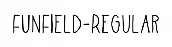
A playful, handwritten font with a casual and approachable style.
![FunField-Regular font caratteri gratis]() Scaricare 38 Downloads@WebFont
Scaricare 38 Downloads@WebFont -
( Fonts by Inermedia Studio - Personal-use only. For commercial use please contact owner. )
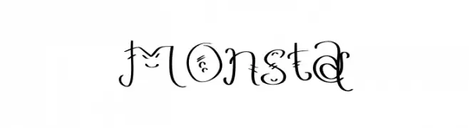
A whimsical and decorative font with ornate embellishments and playful design.
![MOnsta font caratteri gratis]() Scaricare 38 Downloads@WebFont
Scaricare 38 Downloads@WebFont -
( Fonts by Letterative Studio - Personal-use only. For commercial use please contact owner. )
A whimsical, elegant cursive font with flowing, decorative characters.
![Nostalgic font caratteri gratis]() Scaricare 38 Downloads@WebFont
Scaricare 38 Downloads@WebFont -
( Fonts by Iconian Fonts )
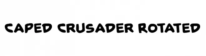
A bold, playful font with rounded edges and a dynamic style.
![Caped Crusader Rotated font caratteri gratis]() Scaricare 38 Downloads@WebFont
Scaricare 38 Downloads@WebFont -
( Fonts by JenggOut Studio - Personal-use only. For commercial use please contact owner. )
A playful, casual handwritten font with rounded, consistent strokes.
![Mondas Bold font caratteri gratis]() Scaricare 38 Downloads@WebFont
Scaricare 38 Downloads@WebFont -
( Fonts by GemFonts - Typotheticals - Graham Meade - Personal-use only. For commercial use please contact owner. )
A modern, condensed sans-serif font with semi-bold weight and geometric design.
![Walkway Condensed SemiBold font caratteri gratis]() Scaricare 38 Downloads@WebFont
Scaricare 38 Downloads@WebFont -
( Fonts by Pizzadude - Jakob Fischer - Personal-use only. For commercial use please contact owner. )
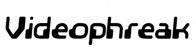
A bold, futuristic font with rounded edges and a sleek, modern design.
![Videophreak font caratteri gratis]() Scaricare 38 Downloads@WebFont
Scaricare 38 Downloads@WebFont -
( Fonts by Thirtypath - Personal-use only. For commercial use please contact owner. )
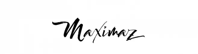
A bold, expressive handwritten font with dynamic strokes and artistic flair.
![Maximaz font caratteri gratis]() Scaricare 38 Downloads@WebFont
Scaricare 38 Downloads@WebFont -
( Fonts by Kong Font - fontkong.com - Personal-use only. For commercial use please contact owner. )
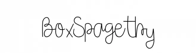
A playful, handwritten font with a whimsical and flowing style.
![Box Spagethy font caratteri gratis]() Scaricare 38 Downloads@WebFont
Scaricare 38 Downloads@WebFont -
( Fonts by Iconian Fonts - Daniel Zadorozny - Personal-use only. For commercial use please contact owner. )
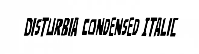
A bold, condensed italic font with a modern, edgy style.
![Disturbia Condensed Italic font caratteri gratis]() Scaricare 38 Downloads@WebFont
Scaricare 38 Downloads@WebFont -
( Fonts by GemFonts - Typotheticals - Graham Meade - Personal-use only. For commercial use please contact owner. )
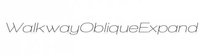
A modern, oblique font with thin, elongated characters and wide spacing.
![Walkway Oblique Expand font caratteri gratis]() Scaricare 38 Downloads@WebFont
Scaricare 38 Downloads@WebFont -
( Fonts by Iconian Fonts - Daniel Zadorozny - Personal-use only. For commercial use please contact owner. )
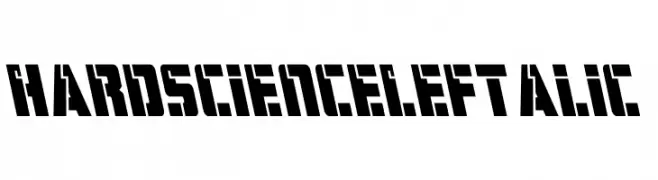
A bold, geometric font with a leftward slant and industrial style.
![Hard Science Leftalic font caratteri gratis]() Scaricare 38 Downloads@WebFont
Scaricare 38 Downloads@WebFont -
( Personal-use only. For commercial use please contact owner. )
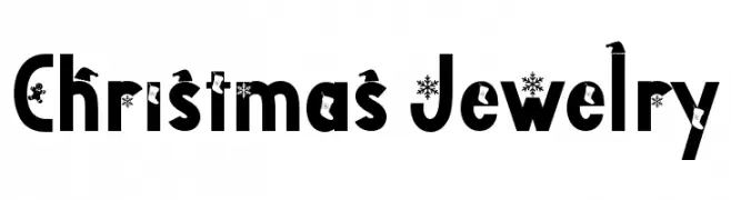
Bold, festive display font with Christmas-themed decorations.
![Christmas Jewelry font caratteri gratis]() Scaricare 38 Downloads@WebFont
Scaricare 38 Downloads@WebFont -
( Fonts by Kong Font - Personal-use only. For commercial use please contact owner. )
A bold, italicized font with angular lines and a dynamic style.
![Emizen font caratteri gratis]() Scaricare 38 Downloads@WebFont
Scaricare 38 Downloads@WebFont -
( Fonts by Mans Greback - www.mansgreback.com - Personal-use only. For commercial use please contact owner. )
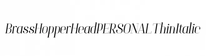
A sleek, thin, italic font with high contrast and elegant style.
![Brass Hopper Head PERSONAL Thin Italic font caratteri gratis]() Scaricare 38 Downloads@WebFont
Scaricare 38 Downloads@WebFont -
( Fonts by Isuzu Hinode - Personal-use only. For commercial use please contact owner. )
A decorative, geometric font with a cryptic and futuristic design.
![Yelekish Font Regular font caratteri gratis]() Scaricare 38 Downloads@WebFont
Scaricare 38 Downloads@WebFont -
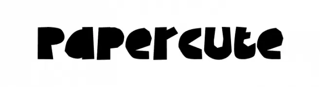
( Fonts by Tokokoo Studio )
Bold, playful font with a cut-paper, handcrafted appearance.
![Papercute font caratteri gratis]() Scaricare 38 Downloads@WebFont
Scaricare 38 Downloads@WebFont


Quali sono i font più popolari adesso?
Poppins, Roboto, Montserrat, Open Sans e Lato sono molto usati per le forme pulite e l'ampia applicabilità — dall'identità di marca alle landing page e ai poster.
Quali font si usano spesso nei loghi?
Le sans serif geometriche (es. Poppins, famiglie in stile Gotham) sono scelte comuni per un branding pulito e scalabile. Per un tocco personale restano valide script e stili manoscritti. Abbina un display deciso per i titoli a un corpo testo neutro per riconoscibilità ed equilibrio.
Ogni quanto si aggiorna la lista?
Con regolarità, in base ai download e all'attività reale. Torna spesso per scoprire in anticipo le nuove preferite.
💡 Consiglio: aggiungi ai preferiti — le tendenze cambiano in fretta e i font top di oggi possono ispirare il rebranding di domani.