Benvenuto nelle Font Più Popolari — dove popolarità e qualità si incontrano. Qui trovi i font più scaricati e usati dell'anno. Se cerchi scelte sicure per logo, web o social, inizia da qui.
Ogni font top si distingue per equilibrio, leggibilità e versatilità. Troverai sans serif moderne, script eleganti, serif vintage e display minimalisti.
-
( Fonts by www.peter-wiegel.de. Personal-use only. For commercial use please contact owner. )
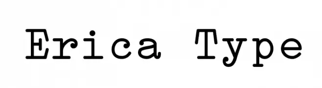
A monospaced font with slab serif elements, offering a structured and uniform appearance.
 Scaricare 1251 Downloads@WebFont
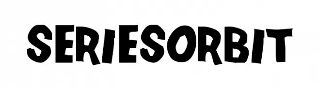
 -
![SeriesOrbit font caratteri gratis]() Scaricare 1251 Downloads@WebFont
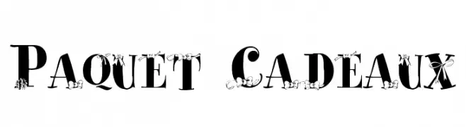
Scaricare 1251 Downloads@WebFont -
![Paquet Cadeaux font caratteri gratis]() Scaricare 1251 Downloads@WebFont
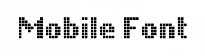
Scaricare 1251 Downloads@WebFont -
![Mobile Font font caratteri gratis]() Scaricare 1251 Downloads@WebFont
Scaricare 1251 Downloads@WebFont -
( Free for a personal use. For a commercial use please visit www.kevinandamanda.com )
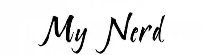
A bold, expressive script font with fluid, brush-like strokes.
![My Nerd font caratteri gratis]() Scaricare 1251 Downloads@WebFont
Scaricare 1251 Downloads@WebFont -
( Fonts by Iconian Fonts - Daniel Zadorozny )
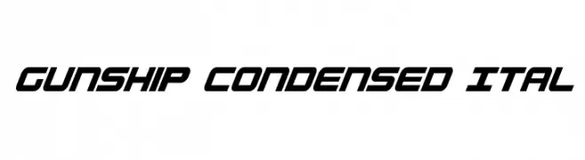
A bold, condensed, and italicized font with a futuristic and angular design.
![Gunship Condensed Ital font caratteri gratis]() Scaricare 1251 Downloads@WebFont
Scaricare 1251 Downloads@WebFont -
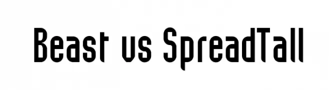
![Beast vs SpreadTall font caratteri gratis]() Scaricare 1251 Downloads@WebFont
Scaricare 1251 Downloads@WebFont -
( Fonts by Ospiro Enterprises - Personal-use only. For commercial use please contact owner. )
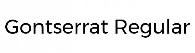
A modern, geometric sans-serif font with balanced proportions and uniform stroke width.
![Gontserrat Regular font caratteri gratis]() Scaricare 1250 Downloads@WebFont
Scaricare 1250 Downloads@WebFont -
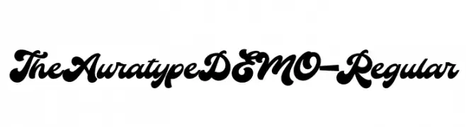
Caratteri di Auratype. For commercial use please contact the owner.
( The Auratype is retro and classic typeface who inspired by the 60s - 80s designs with more unique explored style like swosh and alternate character. This font made from manual sketch with many many scratch then finished to font. Make your designs project )
A bold, flowing script font with smooth, connected letters.
![TheAuratypeDEMO-Regular font caratteri gratis]() Scaricare 1250 Downloads@WebFont
Scaricare 1250 Downloads@WebFont -
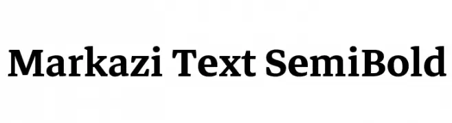
( Fonts by Markazi Text Authors - Personal-use only. For commercial use please contact owner. )
A classic serif typeface with semi-bold weight and medium contrast, ideal for formal text.
![Markazi Text SemiBold font caratteri gratis]() Scaricare 1250 Downloads@WebFont
Scaricare 1250 Downloads@WebFont -
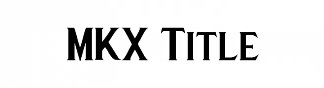
( Fonts by Dennis Ferrand )
A bold, geometric font with a modern and authoritative style.
![MKX Title font caratteri gratis]() Scaricare 1250 Downloads@WebFont
Scaricare 1250 Downloads@WebFont -
![Adigiana Ultra font caratteri gratis]() Scaricare 1250 Downloads@WebFont
Scaricare 1250 Downloads@WebFont -
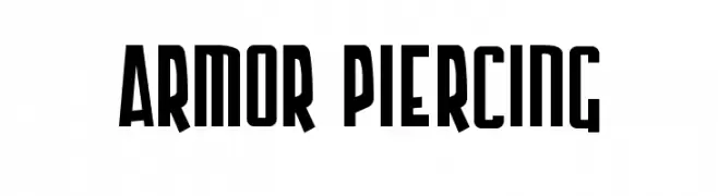
( Fonts by www.blambot.com )
A bold, modern font with tall, narrow characters and consistent stroke width.
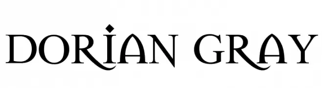
![Armor Piercing font caratteri gratis]() Scaricare 1250 Downloads@WebFont
Scaricare 1250 Downloads@WebFont -
![Dorian Gray font caratteri gratis]() Scaricare 1250 Downloads@WebFont
Scaricare 1250 Downloads@WebFont -
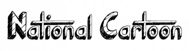
( Fonts by Jonathan Harris - www.tattoowoo.com )
A playful, hand-drawn font with a sketch-like, three-dimensional appearance.
![National Cartoon font caratteri gratis]() Scaricare 1250 Downloads@WebFont
Scaricare 1250 Downloads@WebFont -
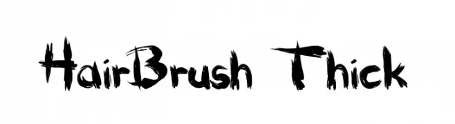
( Fonts by Mickey Rossi - www.subflux.com )
A bold, expressive brush-style font with dynamic, handcrafted strokes.
![HairBrush Thick font caratteri gratis]() Scaricare 1250 Downloads@WebFont
Scaricare 1250 Downloads@WebFont -
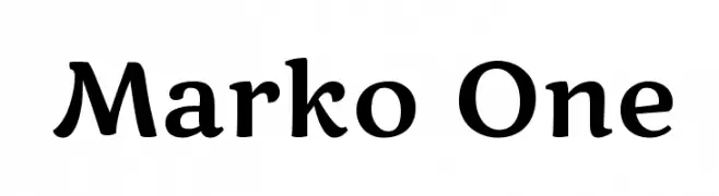
( Copyright (c) 2011, Cyreal (www.cyreal.org) )
A modern serif font with playful curves and a bold presence.
![Marko One font caratteri gratis]() Scaricare 1250 Downloads@WebFont
Scaricare 1250 Downloads@WebFont -
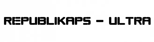
( Fonts by Apostrophic Lab )
A bold, geometric font with rounded edges and a modern aesthetic.
![Republikaps - Ultra font caratteri gratis]() Scaricare 1250 Downloads@WebFont
Scaricare 1250 Downloads@WebFont -
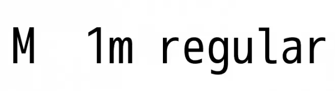
![M+ 1m regular font caratteri gratis]() Scaricare 1250 Downloads@WebFont
Scaricare 1250 Downloads@WebFont -
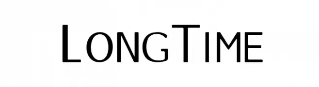
![LongTime font caratteri gratis]() Scaricare 1250 Downloads@WebFont
Scaricare 1250 Downloads@WebFont -
![Stylograph font caratteri gratis]() Scaricare 1250 Downloads@WebFont
Scaricare 1250 Downloads@WebFont -
( Fonts by Burhan Afif - hanscostudio.com - Personal-use only. For commercial use please contact owner. )
A modern, geometric font with bold, angular lines.
![Zeniq Nano font caratteri gratis]() Scaricare 1249 Downloads@WebFont
Scaricare 1249 Downloads@WebFont -
( Copyright (c) 2015 Ek Type (www.ektype.in) )
A bold, rounded font with smooth curves and a playful style.
![Baloo Bhaina 2 ExtraBold font caratteri gratis]() Scaricare 1249 Downloads@WebFont
Scaricare 1249 Downloads@WebFont -
( Zetafonts - www.zetafonts.com )
A modern, clean sans-serif font with geometric uniformity and excellent readability.
![Codec Warm Trial News font caratteri gratis]() Scaricare 1249 Downloads@WebFont
Scaricare 1249 Downloads@WebFont -
( Fonts by Sacha Hills. Free ONLY FOR personal use. For commercial use please contact sachahills[a-t]live.com . )
A bold, playful handwritten font with rounded, consistent strokes.
![Sacha_Sharpie_2 font caratteri gratis]() Scaricare 1249 Downloads@WebFont
Scaricare 1249 Downloads@WebFont -
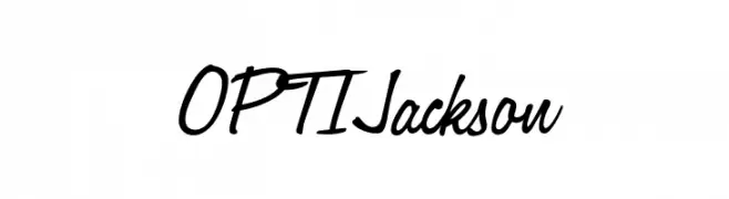
( Fonts by Castcraft Software - opti.netii.net - check the website before use )
A lively handwritten font with fluid strokes and elegant slant.
![OPTIJackson font caratteri gratis]() Scaricare 1249 Downloads@WebFont
Scaricare 1249 Downloads@WebFont -
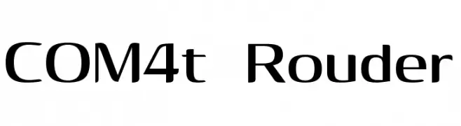
( Fonts by Hideki Katayama - com4t-fff.seesaa.net )
A sleek, modern font with clean lines and a slightly condensed style.
![COM4t Rouder font caratteri gratis]() Scaricare 1249 Downloads@WebFont
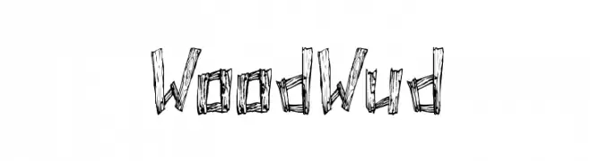
Scaricare 1249 Downloads@WebFont -
![WoodWud font caratteri gratis]() Scaricare 1249 Downloads@WebFont
Scaricare 1249 Downloads@WebFont -
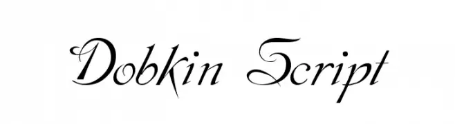
( Fonts by Dieter Steffmann )
An elegant script font with flowing, ornate swashes and flourishes.
![Dobkin Script font caratteri gratis]() Scaricare 1249 Downloads@WebFont
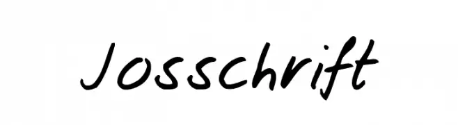
Scaricare 1249 Downloads@WebFont -
![Josschrift font caratteri gratis]() Scaricare 1249 Downloads@WebFont
Scaricare 1249 Downloads@WebFont -
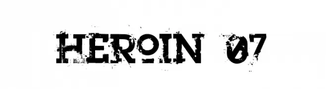
( Fonts by a Clement Nicolle - www.stereo-type.fr . Personal-use only. For commercial use please contact owner. )
A bold, distressed font with a grunge aesthetic and rugged texture.
![Heroin 07 font caratteri gratis]() Scaricare 1249 Downloads@WebFont
Scaricare 1249 Downloads@WebFont -
( Fonts by ShyFonts )
A futuristic, geometric font with a sleek, condensed design.
![SF Electrotome Condensed font caratteri gratis]() Scaricare 1249 Downloads@WebFont
Scaricare 1249 Downloads@WebFont -
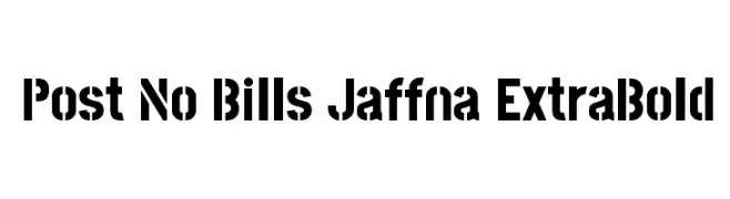
( Copyright (c) 2013-2015 Post No Bills Project Authors (https://github.com/mooniak/post-no-bills-font). )
A bold, stencil-like font with high contrast and industrial appeal.
![Post No Bills Jaffna ExtraBold font caratteri gratis]() Scaricare 1248 Downloads@WebFont
Scaricare 1248 Downloads@WebFont -
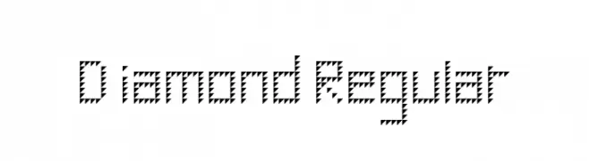
( Fonts by Geronimo Fonts - Personal-use only. For commercial use please contact owner. )
A geometric, zigzag-patterned font with a bold and artistic style.
![Diamond Regular font caratteri gratis]() Scaricare 1248 Downloads@WebFont
Scaricare 1248 Downloads@WebFont -
( Fonts by Måns Grebäck )
A playful, bold font with rounded edges and a bubbly appearance.
![Choko Plain font caratteri gratis]() Scaricare 1248 Downloads@WebFont
Scaricare 1248 Downloads@WebFont


Quali sono i font più popolari adesso?
Poppins, Roboto, Montserrat, Open Sans e Lato sono molto usati per le forme pulite e l'ampia applicabilità — dall'identità di marca alle landing page e ai poster.
Quali font si usano spesso nei loghi?
Le sans serif geometriche (es. Poppins, famiglie in stile Gotham) sono scelte comuni per un branding pulito e scalabile. Per un tocco personale restano valide script e stili manoscritti. Abbina un display deciso per i titoli a un corpo testo neutro per riconoscibilità ed equilibrio.
Ogni quanto si aggiorna la lista?
Con regolarità, in base ai download e all'attività reale. Torna spesso per scoprire in anticipo le nuove preferite.
💡 Consiglio: aggiungi ai preferiti — le tendenze cambiano in fretta e i font top di oggi possono ispirare il rebranding di domani.