Benvenuto nelle Font Più Popolari — dove popolarità e qualità si incontrano. Qui trovi i font più scaricati e usati dell'anno. Se cerchi scelte sicure per logo, web o social, inizia da qui.
Ogni font top si distingue per equilibrio, leggibilità e versatilità. Troverai sans serif moderne, script eleganti, serif vintage e display minimalisti.
-
( Personal-use only. For commercial use please contact owner. )
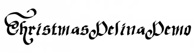
Ornate blackletter style with dramatic swashes and high contrast.
 Scaricare 38 Downloads@WebFont
 -
( Fonts by Gassstype - Anang Fibriyanto - www.gassstype.com - Personal-use only. For commercial use please contact owner. )
A bold, energetic brush-style font with a hand-drawn feel.
![Fast Lane font caratteri gratis]() Scaricare 38 Downloads@WebFont
Scaricare 38 Downloads@WebFont -
( Fonts by Iconian Fonts - Daniel Zadorozny - Personal-use only. For commercial use please contact owner. )
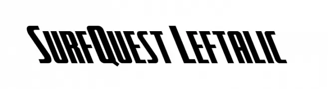
A bold, slanted font with a dynamic and modern style.
![SurfQuest Leftalic font caratteri gratis]() Scaricare 38 Downloads@WebFont
Scaricare 38 Downloads@WebFont -
( Fonts by DumadiStyle - Toni Dzulham - Personal-use only. For commercial use please contact owner. )
A bold, hand-drawn style font with energetic and playful characteristics.
![Remover font caratteri gratis]() Scaricare 38 Downloads@WebFont
Scaricare 38 Downloads@WebFont -
( Fonts by Vz Type - Personal-use only. For commercial use please contact owner. )
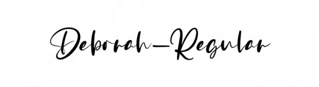
A flowing, cursive font with elegant, sweeping strokes and a handwritten appearance.
![Deborah-Regular font caratteri gratis]() Scaricare 38 Downloads@WebFont
Scaricare 38 Downloads@WebFont -
( Personal-use only. For commercial use please contact owner. )
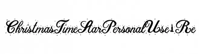
Festive, star-accented script font with holiday-themed embellishments.
![ChristmasTimeStarPersonalUse-Re font caratteri gratis]() Scaricare 38 Downloads@WebFont
Scaricare 38 Downloads@WebFont -
( Fonts by Edric Studio - Personal-use only. For commercial use please contact owner. )
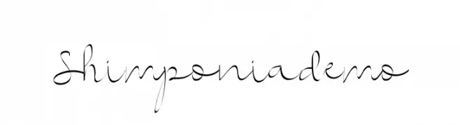
An elegant and decorative script font with flowing, cursive letterforms.
![Shimponiademo font caratteri gratis]() Scaricare 38 Downloads@WebFont
Scaricare 38 Downloads@WebFont -
( Fonts by Letterfand.Studio - Yusuf Afandi - Personal-use only. For commercial use please contact owner. )
An elegant, flowing script font with interconnected letters and a sophisticated style.
![Baybe Evaline font caratteri gratis]() Scaricare 38 Downloads@WebFont
Scaricare 38 Downloads@WebFont -
( Fonts by Pen Culture - Revo Farisky - Personal-use only. For commercial use please contact owner. )
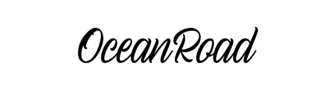
A dynamic cursive script font with elegant, flowing strokes.
![Ocean Road font caratteri gratis]() Scaricare 38 Downloads@WebFont
Scaricare 38 Downloads@WebFont -
( Fonts by The Ocean Studio - Laire Banyu Sandi Pawenang - Personal-use only. For commercial use please contact owner. )
A whimsical, artistic handwritten font with flowing, interconnected letterforms.
![Holy Type font caratteri gratis]() Scaricare 38 Downloads@WebFont
Scaricare 38 Downloads@WebFont -
( Fonts by Vunira Design - Personal-use only. For commercial use please contact owner. )
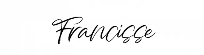
A dynamic, fluid handwritten font with elegant cursive strokes.
![Francisse font caratteri gratis]() Scaricare 38 Downloads@WebFont
Scaricare 38 Downloads@WebFont -
( Fonts by Vunira Design - Personal-use only. For commercial use please contact owner. )
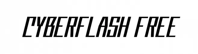
A bold, futuristic font with angular lines and a dynamic slant.
![Cyberflash FREE font caratteri gratis]() Scaricare 38 Downloads@WebFont
Scaricare 38 Downloads@WebFont -
( Fonts by Khurasan - Syaf Rizal - Personal-use only. For commercial use please contact owner. )
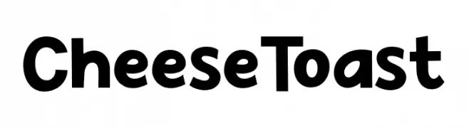
A playful, bold font with a hand-drawn, whimsical style.
![Cheese Toast font caratteri gratis]() Scaricare 38 Downloads@WebFont
Scaricare 38 Downloads@WebFont -
( Fonts by Mans Greback - www.mansgreback.com - Personal-use only. For commercial use please contact owner. )
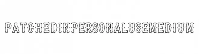
A bold, decorative font with a unique outline style, ideal for vintage-themed projects.
![Patched In PERSONAL USE Medium font caratteri gratis]() Scaricare 38 Downloads@WebFont
Scaricare 38 Downloads@WebFont -
( Personal-use only. For commercial use please contact owner. )
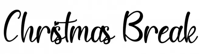
Casual, handwritten script with tall, flowing letters and playful energy.
![Christmas Break font caratteri gratis]() Scaricare 38 Downloads@WebFont
Scaricare 38 Downloads@WebFont -
( Fonts by Letterafa Studio )
Expressive, angular script with a bold, hand-drawn look.
![Gemfity font caratteri gratis]() Scaricare 38 Downloads@WebFont
Scaricare 38 Downloads@WebFont -
( Fonts by Gassstype - Anang Fibriyanto - www.gassstype.com - Personal-use only. For commercial use please contact owner. )
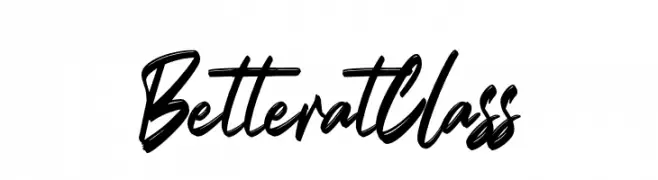
A bold, dynamic handwritten font with expressive strokes and fluid motion.
![Better at Class font caratteri gratis]() Scaricare 38 Downloads@WebFont
Scaricare 38 Downloads@WebFont -
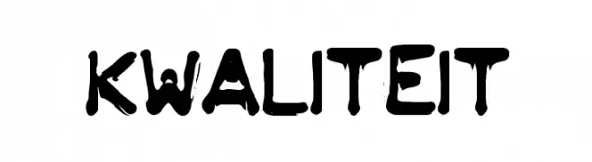
![KWALITEIT font caratteri gratis]() Scaricare 38 Downloads
Scaricare 38 Downloads -
( Fonts by weknow - Wino S Kadir - Personal-use only. For commercial use please contact owner. )
A bold, artistic font with circular and looping strokes, offering a modern twist.
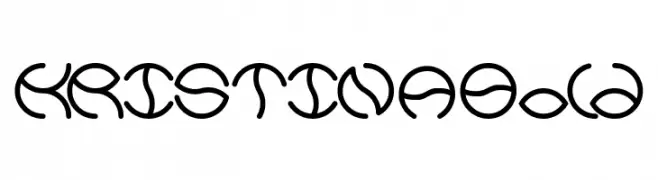
![KRISTINA Bold font caratteri gratis]() Scaricare 38 Downloads@WebFont
Scaricare 38 Downloads@WebFont -
( Fonts by Edric Studio - Personal-use only. For commercial use please contact owner. )
An elegant, flowing script font with a modern calligraphic style.
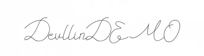
![Devllin DEMO font caratteri gratis]() Scaricare 38 Downloads@WebFont
Scaricare 38 Downloads@WebFont -
( Fonts by Letterena Studios - letterena.com - Personal-use only. For commercial use please contact owner. )
A bold, playful, and slightly italicized font with rounded characters.
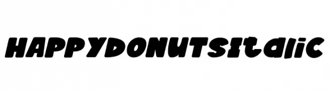
![HAPPY DONUTS Italic font caratteri gratis]() Scaricare 38 Downloads@WebFont
Scaricare 38 Downloads@WebFont -
( Fonts by Fitrah Type )
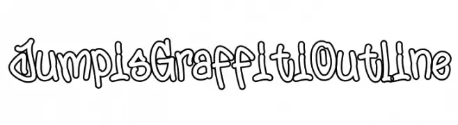
Graffiti-style outlined font with energetic, hand-drawn shapes.
![Jumpis Graffiti Outline font caratteri gratis]() Scaricare 38 Downloads@WebFont
Scaricare 38 Downloads@WebFont -
( Fonts by Iconian Fonts - Daniel Zadorozny - Personal-use only. For commercial use please contact owner. )
A bold, angular font with a futuristic and geometric design.
![Crossbow Head Expanded Leftal font caratteri gratis]() Scaricare 38 Downloads@WebFont
Scaricare 38 Downloads@WebFont -
( Fonts by Gilz Creative Studio - Gilz Type - Personal-use only. For commercial use please contact owner. )
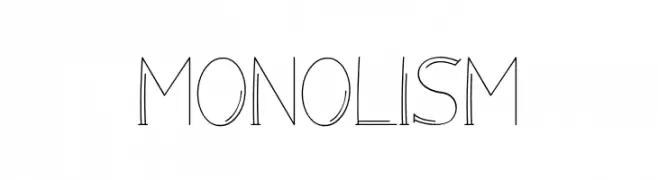
A playful, hand-drawn font with thin, uneven strokes and a whimsical style.
![Monolism font caratteri gratis]() Scaricare 38 Downloads@WebFont
Scaricare 38 Downloads@WebFont -
( Fonts by 177Studio )
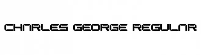
A bold, geometric font with angular, futuristic characters.
![CHARLES GEORGE Regular font caratteri gratis]() Scaricare 38 Downloads@WebFont
Scaricare 38 Downloads@WebFont -
( Personal-use only. For commercial use please contact owner. )
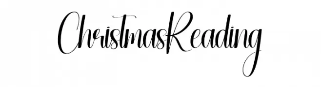
A decorative, high-contrast script with elegant, flowing strokes.
![Christmas Reading font caratteri gratis]() Scaricare 38 Downloads@WebFont
Scaricare 38 Downloads@WebFont -
( Fonts by Iconian Fonts - Daniel Zadorozny - Personal-use only. For commercial use please contact owner. )
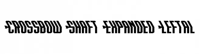
A bold, expanded font with geometric and angular design, perfect for modern displays.
![Crossbow Shaft Expanded Leftal font caratteri gratis]() Scaricare 38 Downloads@WebFont
Scaricare 38 Downloads@WebFont -
( Fonts by Letterfand.Studio - Yusuf Afandi - Personal-use only. For commercial use please contact owner. )
A playful and elegant script font with a handwritten style.
![infelinery font caratteri gratis]() Scaricare 38 Downloads@WebFont
Scaricare 38 Downloads@WebFont -
( Fonts by Letterena Studios - letterena.com - Personal-use only. For commercial use please contact owner. )
A modern, tall, and narrow font with clean lines and minimal curves.
![Wellcome Paradise font caratteri gratis]() Scaricare 38 Downloads@WebFont
Scaricare 38 Downloads@WebFont -
( Fonts by StringLabs - stringlabscreative.com - Personal-use only. For commercial use please contact owner. )
A lively and expressive handwritten font with dynamic strokes.
![Catthy Wellingten font caratteri gratis]() Scaricare 38 Downloads@WebFont
Scaricare 38 Downloads@WebFont -
( Personal-use only. For commercial use please contact owner. )
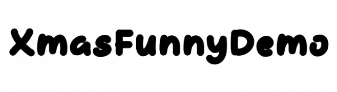
Playful, rounded, and bold hand-drawn display font.
![Xmas Funny Demo font caratteri gratis]() Scaricare 38 Downloads@WebFont
Scaricare 38 Downloads@WebFont -
( Fonts by Zoya Feldman - Personal-use only. For commercial use please contact owner. )
A geometric, angular font with a futuristic and digital style.
![Four Four Regular font caratteri gratis]() Scaricare 38 Downloads@WebFont
Scaricare 38 Downloads@WebFont -
( Fonts by Vladimir Nikolic - www.creativefabrica.com/designer/vladimirnikolic/ - Personal-use only. For commercial use please contact owner. )
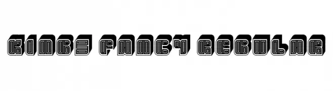
A bold, decorative font with a layered, geometric design.
![Kings Fancy Regular font caratteri gratis]() Scaricare 38 Downloads@WebFont
Scaricare 38 Downloads@WebFont -
( Fonts by Iconian Fonts - Daniel Zadorozny - Personal-use only. For commercial use please contact owner. )
A bold, angular font with a futuristic and dynamic style.
![Crossbow Head font caratteri gratis]() Scaricare 38 Downloads@WebFont
Scaricare 38 Downloads@WebFont -
( Fonts by M )
Graffiti-style decorative symbol font with bold, hand-drawn shapes and spray-paint effects.
![Aerosoldier Symbol PERSONAL Regular font caratteri gratis]() Scaricare 38 Downloads@WebFont
Scaricare 38 Downloads@WebFont


Quali sono i font più popolari adesso?
Poppins, Roboto, Montserrat, Open Sans e Lato sono molto usati per le forme pulite e l'ampia applicabilità — dall'identità di marca alle landing page e ai poster.
Quali font si usano spesso nei loghi?
Le sans serif geometriche (es. Poppins, famiglie in stile Gotham) sono scelte comuni per un branding pulito e scalabile. Per un tocco personale restano valide script e stili manoscritti. Abbina un display deciso per i titoli a un corpo testo neutro per riconoscibilità ed equilibrio.
Ogni quanto si aggiorna la lista?
Con regolarità, in base ai download e all'attività reale. Torna spesso per scoprire in anticipo le nuove preferite.
💡 Consiglio: aggiungi ai preferiti — le tendenze cambiano in fretta e i font top di oggi possono ispirare il rebranding di domani.