Benvenuto nelle Font Più Popolari — dove popolarità e qualità si incontrano. Qui trovi i font più scaricati e usati dell'anno. Se cerchi scelte sicure per logo, web o social, inizia da qui.
Ogni font top si distingue per equilibrio, leggibilità e versatilità. Troverai sans serif moderne, script eleganti, serif vintage e display minimalisti.
-
( Fonts by P. Baudin )
A decorative font with a cross-stitch pattern, ideal for crafty and vintage-themed projects.
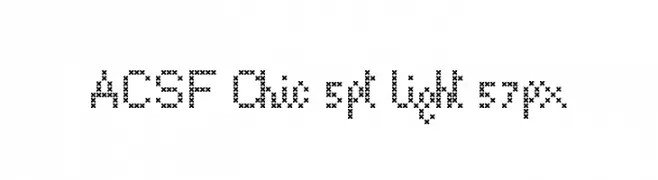 Scaricare 32 Downloads@WebFont
 -
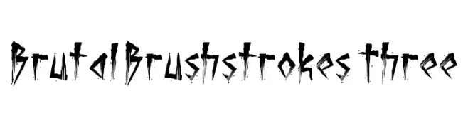
( Fonts by PutraCetol Studio )
A bold, chaotic brushstroke font with sharp, distressed edges.
![Brutal Brushstrokes Three font caratteri gratis]() Scaricare 32 Downloads@WebFont
Scaricare 32 Downloads@WebFont -
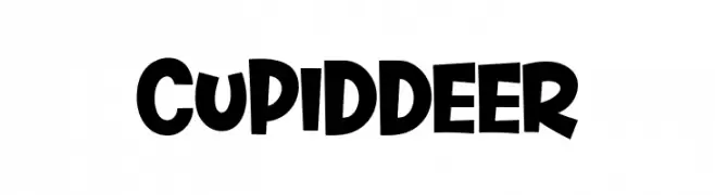
( Fonts by Khurasan - Syaf Rizal - Personal-use only. For commercial use please contact owner. )
A bold, playful font with rounded, whimsical characters.
![Cupid Deer font caratteri gratis]() Scaricare 32 Downloads@WebFont
Scaricare 32 Downloads@WebFont -
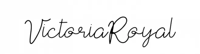
( Fonts by Integritype Studio - Personal-use only. For commercial use please contact owner. )
A cursive, handwritten font with elegant, flowing strokes.
![Victoria Royal font caratteri gratis]() Scaricare 32 Downloads@WebFont
Scaricare 32 Downloads@WebFont -
( Fonts by Digital Typeface Studio - Eva Barabasne Olasz - Personal-use only. For commercial use please contact owner. )
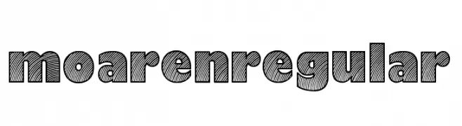
A bold, decorative font with a unique striped pattern for impactful designs.
![Moaren Regular font caratteri gratis]() Scaricare 32 Downloads@WebFont
Scaricare 32 Downloads@WebFont -
( Fonts by Kong Font - Personal-use only. For commercial use please contact owner. )
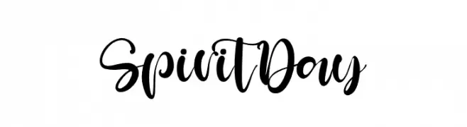
A lively and expressive script font with flowing, interconnected letterforms.
![SpiritDay font caratteri gratis]() Scaricare 32 Downloads@WebFont
Scaricare 32 Downloads@WebFont -
( Fonts by Variatype - Mukhlis Muhammad - Personal-use only. For commercial use please contact owner. )
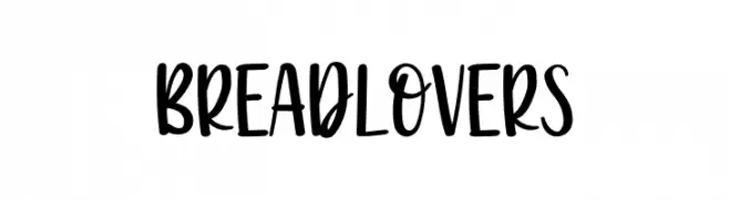
A bold, playful handwritten font with a lively and informal style.
![Breadlovers font caratteri gratis]() Scaricare 32 Downloads@WebFont
Scaricare 32 Downloads@WebFont -
( Fonts by Jetsmax.com - Personal-use only. For commercial use please contact owner. )
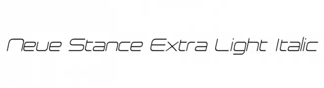
A sleek, modern, extra-light italic font with a futuristic and minimalistic design.
![Neue Stance Extra Light Italic font caratteri gratis]() Scaricare 32 Downloads@WebFont
Scaricare 32 Downloads@WebFont -
( Fonts by Skiiller Studio - Personal-use only. For commercial use please contact owner. )
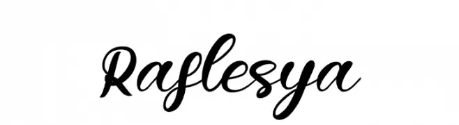
A dynamic and elegant script font with flowing, cursive letterforms.
![Raflesya font caratteri gratis]() Scaricare 32 Downloads@WebFont
Scaricare 32 Downloads@WebFont -
( Fonts by Julien Halgand )
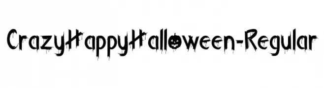
A decorative, dripping Halloween-themed display font.
![CrazyHappyHalloween-Regular font caratteri gratis]() Scaricare 32 Downloads@WebFont
Scaricare 32 Downloads@WebFont -
( Fonts by Letterafa Studio - Ahmad Afandi - Personal-use only. For commercial use please contact owner. )
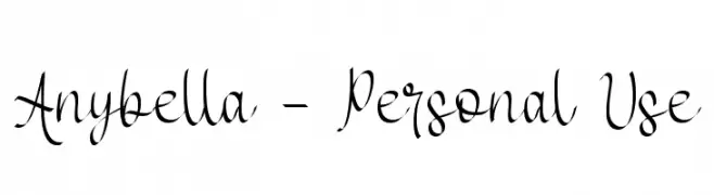
An elegant, flowing script font with sophisticated cursive letterforms.
![Anybella - Personal Use font caratteri gratis]() Scaricare 32 Downloads@WebFont
Scaricare 32 Downloads@WebFont -
( Fonts by Pria Admaja - Personal-use only. For commercial use please contact owner. )
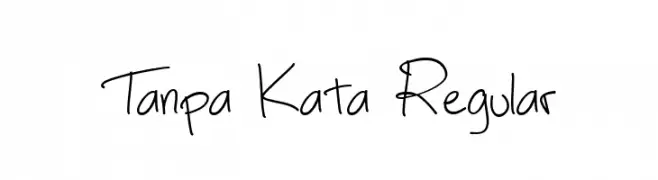
A casual, handwritten font with a playful and approachable style.
![Tanpa Kata Regular font caratteri gratis]() Scaricare 32 Downloads@WebFont
Scaricare 32 Downloads@WebFont -
( Personal-use only. For commercial use please contact owner. )
![Bitten font caratteri gratis]() Scaricare 32 Downloads@WebFont
Scaricare 32 Downloads@WebFont -
( Fonts by Perspectype Studio - Personal-use only. For commercial use please contact owner. )
An elegant and sophisticated script typeface with flowing curves and delicate swashes.
![Melanytha font caratteri gratis]() Scaricare 32 Downloads@WebFont
Scaricare 32 Downloads@WebFont -
( Fonts by Subectype & Orenari - Rangga Subekti & Ari - Personal-use only. For commercial use please contact owner. )
A playful, handwritten font with bold, rounded strokes and a dynamic slant.
![CuteGorilla font caratteri gratis]() Scaricare 32 Downloads@WebFont
Scaricare 32 Downloads@WebFont -
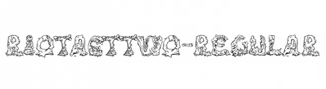
( Fonts by Typodermic Fonts - Raymond Larabie - Personal-use only. For commercial use please contact owner. )
A decorative, gooey, and textured font ideal for creative projects.
![RiotActTwo-Regular font caratteri gratis]() Scaricare 32 Downloads@WebFont
Scaricare 32 Downloads@WebFont -
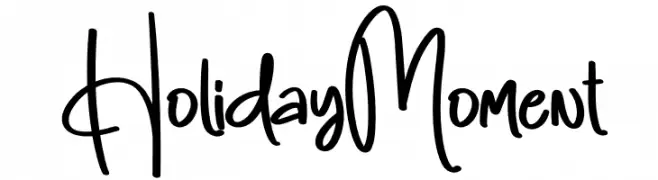
( Personal-use only. For commercial use please contact owner. )
Casual, handwritten script with playful energy and varied stroke thickness.
![Holiday Moment font caratteri gratis]() Scaricare 32 Downloads@WebFont
Scaricare 32 Downloads@WebFont -
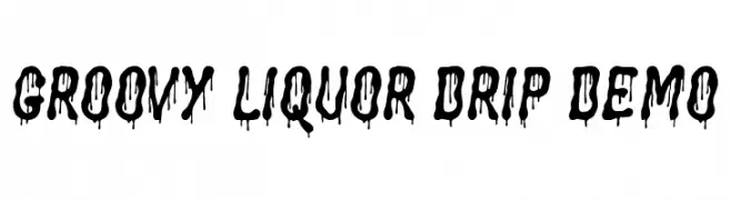
( Personal-use only. For commercial use please contact owner. )
![Groovy Liquor Drip Demo font caratteri gratis]() Scaricare 32 Downloads@WebFont
Scaricare 32 Downloads@WebFont -
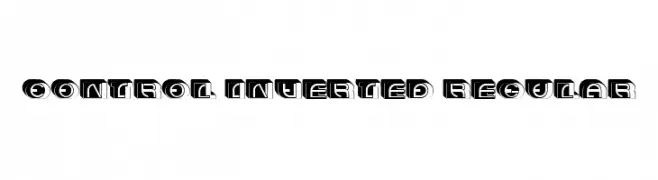
( Fonts by Vladimir Nikolic - www.creativefabrica.com/designer/vladimirnikolic/ - Personal-use only. For commercial use please contact owner. )
A bold, three-dimensional font with a modern, inverted color scheme and geometric structure.
![Control Inverted Regular font caratteri gratis]() Scaricare 32 Downloads@WebFont
Scaricare 32 Downloads@WebFont -
( Fonts by Perspectype Studio - Personal-use only. For commercial use please contact owner. )
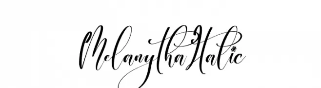
An elegant, italic script font with flowing, cursive letters and high contrast strokes.
![Melanytha Italic font caratteri gratis]() Scaricare 32 Downloads@WebFont
Scaricare 32 Downloads@WebFont -
( Fonts by Mans Greback - www.mansgreback.com - Personal-use only. For commercial use please contact owner. )
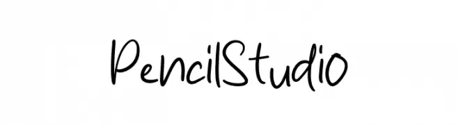
A playful, casual handwritten font with smooth, flowing lines.
![Pencil Studio font caratteri gratis]() Scaricare 32 Downloads@WebFont
Scaricare 32 Downloads@WebFont -
( Fonts by Iconian Fonts - Daniel Zadorozny - Personal-use only. For commercial use please contact owner. )
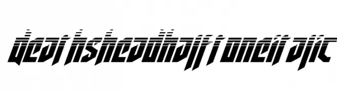
A bold, angular, italic font with a halftone effect for a futuristic look.
![Deathshead Halftone Italic font caratteri gratis]() Scaricare 32 Downloads@WebFont
Scaricare 32 Downloads@WebFont -
( Fonts by Heinzel Std - Personal-use only. For commercial use please contact owner. )
A graceful, cursive script font with fluid, natural strokes.
![Clarisa Script font caratteri gratis]() Scaricare 32 Downloads@WebFont
Scaricare 32 Downloads@WebFont -
( Fonts by UI Creative - Personal-use only. For commercial use please contact owner. )
A dynamic and fluid script font with smooth, flowing lines.
![Gunman font caratteri gratis]() Scaricare 32 Downloads@WebFont
Scaricare 32 Downloads@WebFont -
( Fonts by Khurasan - Syaf Rizal - Personal-use only. For commercial use please contact owner. )
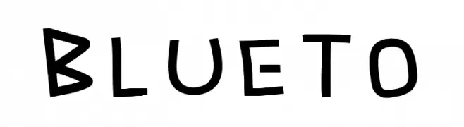
A playful, hand-drawn font with bold, rounded strokes and an informal style.
![Blueto font caratteri gratis]() Scaricare 32 Downloads@WebFont
Scaricare 32 Downloads@WebFont -
( Fonts by Beautypes - Bhakti Al Akbar Pasaribu - Personal-use only. For commercial use please contact owner. )
Intricate and elegant decorative ornaments with fine lines and delicate curves.
![JustSweetOrnament font caratteri gratis]() Scaricare 32 Downloads@WebFont
Scaricare 32 Downloads@WebFont -
( Fonts by Nico Muslib - Personal-use only. For commercial use please contact owner. )
A lively, flowing script font with elegant cursive letterforms.
![Sale Maker Script Script font caratteri gratis]() Scaricare 32 Downloads@WebFont
Scaricare 32 Downloads@WebFont -
( Fonts by Perspectype Studio - Personal-use only. For commercial use please contact owner. )
An elegant, cursive script font with a flowing, handwritten style.
![Senorita Signature Italic font caratteri gratis]() Scaricare 32 Downloads@WebFont
Scaricare 32 Downloads@WebFont -
( Fonts by Jason Pagura - Personal-use only. For commercial use please contact owner. )
A playful, bold font with rounded, thick letterforms and a friendly appearance.
![Gohan font caratteri gratis]() Scaricare 32 Downloads@WebFont
Scaricare 32 Downloads@WebFont -
( Fonts by weknow - Wino S Kadir - Personal-use only. For commercial use please contact owner. )
A bold, geometric font with abstract cutouts and a modern aesthetic.
![Snow Mask Bold font caratteri gratis]() Scaricare 32 Downloads@WebFont
Scaricare 32 Downloads@WebFont -
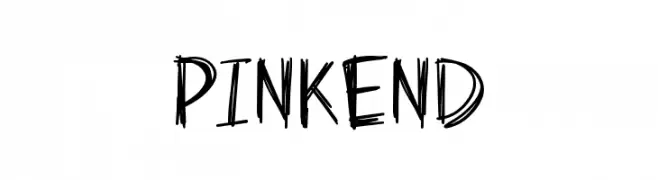
( Fonts by Syaf Rizal - Khurasan - Personal-use only. For commercial use please contact owner. )
A playful, energetic handwritten font with irregular strokes and dynamic flow.
![Pinkend font caratteri gratis]() Scaricare 32 Downloads@WebFont
Scaricare 32 Downloads@WebFont -
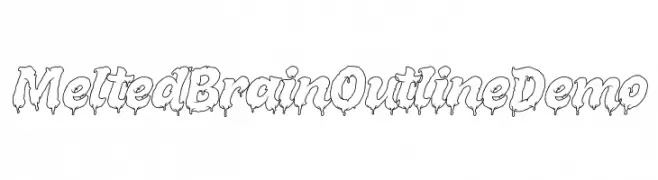
( Personal-use only. For commercial use please contact owner. )
![Melted Brain Outline Demo font caratteri gratis]() Scaricare 32 Downloads@WebFont
Scaricare 32 Downloads@WebFont -
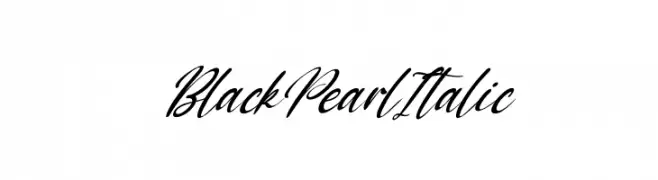
( Fonts by Kong Font - Personal-use only. For commercial use please contact owner. )
A flowing, cursive script font with an elegant italic slant.
![Black Pearl Italic font caratteri gratis]() Scaricare 32 Downloads@WebFont
Scaricare 32 Downloads@WebFont -
( Fonts by Digitype Studio - Yusuf Niki Syahroni - Personal-use only. For commercial use please contact owner. )
A cursive, handwritten font with elegant, flowing lines and decorative flourishes.
![Kaylari font caratteri gratis]() Scaricare 32 Downloads@WebFont
Scaricare 32 Downloads@WebFont -
( Fonts by Khurasan - Syaf Rizal - Personal-use only. For commercial use please contact owner. )
A bold, cursive font with a flowing, handwritten style.
![Friend Write font caratteri gratis]() Scaricare 32 Downloads@WebFont
Scaricare 32 Downloads@WebFont


Quali sono i font più popolari adesso?
Poppins, Roboto, Montserrat, Open Sans e Lato sono molto usati per le forme pulite e l'ampia applicabilità — dall'identità di marca alle landing page e ai poster.
Quali font si usano spesso nei loghi?
Le sans serif geometriche (es. Poppins, famiglie in stile Gotham) sono scelte comuni per un branding pulito e scalabile. Per un tocco personale restano valide script e stili manoscritti. Abbina un display deciso per i titoli a un corpo testo neutro per riconoscibilità ed equilibrio.
Ogni quanto si aggiorna la lista?
Con regolarità, in base ai download e all'attività reale. Torna spesso per scoprire in anticipo le nuove preferite.
💡 Consiglio: aggiungi ai preferiti — le tendenze cambiano in fretta e i font top di oggi possono ispirare il rebranding di domani.