Benvenuto nelle Font Più Popolari — dove popolarità e qualità si incontrano. Qui trovi i font più scaricati e usati dell'anno. Se cerchi scelte sicure per logo, web o social, inizia da qui.
Ogni font top si distingue per equilibrio, leggibilità e versatilità. Troverai sans serif moderne, script eleganti, serif vintage e display minimalisti.
-
( Fonts by Get Studio - Hermansyah , - Personal-use only. For commercial use please contact owner. )
A playful, handwritten font with tall, narrow letters and a casual style.
 Scaricare 35 Downloads@WebFont
 -
( Fonts by Pizzadude - Jakob Fischer - Personal-use only. For commercial use please contact owner. )
A bold, geometric font with a futuristic and edgy style.
![Question of time simple font caratteri gratis]() Scaricare 35 Downloads@WebFont
Scaricare 35 Downloads@WebFont -
( Fonts by Letterena Studios - letterena.com - Personal-use only. For commercial use please contact owner. )
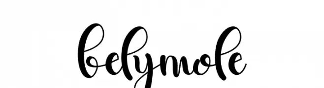
A lively and expressive handwritten font with fluid, dynamic strokes.
![belymole font caratteri gratis]() Scaricare 35 Downloads@WebFont
Scaricare 35 Downloads@WebFont -
( Fonts by Iconian Fonts - Daniel Zadorozny - Personal-use only. For commercial use please contact owner. )
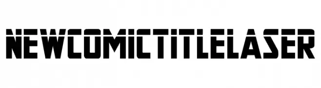
A bold, geometric font with a futuristic and structured design.
![New Comic Title Laser font caratteri gratis]() Scaricare 35 Downloads@WebFont
Scaricare 35 Downloads@WebFont -
( Personal-use only. For commercial use please contact owner. )
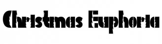
Bold, festive display font with jagged, winter-inspired cutouts.
![Christmas Euphoria font caratteri gratis]() Scaricare 35 Downloads@WebFont
Scaricare 35 Downloads@WebFont -
( Fonts by Iconian Fonts - Daniel Zadorozny - Personal-use only. For commercial use please contact owner. )
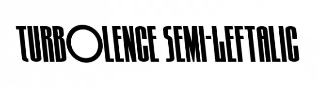
A bold, condensed font with a leftward slant, ideal for dynamic designs.
![Turb0lence Semi-Leftalic font caratteri gratis]() Scaricare 35 Downloads@WebFont
Scaricare 35 Downloads@WebFont -
( Fonts by Iconian Fonts - Daniel Zadorozny - Personal-use only. For commercial use please contact owner. )
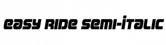
A bold, semi-italic font with a modern and dynamic style.
![Easy Ride Semi-Italic font caratteri gratis]() Scaricare 35 Downloads@WebFont
Scaricare 35 Downloads@WebFont -
( Fonts by Oksana Shudegova - Personal-use only. For commercial use please contact owner. )
A playful, Halloween-themed decorative font with spooky elements.
![Skeletons Regular font caratteri gratis]() Scaricare 35 Downloads@WebFont
Scaricare 35 Downloads@WebFont -
( Fonts by Daniel Ryves - Personal-use only. For commercial use please contact owner. )
A dynamic, angular, and italicized font with bold strokes and medium contrast.
![BOO:] font caratteri gratis]() Scaricare 35 Downloads@WebFont
Scaricare 35 Downloads@WebFont -
( Fonts by Letterena Studios - letterena.com - Personal-use only. For commercial use please contact owner. )
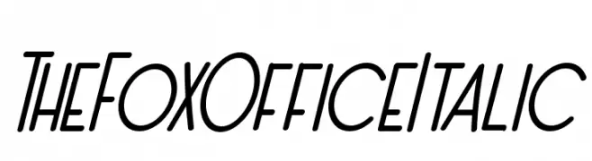
A dynamic, italicized handwritten font with a modern and playful style.
![The Fox Office Italic font caratteri gratis]() Scaricare 35 Downloads@WebFont
Scaricare 35 Downloads@WebFont -
( Fonts by Iconian Fonts )
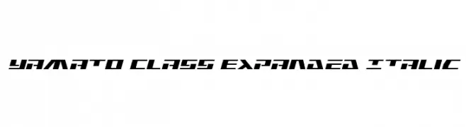
Futuristic, bold, expanded italic sans-serif with sharp geometric forms.
![Yamato Class Expanded Italic font caratteri gratis]() Scaricare 35 Downloads@WebFont
Scaricare 35 Downloads@WebFont -
( Fonts by Oksana Shudegova - Personal-use only. For commercial use please contact owner. )
A modern, minimalist font with geometric and clean lines.
![Elgrand Regular font caratteri gratis]() Scaricare 35 Downloads@WebFont
Scaricare 35 Downloads@WebFont -
( Fonts by Bexxtype - Personal-use only. For commercial use please contact owner. )
An elegant script font with flowing, cursive letters and a sophisticated appearance.
![delthami font caratteri gratis]() Scaricare 35 Downloads@WebFont
Scaricare 35 Downloads@WebFont -
( Fonts by Kong Font - Personal-use only. For commercial use please contact owner. )
Bold, geometric display font with ornamental elements.
![MatterOfFactOrnament font caratteri gratis]() Scaricare 35 Downloads@WebFont
Scaricare 35 Downloads@WebFont -
( Fonts by Iconian Fonts - Daniel Zadorozny - Personal-use only. For commercial use please contact owner. )
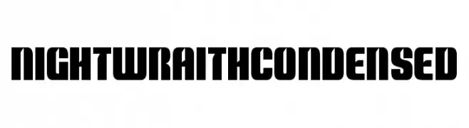
A bold, condensed font with a modern, industrial aesthetic and high contrast strokes.
![Nightwraith Condensed font caratteri gratis]() Scaricare 35 Downloads@WebFont
Scaricare 35 Downloads@WebFont -
![NovaMono Regular font caratteri gratis]() Scaricare 35 Downloads
Scaricare 35 Downloads -
( Fonts by Iconian Fonts )
Futuristic, outlined italic font with a 3D effect and geometric shapes.
![Yamato Class 3D Italic font caratteri gratis]() Scaricare 35 Downloads@WebFont
Scaricare 35 Downloads@WebFont -
( Fonts by Kong Font - Personal-use only. For commercial use please contact owner. )
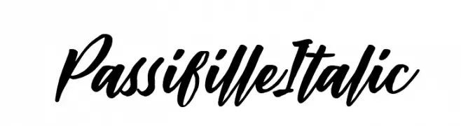
A bold, expressive script font with a dynamic, handwritten style.
![Passifille Italic font caratteri gratis]() Scaricare 35 Downloads@WebFont
Scaricare 35 Downloads@WebFont -
( Personal-use only. For commercial use please contact owner. )
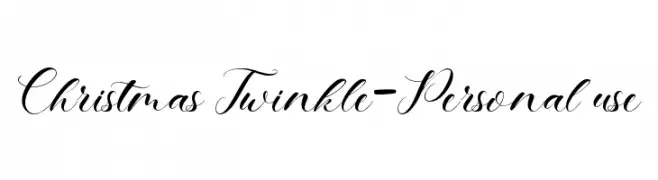
Ornate, high-contrast script with elegant flourishes.
![Christmas Twinkle-Personal use font caratteri gratis]() Scaricare 35 Downloads@WebFont
Scaricare 35 Downloads@WebFont -
( Fonts by ReyreyBlue - Reyrey Blue - Personal-use only. For commercial use please contact owner. )
A whimsical and elegant cursive script font with flowing, graceful lines.
![Mystic Angel font caratteri gratis]() Scaricare 35 Downloads@WebFont
Scaricare 35 Downloads@WebFont -
( Fonts by Erik Studio - Personal-use only. For commercial use please contact owner. )
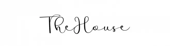
An elegant and flowing script font with graceful curves and continuous strokes.
![The House font caratteri gratis]() Scaricare 35 Downloads@WebFont
Scaricare 35 Downloads@WebFont -
( Fonts by Letterara - Thomas Aradea - Personal-use only. For commercial use please contact owner. )
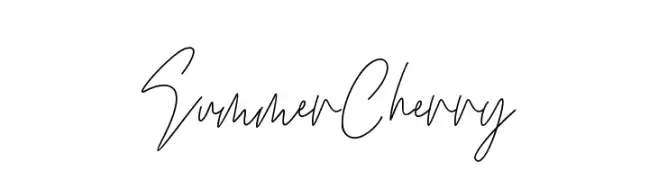
A lively, handwritten font with fluid strokes and a playful, elegant flair.
![Summer Cherry font caratteri gratis]() Scaricare 35 Downloads@WebFont
Scaricare 35 Downloads@WebFont -
( Fonts by The Ocean Studio - Laire Banyu Sandi Pawenang - Personal-use only. For commercial use please contact owner. )
A bold, expressive handwritten font with dynamic strokes and fluidity.
![Ottodidact font caratteri gratis]() Scaricare 35 Downloads@WebFont
Scaricare 35 Downloads@WebFont -
( Fonts by Intellecta Design - Paulo W - Personal-use only. For commercial use please contact owner. )
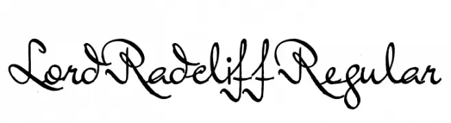
An elegant script font with flowing, cursive letterforms and moderate stroke contrast.
![Lord Radcliff Regular font caratteri gratis]() Scaricare 35 Downloads@WebFont
Scaricare 35 Downloads@WebFont -
( Fonts by Syaf Rizal - Khurasan - Personal-use only. For commercial use please contact owner. )
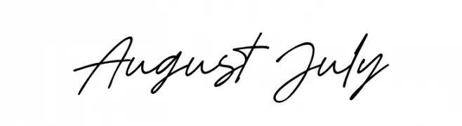
A fluid, handwritten script font with a casual and elegant style.
![August July font caratteri gratis]() Scaricare 35 Downloads@WebFont
Scaricare 35 Downloads@WebFont -
( Fonts by Bangkit Tri Setiadi - Personal-use only. For commercial use please contact owner. )
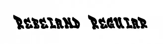
A bold, playful font with exaggerated curves and a dynamic presence.
![Rebeland Regular font caratteri gratis]() Scaricare 35 Downloads@WebFont
Scaricare 35 Downloads@WebFont -
( Fonts by Universe & Co - Personal-use only. For commercial use please contact owner. )
A whimsical, handwritten font with playful, flowing strokes.
![Diableg font caratteri gratis]() Scaricare 35 Downloads@WebFont
Scaricare 35 Downloads@WebFont -
( Fonts by Rezastudio - Reza Mukhtazar - Personal-use only. For commercial use please contact owner. )
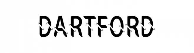
A bold, modern font with a unique decorative line through each character.
![DARTFORD font caratteri gratis]() Scaricare 35 Downloads@WebFont
Scaricare 35 Downloads@WebFont -
( Fonts by Zetafonts - Personal-use only. For commercial use please contact owner. )
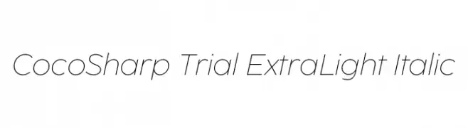
A sleek, extra-light italic font with a modern and elegant design.
![CocoSharp Trial ExtraLight Italic font caratteri gratis]() Scaricare 35 Downloads@WebFont
Scaricare 35 Downloads@WebFont -
( Fonts by Iconian Fonts - Daniel Zadorozny - Personal-use only. For commercial use please contact owner. )
A bold, condensed, and italicized font with a modern, dynamic style.
![Rogue Hero Condensed Italic font caratteri gratis]() Scaricare 35 Downloads@WebFont
Scaricare 35 Downloads@WebFont -
( Fonts by Dug McUgly - Personal-use only. For commercial use please contact owner. )
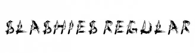
A dynamic, brush-stroke font with a rough, textured appearance.
![Slashies Regular font caratteri gratis]() Scaricare 35 Downloads@WebFont
Scaricare 35 Downloads@WebFont -
( Personal-use only. For commercial use please contact owner. )
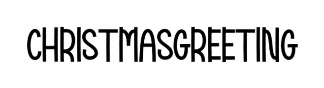
Tall, playful sans-serif with a hand-drawn feel.
![Christmas Greeting font caratteri gratis]() Scaricare 35 Downloads@WebFont
Scaricare 35 Downloads@WebFont -
( Fonts by Edric Studio - Personal-use only. For commercial use please contact owner. )
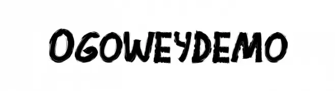
A bold, brush-style font with dynamic and expressive strokes.
![Ogowey Demo font caratteri gratis]() Scaricare 35 Downloads@WebFont
Scaricare 35 Downloads@WebFont -
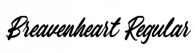
( Fonts by Typetemp Studio - Personal-use only. For commercial use please contact owner. )
A dynamic script font with fluid, cursive strokes and a handwritten feel.
![Breavenheart Regular font caratteri gratis]() Scaricare 35 Downloads@WebFont
Scaricare 35 Downloads@WebFont -
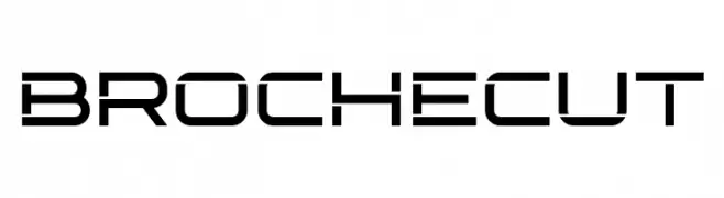
( Fonts by Almarkhatype - Abdul Malik Wisnu - Personal-use only. For commercial use please contact owner. )
A modern, geometric font with sharp angles and a futuristic aesthetic.
![Broche Cut font caratteri gratis]() Scaricare 35 Downloads@WebFont
Scaricare 35 Downloads@WebFont


![BOO:] font caratteri gratis](https://d144mzi0q5mijx.cloudfront.net/img/B/O/BOO1.webp)


Quali sono i font più popolari adesso?
Poppins, Roboto, Montserrat, Open Sans e Lato sono molto usati per le forme pulite e l'ampia applicabilità — dall'identità di marca alle landing page e ai poster.
Quali font si usano spesso nei loghi?
Le sans serif geometriche (es. Poppins, famiglie in stile Gotham) sono scelte comuni per un branding pulito e scalabile. Per un tocco personale restano valide script e stili manoscritti. Abbina un display deciso per i titoli a un corpo testo neutro per riconoscibilità ed equilibrio.
Ogni quanto si aggiorna la lista?
Con regolarità, in base ai download e all'attività reale. Torna spesso per scoprire in anticipo le nuove preferite.
💡 Consiglio: aggiungi ai preferiti — le tendenze cambiano in fretta e i font top di oggi possono ispirare il rebranding di domani.