Benvenuto nelle Font Più Popolari — dove popolarità e qualità si incontrano. Qui trovi i font più scaricati e usati dell'anno. Se cerchi scelte sicure per logo, web o social, inizia da qui.
Ogni font top si distingue per equilibrio, leggibilità e versatilità. Troverai sans serif moderne, script eleganti, serif vintage e display minimalisti.
-
( Fonts by AukimVisuel - Audry Kitoko Makelele - Personal-use only. For commercial use please contact owner. )
A modern, italic, and condensed font with bold strokes and high contrast.
 Scaricare 35 Downloads@WebFont
 -
( Fonts by Iconian Fonts - Daniel Zadorozny - Personal-use only. For commercial use please contact owner. )
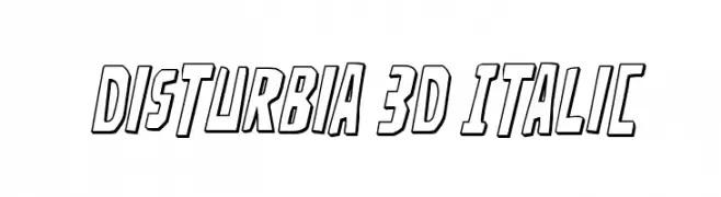
A bold, 3D italic font with outlined characters and a dynamic style.
![Disturbia 3D Italic font caratteri gratis]() Scaricare 35 Downloads@WebFont
Scaricare 35 Downloads@WebFont -
( Fonts by Jehoo Creative - Anwar Patihan - Personal-use only. For commercial use please contact owner. )
A playful, handwritten font with flowing, cursive-like strokes.
![Ballerin font caratteri gratis]() Scaricare 35 Downloads@WebFont
Scaricare 35 Downloads@WebFont -
( Fonts by Incstone Design, by Megami Studios - Rob Barba - Personal-use only. For commercial use please contact owner. )
A bold, italicized font with a modern and dynamic style.
![Orthotopes Italic font caratteri gratis]() Scaricare 35 Downloads@WebFont
Scaricare 35 Downloads@WebFont -
( Fonts by Vladimir Nikolic - www.creativefabrica.com/designer/vladimirnikolic/ - Personal-use only. For commercial use please contact owner. )
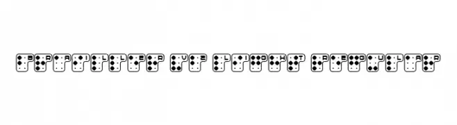
A modern, Braille-inspired font with a playful and innovative design.
![Brailler V2 Light Regular font caratteri gratis]() Scaricare 35 Downloads@WebFont
Scaricare 35 Downloads@WebFont -
( Fonts by WC Fonts - Atypeek - Christophe Féray - Personal-use only. For commercial use please contact owner. )
A bold, pixelated font with circular cutouts, perfect for digital or retro-themed designs.
![WCPIXHOLEBta-Bold font caratteri gratis]() Scaricare 35 Downloads@WebFont
Scaricare 35 Downloads@WebFont -
( Fonts by Pizzadude - Jakob Fischer - Personal-use only. For commercial use please contact owner. )
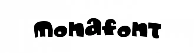
A playful, bold font with chunky, rounded characters and a whimsical style.
![Monafont font caratteri gratis]() Scaricare 35 Downloads@WebFont
Scaricare 35 Downloads@WebFont -
( Fonts by Airotype Studio - Personal-use only. For commercial use please contact owner. )
A playful and elegant handwritten script font with smooth curves.
![Soffnia font caratteri gratis]() Scaricare 35 Downloads@WebFont
Scaricare 35 Downloads@WebFont -
( Fonts by Vladimir Nikolic - Personal-use only. For commercial use please contact owner. )
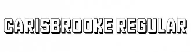
A bold, three-dimensional font with a vintage, shadowed style.
![Carisbrooke Regular font caratteri gratis]() Scaricare 35 Downloads@WebFont
Scaricare 35 Downloads@WebFont -
( Fonts by Alif Ryan Zulfikar - Personal-use only. For commercial use please contact owner. )
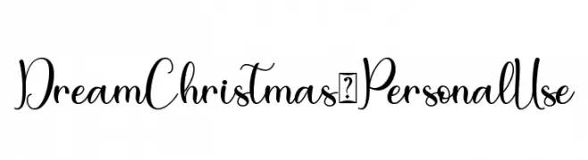
A whimsical and elegant script font with flowing, interconnected letters and decorative flourishes.
![Dream Christmas - Personal Use font caratteri gratis]() Scaricare 35 Downloads@WebFont
Scaricare 35 Downloads@WebFont -
( Fonts by Iconian Fonts - Daniel Zadorozny - Personal-use only. For commercial use please contact owner. )
A bold, geometric, and futuristic condensed font with sharp angles.
![Red Rocket Condensed font caratteri gratis]() Scaricare 35 Downloads@WebFont
Scaricare 35 Downloads@WebFont -
( Fonts by Iconian Fonts - Daniel Zadorozny - Personal-use only. For commercial use please contact owner. )
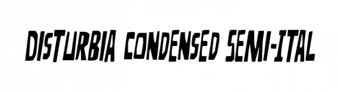
A bold, condensed, semi-italic font with angular edges and dynamic style.
![Disturbia Condensed Semi-Ital font caratteri gratis]() Scaricare 35 Downloads@WebFont
Scaricare 35 Downloads@WebFont -
( Fonts by Rama type - Rama ziana - Personal-use only. For commercial use please contact owner. )
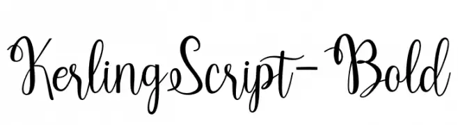
A bold and elegant script font with flowing, decorative strokes.
![KerlingScript-Bold font caratteri gratis]() Scaricare 35 Downloads@WebFont
Scaricare 35 Downloads@WebFont -
( Fonts by Typeline Studio - Yadhie Setiawan - Personal-use only. For commercial use please contact owner. )
A flowing, handwritten script font with a casual elegance.
![Sucillia font caratteri gratis]() Scaricare 35 Downloads@WebFont
Scaricare 35 Downloads@WebFont -
( Fonts by Vunira Design - Personal-use only. For commercial use please contact owner. )
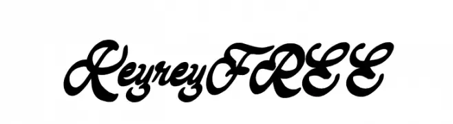
A bold, expressive script font with flowing cursive letters and high contrast.
![KeyreyFREE font caratteri gratis]() Scaricare 35 Downloads@WebFont
Scaricare 35 Downloads@WebFont -
( Fonts by Kong Font - Personal-use only. For commercial use please contact owner. )
An elegant, flowing script font with smooth, cursive strokes.
![Alexandry font caratteri gratis]() Scaricare 35 Downloads@WebFont
Scaricare 35 Downloads@WebFont -
( Fonts by Iconian Fonts - Daniel Zadorozny - Personal-use only. For commercial use please contact owner. )
A bold, expanded, and italicized font with a futuristic and dynamic style.
![Red Rocket Expanded Italic font caratteri gratis]() Scaricare 35 Downloads@WebFont
Scaricare 35 Downloads@WebFont -
( Fonts by selawetype - Personal-use only. For commercial use please contact owner. )
A graceful, cursive script font with elegant loops and fluid connections.
![BuffaloSignature font caratteri gratis]() Scaricare 35 Downloads@WebFont
Scaricare 35 Downloads@WebFont -
( Fonts by Perspectype Studio - Personal-use only. For commercial use please contact owner. )
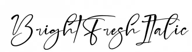
A lively, cursive script font with elegant, flowing connections and a dynamic italic slant.
![Bright Fresh Italic font caratteri gratis]() Scaricare 35 Downloads@WebFont
Scaricare 35 Downloads@WebFont -
( Fonts by Iconian Fonts - Daniel Zadorozny - Personal-use only. For commercial use please contact owner. )
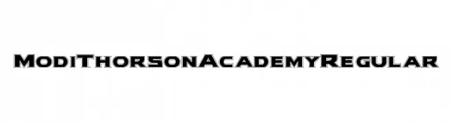
A bold, outlined font with a geometric and three-dimensional style.
![Modi Thorson Academy Regular font caratteri gratis]() Scaricare 35 Downloads@WebFont
Scaricare 35 Downloads@WebFont -
( Fonts by Kong Font - fontkong.com - Personal-use only. For commercial use please contact owner. )
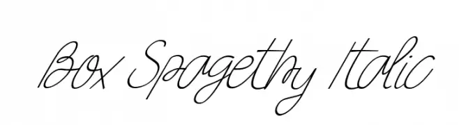
A flowing, cursive italic font with interconnected letters and a delicate, elegant style.
![Box Spagethy Italic font caratteri gratis]() Scaricare 35 Downloads@WebFont
Scaricare 35 Downloads@WebFont -
( Personal-use only. For commercial use please contact owner. )
A decorative, high-contrast script with whimsical, hand-drawn qualities.
![Christmas Chimney-Personal use font caratteri gratis]() Scaricare 35 Downloads@WebFont
Scaricare 35 Downloads@WebFont -
( Fonts by Jetsmax Studio - Khairil Anwar - Personal-use only. For commercial use please contact owner. )
A whimsical and playful font with artistic letterforms and dynamic curves.
![Halgonak font caratteri gratis]() Scaricare 35 Downloads@WebFont
Scaricare 35 Downloads@WebFont -
( Fonts by Jimtype Studio - Personal-use only. For commercial use please contact owner. )
An elegant and flowing script font with graceful curves and loops.
![JustlovePersonalUseOnly font caratteri gratis]() Scaricare 35 Downloads@WebFont
Scaricare 35 Downloads@WebFont -
( Fonts by Mozyen Studio - Personal-use only. For commercial use please contact owner. )
A graceful and flowing script font with elegant curves and loops.
![Angellida font caratteri gratis]() Scaricare 35 Downloads@WebFont
Scaricare 35 Downloads@WebFont -
( Fonts by Typodermic Fonts - Raymond Larabie - Personal-use only. For commercial use please contact owner. )
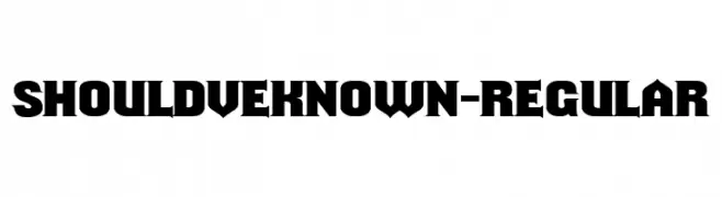
A bold, angular font with a modern yet vintage feel.
![ShouldveKnown-Regular font caratteri gratis]() Scaricare 35 Downloads@WebFont
Scaricare 35 Downloads@WebFont -
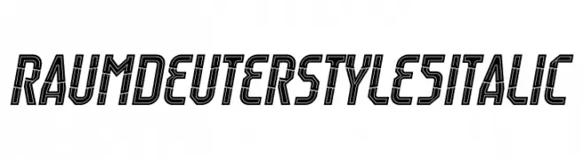
( Fonts by Trequartista Studio - Personal-use only. For commercial use please contact owner. )
A bold, geometric, italic font with a double-line effect and a modern, tech-inspired style.
![Raumdeuter Style 5 Italic font caratteri gratis]() Scaricare 35 Downloads@WebFont
Scaricare 35 Downloads@WebFont -
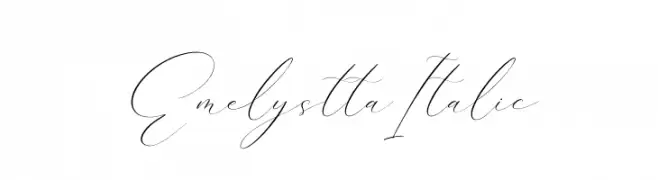
( Fonts by Perspectype Studio - Personal-use only. For commercial use please contact owner. )
A graceful, flowing script font with delicate, thin strokes and connected characters.
![Emelystta Italic font caratteri gratis]() Scaricare 35 Downloads@WebFont
Scaricare 35 Downloads@WebFont -
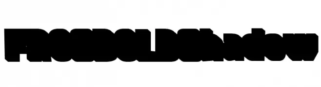
( Fonts by DumadiStyle - Toni Dzulham - Personal-use only. For commercial use please contact owner. )
A bold, shadowed font with thick, blocky letters and a three-dimensional effect.
![FROS BOLD Shadow font caratteri gratis]() Scaricare 35 Downloads@WebFont
Scaricare 35 Downloads@WebFont -
( Fonts by Jimtype Studio - Personal-use only. For commercial use please contact owner. )
An elegant script font with flowing, ornate letterforms and sophisticated style.
![Magtina font caratteri gratis]() Scaricare 35 Downloads@WebFont
Scaricare 35 Downloads@WebFont -
![JoshCooper font caratteri gratis]() Scaricare 35 Downloads@WebFont
Scaricare 35 Downloads@WebFont -
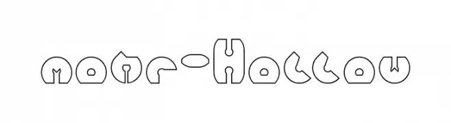
( Fonts by weknow - Wino S Kadir - Personal-use only. For commercial use please contact owner. )
A modern, geometric hollow font with a bold outline and playful style.
![mohr-Hollow font caratteri gratis]() Scaricare 35 Downloads@WebFont
Scaricare 35 Downloads@WebFont -
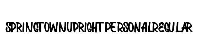
( Fonts by Mans Greback - www.mansgreback.com - Personal-use only. For commercial use please contact owner. )
A bold, expressive handwritten font with playful curves.
![Springtown Upright PERSONAL Regular font caratteri gratis]() Scaricare 35 Downloads@WebFont
Scaricare 35 Downloads@WebFont -
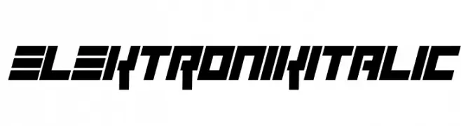
( Fonts by Darrell Flood - Personal-use only. For commercial use please contact owner. )
A bold, italicized font with a futuristic, angular design.
![Elektronik Italic font caratteri gratis]() Scaricare 35 Downloads@WebFont
Scaricare 35 Downloads@WebFont -
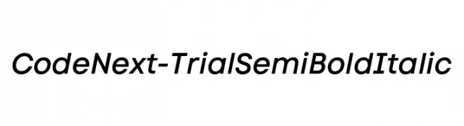
( Fonts by Fontfabric - Svetoslav Simov - Personal-use only. For commercial use please contact owner. )
A modern, semi-bold italic font with medium contrast and clean lines.
![Code Next-Trial SemiBold Italic font caratteri gratis]() Scaricare 35 Downloads@WebFont
Scaricare 35 Downloads@WebFont


Quali sono i font più popolari adesso?
Poppins, Roboto, Montserrat, Open Sans e Lato sono molto usati per le forme pulite e l'ampia applicabilità — dall'identità di marca alle landing page e ai poster.
Quali font si usano spesso nei loghi?
Le sans serif geometriche (es. Poppins, famiglie in stile Gotham) sono scelte comuni per un branding pulito e scalabile. Per un tocco personale restano valide script e stili manoscritti. Abbina un display deciso per i titoli a un corpo testo neutro per riconoscibilità ed equilibrio.
Ogni quanto si aggiorna la lista?
Con regolarità, in base ai download e all'attività reale. Torna spesso per scoprire in anticipo le nuove preferite.
💡 Consiglio: aggiungi ai preferiti — le tendenze cambiano in fretta e i font top di oggi possono ispirare il rebranding di domani.