Benvenuto nelle Font Più Popolari — dove popolarità e qualità si incontrano. Qui trovi i font più scaricati e usati dell'anno. Se cerchi scelte sicure per logo, web o social, inizia da qui.
Ogni font top si distingue per equilibrio, leggibilità e versatilità. Troverai sans serif moderne, script eleganti, serif vintage e display minimalisti.
-
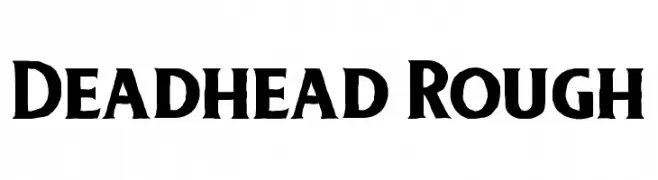
( Free for personal use - twicolabs.com )
A bold, rugged font with a hand-crafted, organic appearance.
 Scaricare 1231 Downloads@WebFont
 -
![Banana font caratteri gratis]() Scaricare 1231 Downloads@WebFont
Scaricare 1231 Downloads@WebFont -
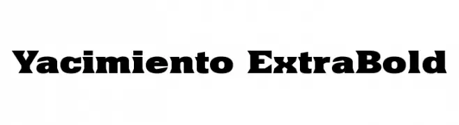
Caratteri di defharo. For commercial use please contact the owner.
![Yacimiento ExtraBold font caratteri gratis]() Scaricare 1231 Downloads@WebFont
Scaricare 1231 Downloads@WebFont -
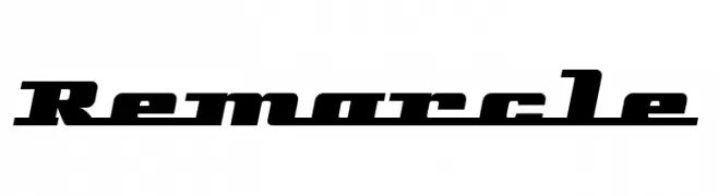
( Fonts by Tup Wanders - www.tupwanders.nl )
A bold, angular font with a futuristic and sporty design.
![Remarcle font caratteri gratis]() Scaricare 1231 Downloads@WebFont
Scaricare 1231 Downloads@WebFont -
( Fonts by Figuree Studio )
A playful, bold font with a cartoonish, hand-drawn style.
![Kids Zone font caratteri gratis]() Scaricare 1230 Downloads@WebFont
Scaricare 1230 Downloads@WebFont -
( Fonts by URW++ - Personal-use only. For commercial use please contact owner. )
A classic serif font with elegant strokes and a formal appearance.
![NimbusRomNo9L-Reg font caratteri gratis]() Scaricare 1230 Downloads@WebFont
Scaricare 1230 Downloads@WebFont -
( Muhammad Akbar - creativemarket.com/sinfa )
A graceful script font with flowing, interconnected letters and a cursive style.
![Andrea font caratteri gratis]() Scaricare 1230 Downloads@WebFont
Scaricare 1230 Downloads@WebFont -
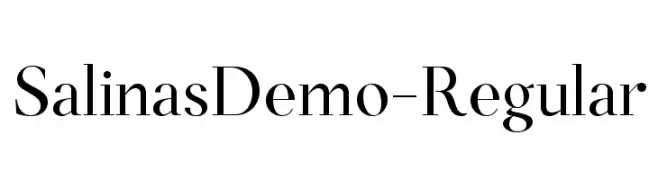
( Genilson L. Santos )
A classic serif font with medium contrast and elegant strokes.
![SalinasDemo-Regular font caratteri gratis]() Scaricare 1230 Downloads@WebFont
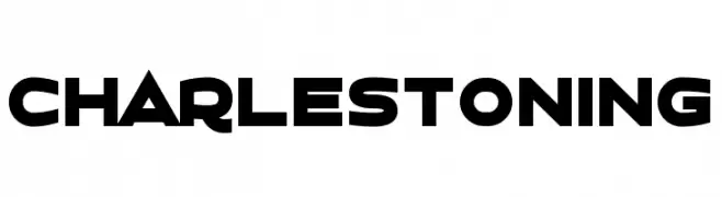
Scaricare 1230 Downloads@WebFont -
![Charlestoning font caratteri gratis]() Scaricare 1230 Downloads@WebFont
Scaricare 1230 Downloads@WebFont -
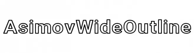
( Fonts by CannotIntoSpaceFonts - KineticPlasma Fonts - Personal-use only. For commercial use please contact owner. )
A bold, wide outline font with a modern and impactful style.
![Asimov Wide Outline font caratteri gratis]() Scaricare 1230 Downloads@WebFont
Scaricare 1230 Downloads@WebFont -
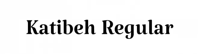
( Copyright 2015, 2016 KB-Studio (www.k-b-studio.com|tarobish@gmail.com). )
A bold, high-contrast serif font with a dynamic and elegant style.
![Katibeh Regular font caratteri gratis]() Scaricare 1230 Downloads@WebFont
Scaricare 1230 Downloads@WebFont -
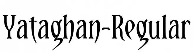
( Fonts by Daniel Midgley )
An artistic font with elongated, curved strokes and a distinct, exotic appearance.
![Yataghan-Regular font caratteri gratis]() Scaricare 1230 Downloads@WebFont
Scaricare 1230 Downloads@WebFont -
![Dumbnerd font caratteri gratis]() Scaricare 1230 Downloads@WebFont
Scaricare 1230 Downloads@WebFont -
![Bolonewt font caratteri gratis]() Scaricare 1230 Downloads@WebFont
Scaricare 1230 Downloads@WebFont -
( Fonts by www.peter-wiegel.de. Personal-use only. For commercial use please contact owner. )
A bold, geometric font with a modern and impactful style.
![Preussische VI 9 font caratteri gratis]() Scaricare 1230 Downloads@WebFont
Scaricare 1230 Downloads@WebFont -
( Fonts by Graham Meade - GemFonts )
A bold, outlined collegiate-style font with strong, clean lines.
![College Halo font caratteri gratis]() Scaricare 1230 Downloads@WebFont
Scaricare 1230 Downloads@WebFont -
( Fonts by Weape Studio )
A playful, hand-drawn font with rounded, irregular letterforms.
![Hobbies-Regular font caratteri gratis]() Scaricare 1229 Downloads@WebFont
Scaricare 1229 Downloads@WebFont -
( Fonts by www.movefont .com - Personal-use only. For commercial use please contact owner. )
A bold, flowing script font with elegant curves and a modern touch.
![Vignettic font caratteri gratis]() Scaricare 1229 Downloads@WebFont
Scaricare 1229 Downloads@WebFont -
( Fonts by Rajesh Rajput - gumroad.com/rajputrajesh_448 - Personal-use only. For commercial use please contact owner. )
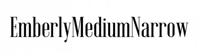
A sophisticated, narrow font with a modern and elegant style.
![Emberly Medium Narrow font caratteri gratis]() Scaricare 1229 Downloads@WebFont
Scaricare 1229 Downloads@WebFont -
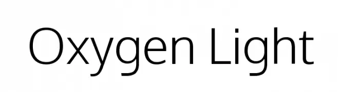
( Copyright (c) 2012, vernon adams (vern@newtypography.co.uk), with Reserved Font Names 'Oxygen' )
A modern, light sans-serif font with clean lines and excellent readability.
![Oxygen Light font caratteri gratis]() Scaricare 1229 Downloads@WebFont
Scaricare 1229 Downloads@WebFont -
( Fonts by a Max Infeld - XEROGRAPHER FONTS - xerographer.blogspot.com . Personal-use only. For commercial use please contact owner. )
A bold, 3D block font with a textured, industrial appearance.
![Gotcha font caratteri gratis]() Scaricare 1229 Downloads@WebFont
Scaricare 1229 Downloads@WebFont -
( about.me/gaowsh )
A playful, handwritten font with smooth, rounded edges and a casual style.
![Baqa font caratteri gratis]() Scaricare 1229 Downloads@WebFont
Scaricare 1229 Downloads@WebFont -
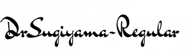
( Copyright (c) 2011 Alejandro Paul (sudtipos@sudtipos.com) )
A lively, script-style font with elegant, flowing characters.
![DrSugiyama-Regular font caratteri gratis]() Scaricare 1229 Downloads@WebFont
Scaricare 1229 Downloads@WebFont -
![AylaCSscript font caratteri gratis]() Scaricare 1229 Downloads@WebFont
Scaricare 1229 Downloads@WebFont -
( Fonts by Patrick Broderick )
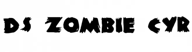
A bold, jagged font with a horror-inspired, torn appearance.
![DS Zombie Cyr font caratteri gratis]() Scaricare 1229 Downloads@WebFont
Scaricare 1229 Downloads@WebFont -
( Fonts by Pinisiart )
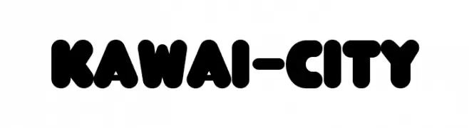
A playful, bold font with rounded edges and a bubbly appearance.
![KAWAI-CITY font caratteri gratis]() Scaricare 1228 Downloads@WebFont
Scaricare 1228 Downloads@WebFont -
( Fonts by GGBotNet )
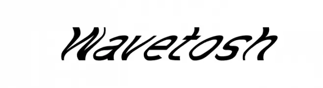
A bold, slanted script font with dynamic and fluid characteristics.
![Wavetosh font caratteri gratis]() Scaricare 1228 Downloads@WebFont
Scaricare 1228 Downloads@WebFont -
( Fonts by Arkandis Digital Foundry )
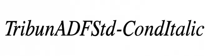
An elegant, italic serif font with a condensed width and moderate contrast.
![TribunADFStd-CondItalic font caratteri gratis]() Scaricare 1228 Downloads@WebFont
Scaricare 1228 Downloads@WebFont -
( Free for a personal use. For a commercial use please visit www.kevinandamanda.com )
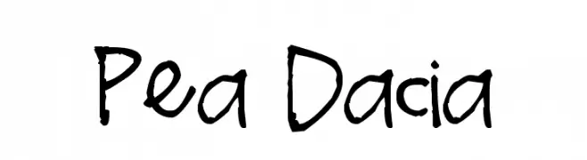
A playful, informal handwritten font with uneven strokes and a lively appearance.
![Pea Dacia font caratteri gratis]() Scaricare 1228 Downloads@WebFont
Scaricare 1228 Downloads@WebFont -
![Pliskin Snake-Eyes font caratteri gratis]() Scaricare 1228 Downloads@WebFont
Scaricare 1228 Downloads@WebFont -
( Fonts by www.peter-wiegel.de. Personal-use only. For commercial use please contact owner. )
A bold, shadowed font with strong geometric shapes and a dynamic 3D effect.
![Preussische VI 9 Schatten font caratteri gratis]() Scaricare 1228 Downloads@WebFont
Scaricare 1228 Downloads@WebFont -
![Convoy Normal font caratteri gratis]() Scaricare 1228 Downloads@WebFont
Scaricare 1228 Downloads@WebFont -
( Fonts by Paul Lloyd )
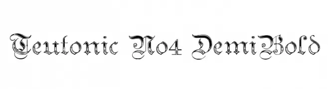
A decorative Blackletter font with intricate, gothic-inspired details.
![Teutonic No4 DemiBold font caratteri gratis]() Scaricare 1228 Downloads@WebFont
Scaricare 1228 Downloads@WebFont -
( Copyright (c) 2015, Cadson Demak (info@cadsondemak.com) )
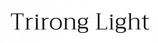
A classic serif font with elegant strokes and balanced proportions.
![Trirong Light font caratteri gratis]() Scaricare 1227 Downloads@WebFont
Scaricare 1227 Downloads@WebFont -
( Fonts by Zetafonts )
A bold blackletter font with sharp, angular lines and a dramatic presence.
![Adlibitum Bold font caratteri gratis]() Scaricare 1227 Downloads@WebFont
Scaricare 1227 Downloads@WebFont


Quali sono i font più popolari adesso?
Poppins, Roboto, Montserrat, Open Sans e Lato sono molto usati per le forme pulite e l'ampia applicabilità — dall'identità di marca alle landing page e ai poster.
Quali font si usano spesso nei loghi?
Le sans serif geometriche (es. Poppins, famiglie in stile Gotham) sono scelte comuni per un branding pulito e scalabile. Per un tocco personale restano valide script e stili manoscritti. Abbina un display deciso per i titoli a un corpo testo neutro per riconoscibilità ed equilibrio.
Ogni quanto si aggiorna la lista?
Con regolarità, in base ai download e all'attività reale. Torna spesso per scoprire in anticipo le nuove preferite.
💡 Consiglio: aggiungi ai preferiti — le tendenze cambiano in fretta e i font top di oggi possono ispirare il rebranding di domani.