Benvenuto nelle Font Più Popolari — dove popolarità e qualità si incontrano. Qui trovi i font più scaricati e usati dell'anno. Se cerchi scelte sicure per logo, web o social, inizia da qui.
Ogni font top si distingue per equilibrio, leggibilità e versatilità. Troverai sans serif moderne, script eleganti, serif vintage e display minimalisti.
-
( Fonts by www.movefont .com - Personal-use only. For commercial use please contact owner. )
A bold, gothic-inspired font with sharp edges and a distressed look.
 Scaricare 319 Downloads@WebFont
 -
Caratteri di danny91194. For commercial use please contact the owner.
( tricky )
A decorative font made of star shapes, perfect for playful designs.
![Shine font caratteri gratis]() Scaricare 319 Downloads@WebFont
Scaricare 319 Downloads@WebFont -
( Fonts by www.vicfieger.com )
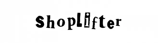
A playful, eclectic font with a ransom note style.
![Shoplifter font caratteri gratis]() Scaricare 319 Downloads@WebFont
Scaricare 319 Downloads@WebFont -
![Scribble Wire font caratteri gratis]() Scaricare 319 Downloads@WebFont
Scaricare 319 Downloads@WebFont -
![Fonitek Bold font caratteri gratis]() Scaricare 319 Downloads@WebFont
Scaricare 319 Downloads@WebFont -
-
( Fonts by www.aenigmafonts.com )
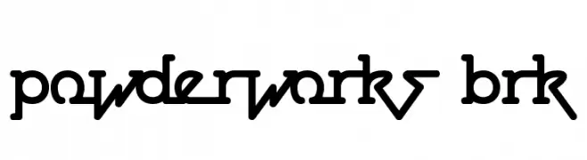
A bold, rounded, and geometric font with interconnected characters.
![Powderworks BRK font caratteri gratis]() Scaricare 319 Downloads@WebFont
Scaricare 319 Downloads@WebFont -
( Fonts by Graham Meade - GemFonts )
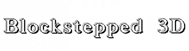
A bold, 3D block font with a stepped shadow effect.
![Blockstepped 3D font caratteri gratis]() Scaricare 319 Downloads@WebFont
Scaricare 319 Downloads@WebFont -
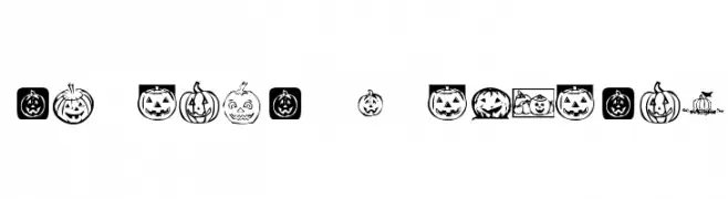
![KR Pick A Pumpkin font caratteri gratis]() Scaricare 319 Downloads@WebFont
Scaricare 319 Downloads@WebFont -
( Matthieu Lonton )
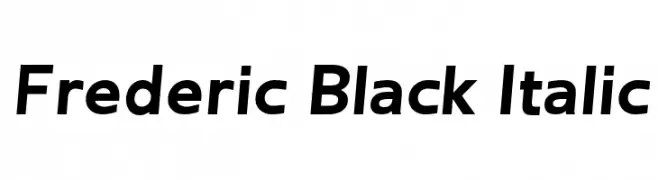
A bold, italic font with a modern and dynamic style.
![Frederic Black Italic font caratteri gratis]() Scaricare 319 Downloads@WebFont
Scaricare 319 Downloads@WebFont -
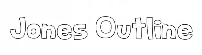
( Fonts by Dan P. Lyons - Personal-use only. For commercial use please contact owner. )
A playful, bold outline font with rounded, uniform strokes.
![Jones Outline font caratteri gratis]() Scaricare 319 Downloads@WebFont
Scaricare 319 Downloads@WebFont

Quali sono i font più popolari adesso?
Poppins, Roboto, Montserrat, Open Sans e Lato sono molto usati per le forme pulite e l'ampia applicabilità — dall'identità di marca alle landing page e ai poster.
Quali font si usano spesso nei loghi?
Le sans serif geometriche (es. Poppins, famiglie in stile Gotham) sono scelte comuni per un branding pulito e scalabile. Per un tocco personale restano valide script e stili manoscritti. Abbina un display deciso per i titoli a un corpo testo neutro per riconoscibilità ed equilibrio.
Ogni quanto si aggiorna la lista?
Con regolarità, in base ai download e all'attività reale. Torna spesso per scoprire in anticipo le nuove preferite.
💡 Consiglio: aggiungi ai preferiti — le tendenze cambiano in fretta e i font top di oggi possono ispirare il rebranding di domani.