Benvenuto nelle Font Più Popolari — dove popolarità e qualità si incontrano. Qui trovi i font più scaricati e usati dell'anno. Se cerchi scelte sicure per logo, web o social, inizia da qui.
Ogni font top si distingue per equilibrio, leggibilità e versatilità. Troverai sans serif moderne, script eleganti, serif vintage e display minimalisti.
-
Caratteri di joorgemoron. For commercial use please contact the owner.
( Free for personal use. )
An elegant italic font with smooth curves and classic flourishes.
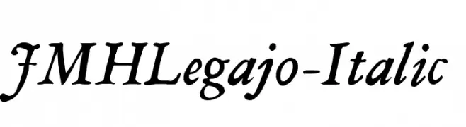 Scaricare 317 Downloads@WebFont
 -
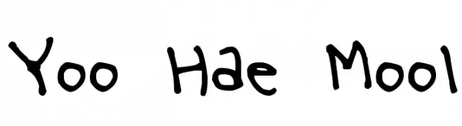
( Fonts by www.kimberlygeswein.com - Kimberly Geswein )
A playful, handwritten font with irregular strokes and a casual style.
![Yoo Hae Mool font caratteri gratis]() Scaricare 317 Downloads@WebFont
Scaricare 317 Downloads@WebFont -
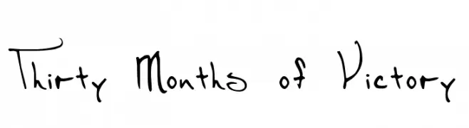
( Fonts by www.foamtrain.com )
A whimsical handwritten font with bold, monospaced numbers.
![Thirty Months of Victory font caratteri gratis]() Scaricare 317 Downloads@WebFont
Scaricare 317 Downloads@WebFont -
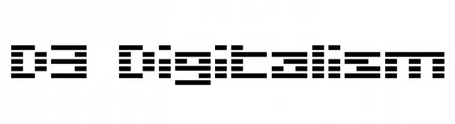
( Fonts by www.DigitalDreamDesign.net )
A pixelated, digital-style font inspired by LED displays.
![D3 Digitalism font caratteri gratis]() Scaricare 317 Downloads@WebFont
Scaricare 317 Downloads@WebFont -
( Fonts by www.DigitalDreamDesign.net )
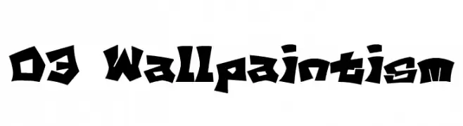
A bold, graffiti-inspired font with sharp, angular lines and dynamic style.
![D3 Wallpaintism font caratteri gratis]() Scaricare 317 Downloads@WebFont
Scaricare 317 Downloads@WebFont -
-
( Fonts by FONTS BY LYAJKA - Personal-use only. For commercial use please contact owner. )
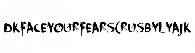
A bold, distressed brushstroke font with an edgy, dramatic style.
![DK Face Your Fears(RUS BY LYAJK font caratteri gratis]() Scaricare 317 Downloads@WebFont
Scaricare 317 Downloads@WebFont -
( Fonts by www.blambot.com )
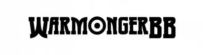
A bold, geometric font with high contrast and unique character shapes.
![WarmongerBB font caratteri gratis]() Scaricare 317 Downloads@WebFont
Scaricare 317 Downloads@WebFont -
![Crayon Kids 1 font caratteri gratis]() Scaricare 317 Downloads@WebFont
Scaricare 317 Downloads@WebFont -
( Fonts by Thomas Ledin - tomledin.com )
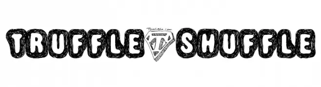
A playful, hand-drawn font with bold, doodle-like characters enclosed in rounded outlines.
![Truffle-Shuffle font caratteri gratis]() Scaricare 317 Downloads@WebFont
Scaricare 317 Downloads@WebFont -
( Fonts by vilogsign - Nur Kholis - Personal-use only. For commercial use please contact owner. )
A bold, geometric font with a modern twist and vintage influences.
![Arcana DEMO font caratteri gratis]() Scaricare 317 Downloads@WebFont
Scaricare 317 Downloads@WebFont


Quali sono i font più popolari adesso?
Poppins, Roboto, Montserrat, Open Sans e Lato sono molto usati per le forme pulite e l'ampia applicabilità — dall'identità di marca alle landing page e ai poster.
Quali font si usano spesso nei loghi?
Le sans serif geometriche (es. Poppins, famiglie in stile Gotham) sono scelte comuni per un branding pulito e scalabile. Per un tocco personale restano valide script e stili manoscritti. Abbina un display deciso per i titoli a un corpo testo neutro per riconoscibilità ed equilibrio.
Ogni quanto si aggiorna la lista?
Con regolarità, in base ai download e all'attività reale. Torna spesso per scoprire in anticipo le nuove preferite.
💡 Consiglio: aggiungi ai preferiti — le tendenze cambiano in fretta e i font top di oggi possono ispirare il rebranding di domani.