Benvenuto nelle Font Più Popolari — dove popolarità e qualità si incontrano. Qui trovi i font più scaricati e usati dell'anno. Se cerchi scelte sicure per logo, web o social, inizia da qui.
Ogni font top si distingue per equilibrio, leggibilità e versatilità. Troverai sans serif moderne, script eleganti, serif vintage e display minimalisti.
-
( Fonts by Creatype Studio - Rian Rahardi - Personal-use only. For commercial use please contact owner. )
A lively, handwritten font with fluid, organic letterforms and a creative touch.
 Scaricare 315 Downloads@WebFont
 -
![Eden Mills font caratteri gratis]() Scaricare 315 Downloads@WebFont
Scaricare 315 Downloads@WebFont -
![InstantTunes font caratteri gratis]() Scaricare 315 Downloads@WebFont
Scaricare 315 Downloads@WebFont -
( charmingcharlie.co.nr/ )
A playful, informal handwritten font with a casual and whimsical style.
![Sigs font caratteri gratis]() Scaricare 315 Downloads@WebFont
Scaricare 315 Downloads@WebFont -
( Fonts by Roland Huse - rolandhuse.com )
A geometric, angular font with sharp lines and a dynamic, futuristic style.
![Pagan Winter font caratteri gratis]() Scaricare 315 Downloads@WebFont
Scaricare 315 Downloads@WebFont -
-
( Fonts by Sacred Nipple - Brode Vosloo )
A bold, vintage-style font with playful curves and strong presence.
![Caslonostrate font caratteri gratis]() Scaricare 315 Downloads@WebFont
Scaricare 315 Downloads@WebFont -
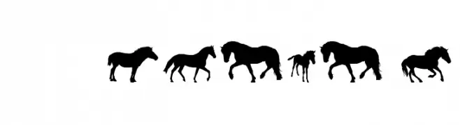
![DJ Horses 1 font caratteri gratis]() Scaricare 315 Downloads@WebFont
Scaricare 315 Downloads@WebFont -
( Fonts by www.blambot.com )
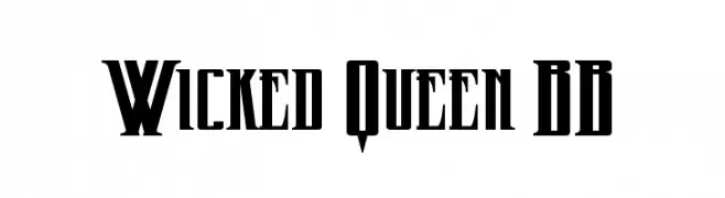
A bold, gothic-inspired font with sharp, angular lines and exaggerated serifs.
![Wicked Queen BB font caratteri gratis]() Scaricare 315 Downloads@WebFont
Scaricare 315 Downloads@WebFont -
( Fonts by Impallari Type - Personal-use only. For commercial use please contact owner. )
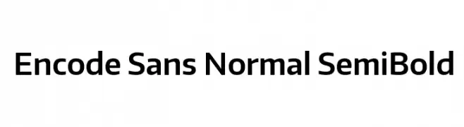
A clean, modern sans-serif typeface with uniform strokes and balanced proportions.
![Encode Sans Normal SemiBold font caratteri gratis]() Scaricare 315 Downloads@WebFont
Scaricare 315 Downloads@WebFont -
( Fonts by Style-7 - www.styleseven.com - Personal-use only. For commercial use please contact owner. )
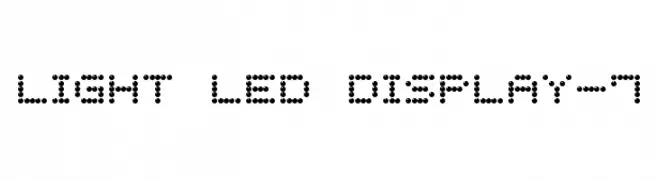
A dot-matrix style font emulating LED displays with a modern, digital look.
![Light LED Display-7 font caratteri gratis]() Scaricare 315 Downloads@WebFont
Scaricare 315 Downloads@WebFont

Quali sono i font più popolari adesso?
Poppins, Roboto, Montserrat, Open Sans e Lato sono molto usati per le forme pulite e l'ampia applicabilità — dall'identità di marca alle landing page e ai poster.
Quali font si usano spesso nei loghi?
Le sans serif geometriche (es. Poppins, famiglie in stile Gotham) sono scelte comuni per un branding pulito e scalabile. Per un tocco personale restano valide script e stili manoscritti. Abbina un display deciso per i titoli a un corpo testo neutro per riconoscibilità ed equilibrio.
Ogni quanto si aggiorna la lista?
Con regolarità, in base ai download e all'attività reale. Torna spesso per scoprire in anticipo le nuove preferite.
💡 Consiglio: aggiungi ai preferiti — le tendenze cambiano in fretta e i font top di oggi possono ispirare il rebranding di domani.