Benvenuto nelle Font Più Popolari — dove popolarità e qualità si incontrano. Qui trovi i font più scaricati e usati dell'anno. Se cerchi scelte sicure per logo, web o social, inizia da qui.
Ogni font top si distingue per equilibrio, leggibilità e versatilità. Troverai sans serif moderne, script eleganti, serif vintage e display minimalisti.
-
 Scaricare 315 Downloads@WebFont
 -
( George Williams - web.archive.org/web/20051223080638/bibliofile.mc.duke.edu/gww/fonts/fonts.html )
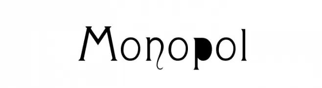
A stylish and artistic font with modern and vintage elements, featuring unique decorative flourishes.
![Monopol font caratteri gratis]() Scaricare 315 Downloads@WebFont
Scaricare 315 Downloads@WebFont -
( Fonts by Mans Greback - Personal-use only. For commercial use please contact owner. )
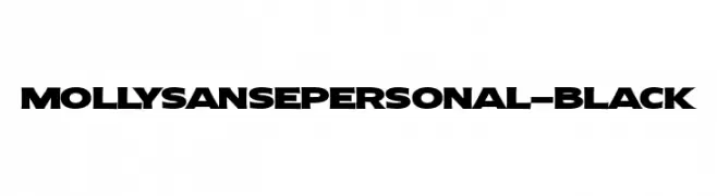
A bold, geometric font with strong, angular characters and a modern style.
![MollySansEPERSONAL-Black font caratteri gratis]() Scaricare 315 Downloads@WebFont
Scaricare 315 Downloads@WebFont -
![Kotak font caratteri gratis]() Scaricare 315 Downloads@WebFont
Scaricare 315 Downloads@WebFont -
( Copyright (c) 2009-2011 by Accademia di Belle Arti di Urbino and students of MA course of Visual design. Some rights reserved. )
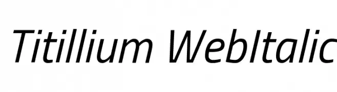
A modern, italicized font with clean lines and a dynamic appearance.
![Titillium WebItalic font caratteri gratis]() Scaricare 315 Downloads@WebFont
Scaricare 315 Downloads@WebFont -
-
![2 Lines shadow font caratteri gratis]() Scaricare 315 Downloads@WebFont
Scaricare 315 Downloads@WebFont -
( Fonts by Southype )
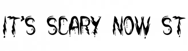
A horror-themed font with jagged, dripping letterforms for a chilling effect.
![it's Scary Now St font caratteri gratis]() Scaricare 314 Downloads@WebFont
Scaricare 314 Downloads@WebFont -
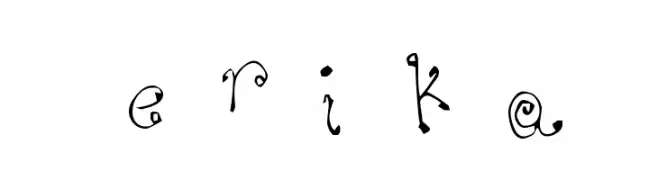
![eriKa font caratteri gratis]() Scaricare 314 Downloads@WebFont
Scaricare 314 Downloads@WebFont -
( Fonts by www.typodermicfonts.com - Ray Larabie )
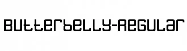
A bold, geometric font with rounded edges and a modern, friendly appearance.
![Butterbelly-Regular font caratteri gratis]() Scaricare 314 Downloads@WebFont
Scaricare 314 Downloads@WebFont -
( Copyright (c) 2011, Pablo Impallari (www.impallari.com|impallari@gmail.com) )
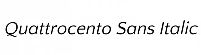
A modern, elegant sans-serif font with a subtle italic slant.
![Quattrocento Sans Italic font caratteri gratis]() Scaricare 314 Downloads@WebFont
Scaricare 314 Downloads@WebFont


Quali sono i font più popolari adesso?
Poppins, Roboto, Montserrat, Open Sans e Lato sono molto usati per le forme pulite e l'ampia applicabilità — dall'identità di marca alle landing page e ai poster.
Quali font si usano spesso nei loghi?
Le sans serif geometriche (es. Poppins, famiglie in stile Gotham) sono scelte comuni per un branding pulito e scalabile. Per un tocco personale restano valide script e stili manoscritti. Abbina un display deciso per i titoli a un corpo testo neutro per riconoscibilità ed equilibrio.
Ogni quanto si aggiorna la lista?
Con regolarità, in base ai download e all'attività reale. Torna spesso per scoprire in anticipo le nuove preferite.
💡 Consiglio: aggiungi ai preferiti — le tendenze cambiano in fretta e i font top di oggi possono ispirare il rebranding di domani.