Benvenuto nelle Font Più Popolari — dove popolarità e qualità si incontrano. Qui trovi i font più scaricati e usati dell'anno. Se cerchi scelte sicure per logo, web o social, inizia da qui.
Ogni font top si distingue per equilibrio, leggibilità e versatilità. Troverai sans serif moderne, script eleganti, serif vintage e display minimalisti.
-
( Fonts by Jacob Fisher - www.pizzadude.dk )
A bold, distressed font with a hand-painted, artistic style.
 Scaricare 1214 Downloads@WebFont
 -
![Shattered font caratteri gratis]() Scaricare 1214 Downloads@WebFont
Scaricare 1214 Downloads@WebFont -
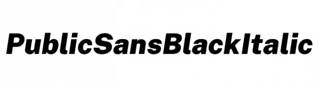
( Fonts by U.S. Web Design System )
A bold, italicized font with a modern and assertive style.
![Public Sans Black Italic font caratteri gratis]() Scaricare 1213 Downloads@WebFont
Scaricare 1213 Downloads@WebFont -
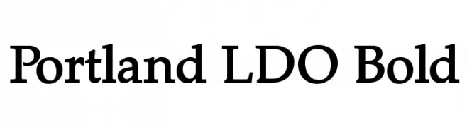
( Fonts by Luke Owens - Personal-use only. For commercial use please contact owner. )
A bold, classic serif font with strong, authoritative characters.
![Portland LDO Bold font caratteri gratis]() Scaricare 1213 Downloads@WebFont
Scaricare 1213 Downloads@WebFont -
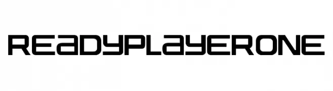
( Fonts by Fran Fernandez - Personal-use only. For commercial use please contact owner. )
A futuristic, geometric font with bold, angular letterforms and a tech-inspired aesthetic.
![Ready Player One font caratteri gratis]() Scaricare 1213 Downloads@WebFont
Scaricare 1213 Downloads@WebFont -
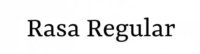
( Copyright (c) 2015 by Rosetta Type Foundry s.r.o. (info@rosettatype.com). )
A modern serif font with balanced proportions and clear readability.
![Rasa Regular font caratteri gratis]() Scaricare 1213 Downloads@WebFont
Scaricare 1213 Downloads@WebFont -
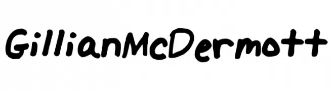
Caratteri di GillianMcDermott. For commercial use please contact the owner.
![GillianMcDermott font caratteri gratis]() Scaricare 1213 Downloads@WebFont
Scaricare 1213 Downloads@WebFont -
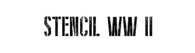
( Fonts by a Galdino Otten - galdinootten.com . Personal-use only. For commercial use please contact owner. )
A bold, distressed stencil font with a vintage military aesthetic.
![Stencil WW II font caratteri gratis]() Scaricare 1213 Downloads@WebFont
Scaricare 1213 Downloads@WebFont -
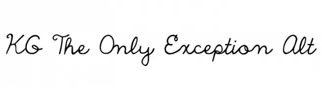
( Fonts by www.kimberlygeswein.com - Kimberly Geswein )
A playful and whimsical script font with fluid, connected letterforms.
![KG The Only Exception Alt font caratteri gratis]() Scaricare 1213 Downloads@WebFont
Scaricare 1213 Downloads@WebFont -
![M+ 2m regular font caratteri gratis]() Scaricare 1213 Downloads@WebFont
Scaricare 1213 Downloads@WebFont -
![IwonaCondHeavy-Regular font caratteri gratis]() Scaricare 1213 Downloads@WebFont
Scaricare 1213 Downloads@WebFont -
![Mortal Kombat 2 font caratteri gratis]() Scaricare 1213 Downloads@WebFont
Scaricare 1213 Downloads@WebFont -
![Manual Cookie Bucket font caratteri gratis]() Scaricare 1213 Downloads@WebFont
Scaricare 1213 Downloads@WebFont -
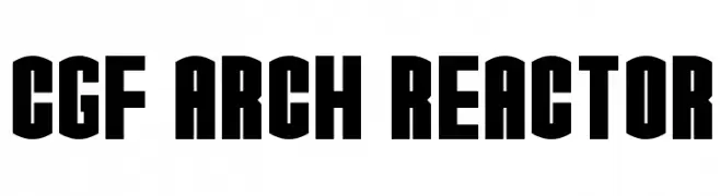
( Fonts by CGF Chris Garrett Fonts - Chris Garrett )
A bold, geometric font with an architectural influence, perfect for impactful designs.
![CGF Arch Reactor font caratteri gratis]() Scaricare 1213 Downloads@WebFont
Scaricare 1213 Downloads@WebFont -
( Fonts by www.paintblackeditions.org )
A bold, distressed font with a grunge effect for impactful designs.
![BurnOut font caratteri gratis]() Scaricare 1213 Downloads@WebFont
Scaricare 1213 Downloads@WebFont -
![Elwood font caratteri gratis]() Scaricare 1213 Downloads
Scaricare 1213 Downloads -
![Aquarium font caratteri gratis]() Scaricare 1213 Downloads@WebFont
Scaricare 1213 Downloads@WebFont -
( Fonts by Font People - Personal-use only. For commercial use please contact owner. )
A modern, semi-bold sans-serif font with excellent readability and versatility.
![Mazin DEMO SemiBold font caratteri gratis]() Scaricare 1212 Downloads@WebFont
Scaricare 1212 Downloads@WebFont -
( Fonts by Sharkshock - Personal-use only. For commercial use please contact owner. )
A modern, geometric sans-serif font with a clean and versatile design.
![Bloomsburg font caratteri gratis]() Scaricare 1212 Downloads@WebFont
Scaricare 1212 Downloads@WebFont -
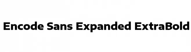
( Copyright 2012 The Encode Project Authors (impallari@gmail.com), with Reserved Font Name "Encode Sansâ€. )
A bold, expanded sans-serif font with a modern and impactful design.
![Encode Sans Expanded ExtraBold font caratteri gratis]() Scaricare 1212 Downloads@WebFont
Scaricare 1212 Downloads@WebFont -
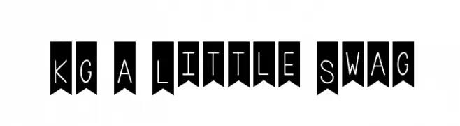
( Fonts by www.kimberlygeswein.com - Kimberly Geswein )
A playful, decorative font with a hand-drawn, whimsical style on banner backgrounds.
![KG A Little Swag font caratteri gratis]() Scaricare 1212 Downloads@WebFont
Scaricare 1212 Downloads@WebFont -
![NOKIA® 5110 FontSet font caratteri gratis]() Scaricare 1212 Downloads@WebFont
Scaricare 1212 Downloads@WebFont -
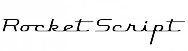
( Fonts by www.fontdiner.com )
A sleek, modern cursive font with smooth, flowing lines and slightly slanted characters.
![Rocket Script font caratteri gratis]() Scaricare 1212 Downloads@WebFont
Scaricare 1212 Downloads@WebFont -
![uni 05_53 font caratteri gratis]() Scaricare 1212 Downloads@WebFont
Scaricare 1212 Downloads@WebFont -
![101! Heart Catcher font caratteri gratis]() Scaricare 1212 Downloads@WebFont
Scaricare 1212 Downloads@WebFont -
![Cher Font font caratteri gratis]() Scaricare 1212 Downloads@WebFont
Scaricare 1212 Downloads@WebFont -
![Frontier font caratteri gratis]() Scaricare 1212 Downloads@WebFont
Scaricare 1212 Downloads@WebFont -
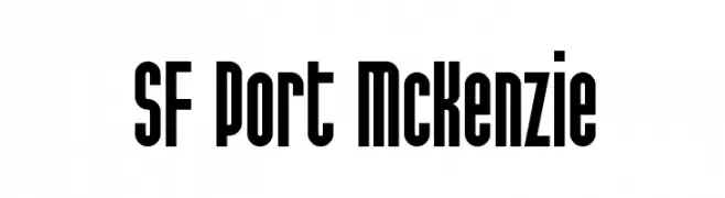
( Fonts by ShyFonts )
A bold, condensed font with a modern yet slightly vintage style.
![SF Port McKenzie font caratteri gratis]() Scaricare 1212 Downloads@WebFont
Scaricare 1212 Downloads@WebFont -
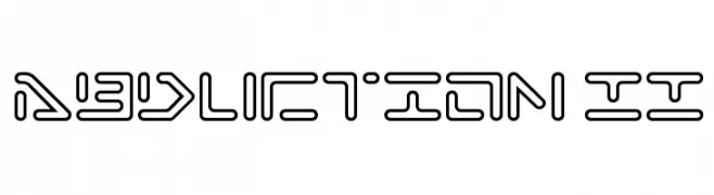
( Fonts by Rich Gast - www.greywolfwebworks.com Commerciali Caratteri )
A futuristic, geometric font with bold, interconnected lines and rounded edges.
![Abduction II font caratteri gratis]() Scaricare 1212 Downloads
Scaricare 1212 Downloads -
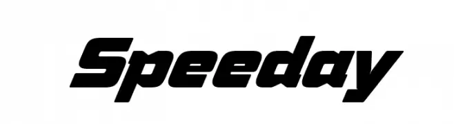
( Fonts by deFharo - Fernando Haro - Personal-use only. For commercial use please contact owner. )
A bold, italicized font with angular lines and a dynamic, modern style.
![Speeday font caratteri gratis]() Scaricare 1211 Downloads@WebFont
Scaricare 1211 Downloads@WebFont -
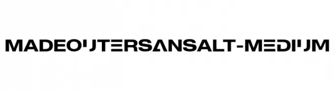
( Fonts by MadeType - Personal-use only. For commercial use please contact owner. )
A bold, modern typeface with clean, geometric lines and excellent readability.
![MADEOuterSansAlt-Medium font caratteri gratis]() Scaricare 1211 Downloads@WebFont
Scaricare 1211 Downloads@WebFont -
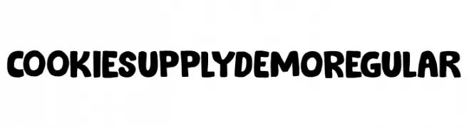
( Fonts by Hanoded )
A bold, playful font with a chunky, hand-drawn style and textured details.
![Cookie Supply DEMO Regular font caratteri gratis]() Scaricare 1211 Downloads@WebFont
Scaricare 1211 Downloads@WebFont -
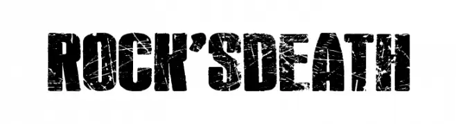
( imagex - www.imagex-fonts.com )
A bold, distressed font with a grunge aesthetic and rugged texture.
![Rock's Death font caratteri gratis]() Scaricare 1211 Downloads@WebFont
Scaricare 1211 Downloads@WebFont -
![Cupcake Smiles font caratteri gratis]() Scaricare 1211 Downloads@WebFont
Scaricare 1211 Downloads@WebFont -
( Copyright 2014-2017 Indian Type Foundry (info@indiantypefoundry.com) )
A sleek, modern, and elegant extra light italic font with a minimalist design.
![Poppins ExtraLight Italic font caratteri gratis]() Scaricare 1211 Downloads@WebFont
Scaricare 1211 Downloads@WebFont


Quali sono i font più popolari adesso?
Poppins, Roboto, Montserrat, Open Sans e Lato sono molto usati per le forme pulite e l'ampia applicabilità — dall'identità di marca alle landing page e ai poster.
Quali font si usano spesso nei loghi?
Le sans serif geometriche (es. Poppins, famiglie in stile Gotham) sono scelte comuni per un branding pulito e scalabile. Per un tocco personale restano valide script e stili manoscritti. Abbina un display deciso per i titoli a un corpo testo neutro per riconoscibilità ed equilibrio.
Ogni quanto si aggiorna la lista?
Con regolarità, in base ai download e all'attività reale. Torna spesso per scoprire in anticipo le nuove preferite.
💡 Consiglio: aggiungi ai preferiti — le tendenze cambiano in fretta e i font top di oggi possono ispirare il rebranding di domani.