Benvenuto nelle Font Più Popolari — dove popolarità e qualità si incontrano. Qui trovi i font più scaricati e usati dell'anno. Se cerchi scelte sicure per logo, web o social, inizia da qui.
Ogni font top si distingue per equilibrio, leggibilità e versatilità. Troverai sans serif moderne, script eleganti, serif vintage e display minimalisti.
-
( Fonts by Typodermic Fonts )
A bold serif font with strong strokes and pronounced serifs, ideal for impactful designs.
 Scaricare 314 Downloads@WebFont
 -
( Fonts by Kat`s Fun Fonts - Personal-use only. For commercial use please contact owner. )
A Halloween-themed decorative font with spooky icons.
![KR Bootown font caratteri gratis]() Scaricare 314 Downloads@WebFont
Scaricare 314 Downloads@WebFont -
Caratteri di fontdationstudio. For commercial use please contact the owner.
( Thank you for downloading this font This font is free for PERSONAL USE ONLY! Commercial license for this font can be purchased at: http://bit.ly/2wkljR6 )
A bold, geometric font with a modern, digital aesthetic.
![Unreal font caratteri gratis]() Scaricare 314 Downloads@WebFont
Scaricare 314 Downloads@WebFont -
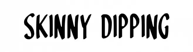
![Skinny Dipping font caratteri gratis]() Scaricare 314 Downloads@WebFont
Scaricare 314 Downloads@WebFont -
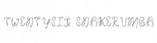
![Twentysix Snakerumba font caratteri gratis]() Scaricare 314 Downloads@WebFont
Scaricare 314 Downloads@WebFont -
-
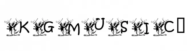
![KGMUSIC1 font caratteri gratis]() Scaricare 314 Downloads@WebFont
Scaricare 314 Downloads@WebFont -
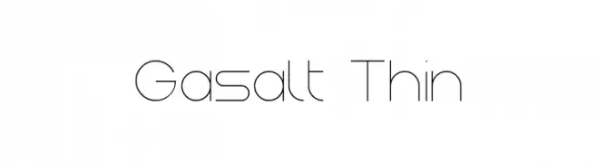
( Fonts by Remi Lagast. Personal-use only. For commercial use please contact owner. )
A sleek, modern font with thin, clean lines and geometric precision.
![Gasalt Thin font caratteri gratis]() Scaricare 314 Downloads@WebFont
Scaricare 314 Downloads@WebFont -
( Fonts by Din Studio - Donis Miftahudin - Personal-use only. For commercial use please contact owner. )
A bold, geometric font with sharp angles and a modern, edgy style.
![Gamerock Personal Use font caratteri gratis]() Scaricare 314 Downloads@WebFont
Scaricare 314 Downloads@WebFont -
![MeganHand font caratteri gratis]() Scaricare 314 Downloads@WebFont
Scaricare 314 Downloads@WebFont -
( Fonts by Khurasan )
A playful, bold font with rounded, hand-drawn characters.
![Marimpa font caratteri gratis]() Scaricare 314 Downloads@WebFont
Scaricare 314 Downloads@WebFont


Quali sono i font più popolari adesso?
Poppins, Roboto, Montserrat, Open Sans e Lato sono molto usati per le forme pulite e l'ampia applicabilità — dall'identità di marca alle landing page e ai poster.
Quali font si usano spesso nei loghi?
Le sans serif geometriche (es. Poppins, famiglie in stile Gotham) sono scelte comuni per un branding pulito e scalabile. Per un tocco personale restano valide script e stili manoscritti. Abbina un display deciso per i titoli a un corpo testo neutro per riconoscibilità ed equilibrio.
Ogni quanto si aggiorna la lista?
Con regolarità, in base ai download e all'attività reale. Torna spesso per scoprire in anticipo le nuove preferite.
💡 Consiglio: aggiungi ai preferiti — le tendenze cambiano in fretta e i font top di oggi possono ispirare il rebranding di domani.