Benvenuto nelle Font Più Popolari — dove popolarità e qualità si incontrano. Qui trovi i font più scaricati e usati dell'anno. Se cerchi scelte sicure per logo, web o social, inizia da qui.
Ogni font top si distingue per equilibrio, leggibilità e versatilità. Troverai sans serif moderne, script eleganti, serif vintage e display minimalisti.
-
( Fonts by Peter Olexa )
A lively, cursive font with interconnected characters and a whimsical charm.
 Scaricare 313 Downloads@WebFont
 -
![inumocca font caratteri gratis]() Scaricare 313 Downloads@WebFont
Scaricare 313 Downloads@WebFont -
( Fonts by www.typodermicfonts.com - Ray Larabie )
A bold, stencil-style font with geometric shapes and an industrial feel.
![Rafika-Regular font caratteri gratis]() Scaricare 313 Downloads@WebFont
Scaricare 313 Downloads@WebFont -
( Fonts by Arkandis Digital Foundry )
A modern, bold italic font with a clean and dynamic style.
![GilliusADF-BoldItalic font caratteri gratis]() Scaricare 313 Downloads@WebFont
Scaricare 313 Downloads@WebFont -
![Anyway BoldItalic font caratteri gratis]() Scaricare 313 Downloads@WebFont
Scaricare 313 Downloads@WebFont -
-
( JoannaVu - ioannaladopoulou.com )
A sophisticated serif font with sharp serifs and elegant curves.
![typernatural font caratteri gratis]() Scaricare 313 Downloads@WebFont
Scaricare 313 Downloads@WebFont -
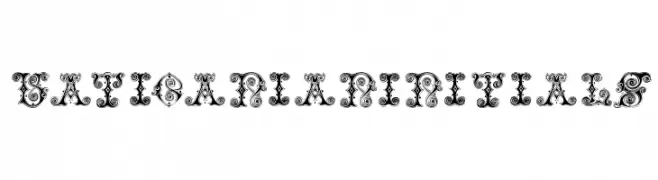
( Fonts by Manfred Klein - manfred-klein.ina-mar.com )
An ornate, decorative font with intricate swirls and embellishments.
![VaticanianInitials font caratteri gratis]() Scaricare 313 Downloads@WebFont
Scaricare 313 Downloads@WebFont -
( Fonts by Qaratype - Personal-use only. For commercial use please contact owner. )
A bold, expressive handwritten font with dynamic strokes and a modern flair.
![Riwaya font caratteri gratis]() Scaricare 313 Downloads@WebFont
Scaricare 313 Downloads@WebFont -
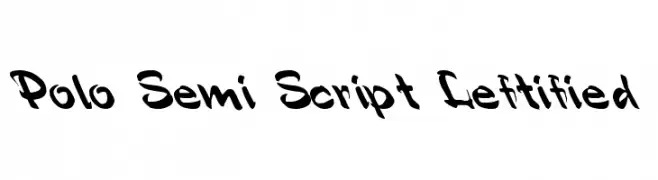
( Fonts by David Rakowski )
A bold, dynamic script font with a playful and energetic style.
![Polo Semi Script Leftified font caratteri gratis]() Scaricare 313 Downloads@WebFont
Scaricare 313 Downloads@WebFont -
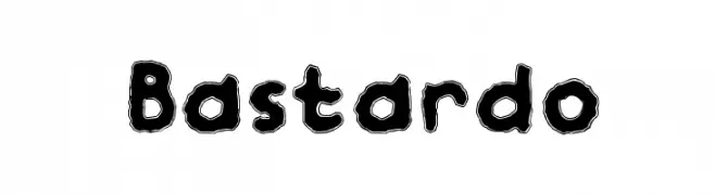
( Woodcutter - woodcutter Manero - www.woodcutter.es )
A bold, playful font with a hand-drawn, energetic style.
![Bastardo font caratteri gratis]() Scaricare 313 Downloads@WebFont
Scaricare 313 Downloads@WebFont


Quali sono i font più popolari adesso?
Poppins, Roboto, Montserrat, Open Sans e Lato sono molto usati per le forme pulite e l'ampia applicabilità — dall'identità di marca alle landing page e ai poster.
Quali font si usano spesso nei loghi?
Le sans serif geometriche (es. Poppins, famiglie in stile Gotham) sono scelte comuni per un branding pulito e scalabile. Per un tocco personale restano valide script e stili manoscritti. Abbina un display deciso per i titoli a un corpo testo neutro per riconoscibilità ed equilibrio.
Ogni quanto si aggiorna la lista?
Con regolarità, in base ai download e all'attività reale. Torna spesso per scoprire in anticipo le nuove preferite.
💡 Consiglio: aggiungi ai preferiti — le tendenze cambiano in fretta e i font top di oggi possono ispirare il rebranding di domani.