Benvenuto nelle Font Più Popolari — dove popolarità e qualità si incontrano. Qui trovi i font più scaricati e usati dell'anno. Se cerchi scelte sicure per logo, web o social, inizia da qui.
Ogni font top si distingue per equilibrio, leggibilità e versatilità. Troverai sans serif moderne, script eleganti, serif vintage e display minimalisti.
-
 Scaricare 312 Downloads@WebFont
 -
( Fonts by Fajar Abdul Fattah - https://fontbundles.net/sibelumpagi-studio - Personal-use only. For commercial use please contact owner. )
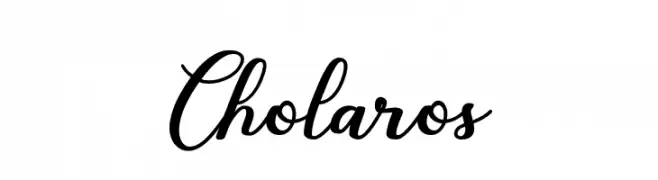
A flowing, cursive font with elegant, sweeping strokes and a sophisticated appearance.
![Cholaros font caratteri gratis]() Scaricare 312 Downloads@WebFont
Scaricare 312 Downloads@WebFont -
( Fonts by www.aka-acid.com )
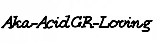
A bold, playful script font with a handwritten style.
![Aka-AcidGR-Loving font caratteri gratis]() Scaricare 312 Downloads@WebFont
Scaricare 312 Downloads@WebFont -
( Fonts by Jacob Fisher - www.pizzadude.dk )
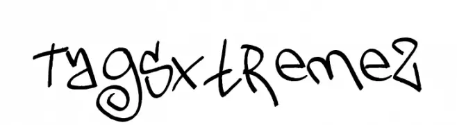
A bold, graffiti-inspired font with a playful and energetic style.
![TagsXtreme2 font caratteri gratis]() Scaricare 312 Downloads@WebFont
Scaricare 312 Downloads@WebFont -
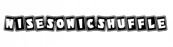
![NiseSonicShuffle font caratteri gratis]() Scaricare 312 Downloads@WebFont
Scaricare 312 Downloads@WebFont -
-
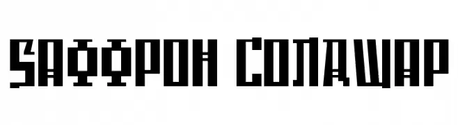
( Fonts by www.aenigmafonts.com )
A bold, geometric font with sharp angles and a blocky, industrial style.
![Saffron ColdWar font caratteri gratis]() Scaricare 312 Downloads@WebFont
Scaricare 312 Downloads@WebFont -
( Fonts by Zane Studio - Personal-use only. For commercial use please contact owner. )
A modern script font with elegant swashes and smooth, flowing characters.
![Spalding font caratteri gratis]() Scaricare 312 Downloads@WebFont
Scaricare 312 Downloads@WebFont -
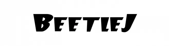
( Fonts by Slub Design - Raymond Buetens - www.slubdesign.com )
A bold, dynamic font with sharp angles and a playful, energetic feel.
![BeetleJ font caratteri gratis]() Scaricare 312 Downloads
Scaricare 312 Downloads -
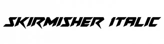
( Fonts by Daniel Zadorozny - www.iconian.com - Free for personal use )
A bold, angular, and italicized font with a futuristic and edgy design.
![Skirmisher Italic font caratteri gratis]() Scaricare 312 Downloads@WebFont
Scaricare 312 Downloads@WebFont -
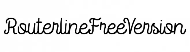
( ViactionType - Lukman Hidayat - www.myfonts.com/foundry/Viaction_Type/ )
A playful, handwritten script font with smooth, flowing lines.
![RouterlineFreeVersion font caratteri gratis]() Scaricare 312 Downloads@WebFont
Scaricare 312 Downloads@WebFont

Quali sono i font più popolari adesso?
Poppins, Roboto, Montserrat, Open Sans e Lato sono molto usati per le forme pulite e l'ampia applicabilità — dall'identità di marca alle landing page e ai poster.
Quali font si usano spesso nei loghi?
Le sans serif geometriche (es. Poppins, famiglie in stile Gotham) sono scelte comuni per un branding pulito e scalabile. Per un tocco personale restano valide script e stili manoscritti. Abbina un display deciso per i titoli a un corpo testo neutro per riconoscibilità ed equilibrio.
Ogni quanto si aggiorna la lista?
Con regolarità, in base ai download e all'attività reale. Torna spesso per scoprire in anticipo le nuove preferite.
💡 Consiglio: aggiungi ai preferiti — le tendenze cambiano in fretta e i font top di oggi possono ispirare il rebranding di domani.