Benvenuto nelle Font Più Popolari — dove popolarità e qualità si incontrano. Qui trovi i font più scaricati e usati dell'anno. Se cerchi scelte sicure per logo, web o social, inizia da qui.
Ogni font top si distingue per equilibrio, leggibilità e versatilità. Troverai sans serif moderne, script eleganti, serif vintage e display minimalisti.
-
 Scaricare 311 Downloads@WebFont
 -
Caratteri di defharo. For commercial use please contact the owner.
![LaPejina-ffp font caratteri gratis]() Scaricare 311 Downloads@WebFont
Scaricare 311 Downloads@WebFont -
( Fonts by softerviews.org )
A modern, italic sans-serif font with clean lines and a dynamic slant.
![Verajja Italic font caratteri gratis]() Scaricare 311 Downloads@WebFont
Scaricare 311 Downloads@WebFont -
( Fonts by Google - Personal-use only. For commercial use please contact owner. )
A modern, semi-condensed sans-serif font with a semi-bold weight.
![Noto Sans SemiCondensed SemiBold font caratteri gratis]() Scaricare 310 Downloads@WebFont
Scaricare 310 Downloads@WebFont -
( Fonts by www.chequered.ink - Chequered Ink - Personal-use only. For commercial use please contact owner. )
A bold, geometric font with a futuristic and robotic design.
![Robot Roc Not a Tilter font caratteri gratis]() Scaricare 310 Downloads@WebFont
Scaricare 310 Downloads@WebFont -
-
( Fonts by share font )
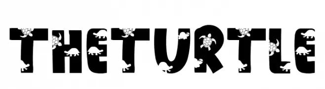
A bold, decorative font with integrated turtle illustrations for a playful touch.
![THE TURTLE font caratteri gratis]() Scaricare 310 Downloads@WebFont
Scaricare 310 Downloads@WebFont -
( Fonts by Daniel Zadorozny - www.iconian.com - Free for personal use )
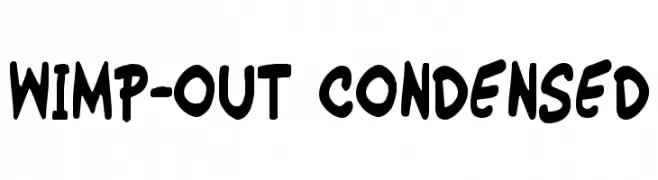
A playful, bold, and condensed hand-drawn font with a friendly appearance.
![Wimp-Out Condensed font caratteri gratis]() Scaricare 310 Downloads@WebFont
Scaricare 310 Downloads@WebFont -
( Fonts by Jen Jones )
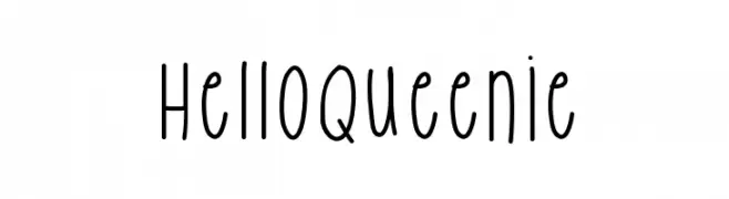
A playful, hand-drawn font with tall, narrow characters and a whimsical style.
![HelloQueenie font caratteri gratis]() Scaricare 310 Downloads@WebFont
Scaricare 310 Downloads@WebFont -
( Fonts by Display Studio )
A bold, italic font with decorative flourishes and high contrast strokes.
![Affistory Italic font caratteri gratis]() Scaricare 310 Downloads@WebFont
Scaricare 310 Downloads@WebFont -
( Fonts by www.blambot.com )
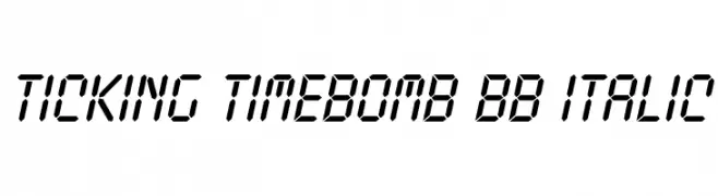
A digital, segmented font with an italic slant, inspired by LED displays.
![Ticking Timebomb BB Italic font caratteri gratis]() Scaricare 310 Downloads@WebFont
Scaricare 310 Downloads@WebFont


Quali sono i font più popolari adesso?
Poppins, Roboto, Montserrat, Open Sans e Lato sono molto usati per le forme pulite e l'ampia applicabilità — dall'identità di marca alle landing page e ai poster.
Quali font si usano spesso nei loghi?
Le sans serif geometriche (es. Poppins, famiglie in stile Gotham) sono scelte comuni per un branding pulito e scalabile. Per un tocco personale restano valide script e stili manoscritti. Abbina un display deciso per i titoli a un corpo testo neutro per riconoscibilità ed equilibrio.
Ogni quanto si aggiorna la lista?
Con regolarità, in base ai download e all'attività reale. Torna spesso per scoprire in anticipo le nuove preferite.
💡 Consiglio: aggiungi ai preferiti — le tendenze cambiano in fretta e i font top di oggi possono ispirare il rebranding di domani.