Benvenuto nelle Font Più Popolari — dove popolarità e qualità si incontrano. Qui trovi i font più scaricati e usati dell'anno. Se cerchi scelte sicure per logo, web o social, inizia da qui.
Ogni font top si distingue per equilibrio, leggibilità e versatilità. Troverai sans serif moderne, script eleganti, serif vintage e display minimalisti.
-
( Paul Lloyd Fonts )
Placeholder squares indicating a missing or unavailable font.
 Scaricare 313 Downloads
 -
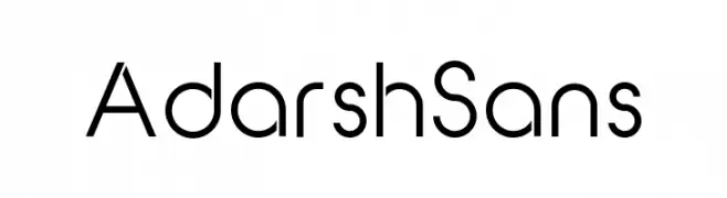
( Fonts by Adarsh S - Personal-use only. For commercial use please contact owner. )
A modern, geometric sans-serif font with clean lines and uniform strokes.
![Adarsh Sans font caratteri gratis]() Scaricare 313 Downloads@WebFont
Scaricare 313 Downloads@WebFont -
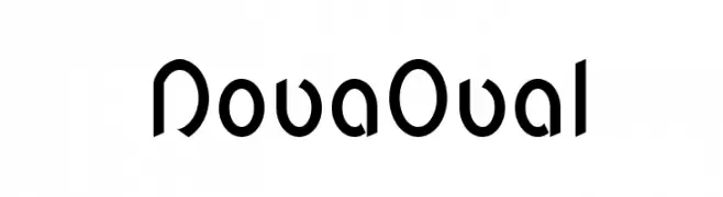
![NovaOval font caratteri gratis]() Scaricare 313 Downloads@WebFont
Scaricare 313 Downloads@WebFont -
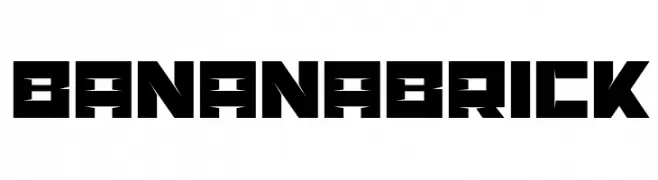
( Artmaker - www.behance.net/artmaker )
A bold, geometric font with sharp angles and block-like shapes.
![BananaBrick font caratteri gratis]() Scaricare 313 Downloads@WebFont
Scaricare 313 Downloads@WebFont -
( Fonts by Graham Meade - GemFonts )
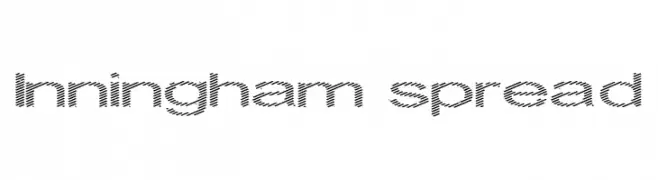
A modern, textured font with diagonal lines and geometric shapes.
![Inningham spread font caratteri gratis]() Scaricare 313 Downloads@WebFont
Scaricare 313 Downloads@WebFont -
-
![Rivalry font caratteri gratis]() Scaricare 313 Downloads
Scaricare 313 Downloads -
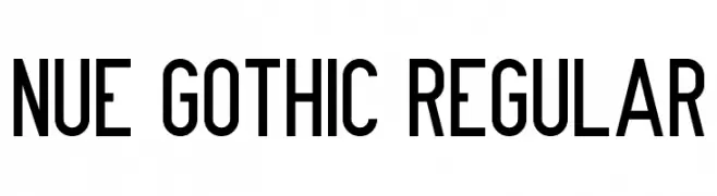
![Nue Gothic Regular font caratteri gratis]() Scaricare 313 Downloads@WebFont
Scaricare 313 Downloads@WebFont -
( Fonts by Apostrophic Lab )
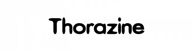
A bold, playful font with rounded edges and a bubbly appearance.
![Thorazine font caratteri gratis]() Scaricare 313 Downloads@WebFont
Scaricare 313 Downloads@WebFont -
( www.mschroeppel.de/ )
A bold, distressed font with a rough, textured appearance ideal for edgy designs.
![LLNitro font caratteri gratis]() Scaricare 313 Downloads@WebFont
Scaricare 313 Downloads@WebFont -
( Fonts by fontsandfashion.com. Personal-use only. For commercial use please contact owner. )
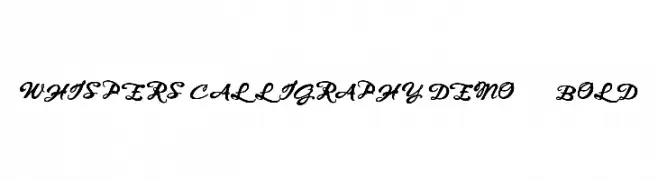
An elegant, flowing script font with bold, cursive letterforms.
![WHISPERS CALLIGRAPHY_DEMO_sinuous_BOLD font caratteri gratis]() Scaricare 313 Downloads@WebFont
Scaricare 313 Downloads@WebFont


Quali sono i font più popolari adesso?
Poppins, Roboto, Montserrat, Open Sans e Lato sono molto usati per le forme pulite e l'ampia applicabilità — dall'identità di marca alle landing page e ai poster.
Quali font si usano spesso nei loghi?
Le sans serif geometriche (es. Poppins, famiglie in stile Gotham) sono scelte comuni per un branding pulito e scalabile. Per un tocco personale restano valide script e stili manoscritti. Abbina un display deciso per i titoli a un corpo testo neutro per riconoscibilità ed equilibrio.
Ogni quanto si aggiorna la lista?
Con regolarità, in base ai download e all'attività reale. Torna spesso per scoprire in anticipo le nuove preferite.
💡 Consiglio: aggiungi ai preferiti — le tendenze cambiano in fretta e i font top di oggi possono ispirare il rebranding di domani.