Benvenuto nelle Font Più Popolari — dove popolarità e qualità si incontrano. Qui trovi i font più scaricati e usati dell'anno. Se cerchi scelte sicure per logo, web o social, inizia da qui.
Ogni font top si distingue per equilibrio, leggibilità e versatilità. Troverai sans serif moderne, script eleganti, serif vintage e display minimalisti.
-
( Fonts by Tribby )
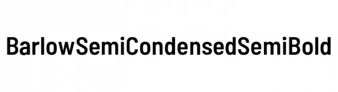
A modern sans-serif font with semi-condensed proportions and uniform stroke widths.
 Scaricare 306 Downloads@WebFont
 -
( Fonts by www.peter-wiegel.de. Personal-use only. For commercial use please contact owner. )
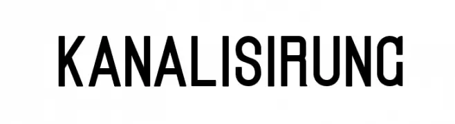
A bold, geometric sans-serif font with a modern and clean design.
![Kanalisirung font caratteri gratis]() Scaricare 306 Downloads@WebFont
Scaricare 306 Downloads@WebFont -
( Fonts by Knackpack Studio - www.knackpack.studio - Personal-use only. For commercial use please contact owner. )
A bold, distressed font with a rugged, grunge appearance.
![The Flast Demo font caratteri gratis]() Scaricare 306 Downloads@WebFont
Scaricare 306 Downloads@WebFont -
( Fonts by Revo Farisky )
A bold, playful handwritten font with smooth, rounded strokes.
![Chrumpy font caratteri gratis]() Scaricare 306 Downloads@WebFont
Scaricare 306 Downloads@WebFont -
( Fonts by Vít Čondák )
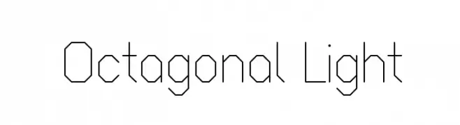
A geometric, octagonal font with a modern and technical style.
![Octagonal Light font caratteri gratis]() Scaricare 306 Downloads@WebFont
Scaricare 306 Downloads@WebFont -
-
( Fonts by Fenny Wiryani - Personal-use only. For commercial use please contact owner. )
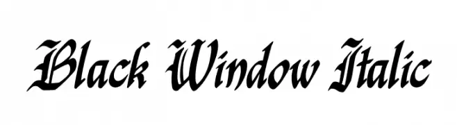
An ornate, italicized font with sharp, angular lines and a calligraphic style.
![Black Window Italic font caratteri gratis]() Scaricare 306 Downloads@WebFont
Scaricare 306 Downloads@WebFont -
![ijifufont Blade font caratteri gratis]() Scaricare 306 Downloads@WebFont
Scaricare 306 Downloads@WebFont -
![DJB Shape Up Stars font caratteri gratis]() Scaricare 306 Downloads@WebFont
Scaricare 306 Downloads@WebFont -
( Fonts by Adarsh S - Personal-use only. For commercial use please contact owner. )
A modern, geometric sans-serif font with clean lines and uniform strokes.
![Adarsh Sans font caratteri gratis]() Scaricare 306 Downloads@WebFont
Scaricare 306 Downloads@WebFont -
( - www.facebook.com/NikoCabal )
An artistic and whimsical font with gothic-inspired swirls and curves.
![ReservoirInk font caratteri gratis]() Scaricare 306 Downloads@WebFont
Scaricare 306 Downloads@WebFont


Quali sono i font più popolari adesso?
Poppins, Roboto, Montserrat, Open Sans e Lato sono molto usati per le forme pulite e l'ampia applicabilità — dall'identità di marca alle landing page e ai poster.
Quali font si usano spesso nei loghi?
Le sans serif geometriche (es. Poppins, famiglie in stile Gotham) sono scelte comuni per un branding pulito e scalabile. Per un tocco personale restano valide script e stili manoscritti. Abbina un display deciso per i titoli a un corpo testo neutro per riconoscibilità ed equilibrio.
Ogni quanto si aggiorna la lista?
Con regolarità, in base ai download e all'attività reale. Torna spesso per scoprire in anticipo le nuove preferite.
💡 Consiglio: aggiungi ai preferiti — le tendenze cambiano in fretta e i font top di oggi possono ispirare il rebranding di domani.