Benvenuto nelle Font Più Popolari — dove popolarità e qualità si incontrano. Qui trovi i font più scaricati e usati dell'anno. Se cerchi scelte sicure per logo, web o social, inizia da qui.
Ogni font top si distingue per equilibrio, leggibilità e versatilità. Troverai sans serif moderne, script eleganti, serif vintage e display minimalisti.
-
 Scaricare 1185 Downloads@WebFont
 -
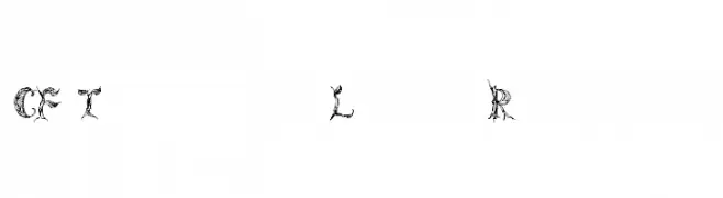
( Fonts by a Emily Spadoni - http://creativemarket.com/emilyspadoni/. Personal-use only. For commercial use please contact owner. )
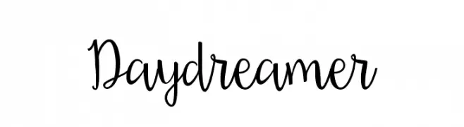
A whimsical, playful script font with elegant, flowing cursive letters.
![Daydreamer font caratteri gratis]() Scaricare 1185 Downloads@WebFont
Scaricare 1185 Downloads@WebFont -
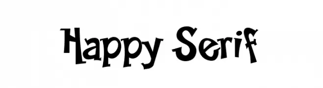
![Happy Serif font caratteri gratis]() Scaricare 1185 Downloads@WebFont
Scaricare 1185 Downloads@WebFont -
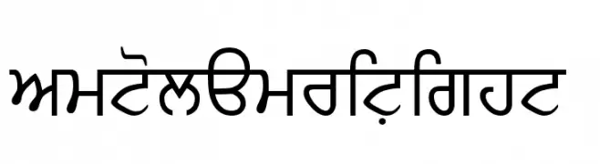
![SamtolAmritLight font caratteri gratis]() Scaricare 1185 Downloads@WebFont
Scaricare 1185 Downloads@WebFont -
( Fonts by Situjuh Nazara - 7ntypes.com - Personal-use only. For commercial use please contact owner. )
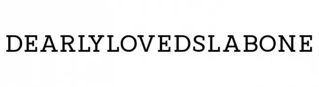
A bold slab serif font with strong, block-like serifs and uniform stroke width.
![DearlylovedSlabOne font caratteri gratis]() Scaricare 1184 Downloads@WebFont
Scaricare 1184 Downloads@WebFont -
( Personal-use only. For commercial use please contact owner. )
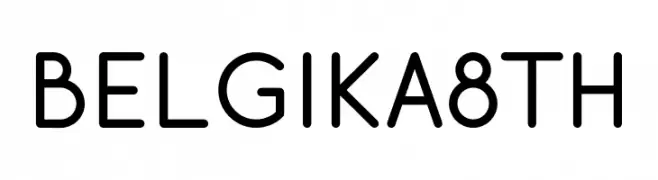
A modern, clean sans-serif font with uniform strokes and rounded edges.
![Belgika 8th font caratteri gratis]() Scaricare 1184 Downloads@WebFont
Scaricare 1184 Downloads@WebFont -
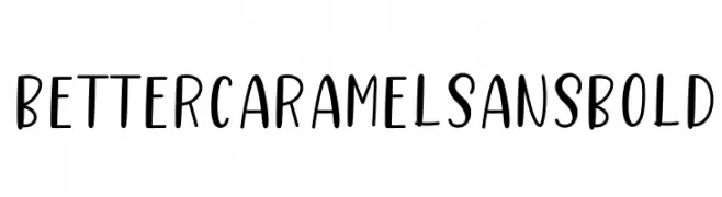
![Better Caramel Sans Bold font caratteri gratis]() Scaricare 1184 Downloads@WebFont
Scaricare 1184 Downloads@WebFont -
( 7NTypes - Situjuh Nazara - 7ntypes.com )
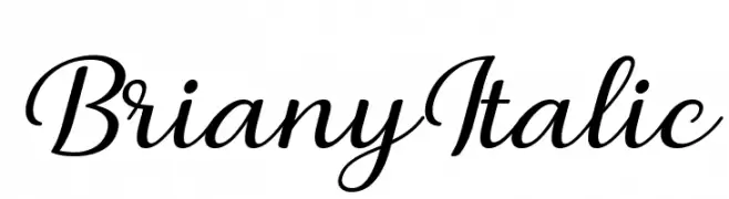
A graceful, flowing script font with elegant, connected strokes and an italic style.
![Briany Italic font caratteri gratis]() Scaricare 1184 Downloads@WebFont
Scaricare 1184 Downloads@WebFont -
![TFonts font caratteri gratis]() Scaricare 1184 Downloads@WebFont
Scaricare 1184 Downloads@WebFont -
![Oganesson font caratteri gratis]() Scaricare 1184 Downloads@WebFont
Scaricare 1184 Downloads@WebFont -
( Fonts by Manuel Ramos - www.infinitismo.com - Personal-use only. For commercial use please contact owner. )
A sleek, modern font with thin, geometric lines and minimalistic design.
![radiance font caratteri gratis]() Scaricare 1184 Downloads@WebFont
Scaricare 1184 Downloads@WebFont -
( Fonts by omnibus-type.com. Personal-use only. For commercial use please contact owner. )
A playful, hand-drawn font with tall, narrow characters and bold strokes.
![Bahiana font caratteri gratis]() Scaricare 1184 Downloads@WebFont
Scaricare 1184 Downloads@WebFont -
![Steelworks Vintage Demo font caratteri gratis]() Scaricare 1184 Downloads@WebFont
Scaricare 1184 Downloads@WebFont -
( Fonts by Castcraft Software - opti.netii.net - check the website before use )
A bold serif font with a classic and authoritative style.
![OPTIBarMay-Bold font caratteri gratis]() Scaricare 1184 Downloads@WebFont
Scaricare 1184 Downloads@WebFont -
( Font by Jayvee D. Enaguas - grandchaos9000.deviantart.com )
A playful, bold font with a hand-drawn, rounded style.
![Barthowheel Regular font caratteri gratis]() Scaricare 1184 Downloads@WebFont
Scaricare 1184 Downloads@WebFont -
( Fonts by Matthew Welch - www.squaregear.net/fonts/ )
A bold, geometric font with sharp angles and a blocky structure.
![Propaganda Regular:Version 1.00 font caratteri gratis]() Scaricare 1184 Downloads@WebFont
Scaricare 1184 Downloads@WebFont -
![Brrr font caratteri gratis]() Scaricare 1184 Downloads@WebFont
Scaricare 1184 Downloads@WebFont -
( Fonts by Subectype & Orenari )
A playful, bold font with rounded, decorative letterforms.
![Hello Rainbow font caratteri gratis]() Scaricare 1183 Downloads@WebFont
Scaricare 1183 Downloads@WebFont -
( Fonts by Khurasan )
A playful, hand-drawn font with a bold, textured style.
![Apasih font caratteri gratis]() Scaricare 1183 Downloads@WebFont
Scaricare 1183 Downloads@WebFont -
( Copyright (c) 2015, Pablo Impallari, Rodrigo Fuenzalida (Modified by Dan O. Williams and USWDS) (https://github.com/uswds/public-sans) )
A modern, clean sans-serif font with uniform strokes and excellent readability.
![Public Sans Medium font caratteri gratis]() Scaricare 1183 Downloads@WebFont
Scaricare 1183 Downloads@WebFont -
( Fonts by BLKBK - https://blkbk.ink - Personal-use only. For commercial use please contact owner. Commerciali Caratteri )
A fluid and elegant script font with flowing cursive letterforms.
![Future Shock font caratteri gratis]() Scaricare 1183 Downloads
Scaricare 1183 Downloads -
( Fonts by a Galdino Otten - galdinootten.com . Personal-use only. For commercial use please contact owner. )
A modern, geometric font with a futuristic, minimalist style.
![Almost Japanese font caratteri gratis]() Scaricare 1183 Downloads@WebFont
Scaricare 1183 Downloads@WebFont -
( Copyright 2013 Seoul Metropolitan Government (gonabis@seoul.go.kr) )
A modern, clean sans-serif font with excellent readability and balance.
![SeoulNamsan vert font caratteri gratis]() Scaricare 1183 Downloads@WebFont
Scaricare 1183 Downloads@WebFont -
( Fonts by Castcraft Software - opti.netii.net - check the website before use )
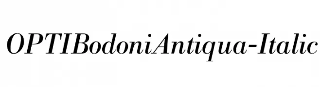
An elegant serif typeface with high contrast and an italic slant, perfect for refined designs.
![OPTIBodoniAntiqua-Italic font caratteri gratis]() Scaricare 1183 Downloads@WebFont
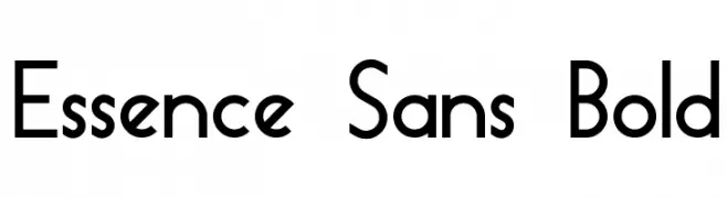
Scaricare 1183 Downloads@WebFont -
![Essence Sans Bold font caratteri gratis]() Scaricare 1183 Downloads@WebFont
Scaricare 1183 Downloads@WebFont -
( Fonts by weknow - Wino S Kadir )
A rounded, geometric sans-serif font with a clean, modern look.
![bookmark font caratteri gratis]() Scaricare 1183 Downloads@WebFont
Scaricare 1183 Downloads@WebFont -
( Copyright (c) 2011 by Sorkin Type Co (www.sorkintype.com) )
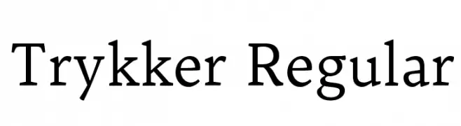
A classic serif typeface with modern elements, offering elegance and readability.
![Trykker Regular font caratteri gratis]() Scaricare 1183 Downloads@WebFont
Scaricare 1183 Downloads@WebFont -
( Fonts by Blue Vinyl - Jess Latham - www.bvfonts.com )
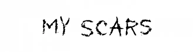
A distressed, grungy font with a scratched, eroded appearance.
![My Scars font caratteri gratis]() Scaricare 1183 Downloads@WebFont
Scaricare 1183 Downloads@WebFont -
![GrievousAngel font caratteri gratis]() Scaricare 1183 Downloads@WebFont
Scaricare 1183 Downloads@WebFont -
( Fonts by www.typodermicfonts.com - Ray Larabie )
A bold, modern sans-serif font with rounded characters and excellent readability.
![PrimerPrint-Bold font caratteri gratis]() Scaricare 1183 Downloads@WebFont
Scaricare 1183 Downloads@WebFont -
![Dirty English font caratteri gratis]() Scaricare 1183 Downloads@WebFont
Scaricare 1183 Downloads@WebFont -
( Fonts by www.fontalicious.com )
A bold, geometric font with a digital, tech-inspired design.
![Micro font caratteri gratis]() Scaricare 1183 Downloads@WebFont
Scaricare 1183 Downloads@WebFont -
( Fonts by Abstract Type Design - Patrick Durr )
A decorative font with sharp, angular edges and an Asian calligraphy-inspired style.
![China Town font caratteri gratis]() Scaricare 1183 Downloads@WebFont
Scaricare 1183 Downloads@WebFont -
![101! EtchASketch font caratteri gratis]() Scaricare 1183 Downloads@WebFont
Scaricare 1183 Downloads@WebFont -
![unifur font caratteri gratis]() Scaricare 1183 Downloads@WebFont
Scaricare 1183 Downloads@WebFont


Quali sono i font più popolari adesso?
Poppins, Roboto, Montserrat, Open Sans e Lato sono molto usati per le forme pulite e l'ampia applicabilità — dall'identità di marca alle landing page e ai poster.
Quali font si usano spesso nei loghi?
Le sans serif geometriche (es. Poppins, famiglie in stile Gotham) sono scelte comuni per un branding pulito e scalabile. Per un tocco personale restano valide script e stili manoscritti. Abbina un display deciso per i titoli a un corpo testo neutro per riconoscibilità ed equilibrio.
Ogni quanto si aggiorna la lista?
Con regolarità, in base ai download e all'attività reale. Torna spesso per scoprire in anticipo le nuove preferite.
💡 Consiglio: aggiungi ai preferiti — le tendenze cambiano in fretta e i font top di oggi possono ispirare il rebranding di domani.