Benvenuto nelle Font Più Popolari — dove popolarità e qualità si incontrano. Qui trovi i font più scaricati e usati dell'anno. Se cerchi scelte sicure per logo, web o social, inizia da qui.
Ogni font top si distingue per equilibrio, leggibilità e versatilità. Troverai sans serif moderne, script eleganti, serif vintage e display minimalisti.
-
( Fonts by www.chequered.ink - Chequered Ink - Personal-use only. For commercial use please contact owner. )
A modern, geometric font with clean lines and balanced structure.
 Scaricare 301 Downloads@WebFont
 -
( Khurasan - Syaf Rizal - creativemarket.com/khurasan?u=khurasan )
An elegant and fluid script font with interconnected letters.
![Viksi Script font caratteri gratis]() Scaricare 301 Downloads@WebFont
Scaricare 301 Downloads@WebFont -
( Fonts by Holisfonts.com - Holis Fonts - Personal-use only. For commercial use please contact owner. )
A bold, condensed font with uniform thickness and clean lines.
![RECKFIELD-NORMAL font caratteri gratis]() Scaricare 301 Downloads@WebFont
Scaricare 301 Downloads@WebFont -
( Fonts by www.woodcutter.es - woodcutter Manero - Personal-use only. For commercial use please contact owner. )
![Eagle font caratteri gratis]() Scaricare 301 Downloads@WebFont
Scaricare 301 Downloads@WebFont -
( Fonts by Iconian Fonts - Daniel Zadorozny )
A bold, geometric font with a futuristic and dynamic style.
![Gemina Academy Regular font caratteri gratis]() Scaricare 301 Downloads@WebFont
Scaricare 301 Downloads@WebFont -
-
( Fonts by Castcraft Software - OPTI Fonts Archive - opti.netii.net - Personal-use only. For commercial use please contact owner. )
A bold, high-contrast serif font with a modern twist.
![OPTINubianFoundry font caratteri gratis]() Scaricare 301 Downloads@WebFont
Scaricare 301 Downloads@WebFont -
( Fonts by Kevin Christopher - www.kcfonts.com )
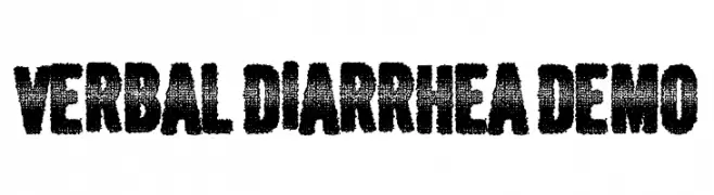
A bold, distressed font with a grunge texture and vintage appeal.
![Verbal Diarrhea DEMO font caratteri gratis]() Scaricare 301 Downloads@WebFont
Scaricare 301 Downloads@WebFont -
( Kirsten Louise - www.kirstenlouisedesign.com )
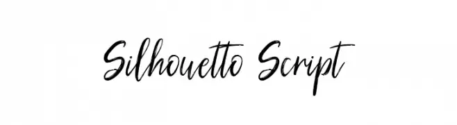
A lively, handwritten script font with elegant, flowing characters.
![Silhouetto Script font caratteri gratis]() Scaricare 301 Downloads@WebFont
Scaricare 301 Downloads@WebFont -
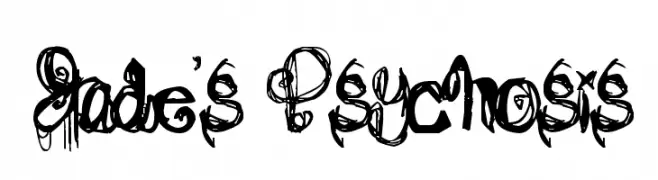
![Jade's Psychosis font caratteri gratis]() Scaricare 301 Downloads@WebFont
Scaricare 301 Downloads@WebFont -
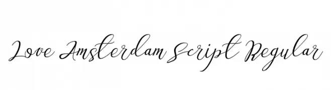
![Love Amsterdam Script Regular font caratteri gratis]() Scaricare 301 Downloads@WebFont
Scaricare 301 Downloads@WebFont


Quali sono i font più popolari adesso?
Poppins, Roboto, Montserrat, Open Sans e Lato sono molto usati per le forme pulite e l'ampia applicabilità — dall'identità di marca alle landing page e ai poster.
Quali font si usano spesso nei loghi?
Le sans serif geometriche (es. Poppins, famiglie in stile Gotham) sono scelte comuni per un branding pulito e scalabile. Per un tocco personale restano valide script e stili manoscritti. Abbina un display deciso per i titoli a un corpo testo neutro per riconoscibilità ed equilibrio.
Ogni quanto si aggiorna la lista?
Con regolarità, in base ai download e all'attività reale. Torna spesso per scoprire in anticipo le nuove preferite.
💡 Consiglio: aggiungi ai preferiti — le tendenze cambiano in fretta e i font top di oggi possono ispirare il rebranding di domani.