Benvenuto nelle Font Più Popolari — dove popolarità e qualità si incontrano. Qui trovi i font più scaricati e usati dell'anno. Se cerchi scelte sicure per logo, web o social, inizia da qui.
Ogni font top si distingue per equilibrio, leggibilità e versatilità. Troverai sans serif moderne, script eleganti, serif vintage e display minimalisti.
-
( Fonts by Kurdz - vividbluezz.weebly.com )
A playful, bold font with thick outlines and a cartoonish style.
 Scaricare 303 Downloads@WebFont
 -
![BjBj font caratteri gratis]() Scaricare 303 Downloads@WebFont
Scaricare 303 Downloads@WebFont -
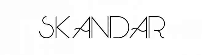
( Fonts by skomii - Personal-use only. For commercial use please contact owner. )
A modern, geometric font with artistic curves and sharp angles.
![Skandar font caratteri gratis]() Scaricare 303 Downloads@WebFont
Scaricare 303 Downloads@WebFont -
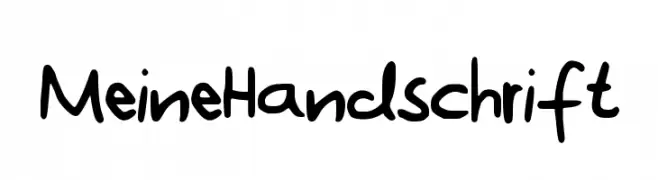
![MeineHandschrift font caratteri gratis]() Scaricare 303 Downloads@WebFont
Scaricare 303 Downloads@WebFont -
( Personal-use only. For commercial use please contact owner. )
A vintage, hand-crafted serif font with bold, artistic characters.
![GL-Tsukiji-4go Regular font caratteri gratis]() Scaricare 303 Downloads@WebFont
Scaricare 303 Downloads@WebFont -
( Fonts by Ingo Zimmermann - www.ingofonts.com )
A modern, italic sans-serif font with a sleek and elegant design.
![FaberSansPro-NormalKursiv font caratteri gratis]() Scaricare 303 Downloads@WebFont
Scaricare 303 Downloads@WebFont -
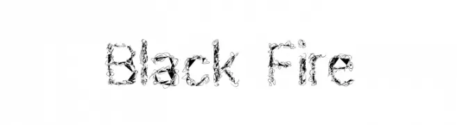
( Fonts by Geronimo Fonts - Personal-use only. For commercial use please contact owner. )
An intricate, chaotic font with overlapping loops and lines, ideal for creative projects.
![Black Fire font caratteri gratis]() Scaricare 303 Downloads@WebFont
Scaricare 303 Downloads@WebFont -
( Fonts by Edric Studio www.creativefabrica.com/designer/edricstudio/ - Personal-use only. For commercial use please contact owner. )
An elegant and decorative script font with intricate swirls and flourishes.
![Nairi Amber font caratteri gratis]() Scaricare 303 Downloads@WebFont
Scaricare 303 Downloads@WebFont -
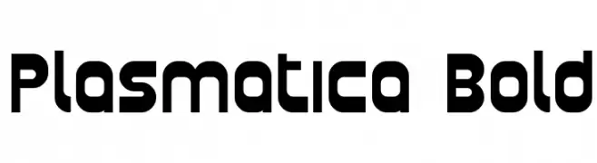
( Fonts by Apostrophic Lab )
A bold, geometric font with rounded edges and a modern aesthetic.
![Plasmatica Bold font caratteri gratis]() Scaricare 303 Downloads@WebFont
Scaricare 303 Downloads@WebFont -
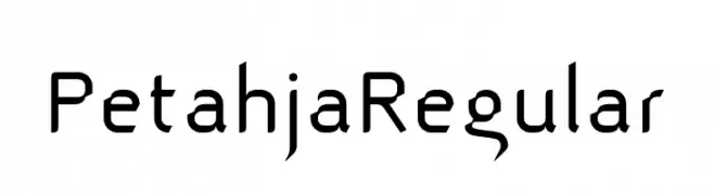
( Fonts by T. Christopher White )
A modern, geometric font with angular, futuristic styling.
![Petahja Regular font caratteri gratis]() Scaricare 303 Downloads@WebFont
Scaricare 303 Downloads@WebFont


Quali sono i font più popolari adesso?
Poppins, Roboto, Montserrat, Open Sans e Lato sono molto usati per le forme pulite e l'ampia applicabilità — dall'identità di marca alle landing page e ai poster.
Quali font si usano spesso nei loghi?
Le sans serif geometriche (es. Poppins, famiglie in stile Gotham) sono scelte comuni per un branding pulito e scalabile. Per un tocco personale restano valide script e stili manoscritti. Abbina un display deciso per i titoli a un corpo testo neutro per riconoscibilità ed equilibrio.
Ogni quanto si aggiorna la lista?
Con regolarità, in base ai download e all'attività reale. Torna spesso per scoprire in anticipo le nuove preferite.
💡 Consiglio: aggiungi ai preferiti — le tendenze cambiano in fretta e i font top di oggi possono ispirare il rebranding di domani.