Benvenuto nelle Font Più Popolari — dove popolarità e qualità si incontrano. Qui trovi i font più scaricati e usati dell'anno. Se cerchi scelte sicure per logo, web o social, inizia da qui.
Ogni font top si distingue per equilibrio, leggibilità e versatilità. Troverai sans serif moderne, script eleganti, serif vintage e display minimalisti.
-
( Fonts by Castcraft Software - opti.netii.net - check the website before use )
A bold, modern sans-serif font with geometric precision and strong visual impact.
 Scaricare 9604 Downloads@WebFont
 -
( Fonts by Hanken Design Co. - Personal-use only. For commercial use please contact owner. )
A bold, modern sans-serif typeface with geometric shapes and uniform stroke width.
![GlacialIndifference-Bold font caratteri gratis]() Scaricare 9595 Downloads@WebFont
Scaricare 9595 Downloads@WebFont -
( Copyright (c) 2012 Silicon Andhra (fonts.siliconandhra.org). )
A modern, clean sans-serif font with rounded edges and uniform strokes.
![NTR font caratteri gratis]() Scaricare 9588 Downloads@WebFont
Scaricare 9588 Downloads@WebFont -
( Copyright (c) 2015, Danh Hong (www.khmertype.org) )
A modern, geometric sans-serif font with uniform strokes and clear readability.
![Myanmar Khyay font caratteri gratis]() Scaricare 9587 Downloads@WebFont
Scaricare 9587 Downloads@WebFont -
( Copyright (c) 2010, 2011 vernon adams (vern@newtypography.co.uk) )
A modern, geometric sans-serif font with clean lines and balanced spacing.
![Gruppo font caratteri gratis]() Scaricare 9576 Downloads@WebFont
Scaricare 9576 Downloads@WebFont -
( Copyright (c) 2010, Sebastian Kosch (sebastian@aldusleaf.org) )
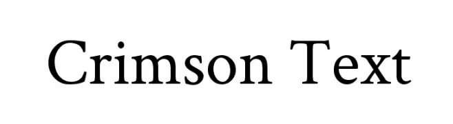
A classic serif typeface with elegant proportions and refined serifs.
![Crimson Text font caratteri gratis]() Scaricare 9572 Downloads@WebFont
Scaricare 9572 Downloads@WebFont -
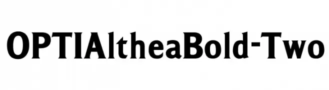
( Fonts by Castcraft Software - opti.netii.net - check the website before use )
A bold serif font with strong strokes and clear readability.
![OPTIAltheaBold-Two font caratteri gratis]() Scaricare 9565 Downloads@WebFont
Scaricare 9565 Downloads@WebFont -
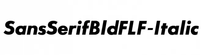
( Fonts by Casady & Greene )
Bold, italic sans-serif font with a modern, geometric style.
![SansSerifBldFLF-Italic font caratteri gratis]() Scaricare 9558 Downloads@WebFont
Scaricare 9558 Downloads@WebFont -
![French font caratteri gratis]() Scaricare 9557 Downloads@WebFont
Scaricare 9557 Downloads@WebFont -
![Amelia font caratteri gratis]() Scaricare 9555 Downloads
Scaricare 9555 Downloads -
![Fabrica font caratteri gratis]() Scaricare 9552 Downloads@WebFont
Scaricare 9552 Downloads@WebFont -
Caratteri di filsonkiol. For commercial use please contact the owner.
![Sansus Webissimo font caratteri gratis]() Scaricare 9538 Downloads@WebFont
Scaricare 9538 Downloads@WebFont -
( Fonts by Altsys Metamorphosis )
A classic, ornate font with intricate flourishes and bold strokes, perfect for elegant designs.
![Beckett Regular font caratteri gratis]() Scaricare 9535 Downloads@WebFont
Scaricare 9535 Downloads@WebFont -
![Village font caratteri gratis]() Scaricare 9534 Downloads@WebFont
Scaricare 9534 Downloads@WebFont -
![ArTarumianErevan font caratteri gratis]() Scaricare 9532 Downloads@WebFont
Scaricare 9532 Downloads@WebFont -
( Fonts by www.vicfieger.com )
A geometric, futuristic font with bold, angular letterforms and consistent stroke widths.
![Data Control font caratteri gratis]() Scaricare 9521 Downloads@WebFont
Scaricare 9521 Downloads@WebFont -
( Copyright (c) 2014-2015 Wei Huang (wweeiihhuuaanngg@gmail.com) )
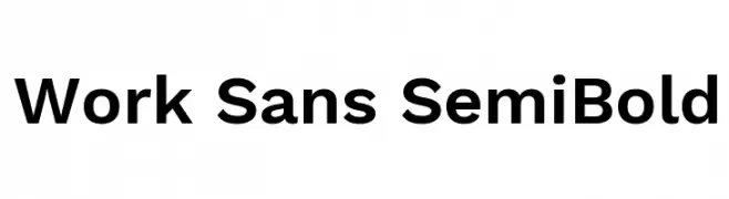
A modern, semi-bold sans-serif font with excellent legibility and balance.
![Work Sans SemiBold font caratteri gratis]() Scaricare 9519 Downloads@WebFont
Scaricare 9519 Downloads@WebFont -
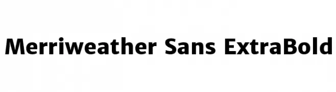
( Copyright (c) 2013-2016, Sorkin Type Co (www.sorkintype.com) with Reserved Font Name 'Merriweather'. Merriweather is a trademark of Sorkin Type Co. )
A bold, modern sans-serif font with clean lines and strong presence.
![Merriweather Sans ExtraBold font caratteri gratis]() Scaricare 9513 Downloads@WebFont
Scaricare 9513 Downloads@WebFont -
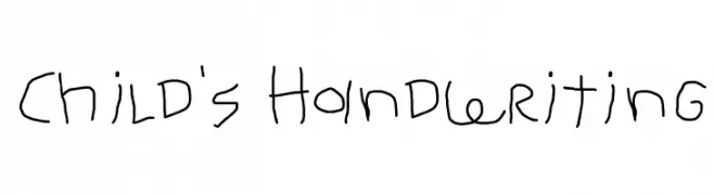
![Child's Handwriting font caratteri gratis]() Scaricare 9510 Downloads@WebFont
Scaricare 9510 Downloads@WebFont -
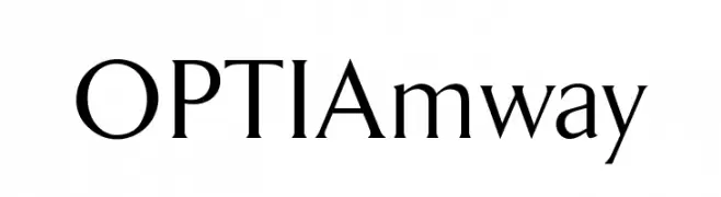
( Fonts by Castcraft Software - opti.netii.net - check the website before use )
A classic serif typeface with elegant strokes and refined details.
![OPTIAmway font caratteri gratis]() Scaricare 9507 Downloads@WebFont
Scaricare 9507 Downloads@WebFont -
![Pou font caratteri gratis]() Scaricare 9503 Downloads@WebFont
Scaricare 9503 Downloads@WebFont -
( Copyright (c) 2015, Cadson Demak (info@cadsondemak.com) )
A bold, italicized font with a dynamic and modern style.
![Kanit Black Italic font caratteri gratis]() Scaricare 9499 Downloads@WebFont
Scaricare 9499 Downloads@WebFont -
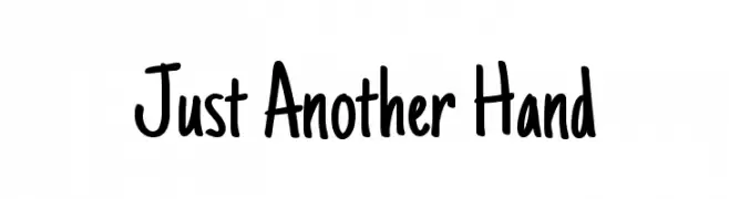
( Fonts by Astigmatic One Eye Typographic Institute - Brian J. Bonislawsky - astigmatic.com )
A casual, handwritten font with a playful and informal style.
![Just Another Hand font caratteri gratis]() Scaricare 9496 Downloads@WebFont
Scaricare 9496 Downloads@WebFont -
![IRON MAN OF WAR 001C NCV font caratteri gratis]() Scaricare 9492 Downloads@WebFont
Scaricare 9492 Downloads@WebFont -
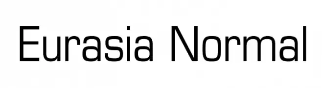
![Eurasia Normal font caratteri gratis]() Scaricare 9482 Downloads@WebFont
Scaricare 9482 Downloads@WebFont -
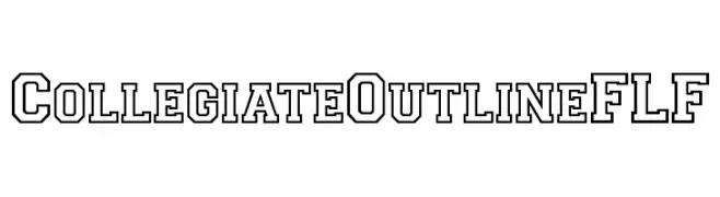
( Fonts by Casady & Greene )
A bold, outlined font with a collegiate, varsity style.
![CollegiateOutlineFLF font caratteri gratis]() Scaricare 9481 Downloads@WebFont
Scaricare 9481 Downloads@WebFont -
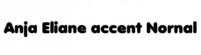
![Anja Eliane accent Nornal font caratteri gratis]() Scaricare 9469 Downloads@WebFont
Scaricare 9469 Downloads@WebFont -
( Woodcutter - woodcutter Manero - www.woodcutter.es )
Skateboarding-themed pictogram font with silhouettes and icons.
![SKATE font caratteri gratis]() Scaricare 9461 Downloads@WebFont
Scaricare 9461 Downloads@WebFont -
![Portrait font caratteri gratis]() Scaricare 9456 Downloads@WebFont
Scaricare 9456 Downloads@WebFont -
![Hemi Head 426 font caratteri gratis]() Scaricare 9456 Downloads@WebFont
Scaricare 9456 Downloads@WebFont -
![Mexcellent font caratteri gratis]() Scaricare 9414 Downloads@WebFont
Scaricare 9414 Downloads@WebFont -
( Copyright (c) 2010, NHN Corporation (http://www.nhncorp.com) )
A casual, brush-style script font with a dynamic and artistic flair.
![Nanum Brush Script OTF font caratteri gratis]() Scaricare 9413 Downloads
Scaricare 9413 Downloads -
( Fonts by Bonjour Monde - Personal-use only. For commercial use please contact owner. )
A bold, modern font with geometric influences and strong character presence.
![Syne Extra font caratteri gratis]() Scaricare 9407 Downloads@WebFont
Scaricare 9407 Downloads@WebFont -
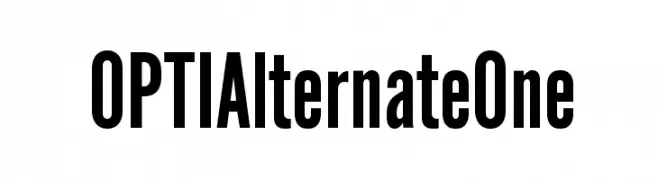
( Fonts by Castcraft Software - opti.netii.net - check the website before use )
A bold, modern font with strong, thick strokes and a commanding presence.
![OPTIAlternateOne font caratteri gratis]() Scaricare 9402 Downloads@WebFont
Scaricare 9402 Downloads@WebFont -
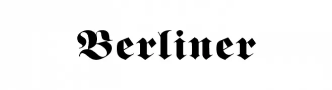
![Berliner font caratteri gratis]() Scaricare 9402 Downloads@WebFont
Scaricare 9402 Downloads@WebFont


Quali sono i font più popolari adesso?
Poppins, Roboto, Montserrat, Open Sans e Lato sono molto usati per le forme pulite e l'ampia applicabilità — dall'identità di marca alle landing page e ai poster.
Quali font si usano spesso nei loghi?
Le sans serif geometriche (es. Poppins, famiglie in stile Gotham) sono scelte comuni per un branding pulito e scalabile. Per un tocco personale restano valide script e stili manoscritti. Abbina un display deciso per i titoli a un corpo testo neutro per riconoscibilità ed equilibrio.
Ogni quanto si aggiorna la lista?
Con regolarità, in base ai download e all'attività reale. Torna spesso per scoprire in anticipo le nuove preferite.
💡 Consiglio: aggiungi ai preferiti — le tendenze cambiano in fretta e i font top di oggi possono ispirare il rebranding di domani.