Benvenuto nelle Font Più Popolari — dove popolarità e qualità si incontrano. Qui trovi i font più scaricati e usati dell'anno. Se cerchi scelte sicure per logo, web o social, inizia da qui.
Ogni font top si distingue per equilibrio, leggibilità e versatilità. Troverai sans serif moderne, script eleganti, serif vintage e display minimalisti.
-
 Scaricare 1154 Downloads@WebFont
 -
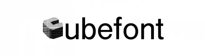
![Cubefont font caratteri gratis]() Scaricare 1154 Downloads@WebFont
Scaricare 1154 Downloads@WebFont -
( Fonts by Manfred Klein. Free for private and charity use. Free for commercial with donation to organizations )
A classic serif font with elegant, sharp serifs and a vintage touch.
![Cock font caratteri gratis]() Scaricare 1154 Downloads@WebFont
Scaricare 1154 Downloads@WebFont -
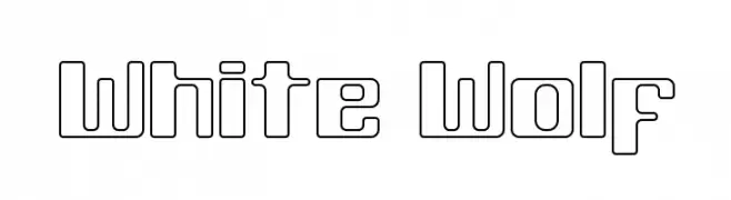
( Fonts by Rich Gast, a.k.a. GreyWolf )
A geometric, outline-style font with a modern and futuristic look.
![White Wolf font caratteri gratis]() Scaricare 1154 Downloads@WebFont
Scaricare 1154 Downloads@WebFont -
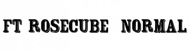
( Fonts by www.fenotype.com )
A bold, vintage-inspired serif font with strong, block-like serifs and a cohesive, decorative style.
![FT Rosecube normal font caratteri gratis]() Scaricare 1154 Downloads@WebFont
Scaricare 1154 Downloads@WebFont -
![Smudgers!]() Scaricare 1154 Downloads@WebFont
Scaricare 1154 Downloads@WebFont -
![LoKinderSchrift Dunkel font caratteri gratis]() Scaricare 1154 Downloads@WebFont
Scaricare 1154 Downloads@WebFont -
( Fonts by Masa Aska Sanurumi )
A bold, rounded font with a playful and friendly style.
![Masa Boo font caratteri gratis]() Scaricare 1153 Downloads@WebFont
Scaricare 1153 Downloads@WebFont -
( Fonts by Salamahtype.com )
A playful, rounded font with smooth curves and consistent stroke width.
![Evoley Notes font caratteri gratis]() Scaricare 1153 Downloads@WebFont
Scaricare 1153 Downloads@WebFont -
Caratteri di mutno. For commercial use please contact the owner.
( Clickuper is a free multilingual display typeface with sharp look. )
A bold, geometric font with sharp angles and a strong presence.
![Clickuper font caratteri gratis]() Scaricare 1153 Downloads@WebFont
Scaricare 1153 Downloads@WebFont -
( Fonts by Alex Slobzheninov - Personal-use only. For commercial use please contact owner. )
A bold, modern sans-serif font with a strong, uniform appearance.
![FivoSans-Heavy font caratteri gratis]() Scaricare 1153 Downloads@WebFont
Scaricare 1153 Downloads@WebFont -
( Fonts by Barland )
An elegant script font with flowing lines and intricate swashes, perfect for sophisticated designs.
![honiladdemo font caratteri gratis]() Scaricare 1153 Downloads@WebFont
Scaricare 1153 Downloads@WebFont -
![Raider Crusader Shift Up font caratteri gratis]() Scaricare 1153 Downloads@WebFont
Scaricare 1153 Downloads@WebFont -
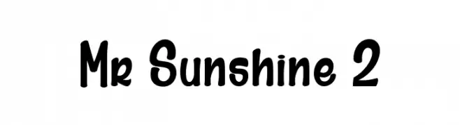
( Fonts by dcoxy | Greg Medina )
A playful, bold font with rounded edges and a whimsical style.
![Mr Sunshine 2 font caratteri gratis]() Scaricare 1153 Downloads@WebFont
Scaricare 1153 Downloads@WebFont -
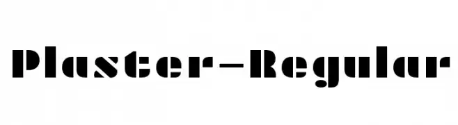
( Copyright (c) 2011 by Sorkin Type Co (www.sorkintype.com) )
A bold, geometric font with block-like letterforms and sharp angles.
![Plaster-Regular font caratteri gratis]() Scaricare 1153 Downloads@WebFont
Scaricare 1153 Downloads@WebFont -
![101! Celtic Astrologer font caratteri gratis]() Scaricare 1153 Downloads@WebFont
Scaricare 1153 Downloads@WebFont -
![N0RP ICONS #1 font caratteri gratis]() Scaricare 1153 Downloads@WebFont
Scaricare 1153 Downloads@WebFont -
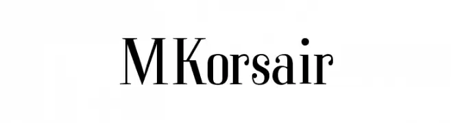
( Fonts by Manfred Klein - manfred-klein.ina-mar.com )
A classic serif font with modern elegance and refined letterforms.
![MKorsair font caratteri gratis]() Scaricare 1153 Downloads@WebFont
Scaricare 1153 Downloads@WebFont -
![LCD2 Bold font caratteri gratis]() Scaricare 1153 Downloads@WebFont
Scaricare 1153 Downloads@WebFont -
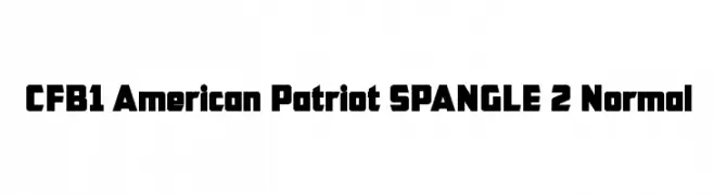
![CFB1 American Patriot SPANGLE 2 Normal font caratteri gratis]() Scaricare 1153 Downloads@WebFont
Scaricare 1153 Downloads@WebFont -
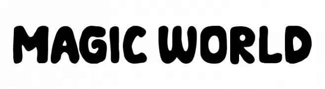
( Fonts by Mozarella Art )
A playful, bold font with rounded, thick strokes and a whimsical touch.
![MAGIC WORLD font caratteri gratis]() Scaricare 1152 Downloads@WebFont
Scaricare 1152 Downloads@WebFont -
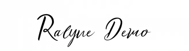
( Mindtype Co. - Putra Khan - creativemarket.com/putra_khan?u=putra_khan )
A flowing, cursive font with elegant, interconnected strokes and a modern calligraphic style.
![Ralyne Demo font caratteri gratis]() Scaricare 1152 Downloads@WebFont
Scaricare 1152 Downloads@WebFont -
( Iconian Fonts - Daniel Zadorozny - www.iconian.com )
A bold, italic font with a dynamic and modern style.
![Soloist Extra-Italic font caratteri gratis]() Scaricare 1152 Downloads@WebFont
Scaricare 1152 Downloads@WebFont -
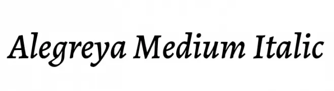
( Copyright 2011 The Alegreya Project Authors (https://github.com/huertatipografica/Alegreya) )
A medium weight, italic serif font with elegant and refined characteristics.
![Alegreya Medium Italic font caratteri gratis]() Scaricare 1152 Downloads@WebFont
Scaricare 1152 Downloads@WebFont -
![Libertinage font caratteri gratis]() Scaricare 1152 Downloads@WebFont
Scaricare 1152 Downloads@WebFont -
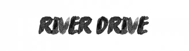
( Fonts by a The Branded Quotes - https://sellfy.com/thebrandedquotes. Personal-use only. For commercial use please contact owner. )
A bold, brush-style font with a textured, hand-painted look.
![River Drive font caratteri gratis]() Scaricare 1152 Downloads@WebFont
Scaricare 1152 Downloads@WebFont -
( Fonts by www.houseoflime.com )
An ornate decorative font with intricate floral and circular patterns.
![Spring font caratteri gratis]() Scaricare 1152 Downloads@WebFont
Scaricare 1152 Downloads@WebFont -
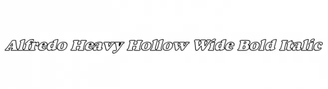
![Alfredo Heavy Hollow Wide Bold Italic font caratteri gratis]() Scaricare 1152 Downloads
Scaricare 1152 Downloads -
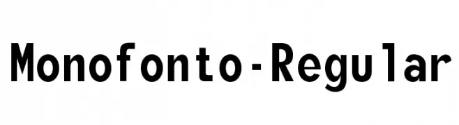
( Fonts by www.typodermicfonts.com - Ray Larabie )
A modern, monospaced font ideal for coding and technical documentation.
![Monofonto-Regular font caratteri gratis]() Scaricare 1152 Downloads@WebFont
Scaricare 1152 Downloads@WebFont -
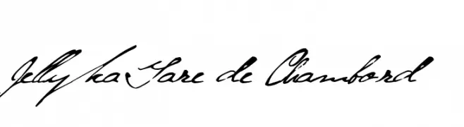
( Fonts are free for a personal use only - www.cuttyfruty.com )
A whimsical, elegant cursive font with flowing, artistic strokes.
![Jellyka Gare de Chambord font caratteri gratis]() Scaricare 1152 Downloads@WebFont
Scaricare 1152 Downloads@WebFont -
![Glitch1 font caratteri gratis]() Scaricare 1152 Downloads@WebFont
Scaricare 1152 Downloads@WebFont -
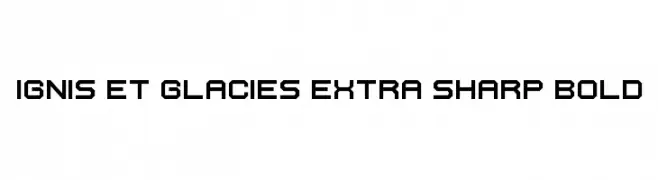
( Fonts by Zdenek Gromnica - www.futuremillennium.com )
A bold, geometric font with sharp angles and a futuristic style.
![Ignis et Glacies Extra Sharp Bold font caratteri gratis]() Scaricare 1152 Downloads@WebFont
Scaricare 1152 Downloads@WebFont -
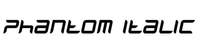
( Fonts by www.phantompower.de )
A sleek, italic font with a futuristic and dynamic design.
![Phantom Italic font caratteri gratis]() Scaricare 1152 Downloads@WebFont
Scaricare 1152 Downloads@WebFont -
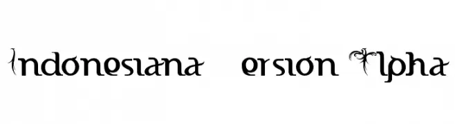
![Indonesiana Version Alpha font caratteri gratis]() Scaricare 1152 Downloads@WebFont
Scaricare 1152 Downloads@WebFont -
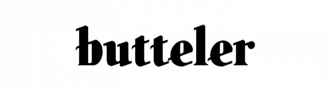
![butteler font caratteri gratis]() Scaricare 1152 Downloads@WebFont
Scaricare 1152 Downloads@WebFont


Quali sono i font più popolari adesso?
Poppins, Roboto, Montserrat, Open Sans e Lato sono molto usati per le forme pulite e l'ampia applicabilità — dall'identità di marca alle landing page e ai poster.
Quali font si usano spesso nei loghi?
Le sans serif geometriche (es. Poppins, famiglie in stile Gotham) sono scelte comuni per un branding pulito e scalabile. Per un tocco personale restano valide script e stili manoscritti. Abbina un display deciso per i titoli a un corpo testo neutro per riconoscibilità ed equilibrio.
Ogni quanto si aggiorna la lista?
Con regolarità, in base ai download e all'attività reale. Torna spesso per scoprire in anticipo le nuove preferite.
💡 Consiglio: aggiungi ai preferiti — le tendenze cambiano in fretta e i font top di oggi possono ispirare il rebranding di domani.