Benvenuto nelle Font Più Popolari — dove popolarità e qualità si incontrano. Qui trovi i font più scaricati e usati dell'anno. Se cerchi scelte sicure per logo, web o social, inizia da qui.
Ogni font top si distingue per equilibrio, leggibilità e versatilità. Troverai sans serif moderne, script eleganti, serif vintage e display minimalisti.
-
 Scaricare 1148 Downloads@WebFont
 -
![Bluebird font caratteri gratis]() Scaricare 1148 Downloads@WebFont
Scaricare 1148 Downloads@WebFont -
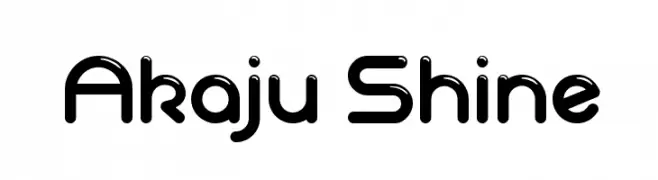
![Akaju Shine font caratteri gratis]() Scaricare 1148 Downloads@WebFont
Scaricare 1148 Downloads@WebFont -
( Fonts by Castcraft Software - opti.netii.net - check the website before use )
A bold, dynamic script font with brush-like strokes and a cursive slant.
![CharlieChadOpti-Script font caratteri gratis]() Scaricare 1148 Downloads@WebFont
Scaricare 1148 Downloads@WebFont -
( Fonts by Daniel Zadorozny - www.iconian.com - Free for personal use )
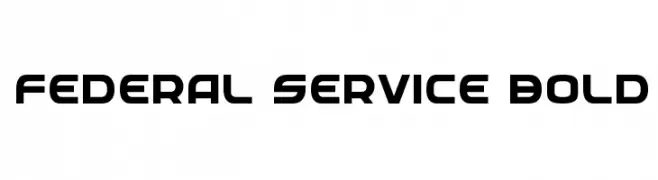
A bold, modern font with a geometric and slightly condensed design.
![Federal Service Bold font caratteri gratis]() Scaricare 1148 Downloads@WebFont
Scaricare 1148 Downloads@WebFont -
( Fonts by Apostrophic Lab )
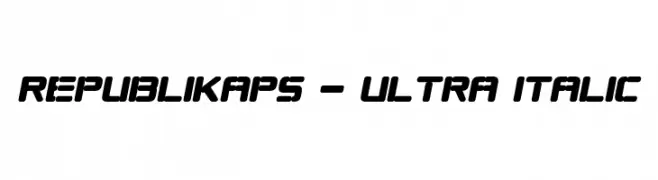
A bold, italic font with a modern, dynamic style and rounded edges.
![Republikaps - Ultra Italic font caratteri gratis]() Scaricare 1148 Downloads@WebFont
Scaricare 1148 Downloads@WebFont -
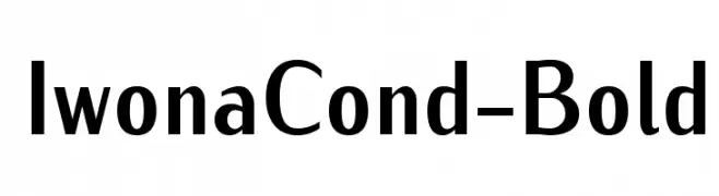
![IwonaCond-Bold font caratteri gratis]() Scaricare 1148 Downloads@WebFont
Scaricare 1148 Downloads@WebFont -
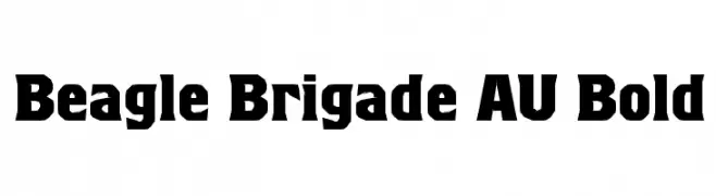
( Fonts by www.ajpaglia.com - FREE for personal or commercial usage )
A bold, angular font with a strong, geometric presence.
![Beagle Brigade AU Bold font caratteri gratis]() Scaricare 1148 Downloads@WebFont
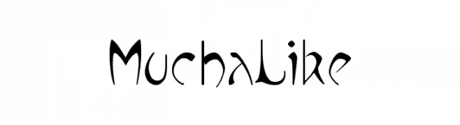
Scaricare 1148 Downloads@WebFont -
![MuchaLike font caratteri gratis]() Scaricare 1148 Downloads@WebFont
Scaricare 1148 Downloads@WebFont -
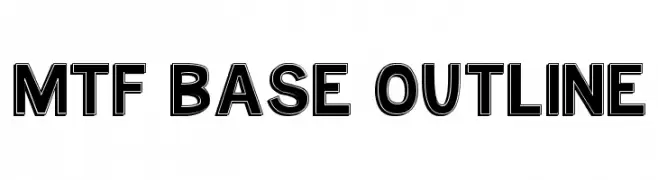
( Fonts by Miss Tiina at www.misstiina.com (please check the website before use) )
A bold, outlined font with a modern and structured appearance.
![MTF Base Outline font caratteri gratis]() Scaricare 1148 Downloads@WebFont
Scaricare 1148 Downloads@WebFont -
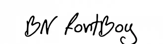
( Font by Ben Nathan - www.hafontia.com )
A playful, handwritten font with fluid, dynamic strokes and a casual style.
![BN FontBoy font caratteri gratis]() Scaricare 1148 Downloads@WebFont
Scaricare 1148 Downloads@WebFont -
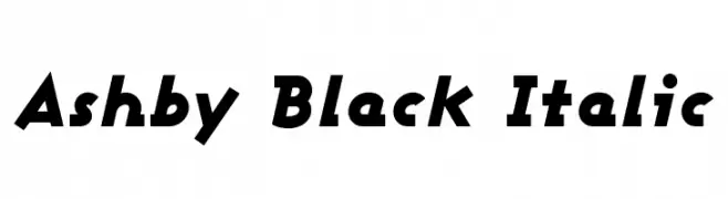
( Fonts by Apostrophic Lab )
A bold, italic font with a dynamic and energetic style.
![Ashby Black Italic font caratteri gratis]() Scaricare 1148 Downloads@WebFont
Scaricare 1148 Downloads@WebFont -
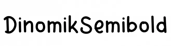
( Fonts by Agustian Eko Saputro )
A playful, rounded font with a hand-drawn appearance and consistent, bold strokes.
![Dinomik Semibold font caratteri gratis]() Scaricare 1147 Downloads@WebFont
Scaricare 1147 Downloads@WebFont -
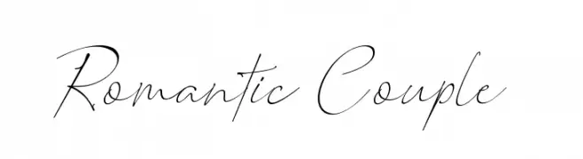
( typelinestudio - Yadhie Setiawan - creativemarket.com/typeline )
A delicate and elegant cursive script font with flowing, connected letters.
![Romantic Couple font caratteri gratis]() Scaricare 1147 Downloads@WebFont
Scaricare 1147 Downloads@WebFont -
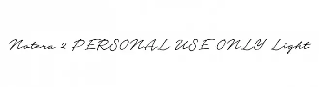
( Måns Grebäck - www.mansgreback.com )
A classic, elegant handwritten script with fluid, connected letterforms.
![Notera 2 PERSONAL USE ONLY Light font caratteri gratis]() Scaricare 1147 Downloads@WebFont
Scaricare 1147 Downloads@WebFont -
( Fonts by Docallisme HAS - Ryal - docallisme.blogspot.com - Personal-use only. For commercial use please contact owner. )
A bold, decorative font with dotted patterns for a festive look.
![CHEERFUL PARTY font caratteri gratis]() Scaricare 1147 Downloads@WebFont
Scaricare 1147 Downloads@WebFont -
( Copyright 2013 The Alegreya Sans Project Authors (https://github.com/huertatipografica/Alegreya-Sans) )
A bold, modern sans-serif font with clean lines and a strong presence.
![Alegreya Sans Bold font caratteri gratis]() Scaricare 1147 Downloads@WebFont
Scaricare 1147 Downloads@WebFont -
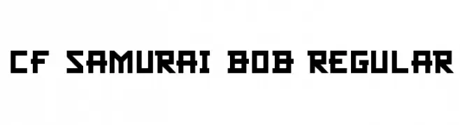
( Fonts by Steve Cloutier - www.cloutierfontes.ca )
A bold, geometric font with sharp, angular characters and a digital aesthetic.
![CF Samurai Bob Regular font caratteri gratis]() Scaricare 1147 Downloads@WebFont
Scaricare 1147 Downloads@WebFont -
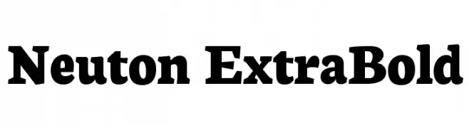
( Copyright 2010 The Neuton Project Authors (http://www.21326.info/), with Reserved Font Name "Neuton". )
A bold serif font with strong strokes and prominent serifs.
![Neuton ExtraBold font caratteri gratis]() Scaricare 1147 Downloads@WebFont
Scaricare 1147 Downloads@WebFont -
( Copyright (c) 2011 by Sorkin Type Co (www.sorkintype.com) )
A modern, geometric sans-serif font with clean lines and uniform strokes.
![Basic font caratteri gratis]() Scaricare 1147 Downloads@WebFont
Scaricare 1147 Downloads@WebFont -
![the chemical parade font caratteri gratis]() Scaricare 1147 Downloads@WebFont
Scaricare 1147 Downloads@WebFont -
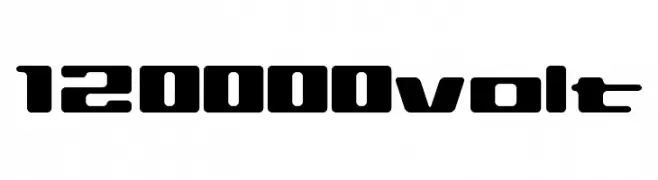
![120000volt font caratteri gratis]() Scaricare 1147 Downloads@WebFont
Scaricare 1147 Downloads@WebFont -
![English-Russian Architect font caratteri gratis]() Scaricare 1147 Downloads@WebFont
Scaricare 1147 Downloads@WebFont -
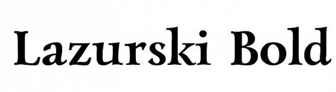
![Lazurski Bold font caratteri gratis]() Scaricare 1147 Downloads
Scaricare 1147 Downloads -
( Fonts by Levi Halmos )
A bold, rounded font with smooth curves and consistent weight.
![Phat guy font caratteri gratis]() Scaricare 1147 Downloads@WebFont
Scaricare 1147 Downloads@WebFont -
( Fonts by www.typodermicfonts.com - Ray Larabie )
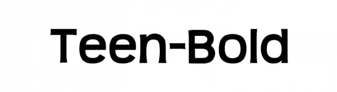
A bold, modern sans-serif font with clean lines and strong presence.
![Teen-Bold font caratteri gratis]() Scaricare 1147 Downloads@WebFont
Scaricare 1147 Downloads@WebFont -
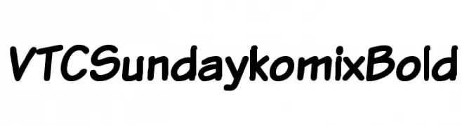
![VTCSundaykomixBold font caratteri gratis]() Scaricare 1147 Downloads@WebFont
Scaricare 1147 Downloads@WebFont -
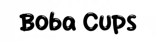
( Fonts by Khurasan )
A playful, rounded font with a bubbly, hand-drawn style.
![Boba Cups font caratteri gratis]() Scaricare 1146 Downloads@WebFont
Scaricare 1146 Downloads@WebFont -
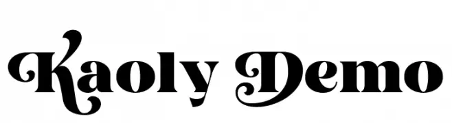
( Fonts by Creative Media Lab - Kadek Mahardika - Personal-use only. For commercial use please contact owner. )
A bold, decorative font with ornate uppercase letters and strong lowercase characters.
![Kaoly Demo font caratteri gratis]() Scaricare 1146 Downloads@WebFont
Scaricare 1146 Downloads@WebFont -
( Fonts by Vladimir Nikolic - www.creativefabrica.com/designer/vladimirnikolic/ - Personal-use only. For commercial use please contact owner. )
A bold, geometric font with a modern, industrial aesthetic.
![New York Regular font caratteri gratis]() Scaricare 1146 Downloads@WebFont
Scaricare 1146 Downloads@WebFont -
( Fonts by Vladimir Nikolic - https://www.creativefabrica.com/product/educated-deers/ref/144265/ - Personal-use only. For commercial use please contact owner. )
A bold, geometric font with strong lines and a modern style.
![Educated Deers Regular font caratteri gratis]() Scaricare 1146 Downloads@WebFont
Scaricare 1146 Downloads@WebFont -
Caratteri di KidzBopFan2019. For commercial use please contact the owner.
( Big and small Caps )
A bold, geometric font with clean lines and strong presence, ideal for modern designs.
![Idler Solid 15 Regular font caratteri gratis]() Scaricare 1146 Downloads@WebFont
Scaricare 1146 Downloads@WebFont -
( Fonts by Donald E. Knuth - Personal-use only. For commercial use please contact owner. )
A classic monospaced typewriter font with a light weight and low contrast, ideal for structured and readable text.
![CMU Typewriter Text Light font caratteri gratis]() Scaricare 1146 Downloads@WebFont
Scaricare 1146 Downloads@WebFont -
( Aaron Brokaw - www.fontspace.com/twcaaron16 )
A playful, hand-drawn font with a childlike, whimsical style.
![Baby Einstein font caratteri gratis]() Scaricare 1146 Downloads@WebFont
Scaricare 1146 Downloads@WebFont -
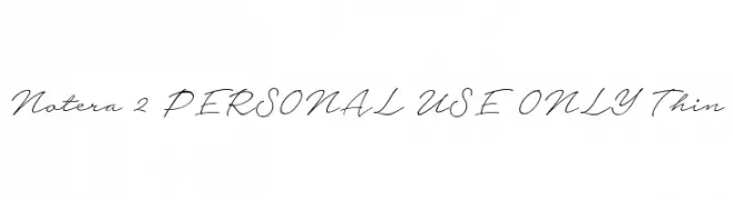
( Måns Grebäck - www.mansgreback.com )
An elegant, flowing script font with a natural handwriting style.
![Notera 2 PERSONAL USE ONLY Thin font caratteri gratis]() Scaricare 1146 Downloads@WebFont
Scaricare 1146 Downloads@WebFont


Quali sono i font più popolari adesso?
Poppins, Roboto, Montserrat, Open Sans e Lato sono molto usati per le forme pulite e l'ampia applicabilità — dall'identità di marca alle landing page e ai poster.
Quali font si usano spesso nei loghi?
Le sans serif geometriche (es. Poppins, famiglie in stile Gotham) sono scelte comuni per un branding pulito e scalabile. Per un tocco personale restano valide script e stili manoscritti. Abbina un display deciso per i titoli a un corpo testo neutro per riconoscibilità ed equilibrio.
Ogni quanto si aggiorna la lista?
Con regolarità, in base ai download e all'attività reale. Torna spesso per scoprire in anticipo le nuove preferite.
💡 Consiglio: aggiungi ai preferiti — le tendenze cambiano in fretta e i font top di oggi possono ispirare il rebranding di domani.