Benvenuto nelle Font Più Popolari — dove popolarità e qualità si incontrano. Qui trovi i font più scaricati e usati dell'anno. Se cerchi scelte sicure per logo, web o social, inizia da qui.
Ogni font top si distingue per equilibrio, leggibilità e versatilità. Troverai sans serif moderne, script eleganti, serif vintage e display minimalisti.
-
( Fonts by Aryel Filipe )
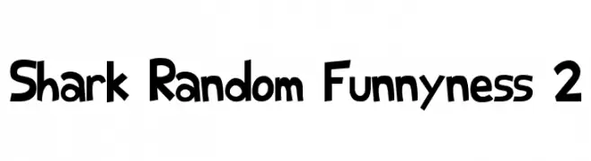
A playful, cartoon-like font with bold, exaggerated letterforms.
 Scaricare 1138 Downloads@WebFont
 -
( Fonts by Altsys Metamorphosis )
A bold, angular serif font with a striking and aggressive design.
![Farquharson Regular font caratteri gratis]() Scaricare 1138 Downloads@WebFont
Scaricare 1138 Downloads@WebFont -
( Fonts by Graham Meade - GemFonts )
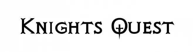
A medieval-inspired font with sharp serifs and unique cross-like details.
![Knights Quest font caratteri gratis]() Scaricare 1138 Downloads@WebFont
Scaricare 1138 Downloads@WebFont -
( Fonts by Creative Media Lab - Kadek Mahardika - Personal-use only. For commercial use please contact owner. )
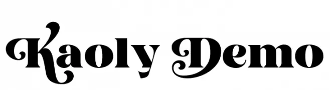
A bold, decorative font with ornate uppercase letters and strong lowercase characters.
![Kaoly Demo font caratteri gratis]() Scaricare 1137 Downloads@WebFont
Scaricare 1137 Downloads@WebFont -
( Roger White - web.archive.org/web/20120416090521/www.rogersfonts.org.uk/ )
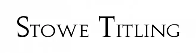
A classic serif font with elegant, sharp serifs and refined structure.
![Stowe Titling font caratteri gratis]() Scaricare 1137 Downloads@WebFont
Scaricare 1137 Downloads@WebFont -
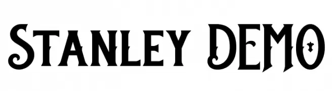
( Twicolabs Fontdation - Fahrizal Tawakkal - fontdation.com )
A bold, decorative font with vintage flair and ornate details.
![Stanley DEMO font caratteri gratis]() Scaricare 1137 Downloads@WebFont
Scaricare 1137 Downloads@WebFont -
( Solidtype - bit.ly/2OxZn2V )
An elegant script font with fluid, cursive strokes and decorative loops.
![Gredom font caratteri gratis]() Scaricare 1137 Downloads@WebFont
Scaricare 1137 Downloads@WebFont -
![DKJalebi font caratteri gratis]() Scaricare 1137 Downloads@WebFont
Scaricare 1137 Downloads@WebFont -
( Copyright (c) 2014, Indian Type Foundry (info@indiantypefoundry.com). )
A lively, handwritten-style font with smooth, fluid strokes and moderate contrast.
![Tillana font caratteri gratis]() Scaricare 1137 Downloads@WebFont
Scaricare 1137 Downloads@WebFont -
( Fonts by www.gust.org.pl )
A classic italic serif font with elegant curves and refined serifs.
![LMRoman12-Italic font caratteri gratis]() Scaricare 1137 Downloads@WebFont
Scaricare 1137 Downloads@WebFont -
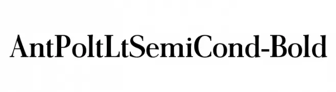
![AntPoltLtSemiCond-Bold font caratteri gratis]() Scaricare 1137 Downloads@WebFont
Scaricare 1137 Downloads@WebFont -
( Fonts by John David www.easywriter.com/fonts/ )
A bold serif font with high contrast and elegant curves.
![BudBird Normal font caratteri gratis]() Scaricare 1137 Downloads@WebFont
Scaricare 1137 Downloads@WebFont -
( Fonts by www.blambot.com )
A bold, flame-inspired font with dynamic, jagged edges.
![Char BB font caratteri gratis]() Scaricare 1137 Downloads@WebFont
Scaricare 1137 Downloads@WebFont -
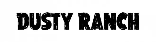
( Fonts by Guaraldo Fonts - Personal-use only. For commercial use please contact owner. )
A bold, distressed font with a rugged, textured appearance.
![Dusty Ranch font caratteri gratis]() Scaricare 1136 Downloads@WebFont
Scaricare 1136 Downloads@WebFont -
( Fonts by Peter Wiegel - www.peter-wiegel.de - Personal-use only. For commercial use please contact owner. )
A bold, modern sans-serif font with geometric lines and strong readability.
![PostBus font caratteri gratis]() Scaricare 1136 Downloads@WebFont
Scaricare 1136 Downloads@WebFont -
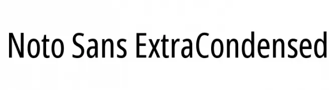
( Fonts by Google - Personal-use only. For commercial use please contact owner. )
A clean, modern, extra condensed sans-serif font with uniform strokes and minimal contrast.
![Noto Sans ExtraCondensed font caratteri gratis]() Scaricare 1136 Downloads@WebFont
Scaricare 1136 Downloads@WebFont -
( aldedesign - Alde Saputro - creativemarket.com/aldedesign?u=aldedesign )
An elegant script font with flowing, interconnected letters and ornate flourishes.
![Brainlove font caratteri gratis]() Scaricare 1136 Downloads@WebFont
Scaricare 1136 Downloads@WebFont -
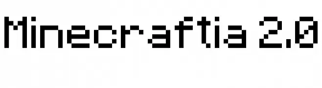
![Minecraftia 2.0 font caratteri gratis]() Scaricare 1136 Downloads@WebFont
Scaricare 1136 Downloads@WebFont -
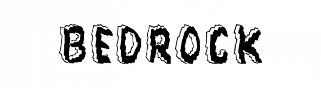
( Fonts by Jonathan S. Harris )
A bold, rock-inspired font with a three-dimensional, chiseled appearance.
![Bedrock font caratteri gratis]() Scaricare 1136 Downloads@WebFont
Scaricare 1136 Downloads@WebFont -
( Fonts by Darrell Flood )
A playful, bold font with rounded edges and a bubbly, friendly appearance.
![Roundy Rainbows font caratteri gratis]() Scaricare 1136 Downloads@WebFont
Scaricare 1136 Downloads@WebFont -
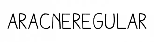
Caratteri di antipixel. For commercial use please contact the owner.
![AracneRegular font caratteri gratis]() Scaricare 1136 Downloads@WebFont
Scaricare 1136 Downloads@WebFont -
( Fonts by Alphabet & Type: Typography & Graphic - Paolo Vannucci - www.alphabetype.it )
A bold, slanted font with a futuristic and dynamic style.
![FANTASTIC FOUR MOVIE SLANT font caratteri gratis]() Scaricare 1136 Downloads@WebFont
Scaricare 1136 Downloads@WebFont -
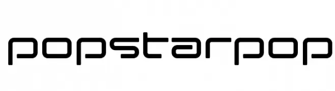
( These fonts are free to use in any private, recreational manner.For commercial go to www.flopdesign.com/fordesign/font.html )
A modern, geometric font with clean lines and rounded edges.
![popstarpop font caratteri gratis]() Scaricare 1136 Downloads@WebFont
Scaricare 1136 Downloads@WebFont -
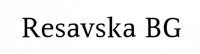
( Fonts by www.tipometar.org )
A classic serif font with a modern touch, offering elegance and readability.
![Resavska BG font caratteri gratis]() Scaricare 1136 Downloads@WebFont
Scaricare 1136 Downloads@WebFont -
![Vaca font caratteri gratis]() Scaricare 1136 Downloads@WebFont
Scaricare 1136 Downloads@WebFont -
( Free )
A geometric, outlined font with a modern and structured design.
![SquareFont Outline font caratteri gratis]() Scaricare 1136 Downloads@WebFont
Scaricare 1136 Downloads@WebFont -
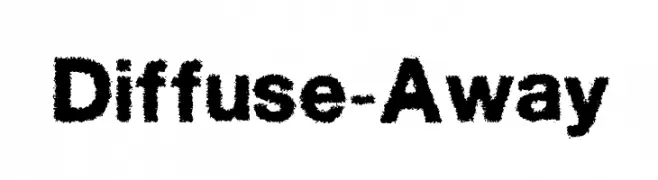
![Diffuse-Away font caratteri gratis]() Scaricare 1136 Downloads@WebFont
Scaricare 1136 Downloads@WebFont -
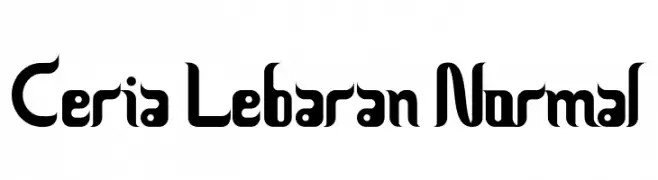
![Ceria Lebaran Normal font caratteri gratis]() Scaricare 1136 Downloads@WebFont
Scaricare 1136 Downloads@WebFont -
![Italian Cursive 16th c font caratteri gratis]() Scaricare 1136 Downloads@WebFont
Scaricare 1136 Downloads@WebFont -
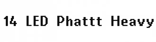
![14 LED Phattt Heavy font caratteri gratis]() Scaricare 1136 Downloads@WebFont
Scaricare 1136 Downloads@WebFont -
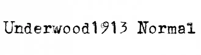
![Underwood1913 Normal font caratteri gratis]() Scaricare 1136 Downloads@WebFont
Scaricare 1136 Downloads@WebFont -
![Teen font caratteri gratis]() Scaricare 1136 Downloads@WebFont
Scaricare 1136 Downloads@WebFont -
![Under water font caratteri gratis]() Scaricare 1136 Downloads@WebFont
Scaricare 1136 Downloads@WebFont -
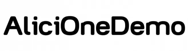
( André Harabara - harabara.carbonmade.com/ )
A modern, rounded sans-serif font with uniform stroke width.
![AliciOne Demo font caratteri gratis]() Scaricare 1135 Downloads@WebFont
Scaricare 1135 Downloads@WebFont -
( Fonts by www.fontscafe.com )
A modern serif font with clean lines and a minimalistic design.
![Basically Serif_FREE-version font caratteri gratis]() Scaricare 1135 Downloads@WebFont
Scaricare 1135 Downloads@WebFont


Quali sono i font più popolari adesso?
Poppins, Roboto, Montserrat, Open Sans e Lato sono molto usati per le forme pulite e l'ampia applicabilità — dall'identità di marca alle landing page e ai poster.
Quali font si usano spesso nei loghi?
Le sans serif geometriche (es. Poppins, famiglie in stile Gotham) sono scelte comuni per un branding pulito e scalabile. Per un tocco personale restano valide script e stili manoscritti. Abbina un display deciso per i titoli a un corpo testo neutro per riconoscibilità ed equilibrio.
Ogni quanto si aggiorna la lista?
Con regolarità, in base ai download e all'attività reale. Torna spesso per scoprire in anticipo le nuove preferite.
💡 Consiglio: aggiungi ai preferiti — le tendenze cambiano in fretta e i font top di oggi possono ispirare il rebranding di domani.