Benvenuto nelle Font Più Popolari — dove popolarità e qualità si incontrano. Qui trovi i font più scaricati e usati dell'anno. Se cerchi scelte sicure per logo, web o social, inizia da qui.
Ogni font top si distingue per equilibrio, leggibilità e versatilità. Troverai sans serif moderne, script eleganti, serif vintage e display minimalisti.
-
( Fonts by MJType )
A playful, casual handwritten font with smooth, rounded strokes.
 Scaricare 287 Downloads@WebFont
 -
( Fonts by www.woodcutter.es - woodcutter Manero - Personal-use only. For commercial use please contact owner. )
A bold, rounded font with a 3D effect and playful style.
![New Society font caratteri gratis]() Scaricare 287 Downloads@WebFont
Scaricare 287 Downloads@WebFont -
( Runsell Studio - creativemarket.com/RunsellStudio )
A bold, expressive handwritten font with fluid, cursive strokes.
![JustlyneDemo font caratteri gratis]() Scaricare 287 Downloads@WebFont
Scaricare 287 Downloads@WebFont -
( Fonts by www.fontpanda.com. Personal-use only. For commercial use please contact owner. )
A playful, informal handwritten font with bold, dynamic strokes.
![asdf font caratteri gratis]() Scaricare 287 Downloads@WebFont
Scaricare 287 Downloads@WebFont -
![Commonwealth font caratteri gratis]() Scaricare 287 Downloads
Scaricare 287 Downloads -
-
![FHA Broken Gothic Kond NC font caratteri gratis]() Scaricare 287 Downloads@WebFont
Scaricare 287 Downloads@WebFont -
( Fonts by Dan P. Lyons - Personal-use only. For commercial use please contact owner. )
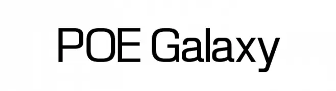
A modern, geometric sans-serif font with clean lines and consistent structure.
![POE Galaxy font caratteri gratis]() Scaricare 287 Downloads@WebFont
Scaricare 287 Downloads@WebFont -
( Fonts by Galdino Otten - galdinootten.com )
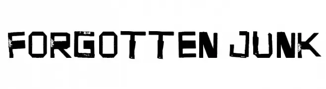
A bold, distressed font with a rugged, industrial style.
![Forgotten Junk font caratteri gratis]() Scaricare 287 Downloads@WebFont
Scaricare 287 Downloads@WebFont -
( Fonts by Matthew Austin Petty - www.disturbed.com )
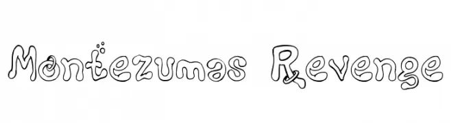
A whimsical, bubbly outline font with playful accents and a hand-drawn feel.
![Montezumas Revenge font caratteri gratis]() Scaricare 287 Downloads@WebFont
Scaricare 287 Downloads@WebFont -
( Fonts by Nick Curtis - www.nicksfonts.com )
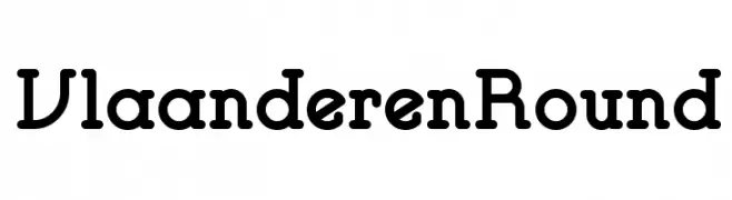
A playful, rounded font with bold, approachable characters.
![VlaanderenRound font caratteri gratis]() Scaricare 287 Downloads@WebFont
Scaricare 287 Downloads@WebFont


Quali sono i font più popolari adesso?
Poppins, Roboto, Montserrat, Open Sans e Lato sono molto usati per le forme pulite e l'ampia applicabilità — dall'identità di marca alle landing page e ai poster.
Quali font si usano spesso nei loghi?
Le sans serif geometriche (es. Poppins, famiglie in stile Gotham) sono scelte comuni per un branding pulito e scalabile. Per un tocco personale restano valide script e stili manoscritti. Abbina un display deciso per i titoli a un corpo testo neutro per riconoscibilità ed equilibrio.
Ogni quanto si aggiorna la lista?
Con regolarità, in base ai download e all'attività reale. Torna spesso per scoprire in anticipo le nuove preferite.
💡 Consiglio: aggiungi ai preferiti — le tendenze cambiano in fretta e i font top di oggi possono ispirare il rebranding di domani.