Benvenuto nelle Font Più Popolari — dove popolarità e qualità si incontrano. Qui trovi i font più scaricati e usati dell'anno. Se cerchi scelte sicure per logo, web o social, inizia da qui.
Ogni font top si distingue per equilibrio, leggibilità e versatilità. Troverai sans serif moderne, script eleganti, serif vintage e display minimalisti.
-
( Antipixel - Julia Martínez Diana - www.antipixel.com.ar/ )
A playful, hand-drawn font with a bold and rough aesthetic.
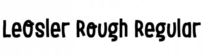 Scaricare 284 Downloads@WebFont
 -
( Fonts by Manuel Ramos - www.infinitismo.com - Personal-use only. For commercial use please contact owner. )
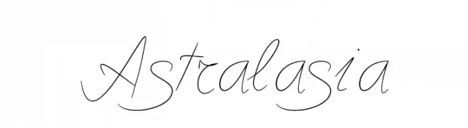
A graceful script font with elegant, flowing strokes.
![Astralasia font caratteri gratis]() Scaricare 284 Downloads@WebFont
Scaricare 284 Downloads@WebFont -
( Fonts by or from www.graffitifonts.net )
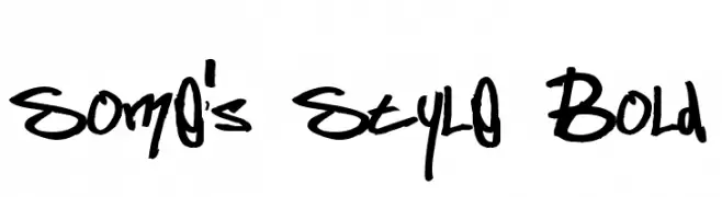
A bold, graffiti-inspired handwritten font with dynamic, expressive strokes.
![Some's Style Bold font caratteri gratis]() Scaricare 284 Downloads@WebFont
Scaricare 284 Downloads@WebFont -
( Fonts by andfonts - Andrii Shevchyk - Personal-use only. For commercial use please contact owner. )
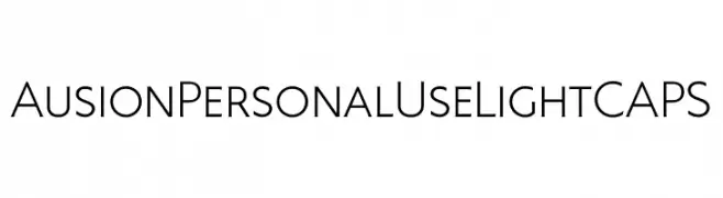
A clean, modern font with uniform stroke width and excellent readability.
![Ausion Personal Use LightCAPS font caratteri gratis]() Scaricare 284 Downloads@WebFont
Scaricare 284 Downloads@WebFont -
( Fonts by Daniel Zadorozny - www.iconian.com )
A geometric, angular font with a retro digital display style.
![Player 1 Up Black font caratteri gratis]() Scaricare 284 Downloads@WebFont
Scaricare 284 Downloads@WebFont -
-
( Fonts by JoannaVu - https://ioannaladopoulou.design - Personal-use only. For commercial use please contact owner. )
A dynamic and flowing script font with elegant, fluid strokes.
![kingofthieves font caratteri gratis]() Scaricare 284 Downloads@WebFont
Scaricare 284 Downloads@WebFont -
( Fonts by Dieter Schumacher )
A modern, geometric font with a digital, stencil-like design.
![Mayday font caratteri gratis]() Scaricare 284 Downloads@WebFont
Scaricare 284 Downloads@WebFont -
( Fonts by David Kerkhoff - www.hanodedphotography.com )
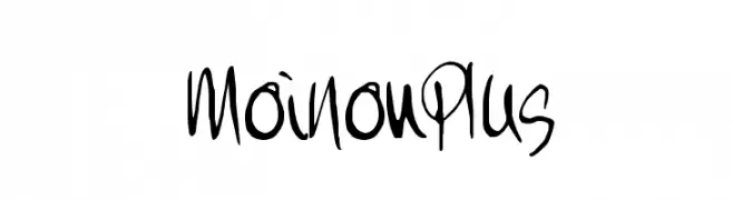
A lively, handwritten font with dynamic strokes and expressive character.
![MoiNonPlus font caratteri gratis]() Scaricare 284 Downloads@WebFont
Scaricare 284 Downloads@WebFont -
( Fonts by Daniel Zadorozny - www.iconian.com - Free for personal use )
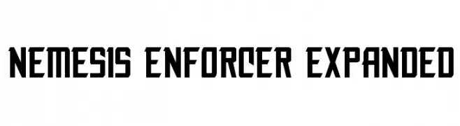
A bold, expanded font with a geometric and industrial style.
![Nemesis Enforcer Expanded font caratteri gratis]() Scaricare 284 Downloads@WebFont
Scaricare 284 Downloads@WebFont -
![Kremlin Bolshevik Bold font caratteri gratis]() Scaricare 284 Downloads@WebFont
Scaricare 284 Downloads@WebFont


Quali sono i font più popolari adesso?
Poppins, Roboto, Montserrat, Open Sans e Lato sono molto usati per le forme pulite e l'ampia applicabilità — dall'identità di marca alle landing page e ai poster.
Quali font si usano spesso nei loghi?
Le sans serif geometriche (es. Poppins, famiglie in stile Gotham) sono scelte comuni per un branding pulito e scalabile. Per un tocco personale restano valide script e stili manoscritti. Abbina un display deciso per i titoli a un corpo testo neutro per riconoscibilità ed equilibrio.
Ogni quanto si aggiorna la lista?
Con regolarità, in base ai download e all'attività reale. Torna spesso per scoprire in anticipo le nuove preferite.
💡 Consiglio: aggiungi ai preferiti — le tendenze cambiano in fretta e i font top di oggi possono ispirare il rebranding di domani.