Benvenuto nelle Font Più Popolari — dove popolarità e qualità si incontrano. Qui trovi i font più scaricati e usati dell'anno. Se cerchi scelte sicure per logo, web o social, inizia da qui.
Ogni font top si distingue per equilibrio, leggibilità e versatilità. Troverai sans serif moderne, script eleganti, serif vintage e display minimalisti.
-
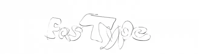
( Fonts by MartinPlus )
A bold, angular font with a modern, edgy style.
 Scaricare 282 Downloads@WebFont
 -
![FasType font caratteri gratis]() Scaricare 282 Downloads@WebFont
Scaricare 282 Downloads@WebFont -
( Fonts by David Kerkhoff - www.hanodedphotography.com )
A bold, distressed font with a grunge aesthetic and rugged, weathered characters.
![Gulag Decay font caratteri gratis]() Scaricare 282 Downloads@WebFont
Scaricare 282 Downloads@WebFont -
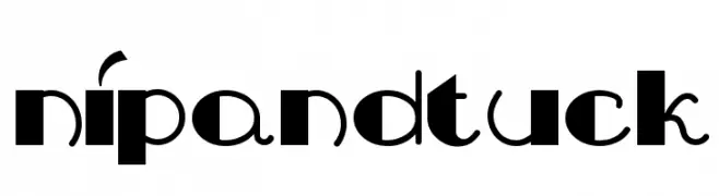
( Fonts by Nick Curtis - www.nicksfonts.com )
A bold, playful font with geometric and curved elements, ideal for creative designs.
![NipAndTuck font caratteri gratis]() Scaricare 282 Downloads
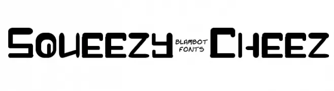
Scaricare 282 Downloads -
![Squeezy-Cheez font caratteri gratis]() Scaricare 282 Downloads@WebFont
Scaricare 282 Downloads@WebFont -
-
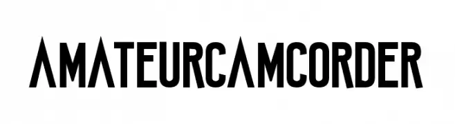
( Fonts by www.chequered.ink - Chequered Ink - Personal-use only. For commercial use please contact owner. )
Bold, geometric sans-serif font with a condensed and modern style.
![Amateur Camcorder font caratteri gratis]() Scaricare 282 Downloads@WebFont
Scaricare 282 Downloads@WebFont -
![ITALIC TYPEWRITER font caratteri gratis]() Scaricare 282 Downloads@WebFont
Scaricare 282 Downloads@WebFont -
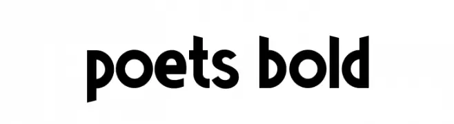
( Valdeir Junior )
A bold, modern font with thick, rounded strokes and tight spacing.
![Poets Bold font caratteri gratis]() Scaricare 282 Downloads@WebFont
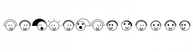
Scaricare 282 Downloads@WebFont -
![MangaAxtFaces font caratteri gratis]() Scaricare 282 Downloads@WebFont
Scaricare 282 Downloads@WebFont -
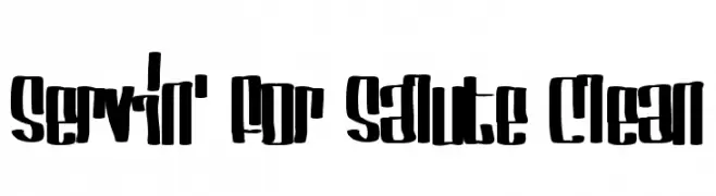
( Fonts by Mans Greback - www.mawns.com )
A bold, condensed font with thick strokes and a striking, uniform appearance.
![Servin' For Salute Clean font caratteri gratis]() Scaricare 282 Downloads@WebFont
Scaricare 282 Downloads@WebFont


Quali sono i font più popolari adesso?
Poppins, Roboto, Montserrat, Open Sans e Lato sono molto usati per le forme pulite e l'ampia applicabilità — dall'identità di marca alle landing page e ai poster.
Quali font si usano spesso nei loghi?
Le sans serif geometriche (es. Poppins, famiglie in stile Gotham) sono scelte comuni per un branding pulito e scalabile. Per un tocco personale restano valide script e stili manoscritti. Abbina un display deciso per i titoli a un corpo testo neutro per riconoscibilità ed equilibrio.
Ogni quanto si aggiorna la lista?
Con regolarità, in base ai download e all'attività reale. Torna spesso per scoprire in anticipo le nuove preferite.
💡 Consiglio: aggiungi ai preferiti — le tendenze cambiano in fretta e i font top di oggi possono ispirare il rebranding di domani.