Benvenuto nelle Font Più Popolari — dove popolarità e qualità si incontrano. Qui trovi i font più scaricati e usati dell'anno. Se cerchi scelte sicure per logo, web o social, inizia da qui.
Ogni font top si distingue per equilibrio, leggibilità e versatilità. Troverai sans serif moderne, script eleganti, serif vintage e display minimalisti.
-
 Scaricare 281 Downloads@WebFont
 -
( Darrell Flood )
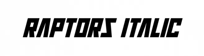
A bold, italic, and angular font with a futuristic look.
![Raptors Italic font caratteri gratis]() Scaricare 281 Downloads@WebFont
Scaricare 281 Downloads@WebFont -
( Fonts by Peter Wiegel - www.peter-wiegel.de - Personal-use only. For commercial use please contact owner. )
A bold, modern sans-serif font with a slightly condensed style.
![KKBahn font caratteri gratis]() Scaricare 281 Downloads@WebFont
Scaricare 281 Downloads@WebFont -
Caratteri di KiddieFonts. For commercial use please contact the owner.
![PUDSEY BEAR font caratteri gratis]() Scaricare 281 Downloads@WebFont
Scaricare 281 Downloads@WebFont -
( Fonts by Andrew McCluskey - nalgames.com. Personal-use only. For commercial use please contact owner. )
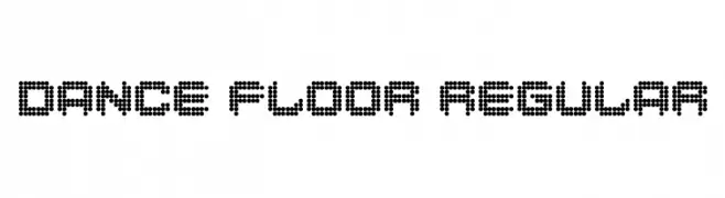
A playful, dot-based font with a retro, digital aesthetic.
![Dance Floor Regular font caratteri gratis]() Scaricare 281 Downloads@WebFont
Scaricare 281 Downloads@WebFont -
-
( Fonts by junkohanhero )
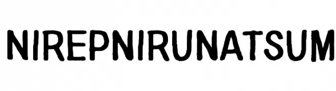
A playful, hand-drawn font with bold, rounded characters and irregular strokes.
![Nirepnirun atsum font caratteri gratis]() Scaricare 281 Downloads@WebFont
Scaricare 281 Downloads@WebFont -
( Copyright (c) 2010, Matt McInerney (matt@pixelspread.com) )
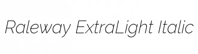
A sleek, modern, and elegant italic font with a light weight and geometric design.
![Raleway ExtraLight Italic font caratteri gratis]() Scaricare 281 Downloads@WebFont
Scaricare 281 Downloads@WebFont -
( Fonts by a Max Infeld - XEROGRAPHER FONTS - xerographer.blogspot.com . Personal-use only. For commercial use please contact owner. )
A bold, shattered glass effect font with fragmented, edgy characters.
![BadLuck font caratteri gratis]() Scaricare 281 Downloads@WebFont
Scaricare 281 Downloads@WebFont -
![MutantE font caratteri gratis]() Scaricare 281 Downloads@WebFont
Scaricare 281 Downloads@WebFont -
![Rocketeer_Gothic font caratteri gratis]() Scaricare 281 Downloads@WebFont
Scaricare 281 Downloads@WebFont


Quali sono i font più popolari adesso?
Poppins, Roboto, Montserrat, Open Sans e Lato sono molto usati per le forme pulite e l'ampia applicabilità — dall'identità di marca alle landing page e ai poster.
Quali font si usano spesso nei loghi?
Le sans serif geometriche (es. Poppins, famiglie in stile Gotham) sono scelte comuni per un branding pulito e scalabile. Per un tocco personale restano valide script e stili manoscritti. Abbina un display deciso per i titoli a un corpo testo neutro per riconoscibilità ed equilibrio.
Ogni quanto si aggiorna la lista?
Con regolarità, in base ai download e all'attività reale. Torna spesso per scoprire in anticipo le nuove preferite.
💡 Consiglio: aggiungi ai preferiti — le tendenze cambiano in fretta e i font top di oggi possono ispirare il rebranding di domani.