Benvenuto nelle Font Più Popolari — dove popolarità e qualità si incontrano. Qui trovi i font più scaricati e usati dell'anno. Se cerchi scelte sicure per logo, web o social, inizia da qui.
Ogni font top si distingue per equilibrio, leggibilità e versatilità. Troverai sans serif moderne, script eleganti, serif vintage e display minimalisti.
-
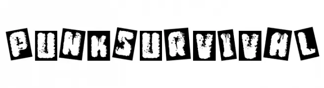
( Fonts by Woodcutter )
A gritty, distressed font with a punk rock aesthetic, featuring bold, jagged characters.
 Scaricare 278 Downloads@WebFont
 -
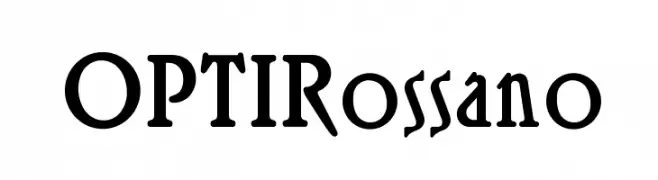
( Fonts by Castcraft Software - OPTI Fonts Archive - opti.netii.net - Personal-use only. For commercial use please contact owner. )
A bold, artistic serif font with unique curves and angles.
![OPTIRossano font caratteri gratis]() Scaricare 278 Downloads@WebFont
Scaricare 278 Downloads@WebFont -
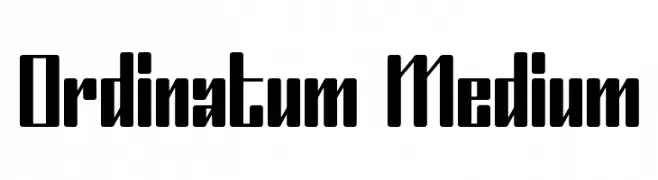
( Fonts by Mans Greback - www.mawns.com )
A bold, geometric font with a modern, industrial style.
![Ordinatum Medium font caratteri gratis]() Scaricare 278 Downloads@WebFont
Scaricare 278 Downloads@WebFont -
( Fonts by Daniel Zadorozny - www.iconian.com - Personal-use only. For commercial use please contact owner. )
A bold, italicized, and expanded font with a modern, dynamic style.
![Urban Defender Expanded Italic font caratteri gratis]() Scaricare 278 Downloads@WebFont
Scaricare 278 Downloads@WebFont -
( Fonts by Maelle.K - Thomas Boucherie )
An artistic and flowing font with elongated, dynamic letterforms.
![Anacondas Light font caratteri gratis]() Scaricare 278 Downloads@WebFont
Scaricare 278 Downloads@WebFont -
-
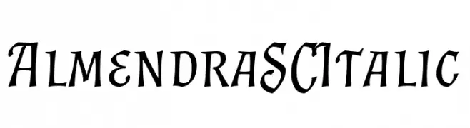
( Fonts by Ana Sanfelippo )
An elegant, italic serif font with a classic, calligraphic style.
![Almendra SC Italic font caratteri gratis]() Scaricare 278 Downloads@WebFont
Scaricare 278 Downloads@WebFont -
( Fonts by or from www.graffitifonts.net )
A dynamic, handwritten font with fluid and playful strokes.
![Simon font caratteri gratis]() Scaricare 278 Downloads@WebFont
Scaricare 278 Downloads@WebFont -
( Fonts by Rodrigo German - RASDESIGN )
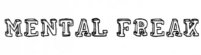
A bold, decorative font with a hand-drawn, sketch-like appearance.
![MENTAL FREAK font caratteri gratis]() Scaricare 278 Downloads@WebFont
Scaricare 278 Downloads@WebFont -
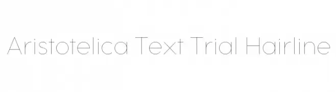
( Fonts by Zetafonts - Personal-use only. For commercial use please contact owner. )
A sleek, ultra-thin font with a modern and elegant design.
![Aristotelica Text Trial Hairline font caratteri gratis]() Scaricare 278 Downloads@WebFont
Scaricare 278 Downloads@WebFont -
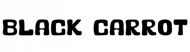
![Black Carrot font caratteri gratis]() Scaricare 278 Downloads@WebFont
Scaricare 278 Downloads@WebFont


Quali sono i font più popolari adesso?
Poppins, Roboto, Montserrat, Open Sans e Lato sono molto usati per le forme pulite e l'ampia applicabilità — dall'identità di marca alle landing page e ai poster.
Quali font si usano spesso nei loghi?
Le sans serif geometriche (es. Poppins, famiglie in stile Gotham) sono scelte comuni per un branding pulito e scalabile. Per un tocco personale restano valide script e stili manoscritti. Abbina un display deciso per i titoli a un corpo testo neutro per riconoscibilità ed equilibrio.
Ogni quanto si aggiorna la lista?
Con regolarità, in base ai download e all'attività reale. Torna spesso per scoprire in anticipo le nuove preferite.
💡 Consiglio: aggiungi ai preferiti — le tendenze cambiano in fretta e i font top di oggi possono ispirare il rebranding di domani.