Benvenuto nelle Font Più Popolari — dove popolarità e qualità si incontrano. Qui trovi i font più scaricati e usati dell'anno. Se cerchi scelte sicure per logo, web o social, inizia da qui.
Ogni font top si distingue per equilibrio, leggibilità e versatilità. Troverai sans serif moderne, script eleganti, serif vintage e display minimalisti.
-
( Fonts by Pablo Impallari, Rodrigo Fuenzalida (Modified by Dan O. Williams) - Personal-use only. For commercial use please contact owner. )
A modern, thin sans-serif font with clean lines and a minimalist aesthetic.
 Scaricare 277 Downloads@WebFont
 -
![O'Connor font caratteri gratis]() Scaricare 277 Downloads@WebFont
Scaricare 277 Downloads@WebFont -
( Fonts by Kat`s Fun Fonts - Personal-use only. For commercial use please contact owner. )
Romantic dingbat font with Valentine’s Day icons.
![KR Belated Valentine font caratteri gratis]() Scaricare 277 Downloads@WebFont
Scaricare 277 Downloads@WebFont -
( Fonts by Nirmala Creative - Personal-use only. For commercial use please contact owner. )
Playful handwritten font with a friendly look.
![Reviera font caratteri gratis]() Scaricare 277 Downloads@WebFont
Scaricare 277 Downloads@WebFont -
( Fonts by www.fontpanda.com. Personal-use only. For commercial use please contact owner. )
A bold, handwritten font with a casual and playful style.
![JasonSharpie font caratteri gratis]() Scaricare 277 Downloads@WebFont
Scaricare 277 Downloads@WebFont -
-
( Fonts by Bartek Nowak - www.nowak.tv/fontoholic/ )
A pixelated, retro-style font inspired by early digital typography.
![MiniMasa font caratteri gratis]() Scaricare 277 Downloads@WebFont
Scaricare 277 Downloads@WebFont -
![Calamitech font caratteri gratis]() Scaricare 277 Downloads@WebFont
Scaricare 277 Downloads@WebFont -
( Fonts by Mans Greback - www.mawns.com )
A bold, dynamic script font with high contrast and expressive strokes.
![Jacked Eleven Highlight font caratteri gratis]() Scaricare 277 Downloads@WebFont
Scaricare 277 Downloads@WebFont -
( Fonts by Graham Meade - GemFonts )
A bold, modern font with a unique dual-line style for dynamic visual impact.
![Skunkline font caratteri gratis]() Scaricare 277 Downloads@WebFont
Scaricare 277 Downloads@WebFont -
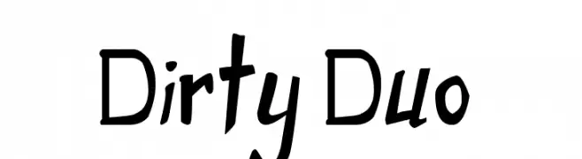
( Fonts by Press Gang Studios - Andeh Pinkard - www.pressgang-studios.com )
A playful, handwritten font with irregular and dynamic letterforms.
![Dirty Duo font caratteri gratis]() Scaricare 277 Downloads@WebFont
Scaricare 277 Downloads@WebFont

Quali sono i font più popolari adesso?
Poppins, Roboto, Montserrat, Open Sans e Lato sono molto usati per le forme pulite e l'ampia applicabilità — dall'identità di marca alle landing page e ai poster.
Quali font si usano spesso nei loghi?
Le sans serif geometriche (es. Poppins, famiglie in stile Gotham) sono scelte comuni per un branding pulito e scalabile. Per un tocco personale restano valide script e stili manoscritti. Abbina un display deciso per i titoli a un corpo testo neutro per riconoscibilità ed equilibrio.
Ogni quanto si aggiorna la lista?
Con regolarità, in base ai download e all'attività reale. Torna spesso per scoprire in anticipo le nuove preferite.
💡 Consiglio: aggiungi ai preferiti — le tendenze cambiano in fretta e i font top di oggi possono ispirare il rebranding di domani.