Benvenuto nelle Font Più Popolari — dove popolarità e qualità si incontrano. Qui trovi i font più scaricati e usati dell'anno. Se cerchi scelte sicure per logo, web o social, inizia da qui.
Ogni font top si distingue per equilibrio, leggibilità e versatilità. Troverai sans serif moderne, script eleganti, serif vintage e display minimalisti.
-
 Scaricare 1091 Downloads@WebFont
 -
![DK Face Your Fears II font caratteri gratis]() Scaricare 1091 Downloads@WebFont
Scaricare 1091 Downloads@WebFont -
( Copyright (c) 2012, Impallari Type (www.impallari.com), with Reserved Font Name Encode Sans. )
A modern, narrow sans-serif font with clean lines and excellent legibility.
![Encode Sans Narrow Medium font caratteri gratis]() Scaricare 1091 Downloads@WebFont
Scaricare 1091 Downloads@WebFont -
![Celestial Bold font caratteri gratis]() Scaricare 1091 Downloads@WebFont
Scaricare 1091 Downloads@WebFont -
![Mauryssel font caratteri gratis]() Scaricare 1091 Downloads@WebFont
Scaricare 1091 Downloads@WebFont -
![WLM Carton Regular font caratteri gratis]() Scaricare 1091 Downloads@WebFont
Scaricare 1091 Downloads@WebFont -
![AGA Sindibad V.2 3F/['/ font caratteri gratis]() Scaricare 1091 Downloads@WebFont
Scaricare 1091 Downloads@WebFont -
![aa Halftone Demo font caratteri gratis]() Scaricare 1091 Downloads@WebFont
Scaricare 1091 Downloads@WebFont -
( Fonts by Lauren Thompson - www.nymfont.com )
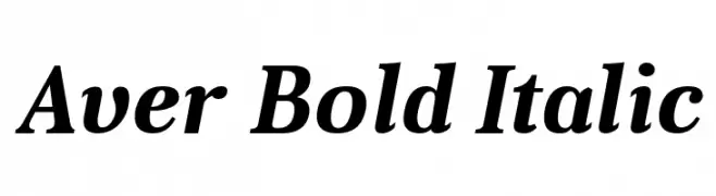
A bold, italic serif font with strong, dynamic strokes.
![Aver Bold Italic font caratteri gratis]() Scaricare 1091 Downloads@WebFont
Scaricare 1091 Downloads@WebFont -
( Copyright (c) 2011 by Anna GiedryÅ› (http://ancymonic.com) )
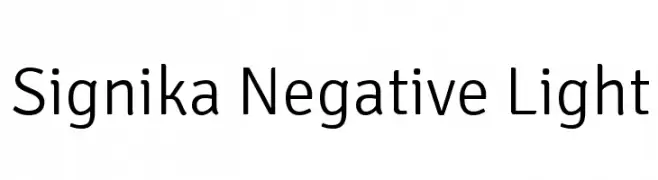
A modern, light sans-serif font with excellent readability and a friendly appearance.
![Signika Negative Light font caratteri gratis]() Scaricare 1091 Downloads@WebFont
Scaricare 1091 Downloads@WebFont -
( Free for personal use - Fonts by Markus Schroppel. For commercial license please donate to http://www.die-gute-schrift.de/donation.html )
A bold, distressed font with a vintage, textured appearance.
![LLRubberGrotesqueOTF font caratteri gratis]() Scaricare 1091 Downloads@WebFont
Scaricare 1091 Downloads@WebFont -
![MrsEavesSmartLigRoman font caratteri gratis]() Scaricare 1091 Downloads
Scaricare 1091 Downloads -
( THESE ARE SHAREWARE FONTS ! NOT FREEWARE ! PLEASE VISIT www.fuelfonts.com )
A tall, narrow, and modern font with a sleek, consistent stroke width.
![Parkland font caratteri gratis]() Scaricare 1091 Downloads@WebFont
Scaricare 1091 Downloads@WebFont -
Caratteri di twinletter. For commercial use please contact the owner.
( THIS FONT IS DEMO ONLY Free for personal used any donations are very appreciated. PayPal account for donation: https://paypal.me/abahrozi -------------------------------------------------------- ENGLISH: Be very careful and take the time to read any a )
A bold, expressive script font with a handwritten, fluid style.
![Settikef Personal Use font caratteri gratis]() Scaricare 1090 Downloads@WebFont
Scaricare 1090 Downloads@WebFont -
( Alfiyan - creativemarket.com/LogoLabs )
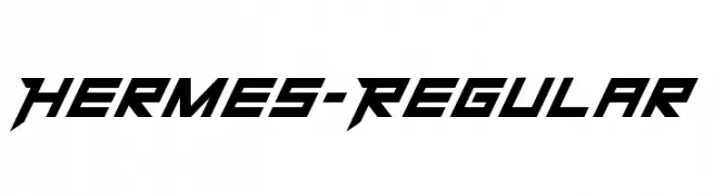
A dynamic, angular font with a futuristic and bold style.
![Hermes-Regular font caratteri gratis]() Scaricare 1090 Downloads@WebFont
Scaricare 1090 Downloads@WebFont -
( Fonts by Dan P. Lyons - Personal-use only. For commercial use please contact owner. )
A modern, condensed sans-serif font with excellent readability and versatility.
![POE Vetica New Condensed font caratteri gratis]() Scaricare 1090 Downloads@WebFont
Scaricare 1090 Downloads@WebFont -
( Copyright (c) 2012, Impallari Type (www.impallari.com). )
A modern, semi-bold sans-serif font with a clean and balanced design.
![Amiko SemiBold font caratteri gratis]() Scaricare 1090 Downloads@WebFont
Scaricare 1090 Downloads@WebFont -
( Fonts by Agathe M.Joyce - www.foundmyfont.com - Personal-use only. For commercial use please contact owner. )
An elegant, flowing script font with ornate uppercase letters and harmonious lowercase characters.
![Pictorial Signature font caratteri gratis]() Scaricare 1090 Downloads@WebFont
Scaricare 1090 Downloads@WebFont -
![Nintender font caratteri gratis]() Scaricare 1090 Downloads@WebFont
Scaricare 1090 Downloads@WebFont -
![Kindly Rewind font caratteri gratis]() Scaricare 1090 Downloads@WebFont
Scaricare 1090 Downloads@WebFont -
( Fonts by Castcraft Software - opti.netii.net - check the website before use )
A modern serif typeface with sharp serifs and elegant curves.
![OPTIBenjieModern font caratteri gratis]() Scaricare 1090 Downloads@WebFont
Scaricare 1090 Downloads@WebFont -
( www.cloutierfontes.ca/ )
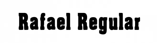
A bold, robust font with thick strokes and a strong presence.
![Rafael Regular font caratteri gratis]() Scaricare 1090 Downloads@WebFont
Scaricare 1090 Downloads@WebFont -
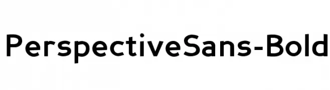
( Fonts by Daniel Midgley )
A bold, modern sans-serif font with geometric proportions and strong readability.
![PerspectiveSans-Bold font caratteri gratis]() Scaricare 1090 Downloads@WebFont
Scaricare 1090 Downloads@WebFont -
![Puppeteer font caratteri gratis]() Scaricare 1090 Downloads@WebFont
Scaricare 1090 Downloads@WebFont -
![Bridgnorth Bold font caratteri gratis]() Scaricare 1090 Downloads@WebFont
Scaricare 1090 Downloads@WebFont -
( Fonts by Scott Dieznyik - Kejak (formerly Cheops) )
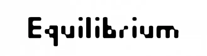
A bold, geometric font with rounded edges and a futuristic style.
![Equilibrium font caratteri gratis]() Scaricare 1090 Downloads@WebFont
Scaricare 1090 Downloads@WebFont -
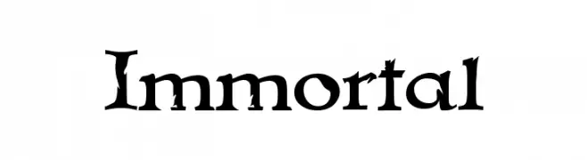
( Fonts by Apostrophic Lab )
A gothic-inspired font with bold, angular serifs and medieval embellishments.
![Immortal font caratteri gratis]() Scaricare 1090 Downloads@WebFont
Scaricare 1090 Downloads@WebFont -
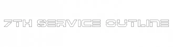
( Fonts by Daniel Zadorozny - www.iconian.com )
A modern, geometric outline font with a futuristic and airy design.
![7th Service Outline font caratteri gratis]() Scaricare 1090 Downloads@WebFont
Scaricare 1090 Downloads@WebFont -
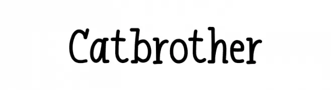
( Fonts by Khurasan )
A playful, handwritten font with a casual and friendly style.
![Catbrother font caratteri gratis]() Scaricare 1089 Downloads@WebFont
Scaricare 1089 Downloads@WebFont -
( Fonts by Khurasan )
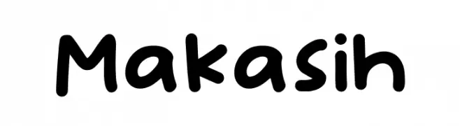
A playful, rounded font with a hand-drawn, casual style.
![Makasih font caratteri gratis]() Scaricare 1089 Downloads@WebFont
Scaricare 1089 Downloads@WebFont -
( Fonts by Vladimir Nikolic - https://www.creativefabrica.com/product/educated-deers/ref/144265/ - Personal-use only. For commercial use please contact owner. )
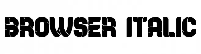
A bold, geometric font with strong, angular shapes and high visual impact.
![Browser Italic font caratteri gratis]() Scaricare 1089 Downloads@WebFont
Scaricare 1089 Downloads@WebFont -
![Love Nature font caratteri gratis]() Scaricare 1089 Downloads@WebFont
Scaricare 1089 Downloads@WebFont -
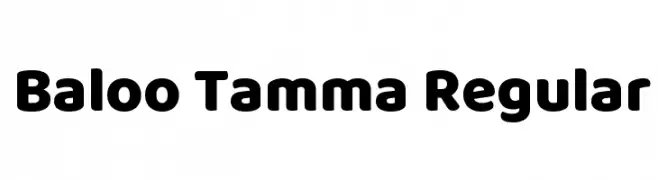
( Copyright (c) 2015 Ek Type (www.ektype.in) )
A bold, rounded font with a playful and friendly style.
![Baloo Tamma Regular font caratteri gratis]() Scaricare 1089 Downloads@WebFont
Scaricare 1089 Downloads@WebFont -
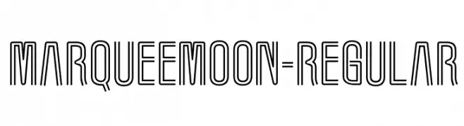
( Fonts by www.typodermicfonts.com - Ray Larabie )
A modern, outlined font with a double-line structure and geometric shapes.
![MarqueeMoon-Regular font caratteri gratis]() Scaricare 1089 Downloads@WebFont
Scaricare 1089 Downloads@WebFont -
( Fonts by Douglas Vitkauskas - www.vtksdesign.com. Personal-use only. For commercial use please contact owner. )
A decorative, hand-drawn font with a whimsical and artistic style.
![scretch font caratteri gratis]() Scaricare 1089 Downloads@WebFont
Scaricare 1089 Downloads@WebFont


Quali sono i font più popolari adesso?
Poppins, Roboto, Montserrat, Open Sans e Lato sono molto usati per le forme pulite e l'ampia applicabilità — dall'identità di marca alle landing page e ai poster.
Quali font si usano spesso nei loghi?
Le sans serif geometriche (es. Poppins, famiglie in stile Gotham) sono scelte comuni per un branding pulito e scalabile. Per un tocco personale restano valide script e stili manoscritti. Abbina un display deciso per i titoli a un corpo testo neutro per riconoscibilità ed equilibrio.
Ogni quanto si aggiorna la lista?
Con regolarità, in base ai download e all'attività reale. Torna spesso per scoprire in anticipo le nuove preferite.
💡 Consiglio: aggiungi ai preferiti — le tendenze cambiano in fretta e i font top di oggi possono ispirare il rebranding di domani.